
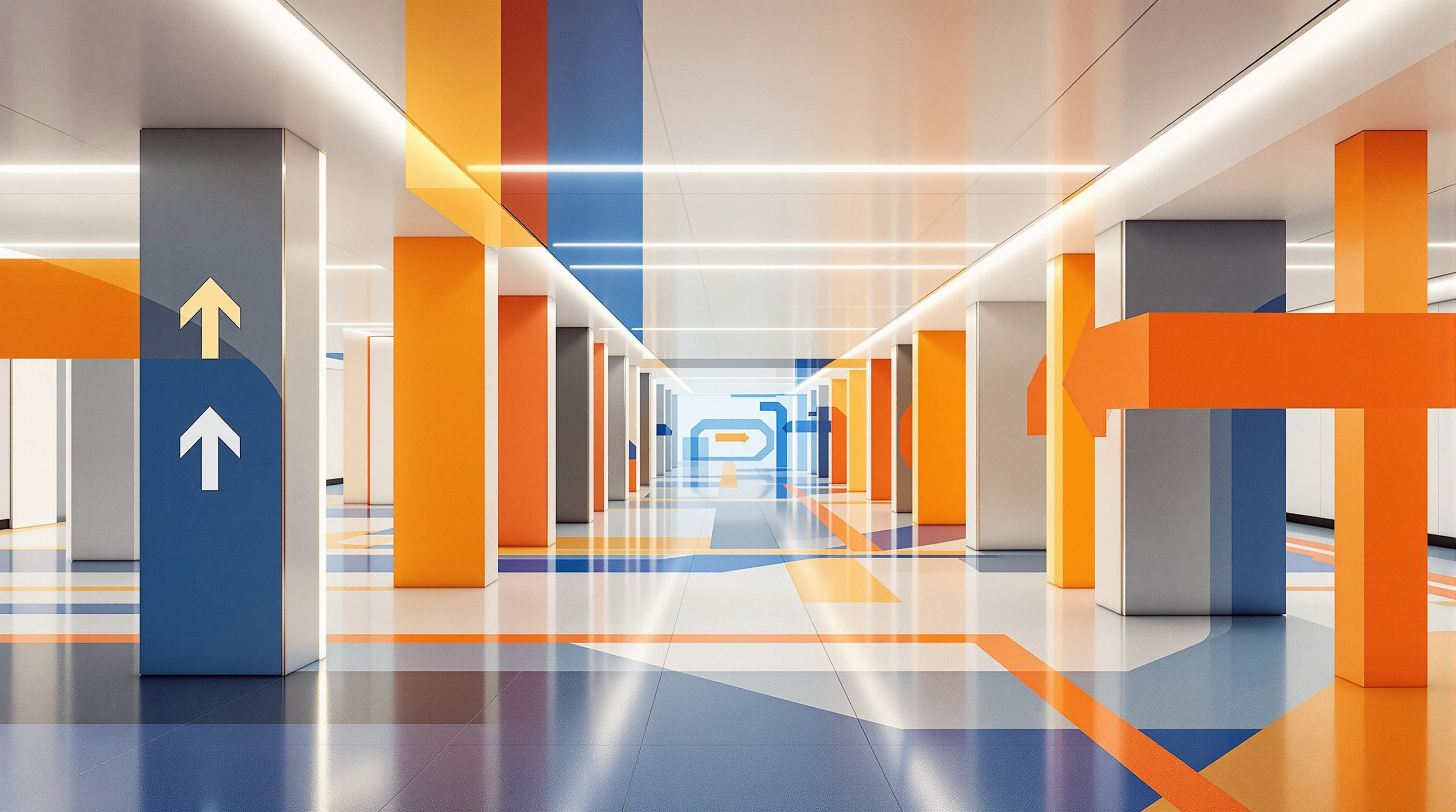
 Lesson 8.2
Lesson 8.2 · Wayfinding by Place Type
Transport & Transit Wayfinding
Airports, railway and metro stations move vast crowds against the clock, in many languages, under real pressure - so transit wayfinding lives or dies on ruthless clarity, a disciplined line-colour system and information disclosed at exactly the moment each decision is made
A transit hub asks thousands of strangers, every minute, to make the right split-second decision - against the clock, in many languages, with luggage. Clarity here is not a luxury; it is the whole job.
An airport or a big railway station is wayfinding at full volume. Thousands of people an hour, most of them strangers to the building, many anxious about missing a flight or a train, a good number unable to read the local script, all moving through the same space at once - arriving, departing, connecting, meeting, lost. Unlike the hospital, where the problem is the vulnerable individual, the transit challenge is the crowd and the clock: decisions must be made fast, by many people at once, with real consequences for getting them wrong - a missed train, a missed flight, a missed connection that unravels a whole journey.
The response that the great transit systems of the world have evolved is one of the clearest achievements of wayfinding and information design. It rests on a small number of disciplined ideas - a network reduced to named, coloured lines; a schematic map that sacrifices geography for legibility; information released in the right order along the journey from street to platform; and live, dynamic information at the point of decision. These ideas are so successful that they have leaked out into the rest of the world - we now expect colour-coded lines and schematic maps everywhere. This lesson unpacks the transit toolkit and then grounds it in the particular, crowded, multilingual reality of the Indian station and airport.
Transit = crowd + clock + many tongues. Named coloured lines, schematic map, journey-order disclosure, live screens.
Huge flows, time pressure and the multilingual crowd
Three conditions define the transit wayfinding problem, and together they explain why its solutions look the way they do.
The first is volume and flow. A transit hub is not navigated by one person at a time but by a continuous crowd, and that changes the design. Signs must be readable at a distance and on the move, placed high so they clear the heads in front and can be seen from far back in a moving stream; decision points must have enough space for people to pause and choose without causing a pile-up; and the system must keep circulation flowing, separating arriving and departing streams where it can. Wayfinding here is as much about managing the movement of a mass of people as about informing an individual.
The second is time pressure. The transit user is usually racing a clock - a boarding time, a departure - and stress plus haste narrows attention and patience. People cannot stop and puzzle out a cluttered sign; they need the answer to their one current question immediately and unmistakably, or they make a wrong turn they have no time to recover from. This is why transit wayfinding is so ruthlessly reductive: at each point it tells you the one thing you need and suppresses everything else.
The third is the multilingual, multi-ability crowd. Airports are international by definition; big Indian stations serve travellers across many languages and literacy levels. No single written language reaches everyone, so transit leans hard on the tools that cross language: an internationally recognised set of pictograms (the origin of the AIGA and ISO public-symbol sets was precisely transport), colour, numbers, and increasingly audio and dynamic screens. The famous transport typefaces - Frutiger was designed for Charles de Gaulle airport, and its relatives run the world's signage - exist because legibility at speed, at distance and at a glance is a life-or-miss-your-flight matter here. Everything in transit wayfinding is shaped by these three pressures: move the crowd, beat the clock, cross the language barrier.
Crowd + clock + many languages. Answer the ONE current question, fast, high up, in pictograms as much as words.
The line-colour system and the schematic network map
The central invention of transit wayfinding is the line-colour system, and understanding why it works is understanding the discipline itself. A complex rail or metro network is an impossible thing to hold in your head as geography - dozens of routes crossing a real city. The breakthrough, most famously Harry Beck's 1933 London Underground diagram, was to stop drawing the true map and instead draw a schematic: straighten the lines, space the stations evenly, fix everything to horizontals, verticals and diagonals, and - crucially - give each line a name and a colour. Suddenly a stranger can trace a route with a finger: start on the Blue Line, change to the Red Line at the interchange, count the stops. The map lies about geography in order to tell a deeper truth about connectivity, and that trade is the heart of information design.
The colour then becomes a thread the traveller follows through the whole system. The Blue Line is blue on the network map, blue on the platform signs, blue on the train, blue on the concourse directions - one consistent identity carried from the map in your hand to the edge of the platform. This is colour-coding working at its best: a single, disciplined, rigorously consistent system where colour is always paired with a line name and a direction (a terminus - "towards East Gate"), so it never relies on hue alone and survives for the colour-blind and the non-reader.
Two disciplines keep it working. First, restraint: the palette must stay distinguishable, which is why mature networks agonise over adding a line's colour and test it for colour-blind confusion. Second, naming the direction by its destination, not "northbound" or "up", because a stranger does not know which way is north but can match a terminus name on a sign to the one on the map. The schematic map, the named coloured line, and the terminus-based direction together let a person who has never been here navigate a vast network confidently in seconds - one of wayfinding's genuine triumphs, and a model of how a hard problem yields to a few ruthless, consistent rules.
Street to platform: progressive disclosure and dynamic information
A transit journey is a chain of decisions, and good transit wayfinding reveals information in the order the traveller needs it - the progressive-disclosure principle from earlier modules, applied with unusual rigour because there is no time to waste.
Think of the sequence from the street. At the entrance, the one question is "is this the right station, and which way in?" - so the big identification and a confirmation dominate, and nothing else competes. On the concourse, the questions become "which line, which direction, and do I need a ticket?" - so directional signs resolve to lines and terminus-named directions, and ticketing is flagged. At the gates, it is "through here, then which way to my platform?". On the platform, it narrows to "is this the right side for my direction, and when is my train?". At each step the system answers the current question and suppresses the others; a sign that tried to tell you everything at the entrance would paralyse the crowd. Return journeys and transfers get the same treatment in reverse, which is why good hubs are as clear on the way out ("Way out", "To the street", exits named by the street they emerge onto) as on the way in - a frequent failing of stations that lavish signs on arrival and abandon you on departure.
Transit is also where dynamic information becomes essential, because the most important facts change minute to minute: which platform, whether delayed, when the next train, which gate. Static signs handle the stable structure (lines, directions, facilities); electronic displays handle the live, changing layer - and they must sit exactly where the decision is made (the departure board before the gates, the next-train indicator on the platform) and be trustworthy, because a wrong or frozen display is worse than none. The art is integrating the two so they feel like one system: the static signs give the permanent map of the place, the dynamic screens fill in the live specifics, and the traveller experiences a single, continuous answer to "where do I go, and when?" all the way from the street to the moving train.
Reveal info in journey order. Static = the fixed structure; screens = the live layer (platform, delay, time). Both at the decision.
The Indian station and airport
Indian transit hubs apply every principle above under intensified conditions, and they are a superb place to study wayfinding because the stakes and the crowds are so real. A major Indian railway station or airport handles immense volumes across an extraordinary spread of languages, scripts and literacy levels, from seasoned flyers to first-time travellers who may never have been in such a building. This makes the language-crossing tools non-negotiable: a strong, consistent pictogram system; a disciplined multi-script hierarchy (typically Hindi and English plus the regional language, ordered and sized consistently rather than crammed); generous use of numbers, colour and platform/gate identifiers as non-verbal anchors; and clear audio announcements as a genuine channel, not an afterthought, for those who cannot read the signs. Indian metro systems - Delhi, Bengaluru, Chennai, Kolkata and others - have, notably, adopted the international line-colour-and-schematic model rigorously, and are among the clearest transit environments in the country as a result.
There are real-world layers the textbook model understates here: dense crowds and queuing, touts and informal "helpers", heavy luggage and families travelling together, and the enduring role of the person you ask - the enquiry counter, the guard, the fellow traveller - as a primary wayfinding channel. Good Indian transit wayfinding works with these realities: it makes enquiry and help points obvious, keeps decision points physically clear so crowds can choose without crushing, and provides strong orientation and confirmation for the anxious first-timer, not just efficiency for the regular commuter.
And, as always, hold the line on what we teach versus what we defer. We cover the design principles - flow, the line-colour system, progressive disclosure, dynamic information, crossing language. We do not set the binding specifics: platform and emergency-egress signage and crowd-safety provisions are safety-critical and defer to the railway and aviation authorities and fire/life-safety specialists; accessibility requirements (tactile routes, audible systems, contrast, heights) defer to the current accessibility standards and a consultant; and illuminated and digital-display engineering defers to the electrical and signage engineers. Treat any cited figure - viewing distance, letter height - as a starting point to verify. Your craft is the clarity; the authorities and specialists make it safe and compliant.
Platform & emergency-egress signage (transport authority)
Platform-edge warning, emergency exits, crowd evacuation in a dense hub
Safety-critical and governed by the railway/aviation authority and fire/life-safety specialists. Principles here; binding provisions and dimensions from them. Module 3.
Accessibility (NBC 2016 / Harmonised Guidelines)
Tactile routes, audible information, contrast, sign heights for all travellers
Transit must serve everyone, including first-time and disabled travellers. Defer binding dimensions and audible-system requirements to the current standards and an accessibility consultant. Module 7.
Dynamic displays (electrical & signage engineers)
Illuminated and electronic passenger-information displays, power, mounting
Live-information screens are engineered products; defer electrical, structural and display specifications to the relevant engineers. Module 9.
Workshop — decode a transit hub from street to platform
You will analyse a real transit hub - a metro station, railway terminus or airport - as a chain of decisions, evaluating its line-colour system, its progressive disclosure, and how it serves the multilingual, hurried, first-time traveller. The aim is to see the transit toolkit working (or failing) in the wild.
A transit hub you can visit or recall and its network map, plus paper. This is about reading the decision chain and the colour system, not engineering displays or setting safety minima.
Goal: a decision-by-decision read of a transit journey and an improvement list
Inputs: a transit hub you can visit or recall, a network map, this lesson, paper
Time: ~60 minutes
- 1Pick a real journey: street entrance to a specific platform or gate. List the sequence of decisions a first-time traveller must make, and write the one question that dominates at each step (entrance, concourse, gates, platform).
- 2Evaluate the line-colour system (for a metro/rail): is each line named and coloured, is the colour carried consistently from map to platform edge, is direction given by terminus name, and would the palette survive colour-blindness?
- 3Test progressive disclosure: at each decision point, does the signage answer just the current question and suppress the rest, or does it clutter and overload? Note where the way-out is as clear as the way-in, or not.
- 4Check the language-crossing tools: pictograms, multi-script hierarchy, numbers, colour and audio - who is served and who is left behind (non-readers, a language not shown, a first-timer)? Note how static signs and live screens hand off.
- 5Write the top three improvements for the hurried, multilingual, first-time traveller, and flag which involve safety, accessibility or display engineering and must defer to the authority and specialists.
You’ll walk away with
A decision-by-decision read of a transit hub: the question at each step, an assessment of the line-colour system and progressive disclosure, the language-crossing provision, and the top three improvements - with safety/accessibility/engineering items flagged for the specialists.
Three altitudes on the same idea
Read the band that fits you — or all three.
In a transit hub your plan either manages the crowd or fights it. Design circulation so arriving and departing streams separate, decision points open into space where people can pause and choose without a pile-up, and sightlines carry to the next decision - the concourse that reveals the gates, the platform you can see from the stairs. Position high-level sign zones and large dynamic-display locations structurally from the start, and give the sequence from street to platform a legible spatial logic so the architecture itself discloses the journey. Bring wayfinding and the display engineers in early. Defer platform-edge and emergency-egress signage, crowd-safety limits and accessibility dimensions to the transport authority, fire/life-safety and accessibility specialists.
You build the line-colour system, the sign family and the integration of static and dynamic that travellers actually read. Design a disciplined, colour-blind-tested line palette always paired with line names and terminus-based directions; a pictogram-led, multi-script sign family legible at distance and on the move; and a clear hierarchy so each decision point answers the one current question. Coordinate the static signs with the electronic displays so they read as one system, placed exactly where decisions happen, and make the way-out as clear as the way-in. Design for the multilingual, first-time, hurried traveller, and verify legibility benchmarks, accessibility dimensions and display/electrical specifics with the relevant specialists.
Transit hubs are the best open-air classroom in wayfinding - go and read them. Trace a journey through a metro or a big station from street to platform and notice the chain of decisions, how each sign answers just one question, how the line colour threads from map to platform edge, and where static signs hand off to live screens. Compare a well-run metro with a chaotic station and ask why one feels effortless and the other frantic. Watch how pictograms, numbers and audio carry people who cannot read the script, and how many still navigate by asking. Learn the toolkit - flow, line-colour, progressive disclosure, dynamic information - without yet setting the safety or accessibility minima, which belong to the authorities and specialists.
“A metro map is just a simplified version of the real map - it shows you where the lines and stations actually are, only tidied up a bit.”
Do it yourself
No tools needed - reason it through from the lesson.
- 1Name the three conditions that define the transit wayfinding problem, and one design consequence of each.
- 2Explain why a schematic metro map sacrifices geography, and why that makes it more useful, not less.
- 3How does the line-colour system thread through a whole network, and what two disciplines keep it working?
- 4Describe progressive disclosure from street to platform, and why a sign should not tell you everything at the entrance.
- 5What extra tools and realities must Indian transit wayfinding handle, and why is audio a genuine channel?
The one line to carry out
Peer-reviewed journals & authoritative standards
- 01Airport — Wikipedia — Airport, 2026.
- 02Rapid transit — Wikipedia — Rapid transit, 2026.
- 03Frutiger (typeface) — Wikipedia — Frutiger (typeface), 2026.
- 04Color code — Wikipedia — Color code, 2026.
Transit pushes people through against the clock; retail wants to slow them down and keep them browsing. Next we look at malls, large retail and the workplace - where wayfinding must also serve commercial and brand goals.
The author
Amogh N P
Architect, interior designer, and creative polymath. Studio Matrx began in his notebooks — his vision of design made honest, useful, and open to everyone. Its Academy is written and taught in his memory, and free, forever.
More about Amogh →