
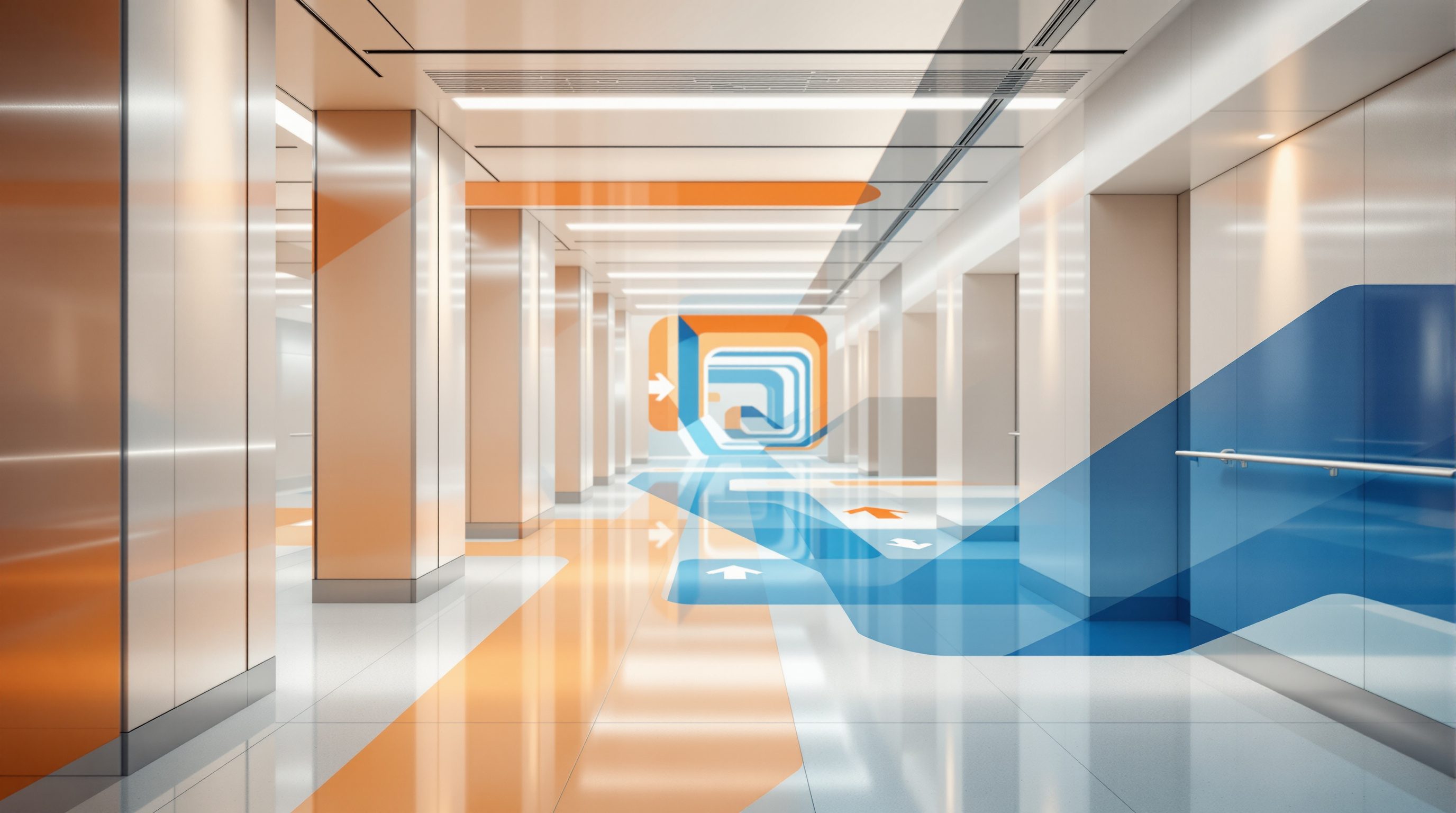
 Lesson 8.1
Lesson 8.1 · Wayfinding by Place Type
Healthcare & Hospital Wayfinding
The hospital is the hardest wayfinding problem in the world - a vast, ever-changing building full of anxious, unwell, unfamiliar people who cannot afford to get lost - which is exactly why it rewards clear, humane wayfinding more than any other place
Nowhere is being lost more frightening, or more costly, than in a hospital - which is why the hardest wayfinding problem is also the one that matters most.
Picture arriving at a large city hospital for a scan you are dreading. You have never been here before. You are unwell, or frightened for someone who is. The building is enormous, stitched together over decades, wing added to wing. The letter told you to report to "Nuclear Medicine, Phase 3, Block C, Level 2" - words that mean nothing to you. You join a queue at an information desk, then another. By the time you find the right door you are flustered, late, and your blood pressure is up before anyone has touched you. None of this was the medicine's fault. It was the wayfinding.
Every place type has its own wayfinding challenge, and this module works through the hardest of them. We begin with healthcare because it concentrates every difficulty the course has discussed into one building. Hospitals are huge and structurally complex; they change constantly as departments move and expand; they are named in a clinical language patients do not speak; and above all their users are not confident regulars but stressed, unwell, grieving or disoriented people - the exact "person having the hardest time" we said wayfinding must be designed for. A hospital that is easy to navigate is a quiet, continuous act of care; one that is confusing inflicts real, avoidable distress on people who are already suffering. That is why healthcare wayfinding is both the toughest brief and the most rewarding one to get right.
Hospital = the hardest, most humane brief. Zone it, name it plainly, reassure, and build it to be updated.
The hardest building to find your way through
Several forces combine to make the hospital the most difficult wayfinding problem of any building type, and it helps to name them because each one shapes the solution.
First, scale and complexity. A major hospital is not one building but a campus of them, frequently accreted over fifty or a hundred years - an old block, a new tower, a research wing, a diagnostic centre - joined by corridors that jink and change level because the buildings were never designed to meet. The result is a three-dimensional maze of near-identical corridors where the classic failures of legibility we studied earlier all appear at once: no sightlines to destinations, no memorable landmarks, repeated forms that give the mind nothing to hang a map on.
Second, constant change. Unlike an airport or a mall, a hospital is never finished. Departments grow, merge, relocate; a ward becomes offices; a new MRI suite opens where the old records room was. Any wayfinding system must therefore be built to be updated cheaply and often - modular, with changeable inserts - or it decays within a year into the tell-tale sign of a failing hospital: the handwritten A4 sheet taped over the official sign, arrows drawn in marker, contradictory directions at every junction.
Third, clinical naming. Hospitals are organised and labelled by medical specialty - Cardiology, Ophthalmology, Phlebotomy, Oncology - a language that is precise for staff and meaningless or frightening for patients, who know only that their heart, or their eyes, or their blood is the problem.
Fourth, and decisively, the state of the user. The hospital visitor is the opposite of the confident commuter. They are anxious, often in pain, sometimes elderly or cognitively impaired, frequently managing a sick relative and children and parking all at once, and very often there for the first and only time. Stress narrows attention and erodes the ability to read and reason - the very faculties wayfinding asks of people. A system that works for a calm designer in an office may collapse entirely for the person it is actually meant to serve. Designing for that person, in that state, in that maze, is the whole challenge.
Huge + always changing + clinical names + a frightened first-timer. Every wayfinding difficulty, in one building.
The stakes: anxiety, missed appointments and wasted care
The cost of poor hospital wayfinding is unusually high, and it lands on three groups at once - which is why hospital managers, once they see the numbers, become wayfinding's keenest clients.
The first cost is human and emotional, and it is the one that matters most. A hospital visit is already loaded with fear. Adding the stress of being lost - the rising panic of not knowing where to go, the indignity of asking strangers again and again, the dread of being late for something you are frightened of anyway - compounds suffering on people least able to bear it. There is evidence that this is not merely unpleasant: disorientation raises stress, and stress affects how patients present and recover. Calm, confident arrival is, in a real sense, part of good care. For a frightened patient, a clear route to the right door is a kindness delivered before the clinician says a word.
The second cost is operational and financial. Lost patients miss or are late for appointments, and a missed slot on an expensive scanner or a surgeon's list is wasted capacity that cannot be recovered. Late arrivals cascade into delays down the day. Studies of large hospitals have repeatedly found that wayfinding failure consumes a startling amount of staff time: nurses, porters, receptionists and security staff spend hours every day giving directions instead of doing their jobs - a recurring, quantifiable cost that good wayfinding directly reduces. Visitors who cannot find their way also crowd information desks and block circulation.
The third cost is safety and reputation. In an emergency, people must find exits and help fast; in daily use, a confused visitor wandering into a clinical or restricted area is a genuine risk. And the experience of getting hopelessly lost colours a person's entire impression of the institution - people forgive a long wait more readily than the humiliation of being lost and late. So the business case and the human case point the same way, which is the happy position the wayfinding designer wants to be in: the kindest solution is also the one that saves the hospital the most time and money.
Strategies that work: zoning, disciplined colour, plain names
No signage package can rescue a hospital that is fundamentally a maze - the architecture must do its share, as always - but a disciplined set of strategies makes an enormous difference, and they are well established in healthcare wayfinding practice.
Destination zoning is the backbone. Instead of asking a frightened stranger to hold a building full of department names, break the hospital into a small number of large, memorable zones off a single legible "main street" or spine, and wayfind to the zone first, the department second. A visitor can remember "Blue Zone, Level 2" far more easily than "Nuclear Medicine, Phase 3, Block C". The zone becomes the big idea they carry; the department resolves only once they are close. This mirrors progressive disclosure and the mental-map principles from earlier modules, applied to the worst case.
Colour-coding is the classic healthcare tool - and the classic trap. Coloured zones genuinely help people hold and confirm a route ("keep following blue"), and colour survives when words fail the non-reader. But colour must be used with discipline: it is an aid layered on top of names and numbers, never the sole channel, because a colour-blind, low-vision or simply forgetful visitor needs the words too; the palette must be small (six or seven zones, not twenty indistinguishable shades); and it only works if it is followed rigorously and consistently everywhere, which in a constantly changing hospital is a maintenance commitment, not a one-off.
Plain language is the quiet hero. Lead signs with the words patients actually think and search in - Heart Clinic, Eye Clinic, Blood Tests, X-ray, Children - and keep the clinical term (Cardiology, Phlebotomy) as a subtitle for staff and referral letters. Crucially, fix the naming at source: the appointment letter, the website, the sign and the desk must all use the same words, because a patient told to find "Nuclear Medicine" cannot follow signs to "Scans". Add generous reassurance along routes (people fear they have gone wrong), confirm arrival clearly, mark decision points, keep text large and high-contrast for older eyes, and design the system to be updated easily so it never decays into taped-up paper. Good hospital wayfinding is mostly this patient, unglamorous discipline.
Zone first, department second. Colour helps but never alone. Say 'Heart Clinic', not 'Cardiology' - everywhere.
The Indian hospital, many languages, and what to defer
Indian healthcare sharpens every one of these challenges, and it is where a clarity-first, inclusive approach earns its keep. A large public or trust hospital may serve enormous daily volumes across a catchment where patients speak several languages, read different scripts, or cannot read fluently at all. Signage that works only in English - or only in English and one regional language - fails a large share of the very people who most need help. The response is not to cram every sign with four scripts until it is unreadable, but to design a deliberate multi-script, pictogram-led system: a consistent, internationally recognisable set of pictograms doing the first heavy lifting (so the symbol for X-ray, toilets or pharmacy works regardless of language), a clear hierarchy of languages (typically English plus the dominant regional language, chosen with the hospital), generous numbers and colour as non-verbal anchors, and crucially people and spoken help treated as part of the system, since in Indian hospitals the guard, the help desk and the family member remain primary wayfinders. Queuing, token and crowd realities also mean orientation and queue information matter as much as directional signs.
Through all of it, remember the division of labour this course insists on. We teach the design principles and judgement of healthcare wayfinding - zoning, plain naming, disciplined colour, reassurance, designing for the stressed first-timer, maintainability. We do not set the binding technical minima, and you should not improvise them. Accessibility requirements for tactile, braille and audible wayfinding, for sign mounting heights and contrast, defer to the current accessibility standards (NBC 2016 and the Harmonised Guidelines) and an accessibility consultant. Fire and exit signage and emergency egress in a hospital are safety-critical and code-governed - defer to the fire authority and a life-safety specialist. Infection-control constraints on sign materials and cleaning, and the clinical naming system itself, belong to the hospital, its clinicians and its estates team. Treat any dimension you have seen quoted - letter height, mounting height, contrast ratio - as an illustrative starting point to verify, not a rule. Your job is to make the hospital humane and legible; the specialists make it compliant and safe.
Accessibility (NBC 2016 / Harmonised Guidelines)
Tactile, braille & audible wayfinding, mounting heights, contrast for patients with disability
Hospitals serve the full range of ability and age. Principles here; every binding dimension and requirement from the current standards and an accessibility consultant. Module 7.
Fire & exit signage (fire authority)
Emergency egress, exit signs, evacuation wayfinding in a complex occupied building
Safety-critical and code-governed, and harder in a hospital where many cannot self-evacuate. Defer to the fire authority and a life-safety specialist. Module 3.
Clinical naming & infection control (the hospital)
Department names, plain-language equivalents, cleanable sign materials
Agree the naming system with clinicians and estates so letter, website and sign match; material and cleaning rules follow the hospital's infection-control policy.
Workshop — rescue a lost hospital visitor
You will diagnose and improve the wayfinding of a real or imagined large hospital by walking one journey as its most vulnerable user, then proposing the highest-impact fixes. The aim is to practise the core healthcare moves - zoning, plain naming, disciplined colour, reassurance - on the hardest case.
A hospital you can visit or recall (or a plan and photos) and paper. This is about humane diagnosis and strategy, not drawing finished signs or setting code minima.
Goal: a wayfinding diagnosis and a one-page rescue plan for a hospital journey
Inputs: a hospital you know or can visit (or a plan/photos), this lesson, paper
Time: ~60 minutes
- 1Choose a real journey: main entrance to a specific department a patient would dread (a scan, oncology, a specialty clinic). Write the instruction as a real appointment letter might - using the clinical name - and note how a first-timer would feel reading it.
- 2Walk or trace it as the stressed, unfamiliar user. At every decision point record what helped (a sightline, a landmark, a sign, a person) and what failed (a missing sign, a clinical name, clutter, a contradiction, a taped-up A4). Mark where anxiety would peak.
- 3Redesign the naming: rewrite the department and the route in plain language the patient actually thinks in, keeping the clinical term as a subtitle, and make the letter, the website and the signs all match.
- 4Propose a zoning and colour scheme: break the building into a few memorable destination zones off a main street, assign a small, disciplined colour set always paired with names and numbers, and say where reassurance and 'you are here' orientation go.
- 5List the top three highest-impact changes for a stressed first-time visitor, note which must be verified with an accessibility or fire-safety specialist, and say how the system would be kept updated so it never decays into taped-up paper.
You’ll walk away with
A one-page hospital wayfinding rescue: the journey diagnosis (space-versus-signs, failure points, anxiety peaks), a plain-language renaming, a zoning-and-colour proposal, and the top three changes - with a note of what defers to the accessibility and fire specialists.
Three altitudes on the same idea
Read the band that fits you — or all three.
The single most valuable thing you can give a hospital is a legible plan, because no signage recovers a maze. Fight at the master-plan and floor-plan stage for a clear organising structure - a main street or spine, a small number of memorable zones, daylight and landmarks at decision points, sightlines to major destinations, and an entrance and arrivals sequence a frightened stranger can read. Design circulation so departments can move and grow without destroying the wayfinding logic, and build in generous, accessible sign zones and mounting provision from the outset. Bring the wayfinding designer in at concept, not at handover. Defer accessibility dimensions, fire-egress signage and infection-control material rules to the codes, the fire authority and the relevant specialists.
Inside the hospital you complete the legibility the building starts - and set its emotional tone. Design the zone colour system with restraint (few, distinguishable colours, always paired with names and numbers), the plain-language naming, the pictogram set, the identification and directional signs, and reassurance along routes. Make text large and high-contrast for older and low-vision eyes, keep decision points uncluttered, and design every element to be updated cheaply as departments change, so the system never decays into taped-up paper. Environmental graphics can also calm - warm, human, non-institutional finishes aid wellbeing. Coordinate accessibility, fire-exit signage, lighting and cleanable materials with the specialists, and verify every benchmark dimension.
Study hospitals as the ultimate wayfinding exam - and read them with empathy, not just with your eyes. Next time you are in a large hospital, trace a route as if you were an anxious first-timer who does not speak the clinical language: where did you lose the thread, where did a taped-up sign betray a system that had decayed, where would plain words or a clear zone have rescued you? Notice how much of the real wayfinding is done by guards, help desks and families, not signs. Learn the core moves - destination zoning, disciplined colour, plain naming, reassurance, designing for the person under stress. You are not expected to set accessibility or fire-signage minima; you are expected to understand why the hospital is the hardest, most humane case.
“Hospital wayfinding is basically a colour-coding job - paint each department area a colour, put up matching coloured signs, and people follow their colour to where they need to go.”
Do it yourself
No tools needed - reason it through from the lesson.
- 1List the four forces that make the hospital the hardest wayfinding problem, and say how each shapes the solution.
- 2Explain destination zoning and why 'Blue Zone, Level 2' is easier for a frightened visitor than 'Nuclear Medicine, Phase 3, Block C'.
- 3Why is colour-coding both the classic healthcare tool and the classic trap? State the discipline it requires.
- 4Give three costs of poor hospital wayfinding - one human, one operational, one safety/reputation.
- 5How would you handle a large Indian hospital serving patients across several languages and low-literacy users?
The one line to carry out
Peer-reviewed journals & authoritative standards
- 01Hospital — Wikipedia — Hospital, 2026.
- 02Wayfinding — Wikipedia — Wayfinding, 2026.
- 03Signage — Wikipedia — Signage, 2026.
- 04Accessibility — Wikipedia — Accessibility, 2026.
If the hospital is hard because of stressed, unfamiliar users in a complex building, transport hubs add sheer volume and the clock. Next we look at airports, railway and metro stations - huge flows, time pressure and the line-colour system.
The author
Amogh N P
Architect, interior designer, and creative polymath. Studio Matrx began in his notebooks — his vision of design made honest, useful, and open to everyone. Its Academy is written and taught in his memory, and free, forever.
More about Amogh →