
 Lesson 8.3
Lesson 8.3 · Wayfinding by Place Type
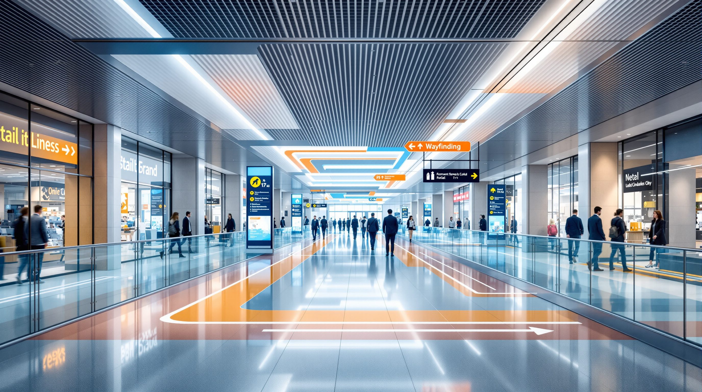
Retail, Mall & Workplace Wayfinding
Malls, big-box retail and the modern workplace each want something subtly different from wayfinding - the mall to orient you while keeping you browsing, the store to guide without killing discovery, the agile office to make a deskless floor findable - and all three must balance clarity against commercial and brand goals
The mall wants you a little bit lost, the shop wants you to wander, and the deskless office wants you found - three places where wayfinding must negotiate with commerce and brand.
Not every place wants you to move through it as fast as possible. A hospital and a station want you to find your destination and get there efficiently; a shopping mall, quietly, would rather you did not - a shopper who drifts past more stores spends more, and the retail environment is deliberately designed to encourage that wandering. This is the first place in the course where wayfinding's goal of effortless clarity meets a competing commercial goal, and learning to negotiate that tension honestly is part of being a professional.
This lesson covers three related but distinct place types. The mall must orient a visitor enough that they never feel anxiously lost, while still encouraging them to browse and discover - a balance struck with directories, zones and the big anchor stores as landmarks. Large retail - the hypermarket, the big-box store, IKEA - must guide a shopper through a huge floor and help them find and re-find goods, without killing the serendipity that sells. And the workplace, transformed by agile, deskless, activity-based working, has become a surprisingly hard wayfinding problem: how do you find a colleague or a meeting room on a floor where nobody has a fixed desk? Each teaches something different, and all three force the honest question of how to serve the visitor's need to find their way and the client's need to sell or to brand - at the same time.
Mall / store / office: serve clarity first - a confident shopper spends more. Keep wayfinding above the ad noise.
The mall: directories, zones and anchor orientation
A shopping mall is a peculiar wayfinding environment because its commercial logic is mildly at odds with pure navigational clarity. Malls are designed to keep shoppers circulating past as many stores as possible - the gentle curve that always reveals more shopfronts, the escalators placed so you traverse a floor to reach the next, the anchor stores pulled to the far ends so foot traffic flows past everyone in between. A shopper who walks straight to one shop and leaves is, commercially, a missed opportunity. So the mall does not want you lost and anxious - that drives people away - but it is content for you to wander and discover. Good mall wayfinding respects this: it provides strong orientation and reassurance (you always know roughly where you are and can find a specific shop or the exit or the toilets when you want them) while leaving room to browse.
The primary wayfinding tools are three. First, the directory - the 'you-are-here' map, now usually an interactive digital kiosk as well as printed boards. A good directory is oriented heads-up (up on the map is the way you are facing), clearly marks 'you are here', groups the vast list of tenants into searchable categories, and lets people both browse and find a named store. Second, zones: a large mall is broken into a few memorable districts or precincts - a fashion zone, a food court, an entertainment level - often with their own character or colour, so the building reads as a handful of places rather than a list of 180 shops. Third, and most powerfully, the anchor stores as landmarks. The big department stores and the cinema and the food court are the fixed, memorable reference points people actually navigate by - 'it's near the big store at the end', 'up by the food court' - exactly the Lynchian landmarks from Module 1. Smart malls name and sign to these anchors relentlessly, because they are the mental-map pegs shoppers genuinely use. The art is an orientation system confident enough to banish anxiety while light enough to leave the pleasure of browsing intact.
Mall: orient + reassure, but let them browse. Directory (heads-up, you-are-here) + zones + anchors as landmarks.
Large retail: guiding without killing the browse
The single large store - the hypermarket, the big-box electronics or furniture retailer, the archetypal IKEA - is its own wayfinding discipline, and it shows the commerce-versus-clarity tension at its most deliberate. Here the operator has a strong view about how you should move: IKEA's famous one-way path marches you past the entire showroom before you reach the tills, maximising exposure to products; a supermarket places staples like milk and bread at the back so you traverse aisles of temptation to reach them. This is wayfinding consciously shaped by sales strategy, and as a designer you need to understand it clearly rather than pretend it is not there.
The legitimate wayfinding job within that commercial frame is real and substantial. Shoppers need to find categories (where are the paints, the dairy, the laptops?), re-find something they saw earlier, locate services (tills, customer service, toilets, exits), and - importantly - never feel trapped or anxiously lost, because frustration kills spending as surely as it kills goodwill. So large-store wayfinding leans on clear category signage high above the aisles (readable across the whole floor), consistent aisle numbering and directories, strong zone identity (the garden section looks and feels different from electronics), and obvious escape valves - clearly marked shortcuts, tills and exits - so that even a forced path does not feel like a trap. The ethical and commercial sweet spot is a store that guides and exposes shoppers to goods while always letting them find what they actually came for and get out when they want to: guiding without killing the browse, and encouraging discovery without inducing the helpless, resentful feeling of being lost in a warehouse. A shopper who can always orient themselves is a relaxed shopper, and a relaxed shopper both buys more and comes back - which is the honest reconciliation of the store's goals and the customer's.
The workplace: neighbourhoods, meeting rooms and the agile office
The workplace has quietly become one of the more interesting wayfinding problems, because the way we work has changed. The old office was easy to navigate by its fixed structure: everyone had an assigned desk, so 'she sits at 4B-217' was a findable address, and the building was a stable grid of named people and numbered rooms. The modern agile, activity-based or hot-desking office has dissolved that. Nobody owns a fixed desk; people choose where to sit each day by the kind of work they are doing; teams cluster loosely and move. Suddenly the basic act of finding a colleague, or orienting a visitor or a new joiner, is genuinely hard - the fixed address that carried the old office's wayfinding has gone.
The response that has emerged is to give the floor a legible structure of named places rather than relying on a grid of desks. The floor is divided into neighbourhoods - memorable, named zones ('Harbour', 'Meadow', 'Bazaar', or themed to the brand or the city) that teams are loosely associated with, so you can say 'the design team is over in Harbour' and a visitor can find it. This is simply the Lynchian district and landmark idea applied indoors, and it works for the same reason: a name and a place are easier to hold and to share than a coordinate. Alongside neighbourhoods, meeting rooms need a naming and numbering system that is logical and learnable - room codes that map to the neighbourhood (H1 to H6 are in Harbour), or a themed naming set, so a stranger invited to 'Meeting Room M3' can reason their way there rather than hunting. Good workplace wayfinding then adds clear floor directories and arrival orientation (especially for visitors and new starters), signage to shared facilities, and increasingly a digital layer - desk- and room-booking apps, a find-a-colleague function - integrated with the physical neighbourhoods. The goal is a deskless, flexible floor that is still instantly legible: you always know which neighbourhood you are in, and you can find a room or a person without a guide.
Agile office killed the fixed-desk address. Replace it with named NEIGHBOURHOODS + learnable room codes (H = Harbour).
Balancing wayfinding with commercial and brand goals
Running through all three of these place types is a tension the course has not faced so squarely before: wayfinding's pursuit of effortless clarity must share the space with commercial and brand goals, and a professional handles that honestly rather than pretending the conflict does not exist.
The commercial tension is real. The mall benefits from shoppers wandering; the store benefits from a path that maximises product exposure; and both are tempted to let promotional graphics, digital advertising screens and shop-front branding crowd the environment. The danger is visual noise drowning the wayfinding: when directional signs compete with a wall of advertising, the advertising usually wins the visual fight and the lost shopper loses. The designer's honest position is that these goals are not actually opposed in the long run - a shopper who feels confident and oriented is relaxed, stays longer and spends more, while a frustrated, lost one leaves and resents the place. Clarity serves commerce. So the craft is to keep a clear visual hierarchy in which the wayfinding layer is always legible and distinct from the advertising layer - different position, consistent language, protected sightlines - so commerce and navigation coexist rather than the former smothering the latter.
The brand tension is more creative and more positive. In retail and workplace environments, wayfinding and environmental graphic design (Module 6) are a major chance to express identity: the typography, colour, materials, tone of voice and neighbourhood naming can all carry the brand, turning necessary signage into placemaking and giving the environment character and memorability. This is welcome - a sign system that is also on-brand is doing two jobs - provided the brand expression never compromises the core function. A beautifully branded sign that is hard to read has failed; legibility, contrast, clear information and inclusive access come first, and brand rides on top. And the familiar boundary still holds even in these commercial settings: fire-exit and emergency signage, accessibility dimensions, and digital-display and electrical engineering defer to the fire authority, the current accessibility standards, and the relevant specialists and engineers - brand and commerce never override safety or access. Serve the visitor's clarity first; the commercial and brand goals are best met by, not against, that clarity.
Fire & exit signage (fire authority)
Emergency egress and exit marking in malls, large stores and offices
Safety-critical and code-governed, and it must never be drowned by retail or brand graphics. Defer to the fire authority and a life-safety specialist. Module 3.
Accessibility (NBC 2016 / Harmonised Guidelines)
Accessible routes, tactile and readable signage, contrast and heights
Commercial and brand goals never override access. Defer binding dimensions and requirements to the current standards and an accessibility consultant. Module 7.
Digital directories & displays (engineers / brand)
Interactive kiosks, advertising screens, booking-app integration
Engineered and software products; defer electrical, structural and software specifics to the relevant engineers, and keep advertising from smothering the wayfinding layer. Module 9.
Workshop — navigate the commerce-versus-clarity tension
You will analyse one commercial or workplace environment - a mall, a large store, or an office - for how well it balances clear wayfinding against its commercial or brand goals, and propose improvements that serve both. The aim is to practise the honest negotiation at the heart of this lesson.
A mall, large store or office you can visit or recall, plus paper. This is about the clarity-versus-commerce negotiation, not drawing finished signs or setting code minima.
Goal: a balanced wayfinding critique of a commercial or workplace environment
Inputs: a mall, large store or office you can visit or recall, this lesson, paper
Time: ~55 minutes
- 1Choose one environment and identify its commercial or brand goal (keep shoppers browsing, push a product path, express a brand, support agile working) and its core wayfinding need (orient, find a shop/category/room, reach facilities and exits).
- 2For a mall or store: assess the directory (heads-up? you-are-here? searchable?), the zones, and the use of anchors or category signs as landmarks. For an office: assess whether the floor has legible named neighbourhoods and a learnable meeting-room logic.
- 3Hunt the conflict: find where commercial or brand graphics (advertising, shopfronts, promotions) drown or compete with the wayfinding layer, and where a lost or confused visitor would feel trapped or anxious.
- 4Redesign the hierarchy: propose how to keep the wayfinding layer legible and distinct from advertising, and how brand can ride on top of - not against - clarity (typography, colour, naming, neighbourhoods).
- 5Write the top three changes that would make visitors both more oriented and more likely to stay, browse or work well, and flag any fire-exit, accessibility or display-engineering items for the specialists.
You’ll walk away with
A balanced critique of one commercial or workplace environment: its commercial/brand goal versus its wayfinding need, where the two conflict, and three changes that serve both - with a note of what defers to the fire, accessibility and engineering specialists.
Three altitudes on the same idea
Read the band that fits you — or all three.
Your plan sets how legible - and how commercial - these places can be. In a mall, the circulation that tempts shoppers past more stores also risks disorientation, so design a structure that can be read as a few memorable zones, put the anchors where they work as landmarks, and protect clear sightlines and directory locations. In large retail, understand the intended path and still build in legible category structure and obvious escape valves. In the workplace, plan floors as readable neighbourhoods with a coherent room logic rather than an undifferentiated desk grid. Position sign and directory zones early, keep the wayfinding layer from being smothered by retail graphics, and defer fire-exit, accessibility and display specifics to the specialists.
This is your richest territory: wayfinding, environmental graphics and brand fused in the fit-out. Design the mall directories and zone identities, the store's category and aisle system, the workplace neighbourhoods and meeting-room naming - and carry the brand through typography, colour, materials and tone while never letting it compromise legibility. Keep a clear visual hierarchy so wayfinding stays distinct from advertising, design orientation that banishes anxiety while leaving room to browse, and integrate any digital directory or booking layer with the physical system. A branded sign that is hard to read has failed; put legibility, contrast and inclusive access first, and coordinate fire-exit, accessibility and display engineering with the specialists.
These are the places you inhabit most, so they are the easiest to study critically. In a mall, notice how the layout gently keeps you browsing, how you navigate by the big anchor stores, and whether the directory is heads-up and honest. In a big store, trace the path the operator wants you to take and ask where the escape valves are. In an office, see whether it has legible neighbourhoods or is a confusing desk grid. Above all, watch the tension between clear wayfinding and commercial/brand noise - where does advertising drown the directions? Learn the honest principle that confident, oriented visitors spend more, so clarity serves commerce. You are reading the negotiation between navigation and selling, not setting code minima.
“Malls and shops deliberately make wayfinding confusing so that lost shoppers wander past more stores and spend more - so good, clear wayfinding is actually against the retailer's interest.”
Do it yourself
No tools needed - reason it through from the lesson.
- 1Why does a mall not want you lost, yet is happy for you to wander - and what three tools strike that balance?
- 2How is large-retail wayfinding shaped by sales strategy, and what is the legitimate wayfinding job inside that frame?
- 3Why did agile, deskless working make the workplace a hard wayfinding problem, and how do neighbourhoods solve it?
- 4Explain why clarity and commerce are allies rather than enemies in retail.
- 5How should brand expression relate to wayfinding legibility when the two seem to pull against each other?
The one line to carry out
Peer-reviewed journals & authoritative standards
- 01Shopping mall — Wikipedia — Shopping mall, 2026.
- 02Signage — Wikipedia — Signage, 2026.
- 03Wayfinding — Wikipedia — Wayfinding, 2026.
- 04Interior design — Wikipedia — Interior design, 2026.
From commercial interiors we zoom out to the largest scale of all. Next: campuses, civic buildings and whole city districts - wayfinding across many buildings and out into the urban street.
The author
Amogh N P
Architect, interior designer, and creative polymath. Studio Matrx began in his notebooks — his vision of design made honest, useful, and open to everyone. Its Academy is written and taught in his memory, and free, forever.
More about Amogh →