
 Lesson 5.4
Lesson 5.4 · Placement & the Physical Sign
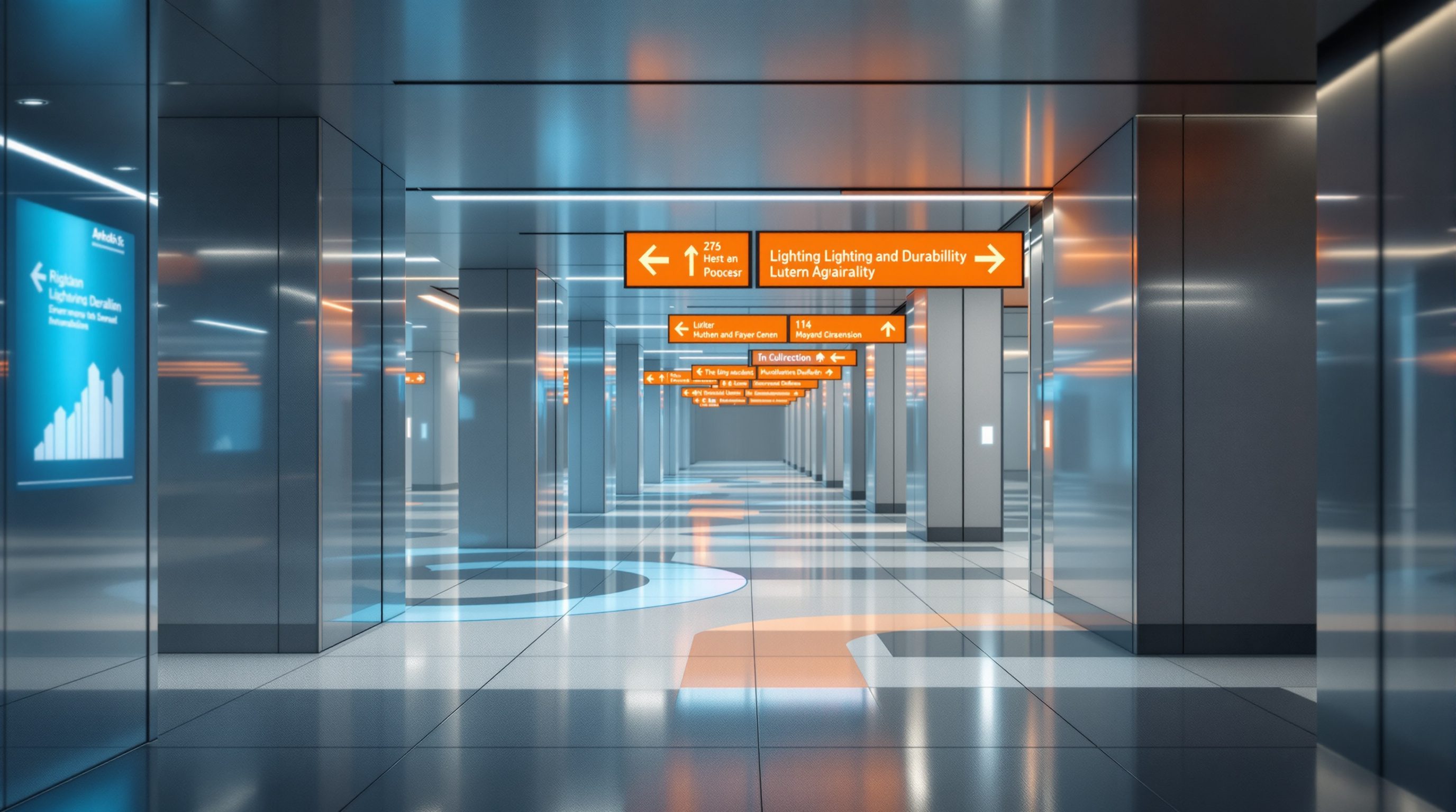
Lighting & Durability
A sign has to be read in the dark as well as the light, and it has to keep doing its job for years - so lighting it for legibility and designing it for a long, maintainable, updatable life are the final physical decisions that turn a sign into infrastructure you can trust
A sign you cannot read in the dark is not a sign at night - and a sign that looks shabby in three years tells everyone the place stopped caring.
Two things decide whether a sign keeps doing its job long after it is installed, and neither is about the artwork. The first is light: many signs must be read at night, in a power cut, in a dim corridor or a gloomy monsoon afternoon, and legibility depends not only on contrast and size but on whether there is enough light, from the environment or from the sign itself, to see by. An exit sign that vanishes when the lights fail is not merely useless - it is dangerous. The second is durability: a sign lives outdoors or in a busy public building for years, exposed to sun, rain, dust, touching, cleaning and the slow drift of the organisation it serves, and a sign designed without that long life in mind fades, peels, gets dirty, goes out of date, and ends up patched with taped-on paper - the visible sign of a system that was never designed to last.
This final lesson of Module 5 takes up both. On lighting, it covers the ways a sign can be illuminated (lit from outside, lit from within, or relying on ambient light), why contrast and light together make legibility, and the special, safety-critical case of emergency legibility - while deferring, as ever, all the electrical specifics to the electrical specialist and the binding emergency-signage rules to the fire authority. On durability, it covers designing for weathering, cleaning, maintenance and - crucially and often forgotten - updatability, so the sign can change as the building changes without being wrecked. Together these turn a sign from a nice object on opening day into dependable infrastructure that still works, and still looks cared for, years later.
Light it (evenly, with contrast). Make it last (weather + clean + maintain). Make it change (updatable). Then it's infrastructure you trust.
Lighting a sign for legibility
Legibility, the subject of Module 4, is not only a property of size, typeface, colour and contrast - it also depends on light, because even a perfectly designed sign cannot be read if there is not enough light to see it by. So lighting is part of making a sign legible, and there are three broad approaches. A sign can rely on ambient or environmental light - the daylight or room lighting already present - which is simplest and cheapest and fine where that light is reliable and sufficient, but fails in dark corridors, at night, and in power cuts. It can be externally illuminated - lit by a dedicated light source (a spotlight, a trough light) aimed at its face - which keeps the sign itself simple and is good for prestige and exterior signs, though it adds fittings and can cast shadows or glare if poorly aimed. Or it can be internally illuminated - light inside the sign itself.
Internal illumination comes in recognisable forms, mostly LED today. Back-lit (face-lit) signs push light through a translucent face or through cut-out letters, so the message glows - the familiar illuminated box sign and illuminated letters, highly visible at night and the default for many commercial and transport signs. Halo or back-halo lit letters throw light onto the wall behind them, producing a soft glow around the letters that reads as refined and premium. Edge-lit panels introduce light at the edge of a clear panel to illuminate engraved or applied graphics. Each has a different character, cost and energy use, and each interacts with the material choices of the last lesson (acrylic, for instance, diffuses internal light beautifully, which is why it dominates illuminated faces).
The design judgement is to light the sign enough, and evenly, for its contrast to work - without overdoing it. Too little light and the sign is illegible at night; uneven light produces dark patches and hot spots that destroy legibility; too much brightness causes glare and, outdoors, light pollution, and a blindingly bright sign can be as hard to read as a dark one. Contrast still rules - a lit sign must maintain strong contrast between message and background when illuminated, which is not always the same as when unlit - and colours shift under artificial light, so (as with materials) illuminated signs should be mocked up and viewed lit, in the real conditions, before being finalised. And every bit of the electrical work - the wiring, drivers, transformers, earthing and weatherproofing - is the domain of a qualified electrical specialist and the relevant code, never the graphic designer; this course specifies the intent and defers the electrics entirely.
Light + contrast = legibility. Ambient / external / internal (back-lit, halo, edge-lit). Even, not blinding. Electrics = the specialist, always.
Emergency legibility: the sign when the lights fail
One lighting case stands apart because lives depend on it: emergency and exit signage must remain legible exactly when normal lighting fails - in a power cut, in smoke, in the panic of an evacuation. This is a different and far more demanding requirement than everyday legibility, and it is heavily code-governed. Exit and emergency signs are typically either illuminated with a reliable, backed-up power source (so they stay lit when mains power is lost, via battery backup or an emergency supply) or made of photoluminescent ('glow in the dark') material that absorbs light in normal conditions and emits it in darkness, or both - and their design, brightness, colour, placement and the duration they must stay visible are all specified by the fire and life-safety regulations, not by aesthetic preference.
Because this is safety-critical and code-governed, this course defers entirely to the fire authority and a fire/life-safety specialist (and to the dedicated Fire & Life-Safety material, Module 3) for every binding requirement: what counts as an acceptable exit sign, how bright and what colour it must be, how it is powered and backed up, where and how far apart such signs must be placed, and how long they must remain legible after a power loss. The wayfinding designer coordinates the emergency wayfinding so that it is consistent and clear and integrates with the overall system, but does not set the safety minima or sign off on the life-safety engineering. This is a place to be humble and precise about the limits of the design role.
What the designer should carry is the mindset: emergency legibility is not an add-on to the signage system but a distinct, non-negotiable layer of it, and it must be considered from the start, coordinated with the fire strategy, and never compromised for appearance. In the quieter everyday register, the same principle - 'will this still be readable when conditions are worst?' - is a good discipline for all signage: think about the dim corridor, the glare of low sun, the power cut, the monsoon gloom, and make sure the sign still communicates. But for genuine emergency signage, the answer is not design judgement at all; it is the code, the fire authority and the life-safety specialist, and the designer's job is to serve that, clearly and consistently, within the larger wayfinding system.
Designing for a long life
A sign is not a one-day object; it is installed to do its job for years, often in a punishing environment, and durability must be designed in from the start rather than hoped for. The first dimension is weathering and wear: exterior signs face sun and intense UV (which fades colours and yellows plastics), rain and monsoon damp (which lifts laminates, corrodes fixings and rots untreated timber), dust and grime (which dull and obscure), and temperature cycling; interior signs in busy places face touching, leaning, knocks and the general abrasion of heavy use. Designing for this means the material and fabrication choices of the last lesson (robust materials, protected graphics, the message in the material rather than on it, well-detailed edges and joints that keep water out), chosen for the sign's real exposure - and in India that exposure is severe, so the specification must be honest about heat, monsoon, dust and hard public use.
The second dimension is cleaning and maintenance, which designers routinely forget and which quietly determines how a sign looks after year one. A sign must be reachable and robust enough to be cleaned with whatever the building's cleaning regime actually uses (not a gentle method nobody will follow), detailed so dirt does not collect in crevices, and made of finishes that do not scratch or dull under routine cleaning. It helps enormously to think about who will maintain the sign and how: a sign that needs special tools, special access or a specialist to clean or repair will, in practice, not be maintained, and will degrade. Anticipating realistic maintenance - and handing over clear guidance on it at the end of the project - is part of designing the sign, and it is often the difference between a system that still looks cared for in five years and one that looks neglected in one.
Underlying both is an attitude: shabby, faded, dirty, broken signage does not just fail to inform - it actively communicates neglect, telling every visitor that the institution behind it has stopped caring, which in a hospital, a public building or a place of welcome is exactly the wrong message, and falls hardest on the anxious visitor the whole course is written for. A well-maintained, durable sign says the opposite - that this is a place that is looked after and can be trusted. So durability is not merely a technical nicety; it is part of the human service of wayfinding, extended across time. Design the sign to survive its real life, to be cleaned and maintained realistically, and to keep looking cared for - because the sign's condition is itself a message.
Updatability: the sign that can change
The most commonly forgotten dimension of a sign's long life is updatability - the ability to change the sign's content when the building's reality changes, which it always does. Departments move, rooms are renumbered, services are renamed, a new wing opens, a company rebrands, a tenant changes. A signage system designed as if the building will never change is a system that goes out of date and then gets patched, usually with the saddest object in wayfinding: the taped-on paper arrow or the scrawled correction stuck over a beautiful permanent sign, which instantly wrecks the system's credibility and consistency and announces that the real situation no longer matches the signs. Anyone who has navigated an older Indian hospital or government office knows this layered sediment of outdated signs and paper corrections well.
The remedy is to design change in from the start: decide which information is stable (the building's identity, permanent room numbers, the structure of floors) and which is volatile (department names, occupants, services), and make the volatile parts easy and graceful to change. Practically, this means modular, updatable elements - replaceable slats or inserts in a directory so one line can be swapped without remaking the whole sign, changeable name panels beside doors, systems where a single element rather than the entire sign is replaced. For genuinely dynamic content, digital signage (Module 9) is the ultimate in updatability, though it brings its own cost and maintenance burden. The goal is that when reality changes, the official system can be updated quickly and cleanly by the building's own staff - so the taped-on paper arrow is never needed.
This closes Module 5 and the physical sign. Across four lessons we have placed the sign where it is seen and needed, chosen the right kind of physical object and integrated it with the architecture, built it from fitting materials by appropriate fabrication in partnership with the maker, and now lit it to be legible and designed it to last, be maintained and be updated - all while deferring the binding structural, electrical, accessibility and fire-safety specifics to the codes, specialists and fabricators. A sign that is well placed, well made, well lit, durable and updatable is infrastructure you can trust: it does its quiet human job of guiding the anxious visitor not just on opening day but for years, and it keeps looking like a place that cares. Next, Module 6 steps beyond the individual sign to how the whole environment communicates through environmental graphic design.
Buildings change -> signs must update. Replaceable slats, not taped-on paper arrows. Separate the stable from the volatile.
Electrical (illuminated signs)
Wiring, LED drivers, transformers, earthing, weatherproofing, energy
All electrical work for illuminated and digital signs is the domain of a qualified electrical specialist and the relevant code - the designer specifies intent only. Never DIY.
Emergency & exit signage (fire authority)
Exit-sign legibility, backed-up power/photoluminescence, brightness, placement, duration
Safety-critical and code-governed - defer every requirement to the fire authority and a fire/life-safety specialist. See the Fire & Life-Safety material. Module 3.
Durability & materials performance
Weathering, UV, cleaning, finish life, maintenance
Judge fitness for the real (Indian) climate and use with the fabricator; verify finish and material performance claims with the fabricator/manufacturer, not from memory.
Workshop — read signs for light and for life
This workshop examines how signs perform over time and in the dark. You will assess how a set of signs is lit and whether they stay legible, and read older signs for the story of durability and updatability.
Signs you can observe (some at night and some older/outdoor ones are ideal) and a phone camera. No electrical testing - observe and judge only; electrics and emergency compliance belong to specialists.
Goal: a lighting-and-durability read of real signs
Inputs: signs you can observe (ideally some at night and some older/outdoor ones) + a phone camera
Time: ~60 minutes
- 1For several signs, identify how each is LIT - ambient/environmental only, externally illuminated, or internally illuminated (back-lit, halo, edge-lit) - and judge whether it is legible in its actual light conditions (try to see some at night or in a dim area).
- 2Assess the LIGHTING QUALITY where signs are illuminated: is the light even, or are there dark patches, hot spots or glare? Is contrast maintained when lit? Note one good and one poor example.
- 3Find the EMERGENCY/exit signage and note how it appears designed to stay legible in a power cut (clearly illuminated, photoluminescent). Record that the binding requirements are the fire authority's - do not judge compliance yourself.
- 4Read older and outdoor signs for DURABILITY: look for fading, yellowing, peeling vinyl, corrosion, weathered timber, dirt in crevices, and signs that are clearly hard to clean or reach. Note what the condition 'says' about the place.
- 5Hunt for UPDATABILITY failures: find a taped-on paper arrow, a scrawled correction, or an outdated sign that reality has overtaken. Propose how the system could have been designed (modular slats, changeable panels) so that update could have been clean.
You’ll walk away with
A lighting-and-durability read: how each sign is lit and whether it is legible, a lighting-quality good/poor pair, an emergency-signage observation (deferring compliance to the fire authority), durability failures and what their condition communicates, and one updatability failure with a modular fix. You now read signs across their whole life, in the dark and over years.
Three altitudes on the same idea
Read the band that fits you — or all three.
Lighting and durability intersect the building, and your early decisions make good signage possible or impossible. Provide for sign lighting in the electrical and lighting design - power to illuminated signs, good ambient light at decision points and over signs, and coordination so externally lit signs are not in shadow - working with the wayfinding designer and the electrical specialist (who owns all the electrics). Allow for the emergency and exit signage the fire strategy requires as a coordinated layer, deferring its specifics to the fire authority. And think about the building's whole life: materials and details that weather well in the real climate, signs reachable for cleaning and maintenance, and an organisation of spaces and sign locations that can absorb change without the building being re-signed from scratch.
Lighting signs for legibility and designing them to last and to change are core to your craft. Choose how each sign is lit (ambient, external, or internal back/halo/edge-lit) for its setting and legibility, keep the light even and not glaring, and mock up illuminated signs lit in the real conditions, since colour and contrast shift under light. Design for the sign's real life - weathering, a realistic cleaning regime, reachable maintenance - and, crucially, build in updatability with modular, replaceable elements so a moved department means a swapped slat, not a taped-on paper arrow. Defer all electrical work to the electrical specialist and all emergency-signage requirements to the fire authority and a life-safety specialist - you coordinate, they certify.
Start noticing signs at night, in the rain, and after a few years of use. See which signs are lit and how - externally spotlit, glowing back-lit boxes, soft halo letters, or unlit and invisible in a dark corridor - and ask whether you could actually read each one. Look at old signs for the story of durability and updatability: the faded, peeling, dirty ones that say 'nobody looks after this place', and the taped-on paper arrows and scrawled corrections that reveal a system that could not keep up with change. Understand that emergency and exit signage is a safety-critical, code-governed layer you defer to the fire authority, and that all electrics belong to specialists. You are learning that a sign has to keep working, and keep looking cared for, long after opening day.
“Once a sign is designed, lit if it's a shop sign, and installed, the job is done - lighting is just for night-time visibility, and durability and updates are the maintenance team's problem later.”
Do it yourself
No tools needed - reason it through.
- 1Name the three broad ways a sign can be lit, and the internal-illumination forms, and when each suits.
- 2Why is lighting part of legibility, not separate from it - and what makes lighting quality 'good'?
- 3Why is emergency/exit signage a distinct, safety-critical layer, and whose rules govern it?
- 4Give three things that make an outdoor sign durable in the harsh Indian climate, and why cleaning/maintenance matters.
- 5What is 'updatability', why is the taped-on paper arrow a symptom of its absence, and how do you design it in?
The one line to carry out
Peer-reviewed journals & authoritative standards
- 01Lighting — Wikipedia — Lighting, 2026.
- 02Exit sign — Wikipedia — Exit sign, 2026.
- 03Contrast (vision) — Wikipedia — Contrast (vision), 2026.
- 04Neon sign and illuminated signage — Wikipedia — Neon sign, 2026.
We have designed the sign as a physical object in full - placed, built, lit and lasting. Module 6 now steps beyond the individual sign to how the whole environment communicates: brand and identity in space, supergraphics, placemaking and storytelling - environmental graphic design.
The author
Amogh N P
Architect, interior designer, and creative polymath. Studio Matrx began in his notebooks — his vision of design made honest, useful, and open to everyone. Its Academy is written and taught in his memory, and free, forever.
More about Amogh →