
 Lesson 6.1
Lesson 6.1 · Environmental Graphic Design
Brand & Identity in Space
Every sign, colour and graphic in a place carries a tone of voice, and environmental graphic design is the craft of translating who a place is into the space itself - so that the thing that tells you who you are among is the same thing that tells you where to go
A logo on a wall is not an identity. The real brand is what a person feels as they move through the place - and that is designed, or left to chance.
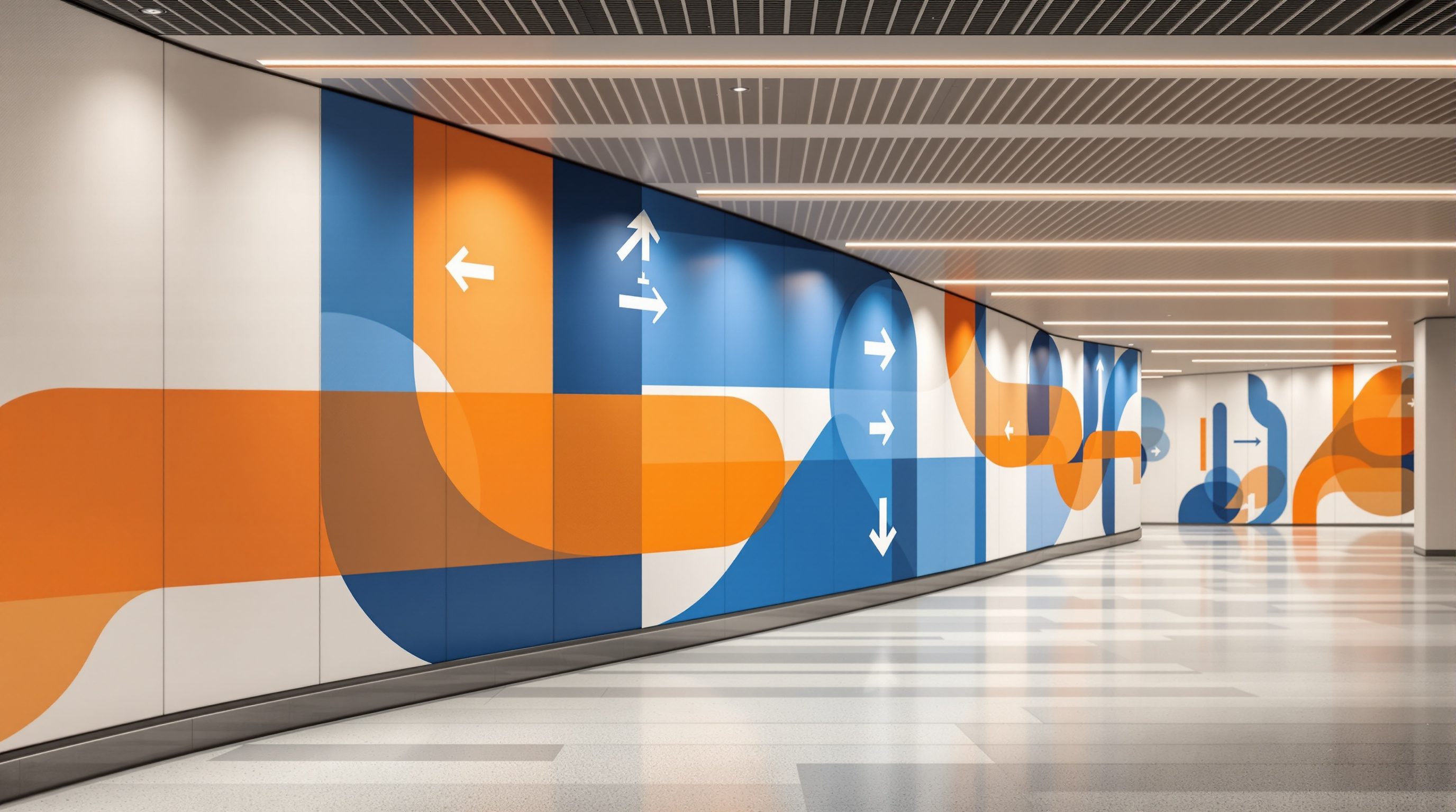
Walk into any place and, within seconds and mostly without knowing it, you form a judgement about who this place is and how it regards you. The worn or gleaming floor, the colour of the walls, the confidence or chaos of the signs, whether the entrance welcomes you or hides from you - the environment is talking, and it is saying something about identity long before you read a word of official copy. Environmental graphic design is the discipline of making that conversation deliberate: of taking the abstract thing we call a brand or an institutional identity and rendering it in the physical environment so that the place itself expresses who it is.
This lesson reframes branding for the built world. A brand is not a mark; it is the sum of experiences a person has with an organisation, and being inside a building is one of the most powerful of those experiences. So environmental graphics are brand made spatial - and, because they share the very same surfaces as the wayfinding system, identity and navigation are not two jobs but one. The same visual language that says "this is who we are" must also say "here is where you go." Get that right and a visitor feels, in a single seamless impression, both oriented and looked after; get it wrong and the building says one thing while its signs say another, and everyone feels the seam.
Brand is what people FEEL moving through a place. EGD = brand made spatial. Identity + wayfinding = one system.
A place has an identity whether you design it or not
Start from a plain fact: a place has an identity whether or not anyone designs one. The worn floor, the colour of the walls, the typeface on a handwritten notice, the way the entrance is (or is not) announced - all of it tells a visitor who this place is and how it regards them, long before they read a word of official copy. Environmental graphic design makes that expression deliberate. It takes the abstract idea of a brand or an institutional identity - the values, the personality, the promise a place makes to the people who use it - and renders it in the physical environment so that the space itself says who it is.
This is a bigger idea than putting a logo on a wall. A brand, properly understood, is not a mark; it is the sum of experiences a person has with an organisation, and the built environment is one of the most powerful of those experiences because you are inside it, moving through it, trusting it with your time and sometimes your safety. A hospital that is calm, legible and warm communicates competence and care more convincingly than any slogan; a university whose campus feels open and serious tells prospective students more than a prospectus. EGD is brand made spatial - the discipline of expressing identity through the materials, colours, typography, graphics and spatial character of a place, so that who the place is and how to move through it are felt as one coherent thing.
And that is the thread back to wayfinding, the through-line of this whole course. A wayfinding system is not a neutral utility bolted onto a building; it is one of the most visible, most touched expressions of a place's identity. Every directional sign, every zone colour, every pictogram carries a tone of voice. Designed well, the identity and the navigation reinforce each other: the same visual language that says "this is who we are" also says "here is where you go," and a visitor feels oriented and looked after in one seamless impression. Designed badly - a generic sign package with no relation to the place it serves - the building says one thing and its signs say another, and the visitor feels the seam.
A brand is the sum of experiences - and you're INSIDE a building. EGD = brand made spatial.
Translating a brand toolkit into space
To translate an identity into space you need something to translate. The raw material is the brand toolkit: the name and mark, the colour palette, the typefaces, the photographic or illustrative style, the language and tone of voice, and - most important and most often missing - the personality and values underneath them. A good brief for environmental graphics does not start with "put our logo here"; it starts with adjectives. Is this place meant to feel authoritative or approachable, quiet or energetic, timeless or contemporary, local or international? Those adjectives are what you actually design to. The logo is a small, late consequence of them.
Then comes the real craft, which is translation, not transplantation. A brand designed for a screen or a business card does not survive being enlarged and stuck on a wall; the environment has its own rules - distance, motion, light, materiality, architecture - and the identity must be re-expressed in that grammar. The brand colour may need to become an architectural colour on a whole zone rather than a thin accent. The brand typeface, chosen for body text, may be unreadable at sign distances and need a legible companion (see Module 4). The brand's personality might be carried less by the logo than by a material choice, a supergraphic, a way of detailing an edge. The environmental graphic designer asks: what does this identity look like at the scale of a building, in three dimensions, seen in passing, touched, lit at night? That is a design act, not a copy-paste.
Crucially, this translation must serve navigation, never fight it. Identity expression and wayfinding share the same surfaces - signs, walls, floors - and when they are designed by different people to different ends they collide: a beautiful but illegible typeface, a brand colour that clashes with a zone-coding system, a feature wall that buries a critical direction. The discipline is to treat identity and wayfinding as one integrated system with a shared visual language, where the expressive moves and the functional moves are the same moves. The best environmental graphics are simultaneously the clearest - the thing that tells you who this place is, is the same thing that tells you where to go.
Translate, don't transplant. Screen brand != wall brand. Identity moves must BE the wayfinding moves.
Consistency is what lets a visitor trust the system
The hardest and most valuable quality in identity-in-space is consistency across the whole system. A brand lives or dies on coherence: the same personality, expressed the same way, everywhere a person encounters it, so that a hundred separate touchpoints add up to one confident impression rather than a jumble. In a wayfinding and EGD system that means the identification sign at the entrance, the directional sign at a junction, the room number on a door, the zone colour, the pictogram set, the supergraphic in the atrium and the donor wall in the lobby must all feel as though one intelligence designed them - same type family, same colour logic, same geometry, same tone of voice - even though they do very different jobs at very different scales.
This is why serious environmental graphics are governed by a design standards manual (or signage and EGD guidelines): a document that codifies the type, colour, materials, layout grids, pictogram library, arrow conventions, sign-type family and rules for applying them, so that the system stays coherent across a large building, a campus, or dozens of outlets built over many years by many hands. It is the same discipline that keeps a transport network or a retail chain recognisable everywhere. Consistency is not rigidity for its own sake - it is what lets a visitor learn the system once, in the first thirty seconds, and then trust it for the rest of their journey: if the green band always means this department, if arrows always behave the same way, the place becomes predictable, and predictability is a huge part of feeling oriented.
Consistency also has to be intelligent about its limits. A system that is rigidly identical everywhere can become monotonous and can fail to respond to special places - the grand lobby, the children's ward, the heritage wing - that deserve their own character. The mature answer is a consistent framework with room for expression: a shared skeleton (type, colour logic, arrow and pictogram conventions, wayfinding hierarchy) that guarantees legibility and identity everywhere, within which certain moments are allowed to sing. Get the framework right and the whole place reads as one identity; get the expressive moments right and it gains warmth and memorability. The failure mode at both ends is familiar: death by inconsistency (every sign a different font), or death by monotony (a vast building with not one memorable place).
Healthcare, retail and the Indian institution
Two place types make the stakes vivid. In healthcare, identity-in-space is not cosmetic: a hospital brand is, at root, a promise of competence and care, and the environment either keeps that promise or breaks it. An anxious patient reads the place constantly - is it clean, ordered, calm, legible, does it seem to know what it is doing? - and the wayfinding and environmental graphics carry much of that message. Here identity and navigation are inseparable: calm colour, clear legible signs, warm materials and a legible plan together say both "you can find your way" and "you are in good hands." The identity that matters is not a logo on the facade; it is how cared-for a frightened person feels moving through.
In retail, hospitality and the workplace, environmental graphics are often the most concentrated expression of a brand a customer or an employee ever stands inside. A flagship store, a cafe chain, a tech campus - the physical space is a three-dimensional advertisement and a daily statement of culture, and the graphics, supergraphics, signage and materials do enormous identity work. Yet even here the wayfinding discipline holds: the brand expression must still let people find the fitting rooms, the meeting room, the exit. The Indian context adds its own texture - a place's identity often has to be expressed across several languages and scripts at once (see Module 7), and a genuinely Indian institution may express identity through motifs, crafts, materials and multilingual graphics rather than a single imported logo system.
Across all of it the test is the same, and it is a human one. Does a first-time, perhaps stressed visitor, moving through the place, come away with a clear and coherent sense of who this place is - and find their way without friction while they form it? If the identity is loud but the person is lost, the environmental graphics have failed the only client who matters. If the person is oriented and also, almost without noticing, has absorbed a warm and confident sense of the place, then identity and wayfinding have done their shared job. Binding specifics - illuminated-sign electricals, fixing, accessibility of branded signage, fire-exit graphics - still defer, as ever, to the codes, the specialists and the fabricator.
Accessibility of branded signage (NBC / Harmonised Guidelines)
Contrast, tactile & readable branded signs, mounting
Brand expression must not break legibility or accessibility; binding minima from the current standards + an accessibility consultant. Module 7.
Illuminated & dimensional brand graphics
Electrical, structural fixing of feature graphics and lit signs
Defer to the fabricator / signage engineer and the electrical and structural specialists. Module 5.
Design standards manual (project guideline)
Type, colour, pictograms, arrows, sign-type family, application rules
The governing document that keeps identity and wayfinding coherent across a large or long-lived system; project-specific, maintained by the design team.
Workshop — translate an identity into a wayfinding system
Take one real or imagined institution and turn its identity into a small, coherent environmental graphics and wayfinding language - practising the translation from values to space, and the discipline of consistency.
Paper and pens, or a simple layout tool. This is about coherent translation and consistency, not polished artwork or regulatory signage.
Goal: a one-page visual language that expresses identity AND aids navigation
Inputs: one institution (a clinic, a college, a cafe chain, a civic office) + this lesson + paper or a simple tool
Time: ~75 minutes
- 1Write the identity in words first: five adjectives for who this place is and how it should make a visitor feel (for example calm, trustworthy, local, modern, warm). Do NOT start from a logo.
- 2Choose the spatial vocabulary those adjectives imply: a colour logic, one legible type direction, a materials feel, and a tone for pictograms and arrows. Note for each how it expresses an adjective.
- 3Apply the same language to four very different jobs - an entrance identification sign, a directional sign at a junction, a zone colour with a pictogram, and one feature graphic or supergraphic - so they clearly belong to one family.
- 4Stress-test navigation: check that every expressive choice still lets a stressed first-time visitor read the sign and find their way. Fix anything where the brand fights legibility.
- 5Write three rules for a one-page standards manual (for example how arrows behave, how colour codes a zone, which type is used where) that would keep the system coherent if a hundred more signs were added later.
You’ll walk away with
A one-page visual language for the institution: five identity adjectives, the spatial vocabulary, the four applied examples as a coherent family, and three standards-manual rules. Annotate where identity and wayfinding reinforce each other.
Three altitudes on the same idea
Read the band that fits you — or all three.
The identity of a place is carried as much by its architecture and materials as by its graphics - which makes you a primary author of it, early. The quality of the entrance, the character of the materials, the legibility of the plan and the way daylight and landmarks shape the experience all say who this place is, and they are your decisions at the master plan and concept stage, long before a sign is specified. Bring the EGD and wayfinding designer in early so that the architectural expression of identity and the graphic expression are one coherent language, design signage zones and feature-graphic walls into the building rather than onto it afterwards, and defer illuminated-sign electrical, structural fixing and accessibility specifics to the specialists and fabricator.
Translating a brand into the fit-out - the colour logic, the type, the materials, the signage family and the feature graphics - is squarely your craft, and it is where identity and wayfinding fuse. Start from the brand's values and personality, not its logo; re-express the identity in the grammar of the environment (distance, light, material, three dimensions) rather than pasting screen assets onto walls; and make every expressive move also a functional one, so the thing that gives the space character is the same thing that helps a person navigate. Govern it all with a standards manual so a large or long-lived interior stays coherent, and coordinate accessibility, fire-exit graphics and fabrication with the specialists.
This is where wayfinding meets graphic design and branding - a genuinely interdisciplinary craft you can study in every cafe, hospital and airport you enter. Train yourself to ask two questions at once about a place: who does this place feel like, and how did that feeling reach me (materials, colour, type, graphics, the signs themselves)? Notice when the identity and the navigation pull together and when they fight - the beautiful illegible sign, the brand colour that clashes with the zone coding. Learn to start from values and adjectives rather than logos, and to see consistency as the thing that lets a stranger trust a system. You are not expected to run a brand programme yet; you are expected to see a place as a deliberate, coherent expression of identity that also has to help people find their way.
“Expressing a brand in a building means putting the logo, brand colour and tagline on the signs and a big graphic in the lobby. That is what environmental branding is.”
Do it yourself
No tools needed - reason it through.
- 1Explain what it means to say environmental graphic design is 'brand made spatial'.
- 2Why is translating a brand into space a design act, not a copy-paste of screen assets?
- 3How can identity expression and wayfinding be 'one system' rather than two competing jobs?
- 4What is a design standards manual for, and how does consistency help a lost visitor?
- 5Give one example where a brand colour or typeface could fight legibility, and how you would resolve it.
The one line to carry out
Peer-reviewed journals & authoritative standards
- 01Environmental graphic design — Wikipedia — Environmental graphic design, 2026.
- 02Graphic design — Wikipedia — Graphic design, 2026.
- 03Signage — Wikipedia — Signage, 2026.
- 04Information design — Wikipedia — Information design, 2026.
- 05Interior design — Wikipedia — Interior design, 2026.
If identity is carried by the surfaces of a place, the most powerful of those surfaces is sheer scale. Next we look at supergraphics and dimensional graphics - identity and orientation at architectural size.
The author
Amogh N P
Architect, interior designer, and creative polymath. Studio Matrx began in his notebooks — his vision of design made honest, useful, and open to everyone. Its Academy is written and taught in his memory, and free, forever.
More about Amogh →