
 Lesson 9.1
Lesson 9.1 · Digital & the Future
Digital Signage & Dynamic Systems
A screen is not a better sign - it is a different tool, brilliant for information that changes and helpless when the power goes out, so the craft is knowing exactly which jobs to give it
A screen can show anything, which is exactly why it so often shows the wrong thing. Digital earns its place only where the information actually changes.
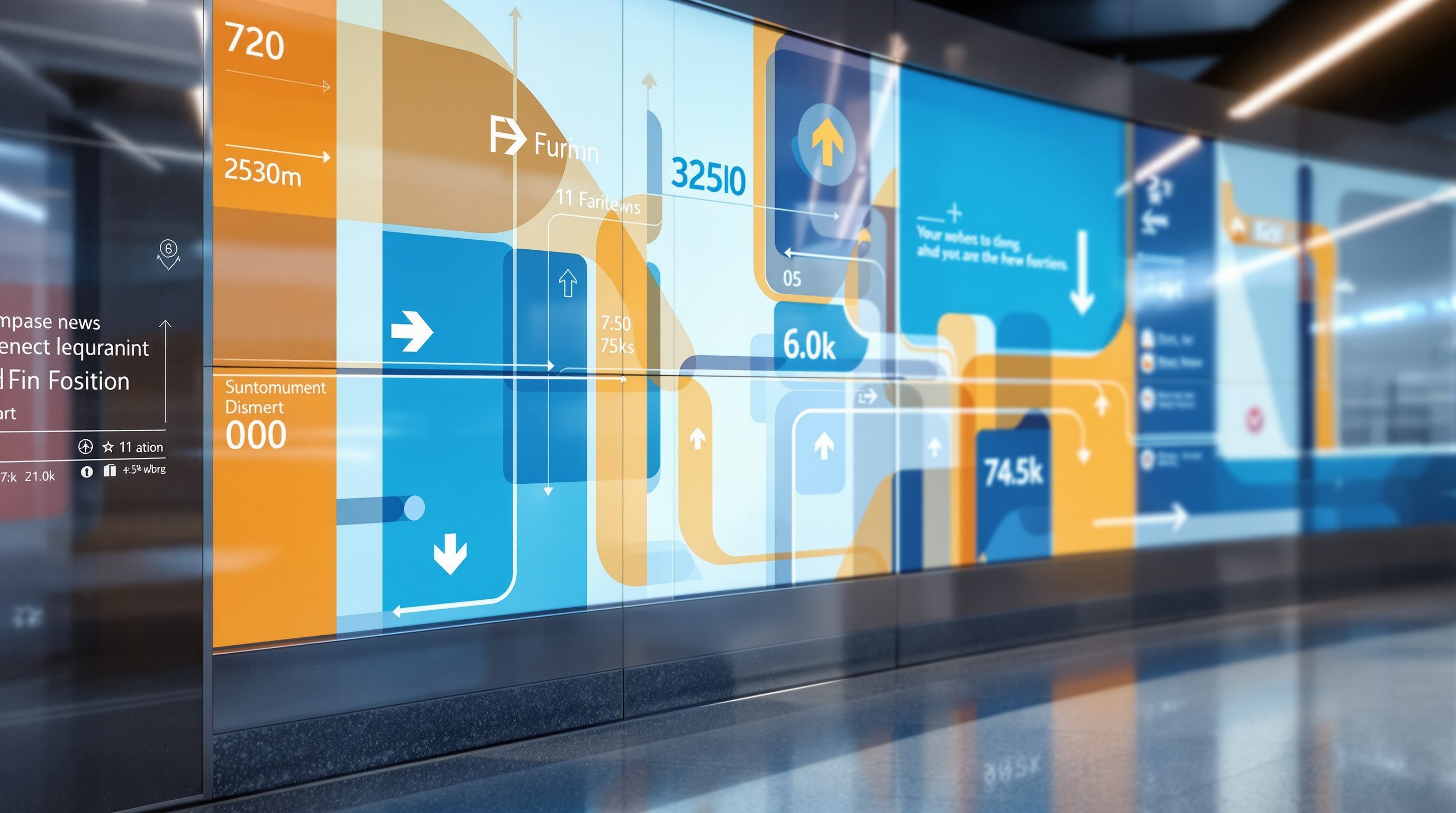
Walk into a modern airport or a new metro station and the screens are everywhere - glowing departure boards, interactive directories you can tap, ribbons of scrolling text, animated maps. It looks like the future of wayfinding, and in one narrow sense it is. But stand and watch people for ten minutes and a quieter truth appears: most travellers glance at the big static overhead signs far more than they touch the kiosks, and the moment the power flickers, a wall of dark screens tells no one anything while a humble printed sign beside it keeps on working. A screen is not a better sign. It is a completely different tool - one with a superpower and a set of real weaknesses - and good wayfinding comes from knowing which jobs to give it and which to keep firmly physical.
The superpower is change. A static sign is perfect for the stable truth - this is Block C, the exit is this way, Radiology is on Floor 2 - information that will be just as true next year. A screen is wasted on that, and worse, it makes permanent information fragile. Where a screen earns its keep is the opposite case: information that is live and updatable - the 09:05 to Chennai is now delayed, gate 7, queue 20 minutes, this lift is out of service, search the directory and preview your route. This lesson is about drawing that line clearly: what dynamic and interactive systems genuinely do better, where they quietly fail (power, network, maintenance, glare, the fact that only one person can use a kiosk at a time), and the discipline of designing the off state, so that when the screens go dark - and one day they will - the place still tells people where to go.
Screens = the CHANGE layer. Keep the skeleton physical. A frozen screen lies; a dark screen just stops.
The one thing digital does that paint cannot: change
Every argument for digital signage in wayfinding comes back to a single quality: it can change. A printed or cut-vinyl sign is fixed from the day it is installed; a screen can show different content every second, driven from a central system or a live data feed. That makes digital the right - often the only - tool for the class of wayfinding information that is genuinely dynamic.
The clearest example is the transport departure board. The gate, the time, the platform and the status of a flight or train change constantly, and no physical sign can keep up; a data-driven board that reads directly from the operations system is the honest answer. The screen here is really a live feed wearing a sign's clothes - the wayfinding value is not the glass, it is the fresh, trustworthy data behind it. The same logic covers a surprising range: a digital directory in a mall or hospital that lets you search for a shop or a department and previews a route; a lift or escalator marked out of service the moment it fails; a queue or occupancy display that tells you this entrance has a twenty-minute wait and that one is clear; a meeting-room panel that shows the current booking; a car park that counts free spaces per level.
Interactivity is the second genuine gift. A touchscreen kiosk can hold far more than a fixed sign - the whole building, every tenant, accessibility routes, a you-are-here map you can zoom - and reveal it progressively, only what the person asks for. Done well, it is a patient, tireless information desk. There is also a real accessibility and multilingual upside: one screen can offer its content in Hindi, English and a regional script on demand, or read a route aloud, without the cost and clutter of printing every panel three times over.
Hold the principle, though. Digital is the right tool specifically because the content changes or because it must hold more than a panel can - timely data, interactive search, multilingual depth. The instant you find yourself putting a permanent, never-changing fact on a screen - the building's name, a fixed exit direction - you are using an expensive, fragile, power-hungry device to do a job a piece of painted metal would do better, cheaper and forever.
Screen = for info that CHANGES (status, queues, search). Never put a permanent fact on a screen.
Where screens quietly fail
For all that, a screen carries weaknesses a painted sign simply does not have, and pretending otherwise is how buildings end up with dark, useless glass at the worst moment. The designer has to hold the failure modes in mind as clearly as the benefits.
The first and biggest is dependence on power and a network. A static sign works in a blackout, a flood, a cyclone, a network outage; a screen does not. In much of India - and anywhere with an unreliable grid - a wayfinding system that assumes continuous power is a system that will periodically tell everyone nothing. The corollary is ruthless: never make safety-critical or fundamental wayfinding depend on a screen. Exit marking, the basic structure of the place, the primary direction to the main destinations - these must remain legible when every screen is off, because the emergency in which you most need them is exactly when the power is most likely to be gone.
The second is maintenance and lifespan. A sign is a near-zero-maintenance object for a decade or more. A screen is a computer: it needs power, software, content management, updates, cleaning, and it will fail, flicker, freeze on an error message, or get stuck showing yesterday's schedule. Every screen is a maintenance commitment and a running cost for the building's whole life - and a frozen or wrong screen is worse than no screen, because people trust it and are misled. The third is physics: glare and reflection in daylight or bright atriums can make a screen unreadable just when it is needed, and unlike print, a screen emits light that can be harsh at night.
The fourth is subtle but real: a screen is usually a single-user, single-moment device. A large overhead static sign is read by a hundred people at once, continuously; a kiosk serves one person at a time and creates a queue, and a screen that cycles through messages shows the wrong one exactly when you look up. This is why the busiest, most important overhead wayfinding in great transport hubs is still, overwhelmingly, large and static - it has to work for everyone, all the time, at a glance. Digital supplements it; it does not replace it.
Kiosks and interactive directories: useful servant, poor master
The interactive kiosk is the most seductive piece of digital wayfinding and the most often misused, so it deserves its own hard look. Its promise is real - a single point that can answer any question, hold the entire directory, plan a route, speak several languages - but it only delivers if it is treated as a supplement to a legible space, placed and designed with discipline.
Start with placement. A kiosk belongs where people arrive and plan - the main entrance, the lobby, the concourse, the point where someone first asks where am I and where do I go. It is useless deep in the building at the moment of a turn, because you cannot stop, queue and tap a screen mid-stride; that decision needs a glanceable overhead sign. So the kiosk answers the big orientation question up front; physical directional signs carry the journey from there. A common failure is leaning on kiosks for the whole system and starving the corridors of the cheap directional signs that actually move people along.
Then the interaction itself. A kiosk must be usable by a stranger in a hurry, in one or two taps, with no instructions - which means a genuinely simple interface, a prominent search, a clear you-are-here, and a route shown on a map oriented the way the person is actually facing (forward-up, not north-up, or it defeats them). It must be reachable and operable by a wheelchair user and a child, offer real language choice, and never trap someone in a menu. And it needs a graceful printed or stable backup of the directory nearby, because the queue, the crash and the out-of-order screen are all certainties.
The deeper point is attitude. A kiosk is a useful servant and a poor master: wonderful for look-up, search and depth on demand, hopeless as the backbone of a wayfinding system. If a building is navigable only by repeatedly consulting screens, it is not legible - it has outsourced its wayfinding to a machine that queues, breaks and goes dark. Design the space and the static signs to carry people, and let the kiosk do what it is uniquely good at: answering the specific, changeable, detailed question a fixed sign never could.
Design the off state
The single most professional habit in digital wayfinding is to design the off state - to decide, deliberately, what the place communicates when the screens are dark, frozen or wrong, because that is not an edge case, it is a scheduled event. Power cuts, network drops, software crashes, maintenance windows, the slow death of an ageing panel: over a building's life, its screens will be unavailable for real stretches, and a system that only works when every screen is alive is a system designed for the demo, not for reality.
In practice this means a layered approach. The permanent skeleton of wayfinding stays physical: the building's legible structure, the names of the major places and zones, the primary directions, and above all the safety and exit information. Digital then sits on top of that skeleton, carrying only the live, changeable, searchable content - and when it fails, the skeleton still holds the person up. A departures hall with dark boards is disorienting but survivable if the gates are physically numbered and signed and staff can direct; a departures hall where even the gate numbers lived only on the screens is chaos.
There are concrete moves. Keep a printed directory and a printed map near every kiosk. Physically number and sign gates, platforms, rooms and zones so the screen adds status to a place that is already named, rather than being the only thing that names it. Specify screens that fail to a sensible state - a blank or a neutral holding message, not a glaring error dialog or a rebooting laptop desktop, which actively erodes trust. Where a screen is the primary display of critical live information, consider redundancy and a manual fallback procedure with staff. And treat content management as a wayfinding responsibility: a screen showing stale or wrong information - yesterday's event, a gate that changed - is a confident liar, often worse than a dark one.
The through-line of this whole course returns here. The architecture speaks first, and physical signage completes what it cannot say; digital is a third layer that speaks only about what changes, and it must never become the layer the others depend on. Used that way - for live data, search and depth, on top of a space that is already legible and physically signed - digital signage is a genuine gift. Used as a substitute for a legible, physically-signed building, it is an expensive, fragile way to get people lost in the dark.
Design what the place says when the screens are DARK. Permanent + safety info stays physical.
Fire & exit signage
Emergency wayfinding, exit marking, power failure
Safety-critical: exit and emergency wayfinding must remain legible when powered displays are off. Defer every binding requirement to the fire authority and a life-safety specialist. Module 3.
Electrical, data & mounting
Power, network, structural fixing, heat/glare
Illuminated and digital displays are an electrical and structural matter - defer loads, cabling, fixing and redundancy to the electrical engineer, the fabricator and the display integrator.
Accessibility (NBC / Harmonised Guidelines)
Reach ranges, operable controls, legibility, audio
Kiosk height, reach, touch targets and audio/visual alternatives must meet the current accessibility standards - verify with an accessibility consultant. Module 7.
Workshop — audit a digital display as a wayfinding tool
Digital wayfinding reveals its strengths and faults only when you watch it in use. In this workshop you will study one real digital display - a departures board, a mall or hospital directory kiosk, a transit screen - and judge whether it is doing a job a screen is right for, and what happens when it fails.
Just one public digital display you can observe and a notebook. You are judging wayfinding behaviour, not building hardware.
Goal: a clear verdict on one digital display's wayfinding role
Inputs: one public digital display you can observe + this lesson + a notebook
Time: ~45 minutes
- 1Classify the content: list what the screen shows, and mark each item as CHANGING (live status, queue, search result) or PERMANENT (a fixed name, a fixed direction). Decide whether a screen is the right tool for the mix - or whether permanent facts have been trapped on glass.
- 2Watch real use for ten minutes: how many people actually use it versus the static signs nearby? If it is a kiosk, can a stranger use it in one or two taps, is the map forward-up, is there a queue, is it reachable for a wheelchair user or child, are other languages offered?
- 3Hunt the failure modes: is any screen frozen, blank, showing an error, glaring in daylight, or displaying stale/wrong information? Note what a traveller would do at that screen right now.
- 4Test the off state: imagine the power is out and every screen is dark. Could you still find your way using only the physical signs, numbering and space that remain? Name exactly what would break.
- 5Write a one-paragraph verdict: is this the right job for a screen, how usable and reliable it is, what it should hand back to physical signage, and the single change that would most help a stressed first-time visitor.
You’ll walk away with
A one-page audit of a real digital display: its changing-versus-permanent content split, its observed usage and usability, its failure modes, its off-state survivability, and a one-line verdict with the highest-impact fix.
Three altitudes on the same idea
Read the band that fits you — or all three.
Digital wayfinding is an infrastructure decision you make at the plan, not a fit-out afterthought. Screens need power, data and network runs, structural mounting, heat and glare management, and a maintenance strategy for the building's life - design them in early or they get bolted on badly. Your bigger contribution is to make them unnecessary as backbone: a legible building with clear static overhead signage means screens can be confined to their real job - live data and search - rather than propping up a confusing plan. Insist that exit and safety wayfinding and the basic structure never depend on powered screens, and coordinate digital loads and fallbacks with the electrical and life-safety consultants.
You will specify, place and design the content of the screens and kiosks, and integrate them with the physical sign family so they read as one system. Match typefaces, colour coding, iconography and naming between the static signs and the screens; place kiosks at arrival and planning points, not mid-journey; design touch interfaces a stressed stranger can use in two taps, with forward-up maps, real language choice and accessibility. Keep a printed directory beside every kiosk, and brief the client honestly on the running cost, content management and the off state - a frozen screen undoes the polish of the whole interior.
Train yourself to ask, of every screen you see: is this showing information that actually changes? Watch a departures board, a mall directory, a hospital kiosk - notice how much people rely on the big static signs versus the screens, what happens at the ones that are frozen or off, and whether the kiosk is at the right place (arrival) or the wrong one (mid-turn). Learn the line between the stable name of a place (physical, forever) and its live status (digital). You are not expected to wire a display network yet; you are expected to understand why a screen is a different tool from a sign, and where each belongs.
“Digital signage is the modern upgrade to old static signs - screens are more flexible and look better, so the more of a building's wayfinding we move onto screens, the better and more future-ready it is.”
Do it yourself
No tools needed - reason it through.
- 1What is the single quality that justifies using a screen instead of a painted sign, and give two wayfinding jobs it makes digital right for.
- 2List four ways a screen can fail that a static sign cannot, and explain why that matters most for exit and safety wayfinding.
- 3Where should an interactive kiosk be placed, and why is it the wrong tool at the moment of a turn in a corridor?
- 4Explain what it means to design the off state, and name three concrete moves that make a place survive its screens going dark.
- 5Why is a frozen screen showing yesterday's schedule sometimes worse than a screen that is simply switched off?
The one line to carry out
Peer-reviewed journals & authoritative standards
- 01Digital signage — Wikipedia — Digital signage, 2026.
- 02Signage — Wikipedia — Signage, 2026.
- 03Wayfinding — Wikipedia — Wayfinding, 2026.
- 04Internet of things — Wikipedia — Internet of things, 2026.
Screens fixed in the building are one digital layer; the other lives in the visitor's pocket. Next we look at the smartphone as a wayfinding tool - maps, indoor positioning, QR and AR - and its honest limits.
The author
Amogh N P
Architect, interior designer, and creative polymath. Studio Matrx began in his notebooks — his vision of design made honest, useful, and open to everyone. Its Academy is written and taught in his memory, and free, forever.
More about Amogh →