
 Lesson 1.2
Lesson 1.2 · Understanding Retail & the Shopper
The Retail Brand & Its Customer
A store is not designed for everyone who might wander in - it is a three-dimensional argument aimed at one specific customer, built to make the brand feel, the moment they step inside, like it was made for them
Walk into a store and, before you read a single price tag, you already know whether it is for you. That instant verdict is the design doing its real job.
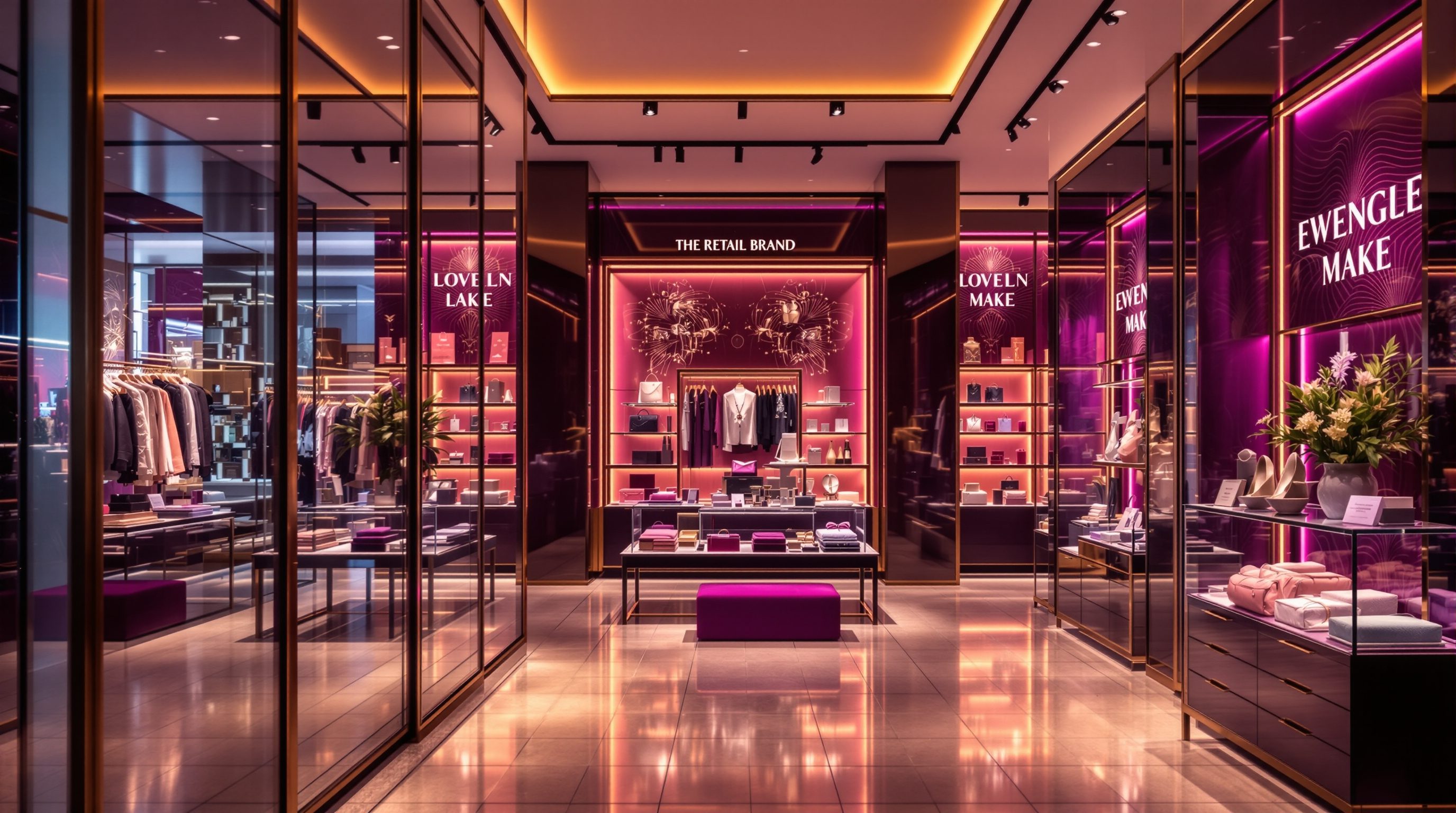
Step from the street into a store and, in the first second or two, something in you decides: this place is for me, or it is not. You have not read a label, compared a price or spoken to anyone. Yet the materials underfoot, the spacing of the racks, the colour and warmth of the light, the music, the way staff stand, the very amount of empty space all add up to a verdict about who this shop is for and what it will cost - and whether that someone is you. That verdict is not an accident of taste; it is the most important thing retail design does, and it is aimed with precision.
This lesson is about that aim. A store is a brand made physical - lesson 0.1 established that - but a brand is never for everybody; it is for a specific customer, and its store is a three-dimensional argument addressed to that person. We will look at how to name and understand that core customer, how a brand's positioning and price tier are signalled physically before any tag is read, how every material and fixture and lumen is a sentence in the brand's argument, and why the hardest discipline in retail branding is the courage to design for one precise customer rather than the anxious, diluted instinct to design for everyone. Get the customer and the positioning right, and every later decision - layout, fixtures, light, display - has a clear brief to answer to. Get them wrong, and the most beautiful store in the world will speak to no one.
Brand made physical, aimed at one customer. Density down, space up as price climbs. Stay coherent.
Who is the store actually for?
Every good retail brief begins with a question that sounds obvious but is constantly dodged: who is this store for? Not "anyone who wants to buy shoes" - that is an abdication - but a specific, richly imagined core customer. What do they earn and value? What is the occasion they are shopping for - the daily essential, the special treat, the aspirational splurge? What other brands fill their life, and what life do they aspire to? What would make them feel instantly at home in this store, and what would make them feel it was not for them? Naming this customer with precision - often as one or two vivid personas - is the single most clarifying act in a retail project, because every subsequent decision can be tested against it: would *this* customer feel this light is flattering, this density reassuring, this price signal right?
The instinct to resist is the anxious urge to design for everyone. It feels safe and inclusive, but it is the surest route to a store that speaks to no one. A space pitched at the broad middle - not cheap enough to reassure the bargain hunter, not refined enough to flatter the aspirant, generic enough to offend no one - ends up exciting no one and being chosen by no one. The paradox of positioning is that the more sharply a store is aimed at one customer, the more people it actually attracts: a store that unmistakably delights its core customer also pulls in the ring of aspiring shoppers who want to feel like that customer, while a store aimed at all of them dissolves into the background.
This does not mean excluding people or designing coldly; India's best retail ranges from the gloriously inclusive big-format bazaar to the tightly aimed boutique, and each works because it knows its customer. It means having the nerve to make choices - this light, this material, this price signal, this level of service - that are unmistakably *for someone*. The designer's first job is to hold that customer steadily in mind, and to push back, gently and with evidence, when a client's "but we want everyone" threatens to blur the store into invisibility. A store for everyone is a store for no one; a store for someone is, paradoxically, a store that reaches many.
Name one core customer. Test every choice against them. A store for everyone reaches no one.
Positioning, and the price tier you can feel
A brand's positioning - where it sits on the ladder from value to luxury, and how it differs from rivals - is communicated by the store more powerfully than by any advertisement, and largely before the shopper consciously notices. The remarkable thing is how consistently the physical signals read. As you climb the price ladder, merchandise density falls and space rises: a value store piles stock high and close because abundance signals low price and lets you sell more per square foot, while a luxury store shows a handful of pieces in acres of space because empty space is the most expensive signal there is. Materials climb too - from plain laminate and painted steel, through warm timber and tidy finishes, to rare stone, fine metal and tactile richness. Lighting shifts from bright, even and efficient (nothing to hide, everything findable) toward softer, warmer, more focused light that flatters goods and faces. Service moves from pure self-service to attentive, even ritualised, help. And the pace the layout sets slows as you rise - value stores move you through, luxury stores invite you to dwell.
A shopper reads this whole vocabulary in seconds and prices the store accordingly, which is why the physical positioning must match the brand's actual price and promise. A store whose finishes say "luxury" but whose prices say "mid-market" confuses and disappoints; one whose cheap fit-out undercuts a premium price feels like a con. The fit-out is a price tag the shopper reads before the real one, and it sets their expectations for everything that follows.
For the designer this is a precise brief, not a vague mood: establish the brand's true positioning, then calibrate density, space, material, light, service and pace to signal exactly that tier - no higher (which overspends and misleads) and no lower (which undersells the brand). These are levers to calibrate to the specific brand, format and market, as of 2026, not fixed formulae - a premium grocery and a premium fashion store express the same tier very differently. But the principle is constant: the physical store is the clearest statement a brand makes about what it costs and what it promises, and making that statement coherent is central retail-design work.
Every surface is the brand speaking
Once the customer and positioning are fixed, the designer's craft is to make every physical element say the same thing - to compose a store where material, colour, light, fixture, sound, scent, graphic and staff all reinforce one brand argument rather than contradicting it. This is where retail design and branding become inseparable. A brand is not its logo; it is a personality and a promise, and the store is where that personality becomes a place you can stand in. A playful, youthful brand and a austere, heritage one might sell similar goods, but their stores should feel like different worlds - in the boldness of colour, the wit or restraint of the graphics, the music's energy, the informality or ceremony of service. The worst retail interiors are not the ugly ones but the incoherent ones, where a luxurious material sits beside a cheap one, a warm brand is lit like a warehouse, or a heritage story is told in fixtures that feel like an airport lounge.
Consistency matters across touchpoints too. Increasingly the store is one expression of a brand the customer also meets online, on packaging, in advertising and on social media, and these should feel like one coherent world - the colours, typography, tone and values continuous from the Instagram grid to the shopfront to the carrier bag (this connected, omnichannel brand is lesson 1.4). A D2C brand that built a distinctive, witty online voice and then opens a physical store that feels generic has wasted its strongest asset; its store should make you feel you have walked inside the brand you already knew.
The designer's tool for this is a clear brand brief - often captured in a brand's design standards for a chain, a detailed rulebook of approved materials, colours, fixtures, lighting and graphics that keeps the brand coherent across many stores (Modules 7 and 10). On a branded project you design within those standards; on an independent one you effectively write them. Either way, the test for every decision is the same: does this surface, this fixture, this lumen say what the brand is, to the customer it is for? If a choice would be just as at home in a rival's store across the street, it is probably not doing brand work - and in retail, almost everything should.
Designing for a specific customer, in a specific place
Holding one customer and one clear argument steady does not make retail design formulaic - it makes it grounded, and it sharpens rather than narrows the creative task. The customer and positioning are the brief; the craft is in how vividly, surprisingly and coherently you answer it. Two designers given the same core customer and premium positioning will produce very different, equally valid stores - but both will be unmistakably *for that person* and *at that tier*, and neither will blur into the generic. The discipline is what makes the creativity land.
Context deepens the brief. A store is designed not only for a customer but for a place and a moment, and the Indian context is rich with specifics a generic template misses: the customer who shops as a family group, the importance of assisted service in many segments, the festive calendar that transforms footfall and mood, the climate that shapes materials and comfort, the span from the aspirational mall flagship to the neighbourhood store, and the cultural resonance of colour, motif and material. A brand aimed at a young urban Indian customer, an established family, or a diaspora-aware aspirant will each call for a different physical language, and the sensitive designer reads those cues rather than importing a look wholesale from elsewhere. The same brand may even flex its store between a metro flagship and a tier-two high street while keeping its core argument intact.
Finally, keep the customer present through the whole project, not just at its start. It is easy to name a core customer in the brief and then quietly design for your own taste, the client's ego or an award-jury's eye. Return to the customer at every decision - the material, the aisle width, the light level, the price signal, the music, the service model - and ask whether it serves and delights *them*. And defer the binding specifics that sit beneath the brand argument - accessible dimensions so every customer can actually use the store, signage permissions, fire and egress - to the current codes, local bye-laws and the relevant consultants; designing for a specific customer never means designing anyone out. Get this right and the whole rest of the course has a clear master to serve: a named customer, a coherent brand, made physical with precision and care.
Same customer, many valid stores. The brief grounds the craft; it does not cage it.
Brand design standards
The retailer's rulebook of materials, colour, light, fixtures, graphics
For branded and chain retail the brand standards govern much of the positioning and fit-out - design within them; for independents you effectively write them. Modules 7, 10.
Accessibility & inclusion
Barrier-free access so the target customer is never anyone excluded
Aiming at a specific customer never means designing anyone out - defer accessible dimensions to the current standards, local bye-laws and a consultant. Modules 2, 5.
Signage & shopfront permissions
Facade, fascia and signage that carry the brand on the street
Brand expression on the shopfront is a design call; the permitted size, projection and illumination are not - defer to local bye-laws and the authorities. Module 3.
Workshop — name the customer, read the positioning
Positioning becomes real when you can name the customer and point to the physical evidence. In this workshop you will profile the core customer of a real store and audit how coherently its design signals a price tier and speaks a brand.
A store you can recall or visit and a notebook. This is about learning to read and aim a brand argument, not to measure - no drawings needed.
Goal: profile a store's customer and audit its brand coherence
Inputs: one store you know well + this lesson + a notebook
Time: ~45 minutes
- 1Choose a store with a clear character. Before looking at any price, write a three-sentence profile of its core customer: who they are, what occasion they shop it for, and the life or brands they aspire to.
- 2Place the store on the value-to-luxury ladder and list the physical signals that put it there - merchandise density, materials, lighting, amount of space, service model and pace. Note for each whether it signals higher or lower price.
- 3Test coherence: find any element that contradicts the rest (a cheap finish in a premium store, warehouse lighting in a warm brand, a generic fixture that could sit in any rival). Flag each contradiction.
- 4Check consistency beyond the store: does the shopfront, and the brand online or on its bag, feel like the same world as the interior? Note one continuity and one break.
- 5Write a verdict: who the store is for, what tier it signals, how coherently it expresses the brand, and the single change that would sharpen its argument for its core customer.
You’ll walk away with
A one-page brand-and-customer audit: a three-sentence customer profile, the store's tier with its physical evidence, a list of coherence contradictions, an online-to-store continuity check, and the highest-impact change. Reuse this structure as the opening move of any retail brief.
Three altitudes on the same idea
Read the band that fits you — or all three.
The brand and its customer should inform the shell and shopfront you design, because the building's scale and materials make the brand's loudest first statement. A luxury brand's calm, generous proportions, fine facade materials and restrained shopfront say something a value brand's bold, high-visibility, maximally-glazed frontage never could - and these are architectural decisions, hard to reverse. For chains, you are often setting a base-build and shopfront system that must carry one brand across many very different sites while flexing to each; that is a systematisation discipline (Module 10). Understand the positioning so the envelope signals the right tier, coordinate signage and facade permissions with the authorities and consultants, and leave the interior designer a shell that already speaks the brand.
Expressing the brand and flattering its customer is the heart of your craft - this is where positioning becomes material, light and fixture. You calibrate merchandise density, the palette of materials, the lighting temperature and focus, the spacing and pace, and the service touchpoints to signal exactly the right tier and speak the brand's personality, keeping every surface coherent. You work to the brand's design standards where they exist and help write them where they do not. And you hold the named customer steady against the pull of your own taste or the client's ego, testing every finish and fixture by whether it serves and delights that specific person - while coordinating accessibility so the store you aim at one customer still works for every shopper.
Train yourself to read the brand argument in every store you enter - it is the fastest way to learn positioning. Walk in and, before reading a price, ask: who is this store for, and what tier is it signalling? Then find the evidence - the density, the materials, the light, the space, the service - and notice how consistently it all points one way (or where it contradicts itself and confuses you). Try describing a store's core customer in three sentences, and sketch how the same brand would differ at a higher or lower tier. You are not expected to run a brand strategy yet; you are expected to see that a store is a brand made physical, aimed at someone, and to read who.
“To be safe and maximise sales, a store should appeal to as many people as possible - keep the look neutral and broadly pleasant, the price signals middle-of-the-road, and avoid anything too distinctive that might put some customers off.”
Do it yourself
No tools needed - reason it through from the lesson.
- 1Why does designing a store for everyone tend to reach no one, and why does aiming sharply at one customer attract more people, not fewer?
- 2Name four physical signals that change as a store climbs from value to luxury positioning, and the direction each moves.
- 3Explain why the fit-out is a price tag the shopper reads before the real one, and what goes wrong when the two disagree.
- 4What makes a store's design incoherent rather than merely ugly, and why is incoherence worse?
- 5Give two ways the Indian context should shape how you design for a specific customer.
The one line to carry out
Peer-reviewed journals & authoritative standards
- 01Brand — Wikipedia — Brand, 2026.
- 02Retail design — Wikipedia — Retail design, 2026.
- 03Marketing — Wikipedia — Marketing, 2026.
- 04Sensory branding — Wikipedia — Sensory branding, 2026.
We have the shopper and the brand and customer they are aimed at. Now we turn to the hard commercial reality that judges every design choice - the numbers that decide whether a beautiful, well-aimed store actually earns its keep.
The author
Amogh N P
Architect, interior designer, and creative polymath. Studio Matrx began in his notebooks — his vision of design made honest, useful, and open to everyone. Its Academy is written and taught in his memory, and free, forever.
More about Amogh →