The Kitchen That Works
One kitchen, read three ways
One kitchen, read three ways — for the homeowner, the professional and the student. A blue-and-white kitchen and its quieter neighbour, studied from photographs, become a lesson in how a kitchen is actually put together.
- Read as
- Homeowner · Professional · Student
- Rooms
- Two connected kitchens
- Palette
- Blue-and-white; marble-and-black
- Studied from
- Finished photographs
- Method
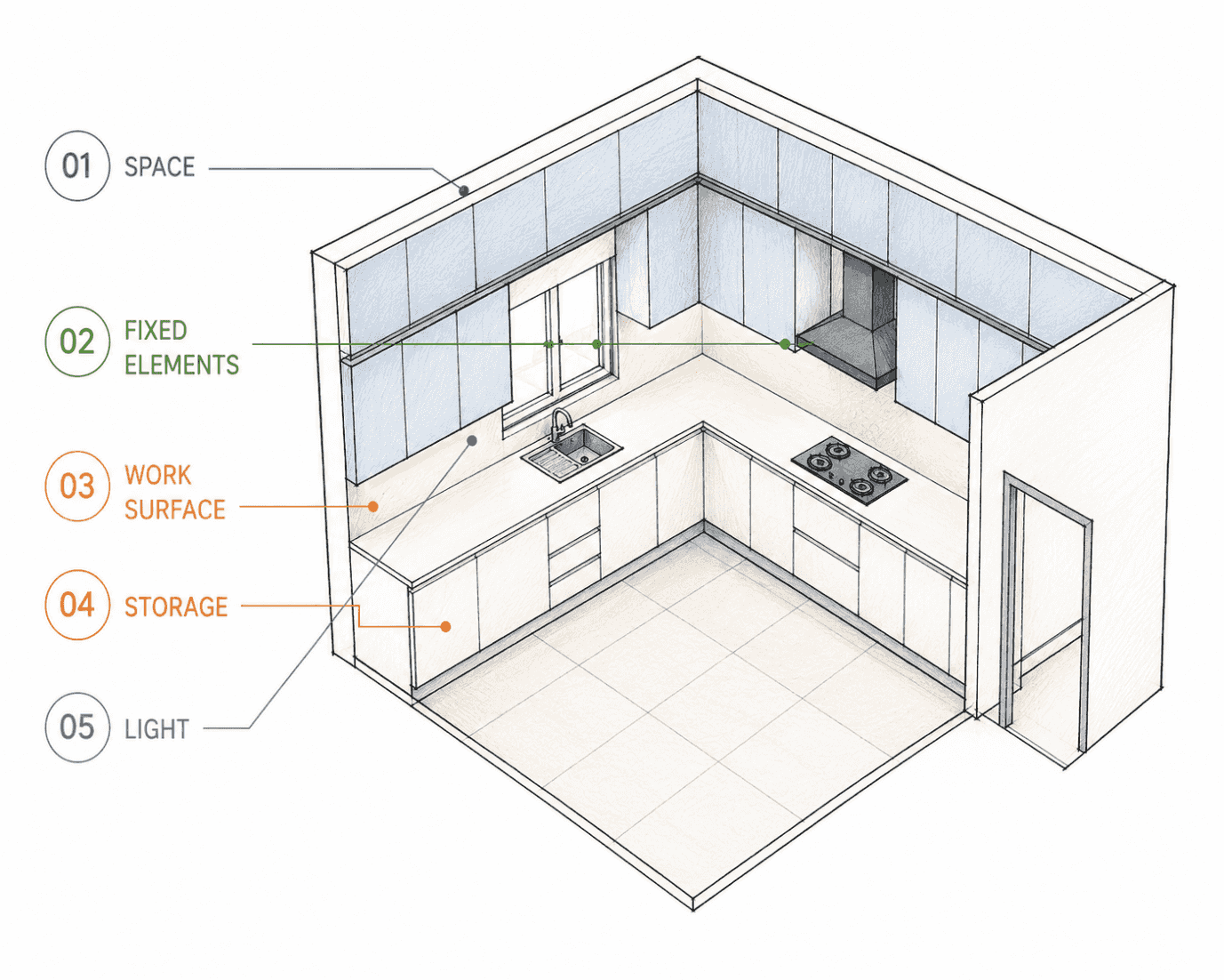
- Space → fixed elements → work surface → storage → light
- Lit by
- General ceiling light + warm under-cabinet strip
Kitchens are usually photographed in isolation — all cabinetry, no context, the adjoining rooms cropped away. This home is more interesting when you refuse to do that and look at it whole.
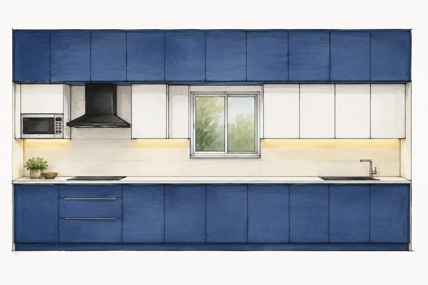
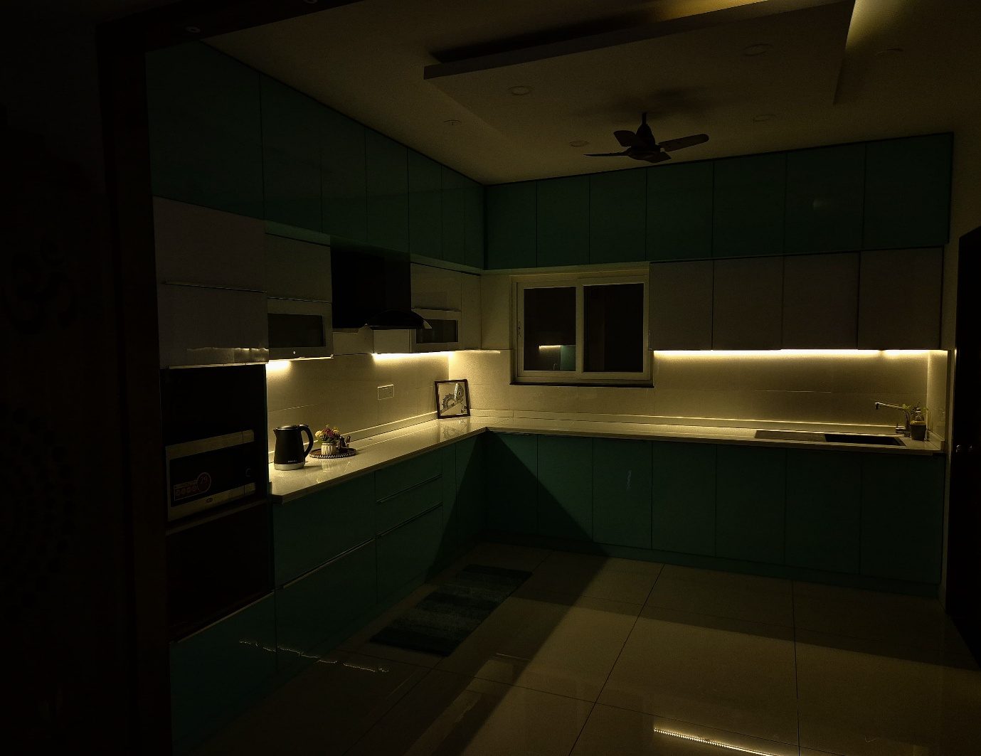
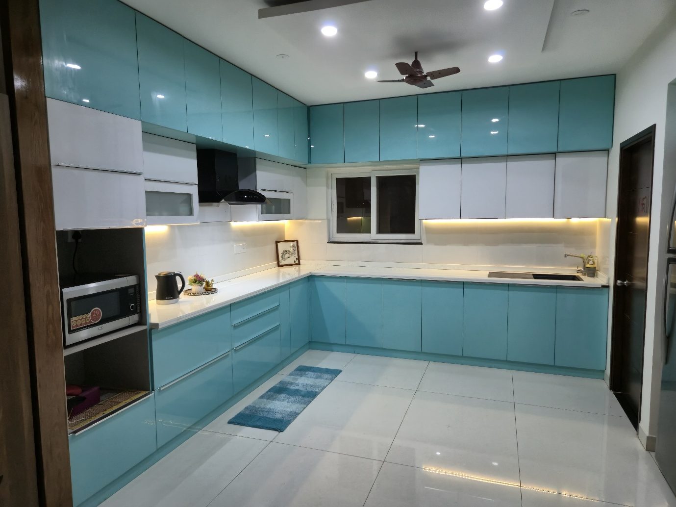
At its centre is a striking blue-and-white kitchen. Deep blue cabinetry grounds the room at both the floor and the ceiling, while white cabinets hold the middle. A pale countertop and backsplash run between them as a continuous band, lifted by warm under-cabinet lighting. The effect is bold but balanced: colour gives the kitchen its identity without ever overwhelming the space.
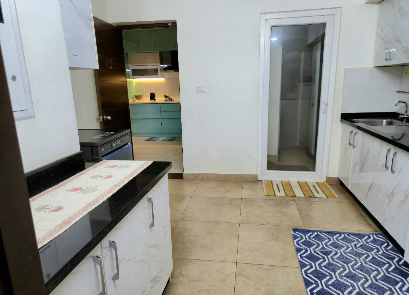
Beyond that room, the project reveals another layer. A second kitchen, visible through a doorway, wears a different face entirely — pale marble-patterned shutters in place of the blue, dark handles that catch the eye, and a black countertop drawn as one strong horizontal line. The two spaces are physically connected but visually distinct.
That relationship changes how you read the home. Rather than the blue kitchen standing alone, the project is best understood as two adjacent kitchen environments, each with its own character, a few steps apart. The photographs never tell us how the household divides the work between them — and there is no need to speculate. What they show is the architecture of it: one room ends at a threshold, another begins, and the visual language shifts as you cross.
In the pages that follow we read that shift three ways. First the homeowner's experience of both spaces, then the details a professional would notice in them, and finally the lessons a student can draw simply by analysing finished photographs.
The story of this kitchen begins not with a single room, but with the relationship between two. One kitchen. Three ways of seeing it.
Colour changes the room — but only where you place it
A bold kitchen does not need every surface to compete for attention; it needs colour that knows where to start and stop.
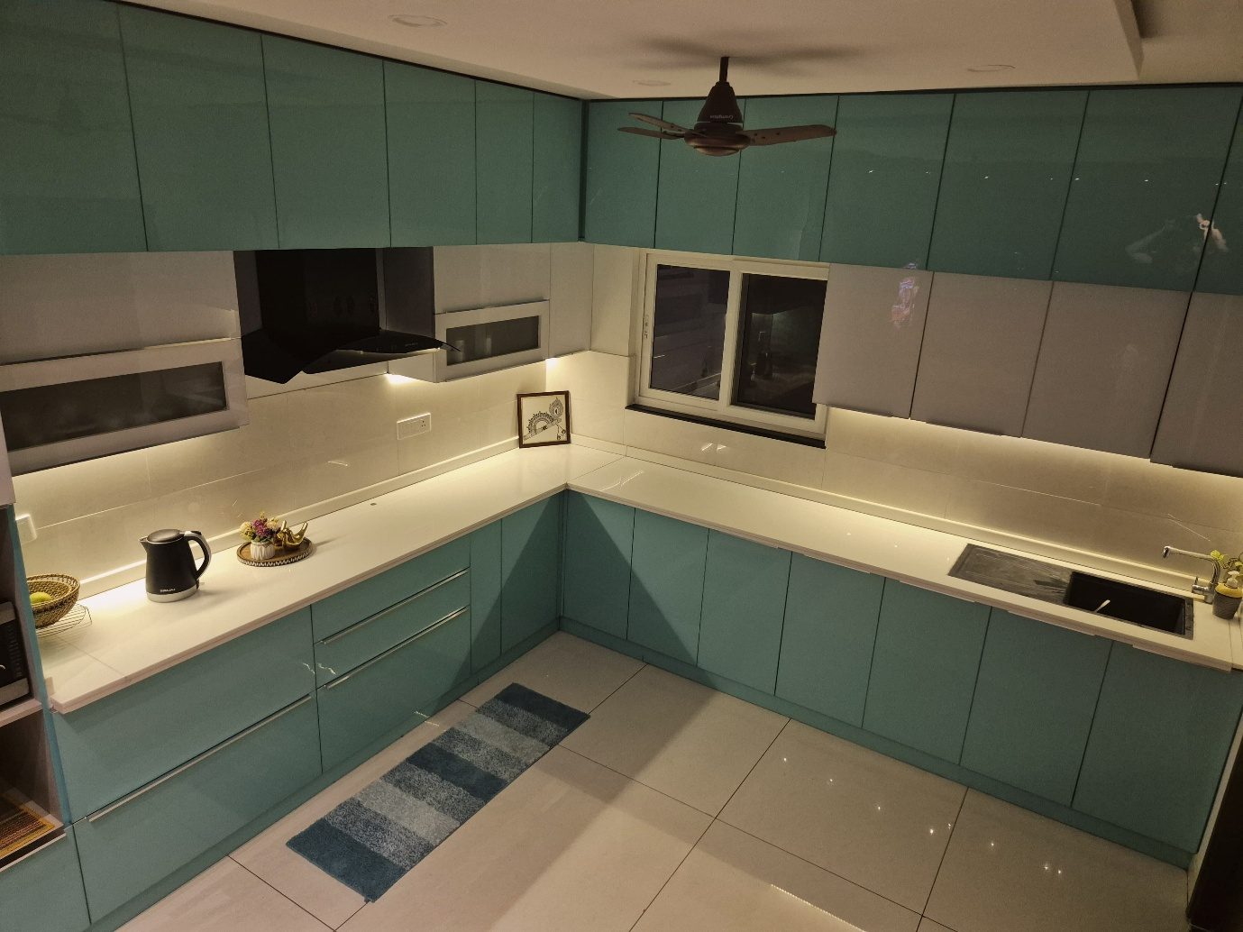
The kitchen's impact comes less from the colour itself than from how it is distributed. Blue sits at the base and again at the highest level, with white cabinetry filling the space between. That single move frames the room in blue without ever letting it overwhelm.
In the middle, the pale countertop and backsplash form a continuous central band. This surface reads bright against the darker cabinetry below, while the white wall cabinets above keep the centre of the room light. A warm strip of lighting beneath the cabinets further separates the working area from the storage overhead.
Look at the wider view and the composition simply continues, the blue-and-white wrapping around the room. But it is not a perfect grid — the cabinetry becomes less symmetrical as it meets the room's realities. A window interrupts one wall. The chimney is a dark vertical presence above the cooking area. A microwave is recessed into another run of cabinetry. The sink takes a separate stretch of counter, and the refrigerator stands at the edge of the fitted composition.
Those interruptions matter. Without them, the kitchen could read as a repeated grid of identical shutters. Instead, the appliances, the openings and the working elements break the cabinetry into smaller episodes, while the repeated colours keep holding the room together. Storage even climbs higher than usual — another blue tier above the white wall cabinets, reaching toward the ceiling — completing the dark frame set by the base units and giving the top edge a clean finish.
For a homeowner, this is a new way to think about strong colour: impact does not depend on quantity. Much of the effect here comes from where the colour starts, where it stops, and what stays neutral in between. Blue appears at the base to ground the kitchen, and again near the ceiling to balance it; between the two bands, the white wall cabinets, pale backsplash and white countertop lighten everything. Three clear layers — blue above, white through the middle, blue below — and the eye is guided calmly around the room rather than tired by it.
The lesson is that a strong colour never needs to be everywhere. Strategic repetition builds a stronger identity than uniform coverage. Blue frames the space; white keeps it open. Colour works hardest when it serves a defined purpose rather than being spread on as decoration.
And the blue kitchen is not sealed off from the rest of the home. A doorway connects it to the second kitchen, and crossing that threshold changes the atmosphere at once. On one side, glossy blue cabinetry, white work surfaces and warm integrated light; on the other, a quieter palette of marble-patterned white cabinetry, a black countertop and conventional metal handles. That one photograph through the doorway is the valuable one, because it captures a relationship no single-room image can. The materials, the counter colour and the cabinet style all shift, yet the two kitchens are only a few steps apart. Connected spaces, it turns out, do not have to look identical — each can keep its own identity while belonging to the same home. Here the contrast is the point: it tells you exactly when you have moved from one kitchen into the other.
Storage, counter and light, read as one wall system
Kitchen detailing begins where storage must accommodate the fixed things — the window, the sink, the appliances and the circulation around them.
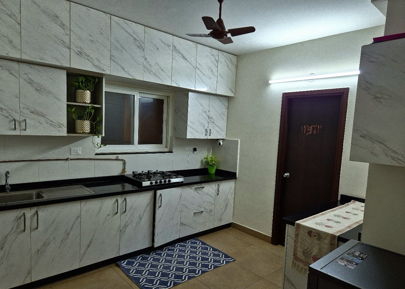
Cross the doorway and the design approach shifts with you. The second kitchen is more subdued than the blue one: marble-patterned white shutters define the cabinetry, and a black countertop draws a distinct horizontal line at the work surface. Rather than hiding cabinet edges within a glossy finish, conventional metal handles make each door and drawer clearly legible.
The photograph shows a compact working wall organised around three fixed elements — the sink, the window and the cooktop. Storage claims nearly every remaining inch: base cabinets run beneath the counter, wall cabinets frame the window, and a further row reaches toward the ceiling. A narrow open shelf beside the window interrupts the closed storage to create one small, accessible niche.
That opening is more significant than it looks. Most of the kitchen is closed shutters, reading as a continuous elevation; the single open shelf disrupts that pattern without introducing a separate storage system. This is exactly where studying a finished kitchen earns its keep for a professional. The photograph does more than display finishes — it demonstrates how the designer has integrated storage, openings, appliances and work surfaces within one wall system.
It also sets up a useful contrast with the blue kitchen. The first room reaches for continuity through colour and mostly handle-free surfaces; the second lets its joints, handles and material patterns stay visible. Two connected spaces, two different cabinet expressions — and both begin from the same discipline of fitting storage around fixed things.
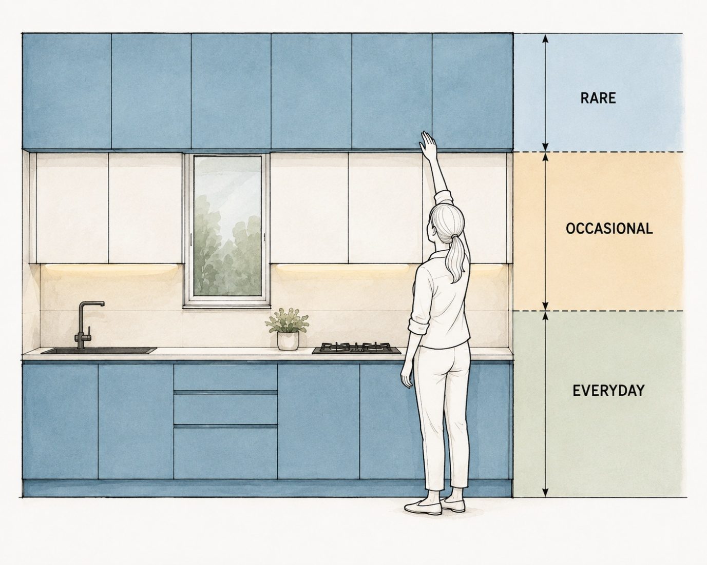
Return to the blue kitchen and read its storage in section. It exploits both floor space and vertical height: storage starts beneath the countertop, continues through the wall cabinets, and rises again into blue cabinetry close to the ceiling. Instead of leaving the top of the wall unused, that height becomes another storage layer. But not every cabinet is equally convenient to reach, and that produces a simple hierarchy. The everyday storage sits between roughly waist height and comfortable reach — drawers, base cabinets and the readily accessible wall cabinets, the natural home for things used repeatedly while cooking. As storage climbs, accessibility drops: the middle-high cabinets take what you need but not several times a day. The highest blue cabinets demand the greatest reach; their value is not immediacy but the ability to use space that would otherwise sit empty.
The lesson for practice is that storage quantity and storage accessibility are not the same thing. A kitchen can hold a great many cabinets, yet their usefulness depends on matching what is stored to how easily each level can be reached. The vertical wall becomes a hierarchy — everyday, then occasional, then rare — rather than a plain stack of cupboards. Design storage by frequency of use, not simply by where another cabinet will fit.
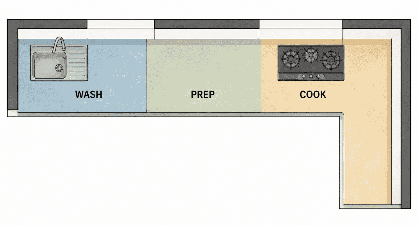
The counter is the horizontal counterpart to that vertical thinking. In the blue kitchen it runs continuously around the room, and the photographs show three functions living on that one surface: washing, preparation and cooking. The sink defines the wet zone; the cooking area sits beneath the chimney; the clear counter between these fixed points is the preparation area. The sink needs a dedicated working edge for washing and for setting things down before and after. The prep stretch is the most flexible zone precisely because it is not committed to any appliance. The hob and chimney, by contrast, fix their section of counter as a dedicated cooking workspace.
So the professional question is never simply how long the countertop is. It is how much of that counter remains genuinely usable once the fixed functions are placed. A long counter broken up by appliances can offer less working space than a shorter, continuous one. Counter length is a measurement; usable counter space is a design choice.
Light is the last layer, and one of the clearest details in the blue kitchen. There is ceiling lighting for general illumination, but a second layer of light sits much closer to where the work happens — a continuous warm strip beneath the wall cabinets, directly above the countertop. Its position matters, because the upper cabinets project over the worktop; relying on ceiling light alone can leave parts of the counter in shadow, especially when someone stands right in front of it. Placing the light under the cabinets brings it to the working surface.
That strip also changes how the cabinetry reads. In the darker photograph the kitchen resolves into layers — blue upper storage, white cabinetry, a warm line of light, the countertop, blue base storage. The lighting is doing two jobs at once: serving the counter, and drawing a clear horizontal break across the elevation. The distinction to hold onto is that lighting should not only answer "Is the room bright enough?" It should also ask "Where does the user actually need the light?" General lighting illuminates the room; task lighting illuminates the work.
Learn to read a kitchen before you design one
A finished photograph looks like colours, cabinets and appliances. Look closer and it reveals the decisions that organise the space.
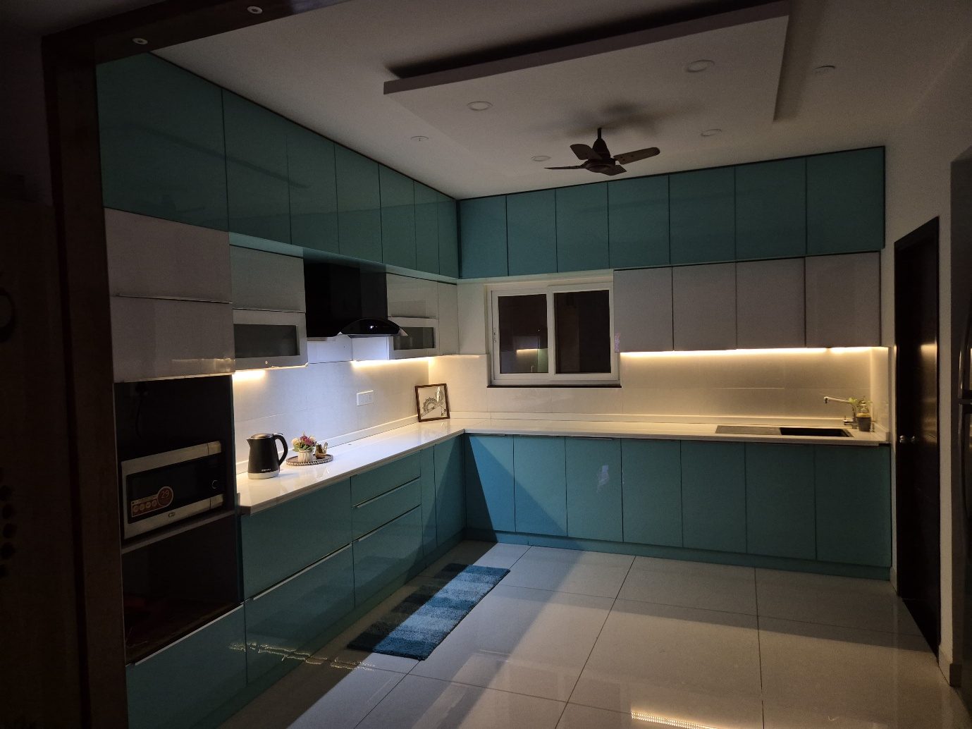
Before you design a new kitchen, learn to analyse an existing one. A finished photograph may seem to show only colours, cabinets and appliances, but observed closely it reveals the decisions that organise the space. Take the blue kitchen as a case study and read it in layers.
Begin with the space itself. Where are the walls, and where are the openings? Where does a person enter? How does the counter occupy the available perimeter? These questions establish the framework within which everything else has to work. Next, identify the fixed elements that shape the layout — the window, the sink, the cooking position, the chimney, the doorway. Once you have named them, the cabinetry can no longer be read as an uninterrupted wall of storage.
Then trace the working surface. Rather than fixating on the counter's total length, mark where it is interrupted by the sink, the cooking equipment and the other fixed elements; what remains is the usable preparation surface. Move to storage above and below — base cabinets on the lower level, wall cabinets as accessible upper storage, and perhaps a further tier reaching toward the ceiling, which is where the storage hierarchy shows itself. Finally, find the light: general ceiling illumination here, reinforced by a continuous source set directly above the counter.
That is the whole method, in order: space, then fixed elements, then work surface, then storage, then light. Colour and appearance should become your focus only after those layers are understood. Do not start with how the kitchen looks; start with how it is organised.
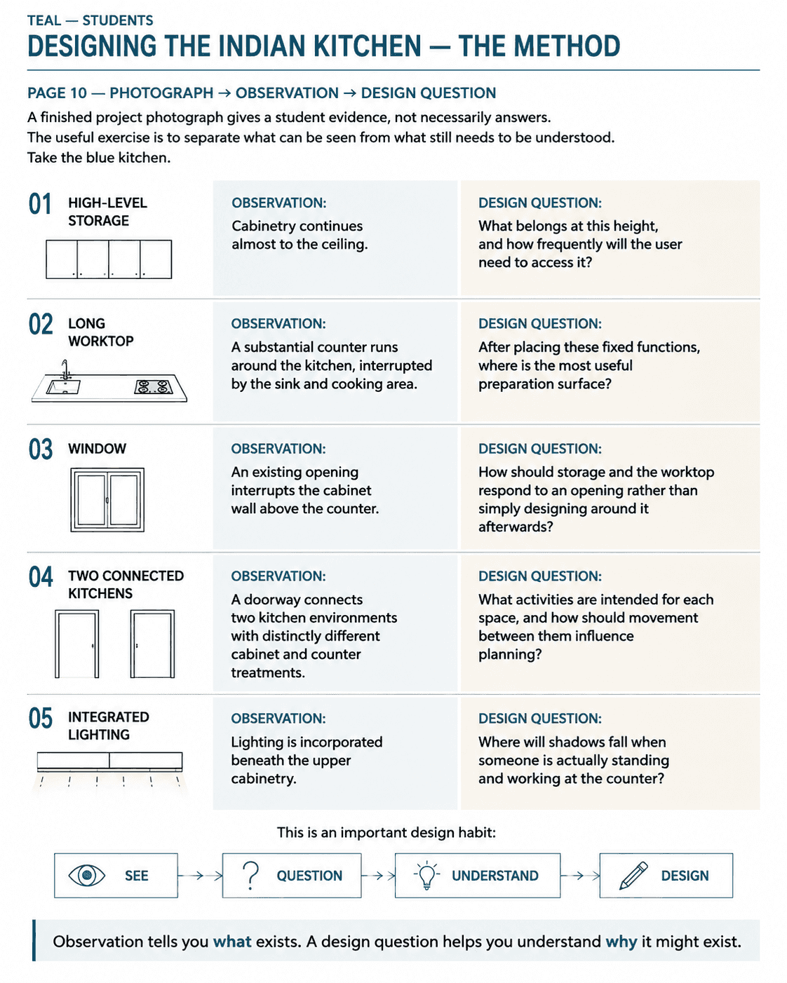
A completed photograph gives a student evidence, but not always answers, so it helps to separate what is visible from what still needs to be understood. The cabinetry runs almost to the ceiling — so what belongs at that height, and how often will anyone reach it? A substantial worktop wraps the room, interrupted by the sink and cooking area — so once those are fixed, where is food preparation most practical? A window breaks the cabinet wall above the counter — so how should storage and worktop be designed to address that opening, rather than adapting to it after the fact? A doorway joins two kitchens with different treatments — so what happens in each, and how should circulation between them shape the design? Light is tucked beneath the upper cabinets — so where will shadows fall when someone stands and works at the counter?
The habit underneath all of that is simple: see, question, understand, then design. Do not assume you understand the reasoning behind a decision just because you can see its result. Observation tells you what is present; a design question helps you uncover why it is there.
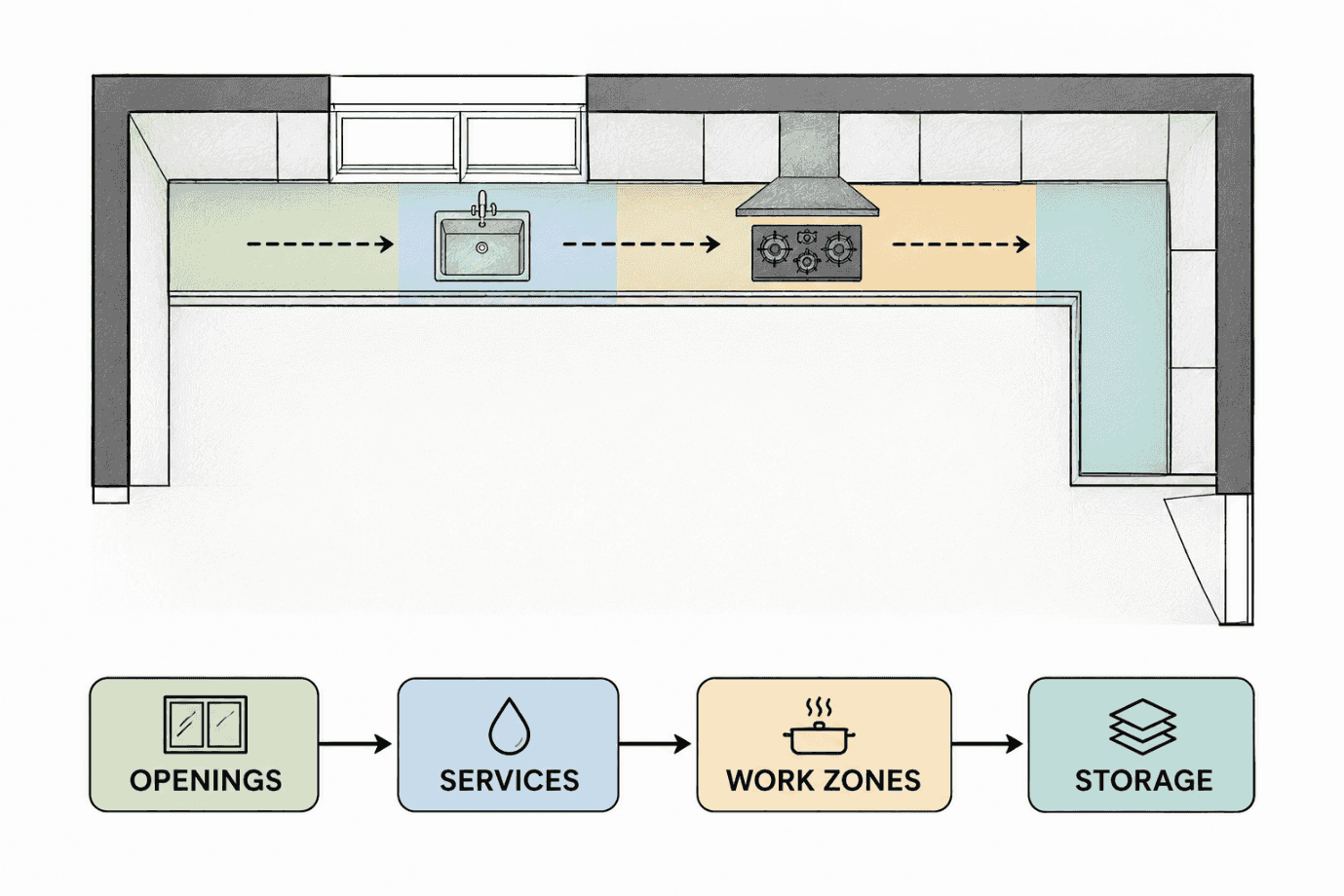
That reasoning also changes the order in which you design. A kitchen rarely begins as an empty rectangle — doors, windows, plumbing, electrical connections and ventilation all define its constraints, and good design responds to them instead of starting from the cabinets. You can see it in both kitchens here. Start with the openings: in each room the window takes valuable wall space above the counter, and rather than mourn the lost storage, the cabinetry stops, turns and continues around it, so the opening is built into the elevation instead of bolted on afterwards. Locate the wet zone next, because the sink is not just another fixture on the counter — its position drives the plumbing, the drainage, the storage nearby and the counter space around it, so fix it early. Locate the cooking zone, with its power or gas connections, its workspace and the extraction above it — the black chimney in the blue kitchen makes that relationship plain. Only then build the storage, allocating the remaining wall and counter to cabinets, drawers and accessible shelves.
For a student, that inverts the usual sequence. Instead of drawing the cabinets first and fitting everything else around them, you move from openings to services to work zones to storage — designing the kitchen around the room's requirements rather than forcing those requirements into a cabinet layout you had already decided. Do not start by filling the walls with cabinets; begin with the fixed constraints.
A finished kitchen marks the end of one design process, but for a student it can be the beginning of another. Everything above was analysis in reverse — identifying the room's layout and openings, locating the functional elements, tracing the countertop, examining the vertical storage, and noticing how the lighting was worked into the cabinetry — and none of it required knowing every decision the original designer made. It only required looking carefully. Read the room before the cabinetry; read the work by locating washing, preparation and cooking, then studying the counter that connects them; read the storage for accessibility and placement, not just cabinet count; read the detail in the handles, the cabinet junctions, the appliances, the lighting and the points where cabinetry meets an opening. Then ask why.
Because a photograph can show you what was built; it cannot always show the reasoning behind it, and that distinction is the whole discipline. Good precedent study is not copying the blue shutters, the white countertop or a particular cabinet arrangement. It is understanding the decisions behind the finished appearance and asking whether they would suit a different user, a different room or a different way of cooking. Observe, question, understand, design — do not replicate the kitchen, learn to interpret it.
Why this kitchen earns the cover
We put this kitchen on the cover not because it is the most expensive or the most photographed, but because it works — and because it explains itself so clearly to anyone willing to look. Two connected rooms, one loud with colour and one deliberately quiet, together make a complete argument about how a kitchen is actually put together.
The blue kitchen shows that colour is a matter of placement, not quantity: blue at the base and the ceiling, white through the middle, and the whole room framed rather than flooded. The second kitchen shows the opposite temperament — visible handles, honest joints, a black line of counter — and proves that connected spaces need not match to belong to the same home.
Read as detailing, both rooms make the same case. Storage is a hierarchy, not a stack; a counter's length matters less than how much of it survives once the sink and hob are placed; and light belongs where the work happens, not only where the ceiling is. Read as method, the kitchen teaches the sequence every designer eventually learns the hard way — openings and services and work zones first, cabinets last.
That is the thesis of this issue in a single project: a kitchen that works is one designed from its fixed points outward, where colour, storage, counter and light each do a defined job. It is not flawless, and we did not need it to be. Studied honestly from a handful of photographs, it teaches more than many kitchens built to be admired.
Impact does not depend on quantity — much of the effect comes from where the colour starts, where it stops, and what stays neutral in between. Design the kitchen from its fixed points; let colour, storage, counter and light each do a defined job.
The house in detail
Photographs & drawings