Skew House
The house that refused to be demolished
One real house, read three ways — for the family who live in it, the architect who detailed it, and the student learning the craft. We begin in a Kerala town, with a home that chose to evolve rather than disappear.
- Project
- Skew House
- Where
- Erumapetty, Thrissur, Kerala
- Completed
- January 2026
- Built-up area
- 5,000 sq ft
- Architect
- Ar. Clinton Thomas · ZOLID Architects
- The brief
- Renovate — don't rebuild
We have a strange habit, in this country, of treating an old house as a problem to be solved. The plaster cracks, the children leave, the kitchen feels small, and almost before anyone has said it aloud the word is already in the room: demolish. Start again. As though the only way forward is to wipe the slate clean and pour fresh concrete over the memory of everything that happened there.
Every so often a house argues back. Skew House, in the small town of Erumapetty in Kerala's Thrissur district, is one of those arguments — and a quietly convincing one.
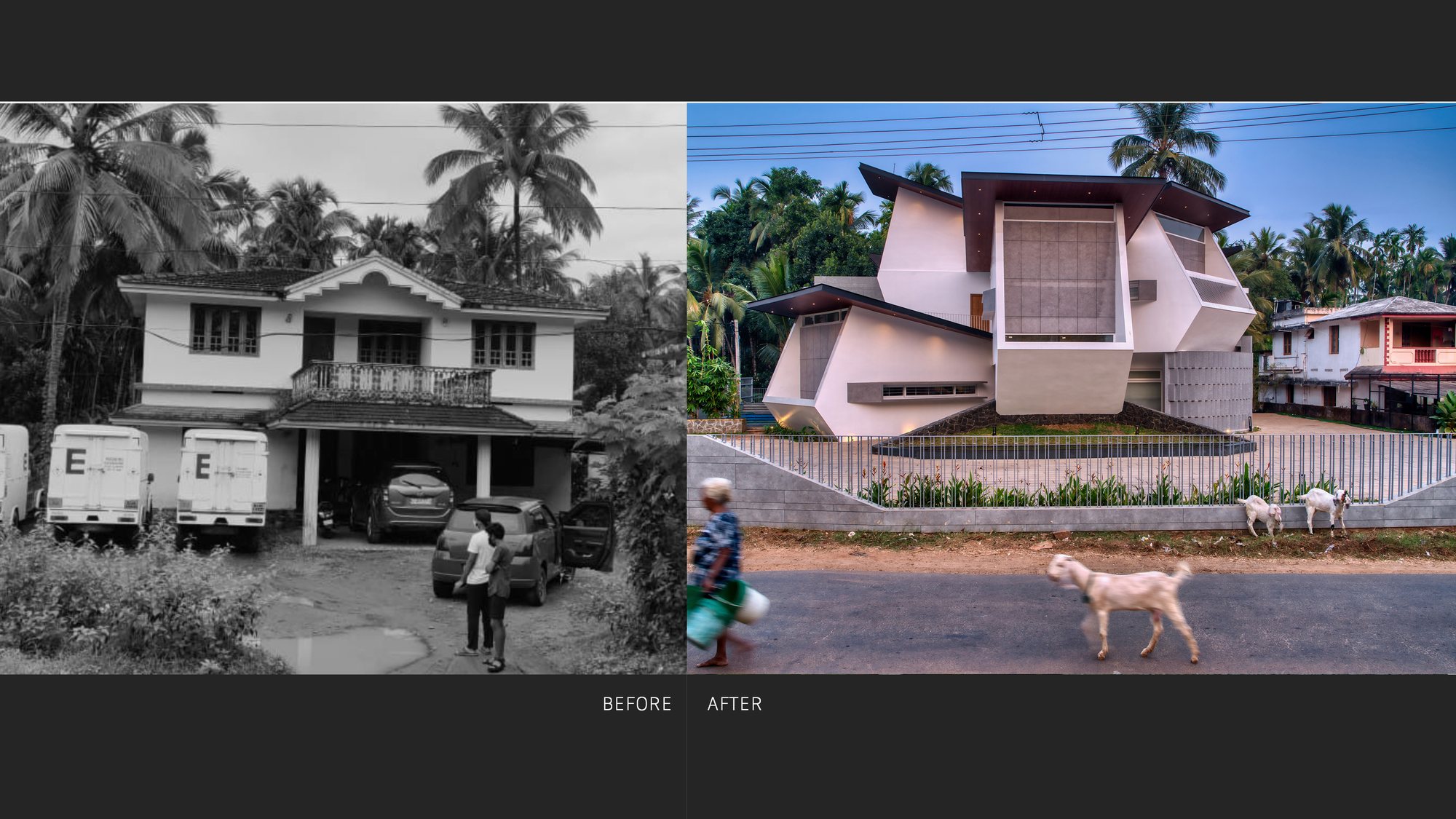
For nearly twenty years it had been an ordinary square-plan home: four walls, a tiled roof, the usual veranda. It had held birthdays and exam nights, Onam sadhyas and long power-cut evenings, the particular silence of a house where children are studying. When the family finally decided it was time for a change, the easy answer was waiting — knock it down, build the dream house in its place. Instead the architect, Clinton Thomas, took the harder road. He kept the old house. And then he changed almost everything about how it feels to live in it.
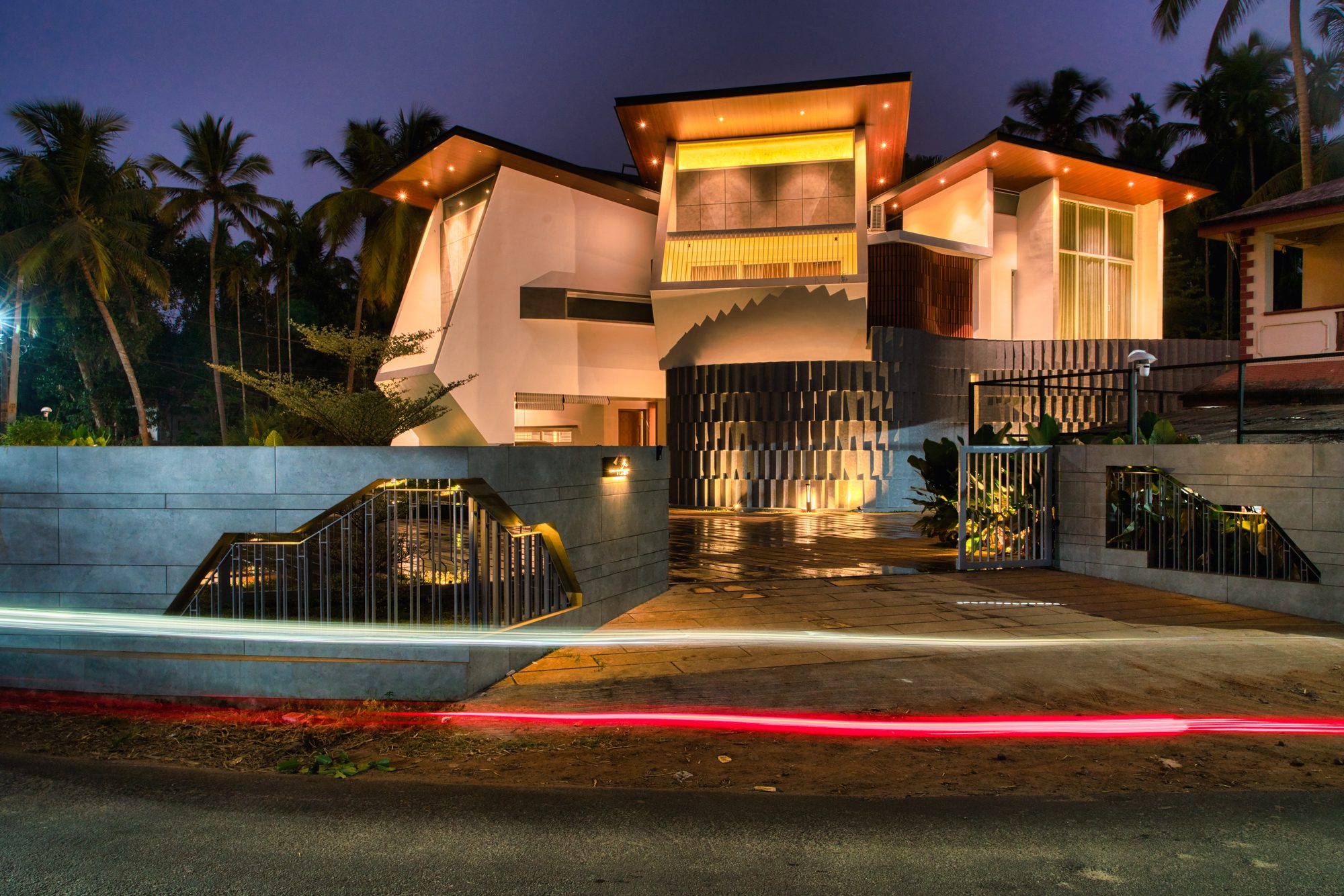
Look at the before-and-after and the nerve of the decision becomes clear. On the left, a tidy two-storey box that could be any house on any Kerala street. On the right, the same footprint reborn as a composition of folded white planes that lean and tilt and catch the evening light — sculpture you can sleep in.
The client, Mr. Jaison, is a well-known businessman whose home sits among his own commercial buildings, on a curving road that puts it on display from three sides. He needed a house that could hold a family and, now and then, a business conversation; that looked successful without shouting about it; that gave his family privacy without sealing them off from the town they belong to. His wife, a teacher, asked for one thing above all — that it stay warm. Not warm in temperature. Warm in feeling.
What follows is the story of how a renovation met all of that. But it is also an experiment in how we tell these stories. Most magazines pick one reader and write to them. We think a good building speaks to everyone at once — so we have written Skew House three times over. Once for the family who live in it. Once for the architect who will want the detail. And once for the student still learning what any of it is for.
Same house. Three ways of seeing it.
A house that grew up with the family
What you keep, what you gain, and why renovating beat starting over.
Every family home reaches a moment when love and practicality stop agreeing. The kids who needed bunk beds now need their own space. The light that was fine in 2005 feels dim. The street outside, once sleepy, is suddenly full of cars and customers. And the question arrives, the same one in every town: do we fix it, or do we flatten it and begin again?
For the Jaison family, flattening it was never quite thinkable. This was the house where three children had grown up — a daughter now married, two sons, one of them already in the family business. Twenty years of ordinary life had soaked into the walls. You cannot buy that, and you certainly cannot rebuild it. But sentiment alone doesn't keep the rain out or give a teenager a quiet corner to study, and the family knew it.
What had really changed was the world around the house. Mr. Jaison's business had grown, and the lane had grown with it, filling up with his own shops and offices. The home that once sat quietly now sat in a shop window — visible from three sides, watched by everyone who passed. The family found themselves closing curtains in the daytime. A house should not make you do that.
So the brief, when you boil it down, was wonderfully human. We want to see out without being seen in. We want light without heat. We want to feel part of the town without living on a stage. And we want it to still feel like ours.
Clinton Thomas's answer was to stop thinking of the old house as something to hide behind a fresh coat of paint, and start treating it as a rough draft worth rewriting. Before he drew a single new wall he watched: how the family actually moved through their day, where the sun landed and when, which windows the neighbours could see into. The design grew out of that watching.
You feel the result first from the street, where the familiar box is simply gone. In its place is something that seems to shift as you drive past it, planes folding over one another, confident but not loud. It is the kind of house that makes people slow down. The family, though, will tell you the real changes are the ones you can't photograph from the road.
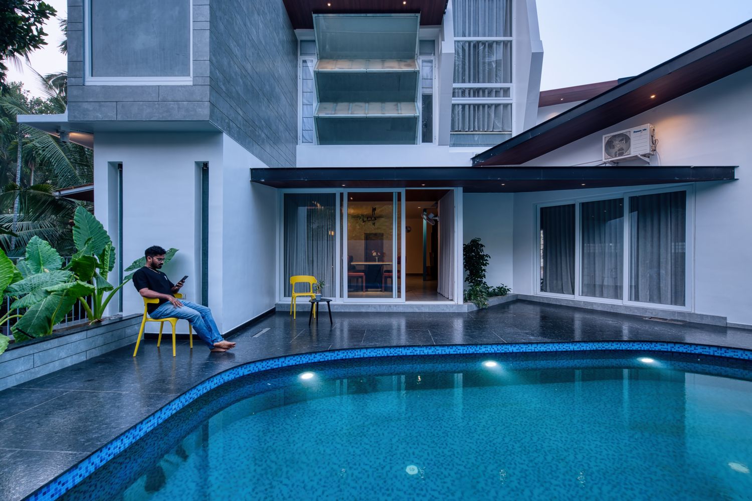
The cleverest of them is the privacy — because there is almost no wall doing it. Instead of hiding behind a tall compound boundary, the house tilts its own surfaces to block the prying sightlines while keeping the good views open. A balcony lets the family watch the life of the street without becoming part of the show. From inside, the world feels close and friendly; from outside, their private life stays politely out of frame. The curtains, finally, can stay open.
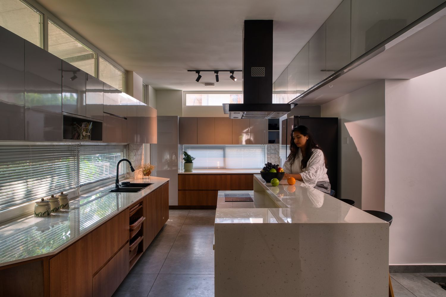
Light came back the same thoughtful way. The old square plan had been gloomy in the middle, the way those plans always are. Now the north side throws its windows open to soft, steady daylight and the evening breeze, while the hot southern side is rationed to slim horizontal slots that let the brightness in but keep the heat out. The house feels sunny without ever feeling like it's been left out in the sun.
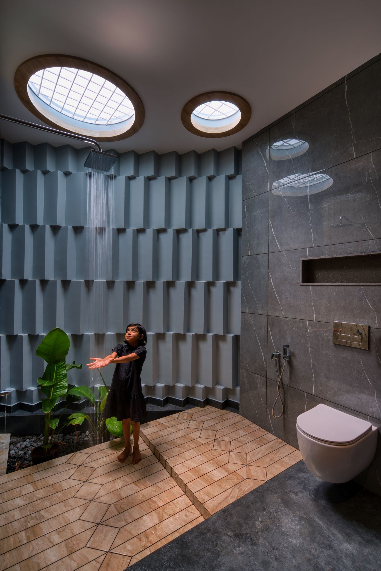
The most magical move is on the east, where a long curved wall is pierced with a pattern, so that all day it prints shifting shadows across the bedrooms behind it. Morning light comes through it soft and dappled, like sun through leaves. The family didn't ask for a feature wall. They got a sundial that decorates the house for free.
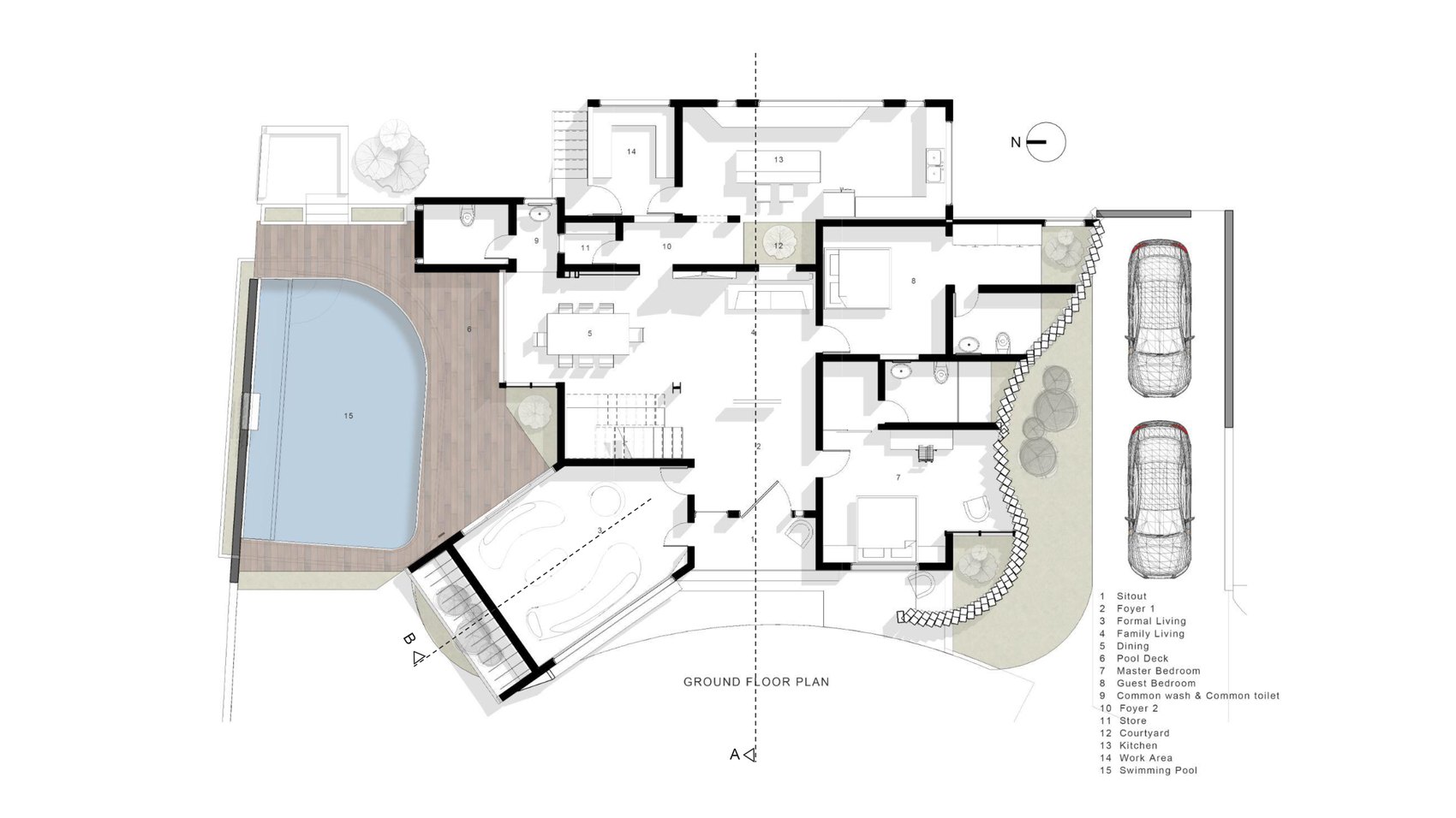
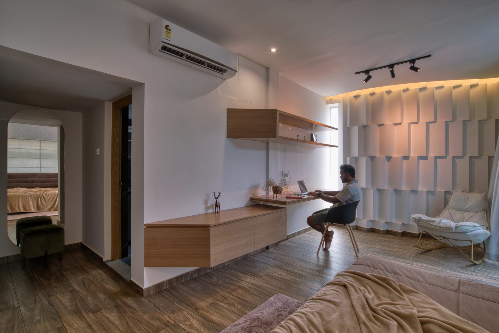
Then there is the room everyone wants to be in. The old car porch sat at a slightly different level from the rest of the house — the sort of awkward step most renovations would simply iron out. Thomas did the opposite. He turned that level change into a three-tier home theatre with stepped, stadium-style seating. The space built to keep a car dry now keeps the family together on movie nights. It has quietly become the heart of the house.
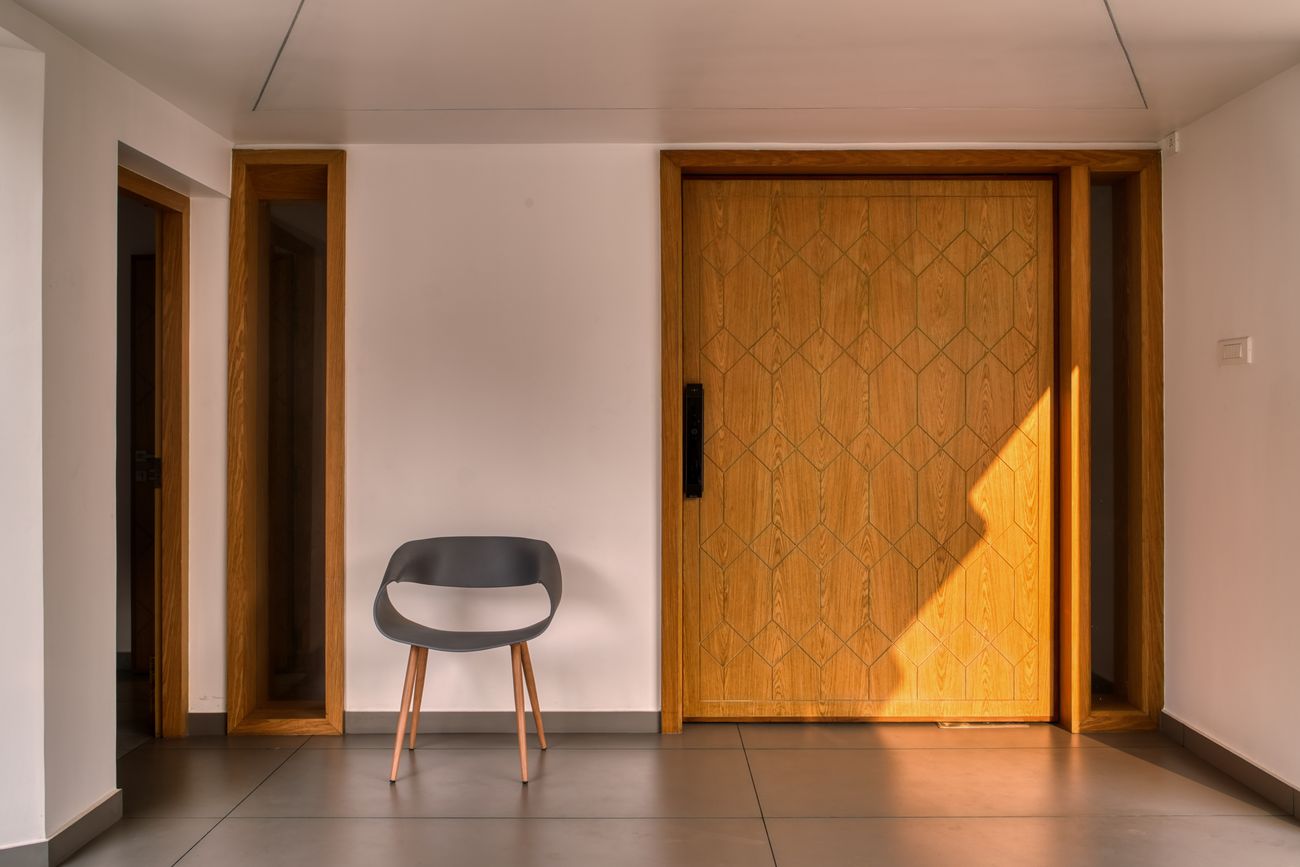
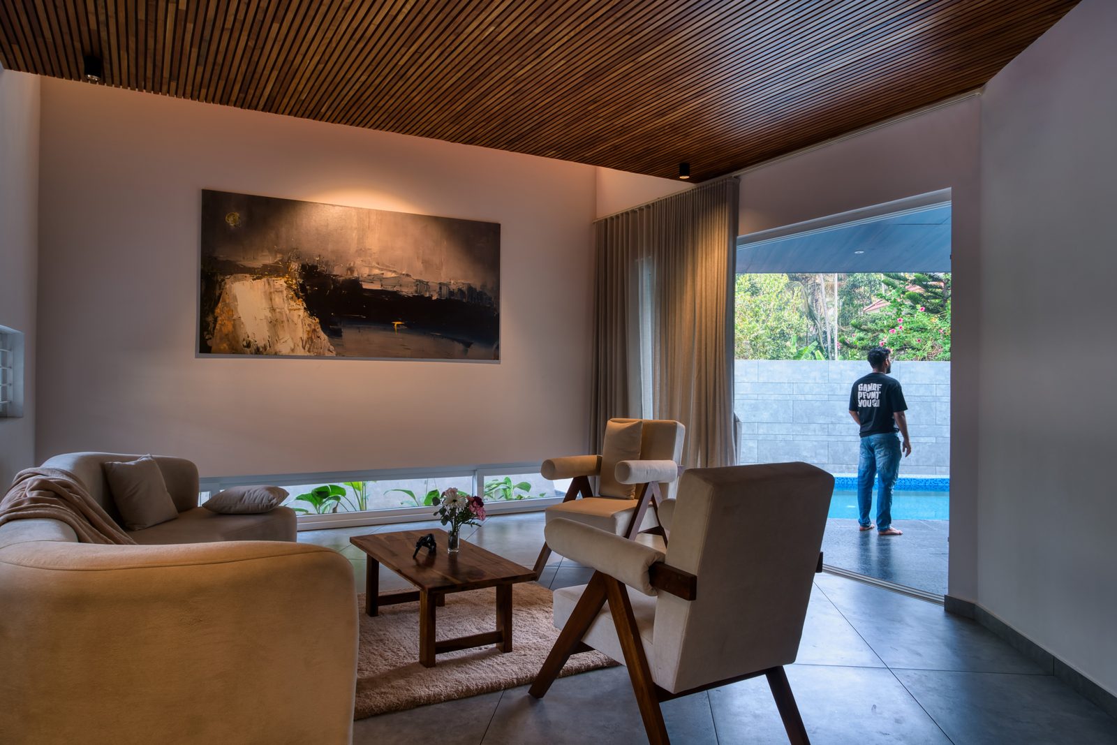
And above the formal living room, the past is hanging over your head — in the best way. The heavy teak doors from the original house, too beautiful to throw out, have been remade into the living-room ceiling. Sit under it and you are sitting under the old home, its grain and dents and history still doing their work. Guests read it as a striking design idea. The family read it as their own.
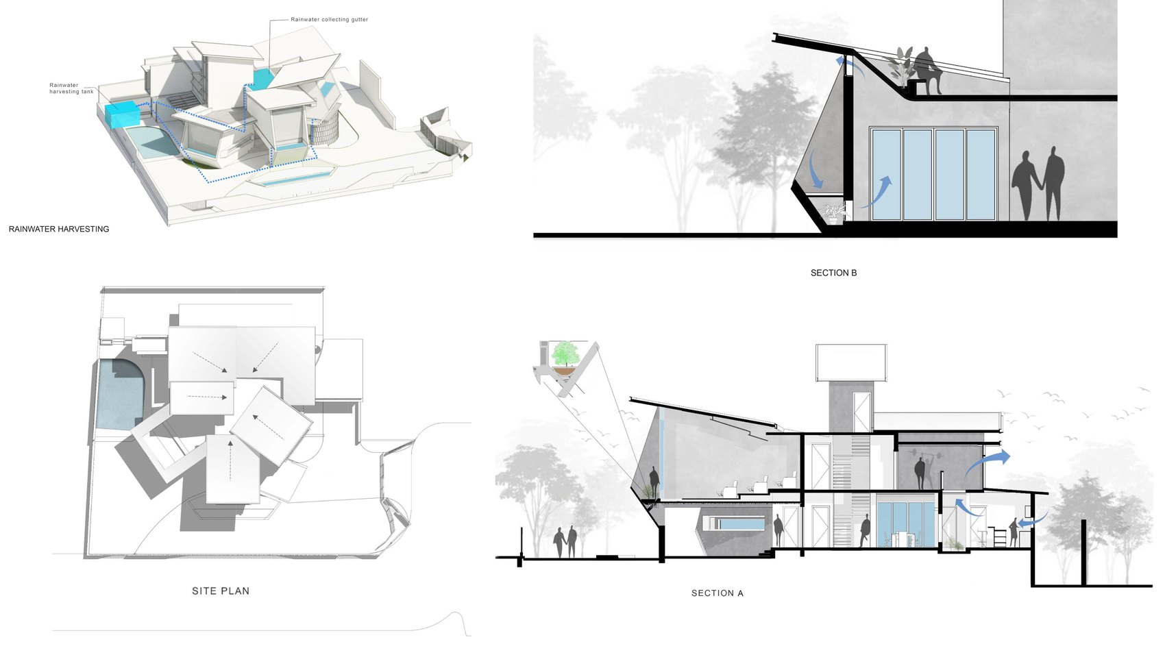
All of this turns out to be green, almost by accident. We usually talk about sustainability in panels and gadgets, but the most sustainable house is often the one already standing. By keeping the original structure, the family skipped the small mountain of waste and carbon that a full teardown would have created. The sculptural roof does its bit too: it gathers the monsoon into a hidden gutter and sends it down to a recharge well, so Kerala's heaviest rain quietly refills the ground instead of running off down the lane.
But ask the family what they love and they won't reach for litres or kilowatts. They'll talk about the pool that the house now wraps itself around; about business guests who can be received without the children's evening being disturbed; about mornings that feel green and unhurried, and that timber ceiling that still smells faintly of the house they grew up in.
If you are standing at the same fork — renovate, or rebuild — Skew House is worth keeping in mind. Done with imagination, a renovation isn't the cheaper, smaller option. It can give you a genuinely new home without asking you to throw the old one away. The greatest luxury here isn't the marble or the dramatic angles. It's the feeling of a house that grew up alongside the people in it — given a second life, and never made to forget the first.
Sculpting a house that was already there
Geometry, climate and adaptive reuse — the moves, and the reasoning behind them.
Renovation still carries a faint apology in practice — the project you take when the budget won't stretch to a new build, the brief where you make peace with someone else's column grid. Skew House is a useful corrective. It treats an existing, unremarkable house not as a constraint to be tolerated but as a block of material to be carved, and it arrives somewhere as resolved as anything built from scratch.
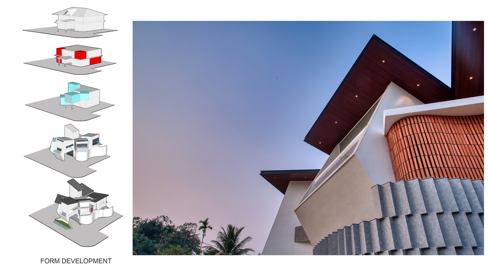
The starting point was a compact square plan, the workhorse typology of early-2000s Kerala: structurally sound, internally dim, indifferent to its surroundings. Cross-ventilation was poor, daylight stopped a few feet inside each window, and the envelope had nothing to say to a context that had since turned commercial. The site had changed under the building's feet — three public edges now, along a curving road, every opening a potential intrusion. Clinton Thomas's response was to find a single architectural language that could answer all of these problems at once, rather than bolting on a separate fix for each.
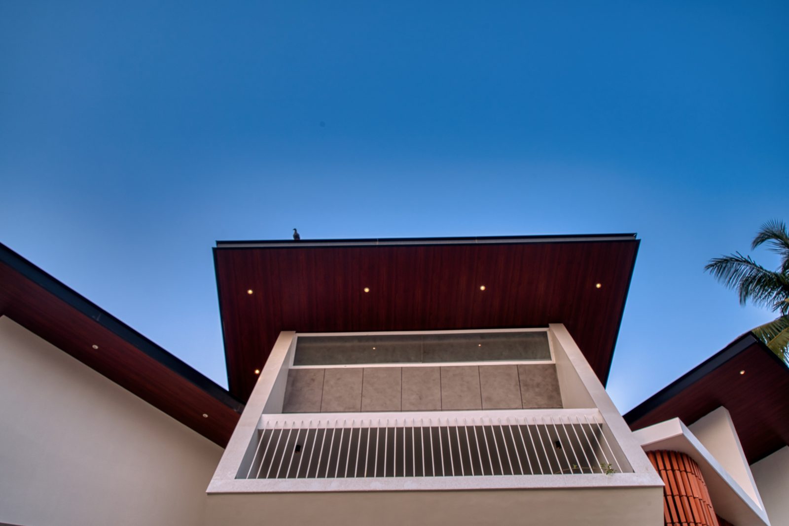
That language is the skew. A family of tilted planes wraps, extends and folds around the original structure, and the angles are doing work, not posing. They break the inherited sightlines, throw shade, carve out sheltered in-between spaces, and give the house a civic presence it never had. Because the geometry is keyed to the curving road, the elevation is never static: drive past and planes, projections and voids slide over one another and resolve into new compositions. The house reads as kinetic because it was designed against movement.
The most disciplined idea in the project is that privacy is achieved almost entirely through form. There is no fortress wall. Volumes are angled to interrupt the specific lines of sight from the street and the neighbouring buildings while leaving light and air completely free. The architecture edits the view instead of blocking it. The signature balcony is the clearest demonstration — it sits at a calibrated angle that opens a wide outward prospect while staying visually discreet from below; neither an exposed platform nor a sealed box, but a deliberately in-between condition.
Climate is handled with similar economy, and with proper respect for the tropics — restraint where a lesser project would have reached for glass. The south elevation is rationed to slim horizontal apertures, proportioned to admit usable daylight while cutting peak solar gain; their elongated profile keeps the high sun off the interior through the worst of the day. The north, by contrast, opens up — larger glazed areas for diffuse light and stack ventilation. Orientation, not symmetry, decides how each face behaves.
The east extension is the project in miniature: a gently curved wall, perforated in a repeating pattern, that does four things with one gesture. It softens the rigidity of the original square, filters direct sun into the bedrooms and bathrooms behind it, drives ventilation, and prints a slow theatre of light and shadow across the interior through the day. It is enclosure, brise-soleil, privacy screen and ornament at once — a single element earning its keep four times over.
Inside, the same instinct governs the plan: amplify what exists rather than erase it. The most-cited example is the old car porch, which sat at its own level. Rather than flatten that to a uniform datum — structurally fiddly, and a waste of a gift — Thomas read the level change as latent section and built a three-tier home theatre with stadium seating into it. A renovation headache became the most memorable room in the house. That is the central lesson of adaptive reuse stated in one move: the existing condition is usually the idea.
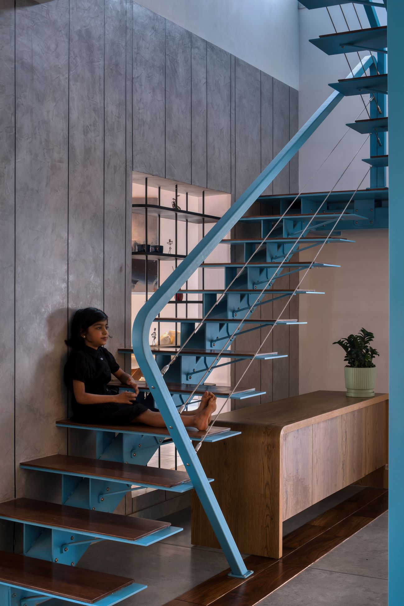
Materially, the building runs two registers at once. Outside it is unapologetically contemporary; inside it keeps the memory of the older house deliberately alive. The clearest instance is the reuse of the original teak entrance doors as a sculptural ceiling over the formal living room. Their weathering carries a warmth no new joinery could fake, and the gesture turns material reuse into narrative — the timber has stopped being a door and become an emotional datum tying the two houses together. Elsewhere, board-marked concrete, a slim steel spiral stair and a restrained palette keep the contemporary work honest.
These are environmental decisions as much as aesthetic ones. Adaptive reuse remains one of the strongest available levers on embodied carbon: by retaining the primary structure, Skew House avoided most of the demolition waste and material draw of a teardown, and compressed the programme. The sustainability here isn't a bolt-on technology — it's the founding decision to keep rather than replace.
Water closes the loop. The sculptural roofscape, the building's most photographed feature, is also its rain machine. The inclined planes are pitched to collect the monsoon and feed it into a reinforced-concrete gutter concealed within the composition, from where it is led to a recharge well — seasonal rainfall returned to the aquifer instead of shed as runoff. The roof is landmark and infrastructure in the same form.
That fusion of performance and expression runs through the whole project, and it is probably no accident that Thomas also works as a sculptor. This is not architecture wearing a sculptural costume; it is sculptural method applied to building — form negotiated through balance, proportion and subtraction, with function setting the terms. The geometry never wins an argument against comfort or climate.
For practitioners, the takeaway is a shift in posture. Renovation is not new-build with the volume turned down; it asks the opposite reflex. The work is to read the latent possibilities in what's already standing — every retained wall, every odd level, every salvageable material — and to treat the act of keeping as a form of authorship. Skew House succeeds because it never apologises for being a renovation. It edits the past rather than deleting it, and the result is contemporary, climate-tuned and quietly rooted in memory.
What a constrained site can teach you
The design-thinking lesson hiding inside the angles.
Studio usually begins with a blank page and an empty site. Dream big, the brief says; nothing is in your way. It is wonderful training for the imagination and slightly misleading about the job, because real practice almost never hands you an empty site. It hands you a building with a history, a budget with a wall, a climate with opinions, and a family already living their lives inside the problem.
Skew House is a good teacher precisely because it had all of those and made something extraordinary anyway. Its lesson isn't in the dramatic angles — it's in the order of the decisions that produced them. Strip the photography away and what's left is a sequence of careful, unglamorous choices. Thinking first; drawing second.
Lesson one is the very first decision: not to demolish. Most of us, early on, equate the best design with the newest building; an existing structure looks like a cage around our creativity. Thomas saw a house that was sound and loved, and changed the question. Not "what can we replace?" but "what deserves to remain?" That single swap reframes everything. Once keeping is part of the brief, design becomes editing — and every retained wall turns from obstacle into prompt. The most interesting projects you'll do rarely come from total freedom. They come from constraints you've learned to negotiate.
Lesson two is to look before you draw. Before any form appeared, the architect studied how the site actually behaved — the three exposed edges, the curving road, the neighbours' windows, the family's quiet worry about being watched. And then, instead of answering privacy with a taller wall, he let the building itself become the answer.
Which leads to the lesson worth tattooing somewhere: never separate problems you can solve together. The skew that gives Skew House its identity also redirects views, filters the sun, buys privacy and announces the house to the street — one move, four jobs. Beginners solve problems one at a time and end up with a building that is a list of solutions. Stronger designers look for the single move that answers several at once. That's not a style. It's an economy of thought, and you can practise it.
Climate carries the next lesson, and it's a warning. The images we grow up admiring are full of glass and openness, photographed in mild countries and quietly disastrous in ours. Skew House does the grown-up thing instead: windows placed by orientation, not by composition — slim slots to the hot south, generous openings to the kind north. The point is bigger than this one house. Climate isn't a problem you tidy up after the design is finished; it's a generator you design with from the first sketch. Build with the sun, wind and rain and your building stays comfortable long after the fashion that produced it has dated.
The east wall teaches the same idea from the other direction. It looks, at first, purely decorative — a pretty perforated screen. Look again and it's filtering harsh light, moving air, softening the old square geometry and casting that slow shadow-play inside. What reads as ornament is doing real work. Learning to see the function hidden inside the beautiful gesture — and to hide function inside beauty in your own work — is a large part of what separates architecture from construction.
Materials hold a quieter lesson. We're trained to specify the new — to express ourselves through fresh finishes. Skew House makes the case for the opposite: the salvaged teak doors, reborn as a ceiling, carry a weight of memory and meaning that no money could buy off a catalogue. Reuse here isn't only an environmental tick. It's a way of building memory into a place. Keep that in your pocket; you'll need it more than another material board.
The home theatre is the constraint-as-gift lesson made literal. That awkward change in level could have been demolished flat. Instead it became the family's favourite room. Train yourself to ask, in front of every inconvenient existing condition, not "how do I remove this?" but "what could this become?" Constraints aren't interruptions to creativity. Very often they are the source of it.
And then the deepest lesson, the one about form. It would be easy, knowing the architect is also a sculptor, to assume the angles came from an artist chasing a shape. They didn't. Trace any tilted plane back and you reach a reason: the geometry comes from privacy, the roof slopes from rainwater, the window proportions from the sun. The house looks sculptural because it solved real problems with grace. That's the right order. Form should fall out of structure, climate, movement and human use — not get imposed first and justified later. When performance shapes the geometry, beauty arrives as a consequence, which is the only way it ever really convinces.
Last, Skew House quietly insists that you design for people, not for the camera. So much architecture now is made to photograph well and live in poorly. The success here isn't in the hero shot. It's in the family folding into the stepped seating on a wet evening, in morning light moving across that patterned wall, in conversations on a balcony no passer-by can quite see. None of it wins likes. All of it is the actual point.
If you take one thing from this project into studio tomorrow, take this: the architect's real gift isn't dreaming up what doesn't exist. It's the patience to see what's hidden inside what already does — and the discipline to set it free.
When a house chooses evolution over erasure
We see a lot of new houses. It is rarer, and quietly braver, to see one that decided not to be new. Skew House could so easily have been a teardown — the budget was there, the plot was prime. Instead Clinton Thomas kept the old bones and rethought the life around them, and the gamble pays off not because the result is dramatic, though it is, but because every dramatic move has a reason underneath it.
What stayed with our editorial team is how many opposites the house holds in balance. It is bold and restrained, open and private, sharply contemporary and deeply sentimental, all at the same time. The angles never tip into theatre because they are answering climate, context and family life; the sustainability never preens because it's built into the founding decision rather than bolted on at the end. The reclaimed teak ceiling, the car-porch cinema and the rain-harvesting roof aren't features on a list. They're the argument.
For a homeowner, Skew House gently dismantles the assumption that rebuilding always wins. For an architect, it's a masterclass in designing through constraints instead of around them. For a student, it's a clean demonstration that observation and empathy, applied with discipline, make better buildings than free invention ever does.
We believe the best architecture doesn't just add a building to the world — it adds a possibility. Skew House does exactly that, without raising its voice. It reminds us that the future of the Indian home may not always start with a clear site, but with the nerve to find the extraordinary hiding inside the ordinary.
An exemplary piece of adaptive residential architecture, where memory, climate, craft and contemporary design meet in a home that feels both timeless and unmistakably of its moment.
The architect
Behind the projectAn award-winning architecture and interior-design studio that treats every project as a work of art — blending art, architecture and design into spaces meant to evoke emotion, not just enclose it.
- Best Innovative & Futuristic Architect — India Design Award 2024 (Ar. Clinton Thomas)
- Multiple award-winning studio since 2016
The house in detail
Photographs & drawings