
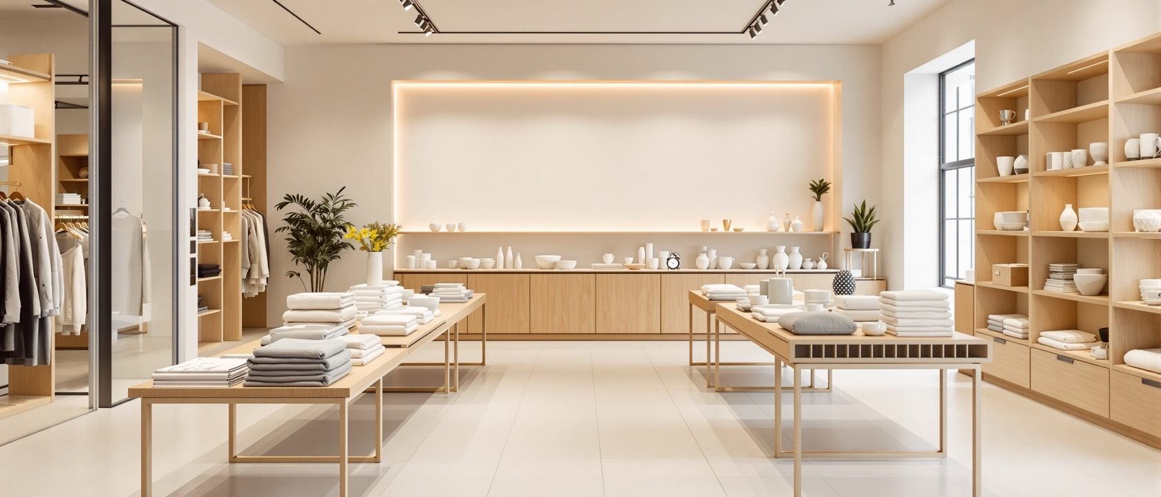
Store Planning & Facade
Designing for how people actually move
Store planning designs the whole store — layout, zones, circulation, flow — as a machine for shopping, grounded in how people actually move, not guesswork. This unit teaches its purpose and principles and store types, the external facade and signage that decide who walks in, and the store-planning concepts: the decompression zone, the power wall, the arena principle, traffic flow and aisles — and the ethical line, to guide the shopper, never to disorient them.
Learning objectives
By the end of this lesson, you will be able to — mapped to the course outcomes for Visual Merchandising:
Explain the purpose and principles of store planning and store types.
Apply the store-planning concepts — decompression zone, power wall, arena, traffic, aisle.
Plan a store layout and facade grounded in real shopper behaviour.
Store planning & the facade
Store planning lays out the whole store — zones, circulation, flow — to draw people in, guide them past merchandise and lead them to the till, while serving them well. Store types each have their logic, and the facade and signage present the store’s face and decide who walks in.[1, 2]
The whole store as a machine to shop
STORE PLANNING is designing the whole store — its layout, zones, circulation and flow — so that it works as a machine for shopping. Its PURPOSE: to draw shoppers in, guide them past the merchandise, make everything findable, maximise the product they see and the time they comfortably spend, and lead them to the till — all while expressing the brand and serving the customer well. Its PRINCIPLES: a clear, legible layout; a considered CIRCULATION that guides without confusing; well-judged ZONES (entry, main floor, features, fitting rooms, till, back-of-house); and a flow matched to the goods. And a STORE SELECTION procedure — choosing the right site, size, frontage and location — comes first, because the best plan cannot fix the wrong shop. Store planning is where VM becomes architecture: the design of the space itself, not just the displays within it.[1, 2]
The store-planning concepts
The concepts are grounded in real shopper behaviour: the decompression zone (where product is missed), the power wall (the right-hand wall as a retail convention — the “always turn right” rationale is folklore), the arena principle (tiered, all visible), traffic flow (grid, free-flow, loop) and the aisle. Explore each in the store-planning explorer.[1, 3]
Store-planning explorer · design for how people move
Decompression zone
- What:
- The first few feet inside the entrance — the 'transition zone' or 'landing strip' — where a shopper adjusts from the street to the store.
- Why it works ·
- Shoppers take little in here while they orient, so merchandise placed in it is systematically underexposed and missed.
- Note:
- Keep it open, uncluttered and welcoming — and don't waste your best product, signage or displays in the zone people walk straight through without really seeing (Underhill).
Every concept is about serving the shopper’s real behaviour — guide them helpfully, never disorient them.
Design for how people really move
The heart of this unit is a set of store-planning CONCEPTS grounded in how people ACTUALLY shop — hard-won from watching real shoppers, not guessed. The DECOMPRESSION (or transition) ZONE: the first few feet inside, where shoppers adjust and take little in, so key product placed there is missed (keep it open). The POWER WALL: the right-hand wall just past the entrance, treated by retail convention as prime display space — though the popular reason given for it, that shoppers reliably turn RIGHT on entering ('the invariant right'), is folklore, not evidence: controlled studies find entry turning closer to a coin-flip (Kim et al., 2022), so treat the right-hand wall as a feature zone only where your own entrance and sightlines justify it. The ARENA PRINCIPLE: tiered, stepped display so ALL merchandise is visible from the front. TRAFFIC FLOW: the layout — grid, free-flow or loop — that guides customers past the goods at the right pace. And the AISLE: walkways wide and clear enough to move, pass and browse comfortably (and accessibly). Explore each in the store-planning explorer — and note that every one of them is about SERVING the shopper's real behaviour, which is exactly where good planning and honest design meet.[1, 3, 4]
At a glance
| Aspect | The fact | The folklore |
|---|---|---|
| Store planning designs | The whole store as a machine to shop — layout, zones, flow | Just where to put the shelves |
| It comes grounded in | How people ACTUALLY move — watched, not guessed | The designer's taste alone |
| The decompression zone | The entry where shoppers adjust — keep it open, product is missed here | Prime spot for your best product |
| The power wall (right-hand wall) | A retail convention — use it where YOUR sightlines justify it; the 'always turn right' reason is folklore (turning ≈ coin-flip) | Prime because shoppers always turn right |
| Traffic flow (grid/free-flow/loop) | Guides shoppers past merchandise at the right pace — to fit the store | Doesn't matter |
| The ethical line is | GUIDE the shopper helpfully — never DISORIENT (Gruen disowned that) | Whatever sells most, however |
Key terms
Designing the whole store — layout, zones, circulation and flow — as a machine for shopping that draws people in, guides them past merchandise and leads them to the till, while serving them well.
The transition zone just inside the entrance (Underhill's 'landing strip') where shoppers adjust and take little in — so key product placed there is systematically missed.
The right-hand wall past the entrance, treated by retail convention as prime display space. The popular 'shoppers always turn right' rationale (the 'invariant right') is folklore — peer-reviewed studies find entry turning closer to a coin-flip (Kim et al., 2022) — so use it where your own sightlines justify it.
Arranging merchandise in tiers or steps, like an amphitheatre, so all of it is visible from the front rather than hidden in the back rows.
The path the layout leads shoppers along — grid (efficient), free-flow (exploratory) or loop/racetrack (guided past all zones) — chosen to fit the store and goods.
The disorienting effect of a deliberately confusing layout that prompts impulse buying — named after Victor Gruen, who disowned that cynical use; the marker of VM's ethical line.
Study task
Take a real store (or a plan of one) and audit its layout against the store-planning concepts. Mark the decompression zone just inside the entrance — is it kept open, or is good product wasted there? Find the power wall to the right of the entrance — is it used for a strong, high-impact display? Trace the traffic flow (grid, free-flow or loop) — does it guide shoppers past the merchandise, and does it suit this store type? Check the aisles — are they clear and wide enough to move, pass and browse comfortably, and would a wheelchair or pram get through? Note where the arena principle could make more product visible. Then redraw the plan to fix the three weakest points. Finally, write one line on the ethical line: how your plan guides the shopper helpfully rather than disorienting them. The goal is to plan a store for how people really move.
Self-assessment
1. What is store planning?
2. How should you treat the 'power wall' and the 'shoppers always turn right' rule?
3. What should you do with the decompression zone?
4. Where is the ethical line in store planning?
Recap
References & further reading
- [1]Swati Bhalla & Anurag Swati, Visual Merchandising, McGraw Hill, New Delhi, 2010 — store planning, store types and facade. https://www.mheducation.co.in/
- [2]Store planning, store types and the external facade and signage (retail-design references). https://www.wgsn.com/
- [3]Paco Underhill, Why We Buy: The Science of Shopping — the transition/decompression zone (a field observation), the much-quoted but unverified 'invariant right', and the Gruen effect (Victor Gruen). https://en.wikipedia.org/wiki/Gruen_transfer
- [4]Peer-reviewed store-traffic research (e.g. Kim et al., 2022) — entry turning is closer to a coin-flip and is shaped by entrance position, layout and local walking side, not an innate rightward bias; this is why the popular 'invariant right' claim behind the power wall is treated here as folklore.
Further reading
- Swati Bhalla & Anurag Swati, Visual Merchandising, McGraw Hill, New Delhi, 2010.
- Paco Underhill, Why We Buy: The Science of Shopping.
- Reji Mathew, Apparel Merchandising, Book Enclave, New Delhi, 2008.
Sources gathered and fact-checked June 2026. Published values vary by source, sample and method — treat as indicative and confirm against the cited standard before structural use.
The author
Amogh N P
Architect, interior designer, and creative polymath. Studio Matrx began in his notebooks — his vision of design made honest, useful, and open to everyone. Its Academy is written and taught in his memory, and free, forever.
More about Amogh →