
The world has five tones, and you need three
Squint at anything — a street, a room, a face — and the detail vanishes. What is left is a small number of masses: some light, some dark, a few in between. That reduction is not a loss of information. It is the information. Everything you do in A2 is about getting those masses right, and everything else is decoration on top of them.
Five tones is a working vocabulary
You do not need a twelve-step value scale. Under a clock, five is generous and three is usually the answer.
White — the paper, untouched. Your brightest note, free and unrepeatable. Light — a whisper of tone. Mid — the workhorse; most of most drawings. Dark — where the shadows group. Black — the accent. One or two places only.
The discipline is to assign every part of your scene to one of these and refuse the in-between. The failure mode is a page where everything drifts toward mid-tone, because that is what happens when you shade what you see without deciding what it is. A page of near-mid-tones reads as grey mush from three metres — the same mush A1 produced with twelve colours at the same value, arriving now through a different door.
Three of the five, used decisively, will out-read all five used tentatively.
Group the darks, or they become confetti
This is the single most useful instruction in tonal drawing and it is almost never taught.
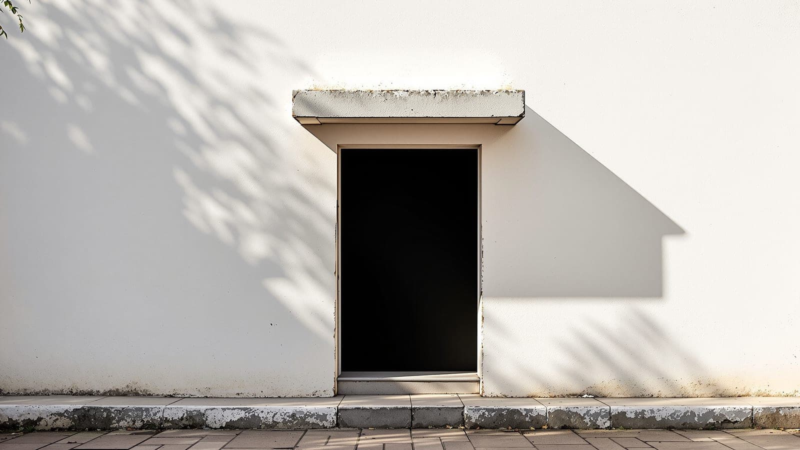
Look at a scene and you will find dark in dozens of places — under the eaves, in a doorway, beneath a car, in a window. Render each one faithfully where you see it and you get confetti: a page speckled with unrelated dark patches, busy and structureless, reading as noise.
Now squint. Many of those darks merge. The shadow under the eave joins the dark of the doorway which joins the dark of the window, and together they make one shape. That shape is a compositional element — it has form, it has edges, it can be placed. It is doing the work that a dominant mass does in A3.
So the instruction is: find the big dark shape and commit to it. Let separate darks merge into one another where the squint says they merge. Resist the urge to preserve the little light gaps between them — that urge is accuracy fighting composition, and composition should win, because composition is what is being marked.
A drawing with one big grouped dark, one clear light, and a mid-tone holding them apart is already most of the way to working, whatever the subject.
Where the light comes from, and why you must decide
One decision organises all of this: pick a light direction and be ruthless about it.
This sounds obvious and it is routinely ignored, because candidates draw each object as they understand it rather than as the light finds it. The result is a page where the tree is lit from the left, the building from the right, and the ground from nowhere in particular. Every element is individually plausible and the page reads as incoherent, and nobody can quite say why.
Deciding a light direction gives you three things immediately. It tells you which planes are light and which are dark, which is most of your value assignment done in one stroke. It gives you cast shadows, which are the cheapest way to sit an object on the ground rather than float it. And it groups your darks for you — everything facing away from the light belongs to the same family and can merge into that one big shape.
Under time this is not a refinement, it is a shortcut. One decision in the first minute removes a hundred small decisions later.
The rules behind this
Sourced to the official brochure rather than restated here, so there is one place to correct when the Council revises it.
Part A is three questions: A1 Composition and Colour (25), A2 Sketching and Composition in Black and White (25), A3 3D Composition (30).
Eighty marks across three questions means each is worth roughly 13% of the whole exam. There is no salvaging a bad question by volume, the way a 50-question paper allows.
Source · verified 2026-07-16
What almost everyone believes
“I should shade each object accurately, the way it actually looks.”
Accuracy per object produces confetti. Squint, let the darks merge into one shape, and commit to that.
Rendering each dark faithfully where you observe it scatters unrelated patches across the page — individually correct, collectively noise. The squint shows that many of those darks read as a single mass, and that mass is a compositional element with form and placement. The urge to preserve the little light gaps between them is accuracy fighting composition, and composition is what is being marked. It is also faster: one grouped dark takes less time than fifteen separate ones.
Depending on how long you have
Foundation
Understand the skill. Months out, or starting from zero.
Practise reducing rather than rendering. Take a photograph and redraw it in exactly three values — no more — in five minutes. It will feel brutal and crude. Do it a hundred times. You are learning to see masses instead of things, which is the whole of tonal drawing and takes months to become automatic.
Drill
The practice protocol. What to repeat, how often, how to score it.
Every attempt starts with a three-value thumbnail, thirty seconds, no detail. If the thumbnail does not read, the finished drawing will not either — and you have found out for the price of thirty seconds. Check whether your darks group into a shape or scatter into confetti; that is the number to watch.
Exam-Day
What to actually do under the constraint — 108 seconds, no instruments, one pass.
Decide the light direction in the first minute and never contradict it. Find your one big dark shape and commit to it — let the separate darks merge. Keep the paper for your lights. Three decisive values will beat five tentative ones, and you will finish, which is worth more than either.
Try it
Twenty minutes. The three-value constraint is the entire point — do not cheat it.
- 01Find a photograph of a street or a building with strong light.
- 02Squint at it until the detail disappears and only masses remain. Note where the darks merge.
- 03Draw it in exactly three values: white paper, one mid, one dark. Five minutes. No in-betweens.
- 04Now do it again in five values, ten minutes. Compare.
- 05Look at both from across the room. If the three-value version reads better — and it usually does — that is the lesson, and it is worth more than any amount of shading technique.
The short version
Squint and the world collapses into five tones; three used decisively out-read five used tentatively, and everything drifting toward mid-tone is the same grey mush A1 makes with twelve colours. Group your darks into one big shape and let them merge — the urge to keep the light gaps between them is accuracy fighting composition. Decide a light direction in the first minute: it assigns your values, gives you cast shadows, and groups your darks for free.
Next: perspective without instruments — because you are not allowed a ruler, and freehand is the only option you have.
Questions people actually ask
- How many values should I use in a NATA A2 drawing?
- Three, decisively, is usually better than five tentatively. A working vocabulary is white (the paper), light, mid, dark and black — but the discipline is assigning everything to one of them and refusing the in-between. A page where everything drifts toward mid-tone reads as grey mush from three metres.
- Why does my tonal drawing look busy and noisy?
- Almost certainly because your darks are scattered rather than grouped. Rendering each shadow faithfully where you see it produces confetti — dozens of unrelated dark patches. Squint: many of them merge into one shape. Commit to that shape and let the small light gaps between them go.
- Do I need to decide where the light is coming from?
- Yes, in the first minute, and then never contradict it. It assigns most of your values in one stroke, gives you cast shadows that sit objects on the ground, and groups your darks for you. Without it, each element is individually plausible and the page reads as incoherent.