The cheapest depth you will ever buy
Take any drawing made entirely of same-weight lines and thicken the ones at the front. That is it — no extra strokes, no extra minutes, nothing added to the page. The drawing now has depth. Line weight is the highest return on effort available anywhere in Part A, and most candidates draw for years without ever using it deliberately.
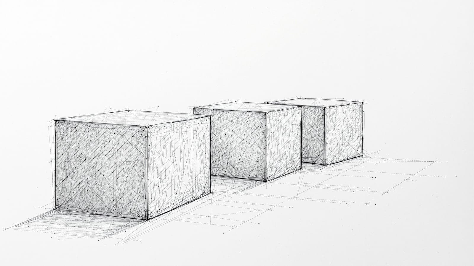
Constant weight is a wire diagram
When every line on a page is the same thickness, every edge claims equal importance, and the eye reads the result as a diagram rather than a space.
This is the same failure as six equal blocks in A3 and twelve equal colours in A1, arriving through a third door. Uniformity is the absence of a decision. A drawing where nothing is emphasised has told the eye nothing about what matters.
What makes it worth its own lesson is the cost. Fixing hierarchy in A3 means rebuilding. Fixing it in A1 means re-planning the palette. Fixing it in A2 means pressing harder on some lines than others, which takes no additional time at all. You are already drawing the line. Whether it is heavy or light is free.
What weight signals
Three conventions do almost all the work, and they compound.
Weight is proximity. Heavier lines come forward, lighter lines recede. Thicken the near edges and thin the far ones and you have aerial perspective without drawing any perspective at all. This alone will transform a flat sketch.
Weight is importance. The heaviest line on the page is where the eye goes. So your focal point should carry your heaviest line, in agreement with your darkest value — the same principle as A1's saturation accent, in a different currency.
Weight is light. An edge in shadow reads heavier; an edge in light reads thinner or breaks up entirely. A line that fades out where the light hits it does more for the illusion of light than a great deal of shading.
And a corollary most people miss: not every edge needs a line. Where two areas of similar value meet, the edge can be left out entirely and the eye will supply it. Leaving a line out is a decision, and it reads as confidence. Drawing every edge you can see is what makes work look laboured.
Confidence is legible, and it is buildable
There is something slightly unfair about drawing: the mark records how it was made. A line drawn in one committed stroke looks different from the same line assembled from six tentative ones, even when they end up in exactly the same place.
The hesitant version is fuzzy, doubled, and searching. It says the person did not know where the line was going. The committed version is single and clean, and it says the opposite — and an examiner reads that in a fraction of a second without consciously registering why.
This is trainable, and it is trained in a specific and slightly uncomfortable way: draw longer lines, faster, from the shoulder rather than the wrist, and accept that some will be wrong. A confident wrong line is worth more than a timid right one, because you can draw over a wrong line and nobody can rescue a page made of fur.
Under a 25-minute clock this compounds. Committed lines are faster. So the same habit buys you both the look of confidence and the time to finish — which is the second time in this module the better-looking option has also been the quicker one.
The rules behind this
Sourced to the official brochure rather than restated here, so there is one place to correct when the Council revises it.
No instruments are permitted — no compass, no set squares — and no calculators, phones, or wet media.
Appendix-II states "Don't bring any instruments". Also barred: Bluetooth devices, slide rules, log tables, electronic watches with calculators, and any textual material. Numerical Ability is examined without a calculator.
Source · verified 2026-07-16
What almost everyone believes
“I should draw carefully and accurately, correcting lines until they are right.”
A committed wrong line beats a timid right one. Correcting produces fur, and fur cannot be rescued.
A mark records how it was made — a line built from six searching strokes reads as hesitation regardless of where it ends up, and examiners register that instantly without needing to articulate it. Accuracy assembled from tentative marks looks worse than a confident line slightly out of place, and it is slower, which matters when you have 25 minutes. Draw from the shoulder, commit, and draw over what is wrong. You can always add a line; you cannot remove hesitation.
Depending on how long you have
Foundation
Understand the skill. Months out, or starting from zero.
Fill pages with long single strokes — straight lines, ellipses, curves — drawn from the shoulder, fast, no correcting. It is dull and it is the fastest way to buy line quality. You are training your arm, not your eye, and arms take months. Start now and it will be free by August.
Drill
The practice protocol. What to repeat, how often, how to score it.
Take a finished sketch and redraw it changing only line weight: heavy at the front, light at the back, heaviest at the focal point, edges dropped where values match. Compare the two. The gap is what deliberate weight is worth, and it will be bigger than you expect for zero extra effort.
Exam-Day
What to actually do under the constraint — 108 seconds, no instruments, one pass.
One committed stroke per line — draw over a wrong line rather than fixing it, because a page of fur cannot be rescued and a wrong line can. Heavy at the front, heaviest at the focal point, and leave out the edges where values match. It costs nothing and it is the fastest depth available to you.
Try it
Fifteen minutes. This one changes drawings immediately, which is rare.
- 01Draw any simple scene using only same-weight lines. Twenty strokes maximum.
- 02Now redraw it. Same scene, same twenty strokes, but: near edges heavy, far edges light.
- 03Add one more pass: make the single heaviest line the thing you want looked at first.
- 04Third version: leave out every edge where two similar values meet. Fewer lines, not more.
- 05Lay all three side by side. Same subject, same time, same stroke count — and the third will look like a different person drew it.
The short version
Constant line weight is a wire diagram — uniformity is the absence of a decision, arriving through a third door. Weight signals proximity, importance and light, and it is free: you are drawing the line anyway. Draw from the shoulder in single committed strokes, because a mark records how it was made and hesitation is legible. Leave out edges where values match. The confident version is also the faster one.
Next: value structure — reading any scene as five tones, and why three of them are usually enough.
Questions people actually ask
- How do I make a sketch look three-dimensional without shading?
- Vary the line weight. Heavier lines come forward, lighter lines recede, so thickening near edges and thinning far ones gives you depth with no extra strokes and no perspective construction. It is the highest return on effort in Part A and it costs nothing, because you are drawing the line either way.
- Should I correct lines that come out wrong?
- Draw over them rather than correcting them. A line assembled from repeated searching strokes reads as hesitation no matter how accurate it ends up, and a page of fur cannot be rescued. A confident line slightly out of place is worth more, and it is faster — which matters under a 25-minute clock.
- Do I need to draw every edge I can see?
- No, and drawing them all is what makes work look laboured. Where two areas of similar value meet, the edge can be left out and the eye will supply it. Omission is a decision and it reads as confidence.