
Graphics & Signage for Exhibits
Environmental graphics that are read, not just seen
A designed world speaks in words and symbols too. Signage and exhibit graphics are environmental graphic design — graphics designed into a built space, part of the architecture. Signs do distinct jobs — identification, directional, information, regulatory — and wayfinding is designed navigation through paths, landmarks and decision points, not just more signs. And legibility is measurable: letter height against viewing distance, contrast, clear type. A beautiful sign no one can read has failed — the aesthetics serve legibility.
Learning objectives
By the end of this lesson, you will be able to — mapped to the course outcomes for Set Design:
Explain environmental graphic design and the kinds of signage in built and mediated space.
Design wayfinding — paths, decision points and signs — so people navigate without a map.
Apply the rules of legibility — letter height, contrast and viewing distance — and clear hierarchy.
Graphics in built space
Signage and exhibit graphics belong to environmental / experiential graphic design (the field of SEGD) — graphics designed into a space, sized and placed for how people move and see. Signs do distinct jobs: identification, directional, information and regulatory.[1]
Environmental graphic design
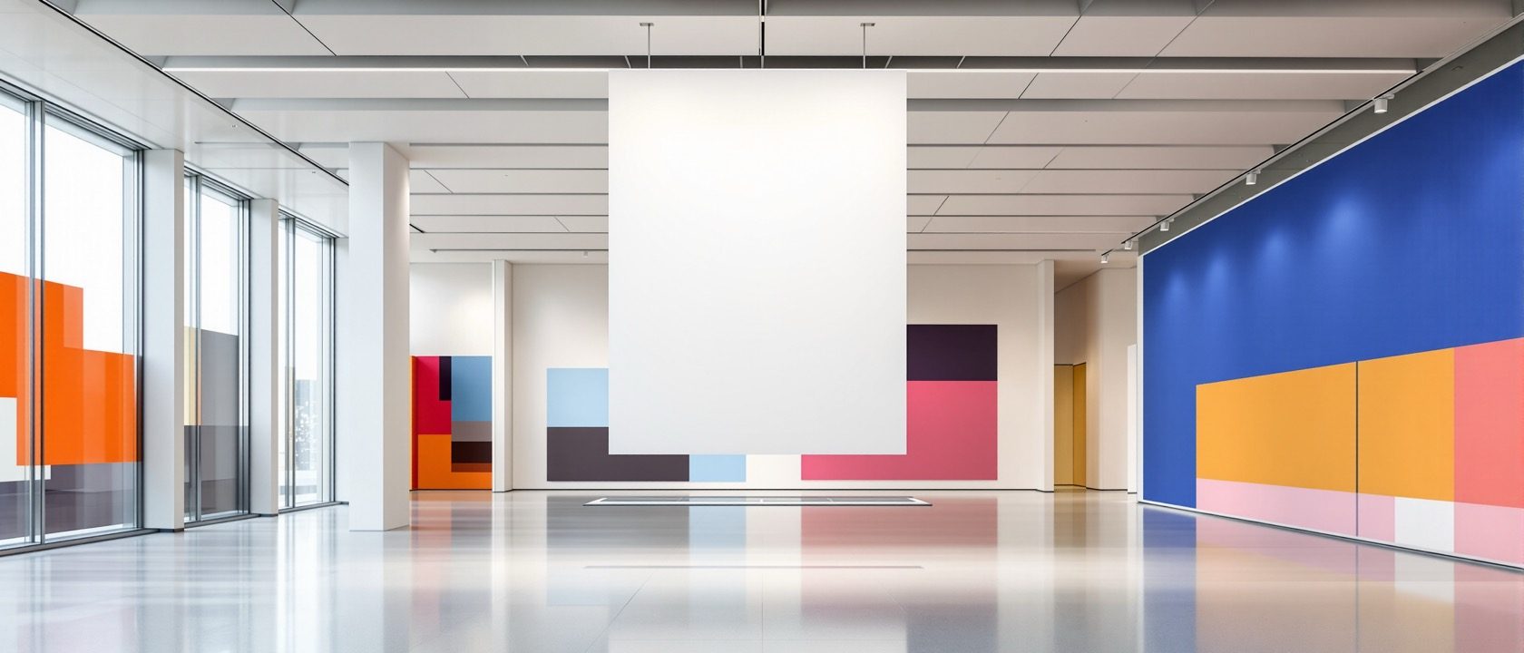
Signage and exhibit graphics belong to ENVIRONMENTAL GRAPHIC DESIGN (also called experiential graphic design, the field of SEGD) — graphics designed INTO a built environment. It joins graphic design, architecture and interiors: a super-graphic on a wall, a hanging banner, floor markings, an exhibit panel, a building's sign programme. The graphics are PART OF THE SPACE, sized and placed for how people move and see — not a poster hung on a wall as an afterthought. For film, theatre and exhibition, this is how a designed world speaks in words and symbols.[1]
Wayfinding
Wayfinding is designing how people navigate a space — through paths, landmarks and a clear sign at each decision point (Lynch; Arthur & Passini) — so a visitor finds the way without a map. Signage is the last layer, not the first; a confusing building cannot be fixed with more signs.[2]
Designed navigation
WAYFINDING is designing how people NAVIGATE a space — and it is far more than signs. Kevin Lynch showed people read a place through PATHS, EDGES, NODES, DISTRICTS and LANDMARKS; Arthur and Passini framed wayfinding as spatial problem-solving at DECISION POINTS. Good wayfinding uses the layout, sightlines and landmarks to do most of the work, and places a clear sign at each point where a person must choose. A visitor should find the way WITHOUT a map. Signage is the last layer, not the first — a confusing building cannot be fixed with more signs.[2]
Legibility and hierarchy
Legibility is measurable: it depends on letter height against viewing distance (roughly 25 mm of cap height per 3 m — confirm for the job), tonal contrast and clear type. And a good sign carries a hierarchy, the key element largest and first, with standard pictograms.[3]
Height, contrast, distance
Legibility is MEASURABLE, not a matter of taste. A sign's readability depends on LETTER HEIGHT relative to VIEWING DISTANCE (a common rule of thumb is about 25 mm of cap height per 3 m of distance — confirm for the job), on tonal CONTRAST between text and background, and on clear, well-spaced type. Farther reading needs bigger letters and higher contrast; small, low-contrast or crowded type fails at distance. 'A beautiful sign' that cannot be read has failed its one job — the aesthetics serve legibility, exactly as in product design.[2, 3]
At a glance
| Aspect | The fact | The folklore |
|---|---|---|
| Exhibit & signage graphics are | Environmental graphic design — part of the space | Posters hung on a wall |
| A sign's job | Identify, direct, inform or regulate — designed for that job | All signs are the same |
| Wayfinding is | Designed navigation — layout, landmarks, signs at decision points | Just putting up more signs |
| Legibility depends on | Letter height vs viewing distance, contrast, clear type | How pretty the sign looks |
| A good sign has | A clear hierarchy — the key element largest and first | Everything the same size |
| Aesthetics of a sign | Serve legibility — a sign no one can read has failed | Are the whole point |
Key terms
Graphics designed into a built environment — signage, wayfinding, super-graphics, exhibits — joining graphic design, architecture and interiors (the field of SEGD).
Identification (names a place), directional / wayfinding (points the way), information (explains) and regulatory / safety (commands or warns) — each designed for its job.
Designing how people navigate a space through paths, landmarks and decision points (Lynch; Arthur & Passini) — signage is the last layer, not the first.
The measurable readability of a sign — depending on letter height relative to viewing distance, tonal contrast and clear type; roughly 25 mm of cap height per 3 m of distance.
Ordering a sign's message so the most important element is largest and first, then secondary text and a pictogram, on a clear grid, so the eye grabs what it needs at a glance.
A standard, tested symbol (the running figure for an exit) that reads across languages and faster than words — effective when standard and consistent.
Study task
Design a small signage and wayfinding scheme for a real place you know — a gallery, a college block, a station. First map how people move and mark the decision points where they must choose a direction. Then design the signs for each job: an identification sign that names the place, directional signs at each junction, an information sign or map, and any regulatory signs. For your main directional sign, set a clear hierarchy, choose legible type, and size the letters for the real viewing distance (about 25 mm of cap height per 3 m as a starting rule). Test it: could a first-time visitor find the way without asking? The goal is signage that is read, not merely seen.
Self-assessment
1. What is environmental graphic design?
2. What is wayfinding?
3. What determines whether a sign is legible?
4. Why does a sign need a typographic hierarchy?
Recap
References & further reading
- [1]Environmental / experiential graphic design and exhibition graphics — signage, wayfinding and place-making (Society for Experiential Graphic Design, SEGD; exhibition-design texts). https://segd.org/
- [2]Wayfinding — Kevin Lynch, The Image of the City; Paul Arthur & Romedi Passini, Wayfinding: People, Signs, and Architecture. https://mitpress.mit.edu/
- [3]Sign typography and legibility — letter height, viewing distance and contrast (signage-standards and typographic references). https://segd.org/
Further reading
- Paul Arthur & Romedi Passini, Wayfinding: People, Signs, and Architecture.
- Kevin Lynch, The Image of the City.
- Time-Saver Standards for Building Types (DeChiara & Callender); Neufert, Architects' Data.
Sources gathered and fact-checked June 2026. Published values vary by source, sample and method — treat as indicative and confirm against the cited standard before structural use.
The author
Amogh N P
Architect, interior designer, and creative polymath. Studio Matrx began in his notebooks — his vision of design made honest, useful, and open to everyone. Its Academy is written and taught in his memory, and free, forever.
More about Amogh →