
Presentation Drawing & the Sheet
The drawing craft of persuasion — the sheet as an edited argument.
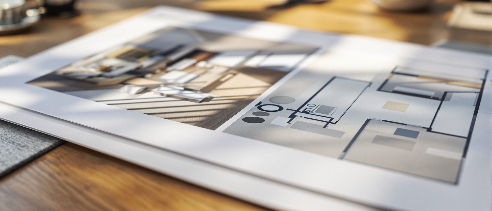
The drawing craft of persuasion. Learn the presentation set for an interior scheme — the rendered floor plan (a working plan stripped of instruction and dressed in colour, shadow and life), rendered elevations, the hero perspective, a concept element and a materials palette; sheet composition — the invisible modular grid, hierarchy and the single lead image, reading order, alignment and white space; and rendering a plan for presentation versus for construction. Then hand versus digital as a hybrid with identical composition principles, and the professional board — a master template so a multi-board set reads as one voice, telling the scheme’s story as an edited argument.
Learning objectives
By the end of this lesson, you will be able to — mapped to the course outcomes for Interior Graphics II:
List the drawings that make up an interior presentation set.
Compose a sheet with a grid, a lead image, hierarchy and white space.
Render a plan for presentation versus for construction — what goes out and in.
Judge a board and set, and maintain one voice with a master template.
The set & composition
The presentation set, sheet composition on a grid with a lead image and hierarchy, and rendering a plan for presentation versus construction.[1, 2, 3]
Persuade and explain
Where the working set instructs a builder, the PRESENTATION set persuades and explains to a client or jury. A complete interior presentation carries: a RENDERED floor plan (coloured, shadowed, furnished, textured — a 'dollhouse' of the scheme); rendered internal ELEVATIONS (key walls with materials and light suggested); one or more PERSPECTIVES (the lead spatial image — the hero view); a CONCEPT / mood element (a concept sketch, mood board or keyword diagram stating the design idea); and a MATERIALS & finishes palette (physical swatches or rendered chips with call-outs). Optionally sections showing spatial drama, an exploded or axonometric, or before-and-after. Consistency of medium and palette across the set is what makes it look AUTHORED rather than assembled.[1, 3]
Presentation plan, boards & judging
The cast shadow that makes a plan spatial, hand versus digital as a hybrid, and the board and master template that keep a set in one voice — and how to judge a sheet.[1, 2]
A hybrid, same principles
HAND presentation (marker or wash on a sheet, a physical board) demonstrates drawing craft and reads as personal and authored; DIGITAL (CAD line-work, a rendered 3D, a laid-out sheet, printed boards) offers precision, editability and photoreal render. Professionally the two are a HYBRID — hand sketches and concept drawings plus digital plans and 3D, composed on a digital sheet. This course teaches the HAND and COMPOSITIONAL craft; digital production tools are the Computer Studio's remit. The point that carries across: the composition principles — grid, hierarchy, white space, narrative — are IDENTICAL in both media, so learning them by hand is not obsolete; it is the transferable skill.[1]
At a glance
| Aspect | One side | The other |
|---|---|---|
| A presentation sheet | Myth: the working drawings coloured in | Reality: instruction OUT, mood/shadow/entourage IN |
| White space | Myth: wasted — fill the sheet | Reality: a compositional tool that signals confidence |
| A stronger board | Myth: bigger and more drawings | Reality: one lead image + edited support + hierarchy |
| Layout | Myth: decoration applied at the end | Reality: composed FIRST — grid, alignment, reading order |
| Digital vs hand | Myth: digital replaces hand skills | Reality: hybrid — composition principles are identical |
Key terms
Rendered plan, elevations, hero perspective, concept/mood and a materials palette — persuade, don't instruct.
The invisible column/row/margin underlay every element aligns to — why a sheet reads calm and professional.
The single dominant image (usually the hero perspective) the eye lands on first; support is subordinate.
Deliberate empty space that frames content and signals confidence — margins are inviolable, crowding reads as panic.
A wall-height shadow onto the floor from one light direction — turns a flat presentation plan spatial.
The shared margins, title strip, palette and type that make a multi-board set read as one voice.
Drawing task
Compose one A2 presentation sheet for a single room. First underlay a modular grid. Choose ONE lead image (your rendered hero perspective) and place it dominant; arrange the support — a rendered colour floor plan with a consistent cast shadow off the walls, one rendered elevation, and a small materials palette — subordinate to it, aligned to the grid, in reading order (concept → plan → experience → materials). Keep deliberate white space, one type family and one palette, and a quiet title strip. Then write two sentences naming what you edited OUT and why the sheet is stronger for it.
Self-assessment
1. A presentation plan differs from a working plan because it —
2. The single most important compositional device on a presentation sheet is —
3. White (negative) space on a sheet should be treated as —
Recap
References & further reading
- [1]Maureen Mitton, Interior Design Visual Presentation: A Guide to Graphics, Models, and Presentation Techniques, Wiley (the core text — presentation drawings, media, sheet composition, boards, portfolio).
- [2]Paul Laseau, Graphic Thinking for Architects and Designers, Wiley (diagramming, visual narrative, composition and communication).
- [3]Francis D.K. Ching, Design Drawing / Architectural Graphics (rendered plans, sections and elevations, shade & shadow, entourage).
- [4]Michael E. Doyle, Color Drawing; BIS IS 10711:2001 / IS 962:1989 (sheet sizes, layout, north point and scale retained in presentation work).
Further reading
- Maureen Mitton — Interior Design Visual Presentation.
- Paul Laseau — Graphic Thinking for Architects and Designers.
- Michael E. Doyle — Color Drawing.
Sources gathered and fact-checked June 2026. Published values vary by source, sample and method — treat as indicative and confirm against the cited standard before structural use.
The author
Amogh N P
Architect, interior designer, and creative polymath. Studio Matrx began in his notebooks — his vision of design made honest, useful, and open to everyone. Its Academy is written and taught in his memory, and free, forever.
More about Amogh →