
Identity, Experience & Communication
Wayfinding is planned, and a render is not the design
Wayfinding is designed into a legible plan — clear circulation, sightlines and landmarks — not bolted on as signs; signage is the confirming last layer. Decorative accessories are the completing, soul-giving layer over a resolved design. And rendering by hand and computer communicates a design — but a great render is not a great design: the render serves the design and must represent a real, resolved one, not flatter a weak one.
Learning objectives
By the end of this lesson, you will be able to — mapped to the course outcomes for Interior Design Studio VI:
Design wayfinding into a legible plan, supported by signage and graphic identity.
Use decorative accessories as the completing layer of a resolved scheme.
Render by hand and computer, knowing the render serves the design, not replaces it.
Wayfinding and signage
Wayfinding is designed into the plan — legible circulation, sightlines, landmarks — so people navigate intuitively; signage adds the confirming last layer. ‘Wayfinding is just putting up signs’ is a nuanced half-truth: a plan that needs a sign at every turn was planned badly.[1, 2]
A space you can read
WAYFINDING — how people find their way through a space — is designed into the PLAN first, not bolted on as signs at the end. A legible interior has a clear CIRCULATION spine, strong SIGHTLINES, LANDMARKS you navigate by, and a layout that makes sense intuitively, so you know where you are and where to go without thinking. Only then does SIGNAGE add the last, confirming layer. 'Wayfinding is just putting up signs' is a NUANCED half-truth: a building that needs a sign at every turn was PLANNED badly, and no signage can fully rescue a confusing plan. Especially in big public interiors — hospitals, airports, malls — wayfinding designed into the plan is a core, life-easing part of the work.[1, 2]
Decorative accessories
Decorative accessories — art, textiles, plants, objects, lighting accents — complete and humanise a scheme and are a real design decision. But they finish a resolved design; they cannot rescue a poor plan — the last, considered layer over a sound design.[1]
The completing layer
DECORATIVE ACCESSORIES are the final layer that completes a scheme and gives it life — art, textiles, plants, objects, sculpture, lighting accents — selected and placed with care. They humanise a space, express identity and finish the design, and they are a real DESIGN decision, chosen and composed, not an afterthought thrown in at the end. But they finish a RESOLVED design; accessories cannot rescue a poor plan or a space that does not work. The honest place of accessories is the last, considered layer over a sound design — the layer that gives a room its soul and its personality, placed with the same intention as the walls and the light.[1]
Rendering, and the render is not the design
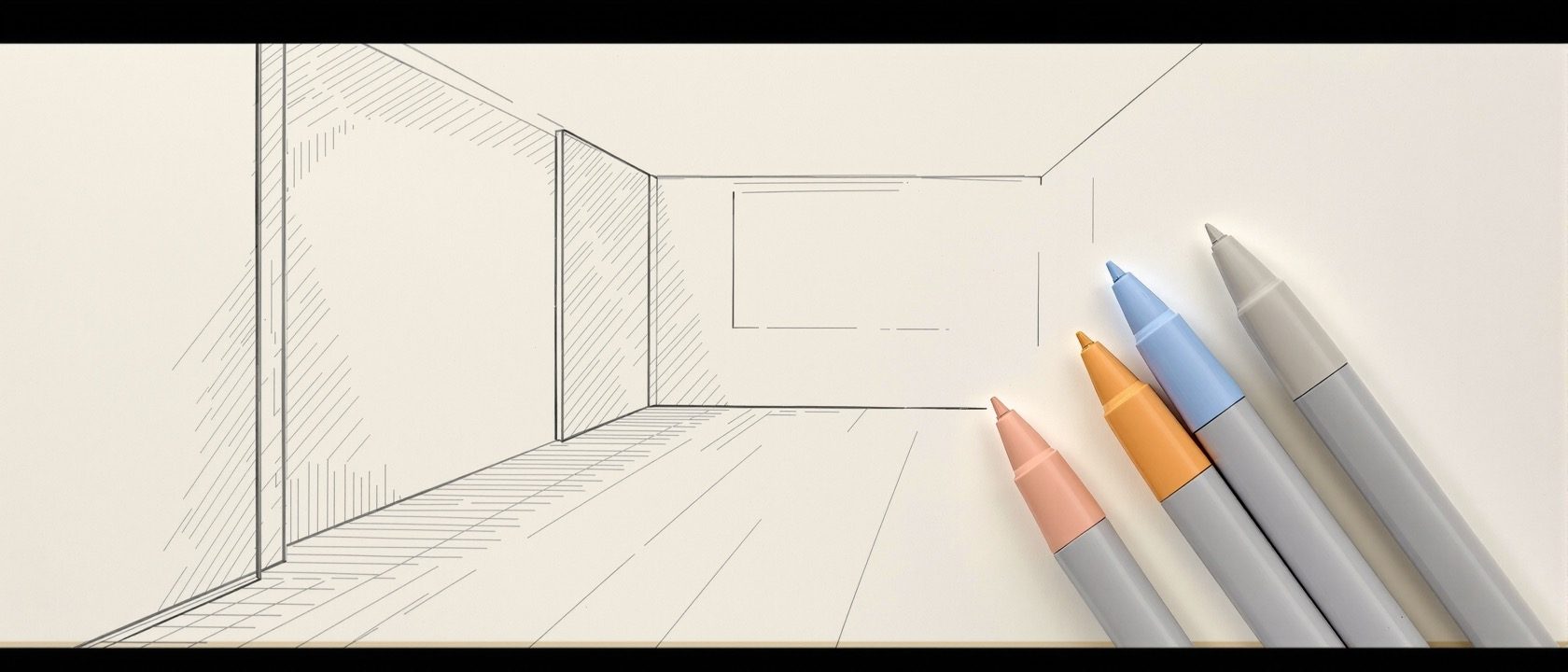
Rendering communicates a design — by hand (fast, expressive) and by computer (precise, photoreal). But ‘a great render = a great design’ is a myth: a gorgeous render can hide a bad plan. The render serves the design; judge the plan, integration and fitness for the brief, not the picture.[1]
Showing the design
RENDERING communicates a design so a client can SEE and understand it before it is built — and it is done two ways, both valuable. HAND rendering (sketches, perspectives, marker and pencil) is fast, expressive and a way of THINKING on paper, and it stays a prized professional skill. COMPUTER rendering is precise and photoreal, powerful for realistic visuals and client persuasion. A comprehensive designer commands both, choosing the right one for the moment — a quick hand sketch to explore, a computer render to present. Rendering is a means to SHOW a design truthfully, and to test and communicate it — a skill in service of the design.[1, 2]
At a glance
| Aspect | The fact | The folklore |
|---|---|---|
| Wayfinding is | Designed into the PLAN — legible circulation, sightlines, landmarks | Signs bolted on at the end |
| Signage works | WITH a legible plan, confirming it (and accessibly) | Instead of a good plan |
| Decorative accessories | Complete a RESOLVED design — the soul-giving last layer | Rescue a poor plan |
| Rendering is | A means to SHOW a design truthfully — hand and computer | The design itself |
| 'A great render = a great design' | A myth — a render can hide a bad plan | True |
| Judge a project by | Its plan, integration and fitness for the brief | The prettiness of its picture |
Key terms
How people find their way through a space — designed into the plan first through legible circulation, sightlines and landmarks, with signage as the confirming last layer.
The graphic identification of a space — directional and room signs, pictograms and a consistent visual language — that names and brands it; a requirement in accessible public spaces.
The completing layer of a scheme — art, textiles, plants, objects, lighting accents — selected and placed to finish and humanise a resolved design; a real design decision.
Communicating a design through images — hand-drawn (fast, expressive, thinking on paper) and computer-generated (precise, photoreal) — a skill in service of showing the design truthfully.
The honest distinction that a beautiful render can hide a bad plan — the render serves and represents the design, it does not replace it or prove it good.
A clear, intuitive movement structure through a space — the backbone of good wayfinding, so people know where they are and where to go without needing a sign at every turn.
Study task
Take a floor plan of a public space (a clinic, a small mall, a station concourse). Trace its wayfinding: is the circulation legible, are there clear sightlines and landmarks, could a first-time visitor find their way before reading a single sign? Mark where signage should confirm the route (and how it would meet accessibility — legible, well-lit, tactile). Then propose the accessories that would complete one room, as a considered layer over the resolved design. Finally, take any glossy interior render you admire and ask the hard question: does the plan behind it actually work, or is the render doing the work? Write what you would check to judge the design, not the picture. The goal is substance under the shine.
Self-assessment
1. How is wayfinding best achieved?
2. What is the honest place of decorative accessories?
3. Is a great render proof of a great design?
4. Why learn both hand and computer rendering?
Recap
References & further reading
- [1]Maureen Mitton, Interior Design Visual Presentation, Wiley — rendering by hand and computer, presentation and communicating a design; and accessories. https://www.wiley.com/
- [2]Wayfinding, environmental graphics and signage in interiors, and accessible signage (wayfinding and interior-graphics references; Maryrose McGowan & Kelsey Kruse, Interior Graphic Standards). https://www.wiley.com/
Further reading
- Maureen Mitton, Interior Design Visual Presentation.
- Mark W. Lin, Drawing and Designing with Confidence.
- Maryrose McGowan & Kelsey Kruse, Interior Graphic Standards.
Sources gathered and fact-checked June 2026. Published values vary by source, sample and method — treat as indicative and confirm against the cited standard before structural use.
The author
Amogh N P
Architect, interior designer, and creative polymath. Studio Matrx began in his notebooks — his vision of design made honest, useful, and open to everyone. Its Academy is written and taught in his memory, and free, forever.
More about Amogh →