
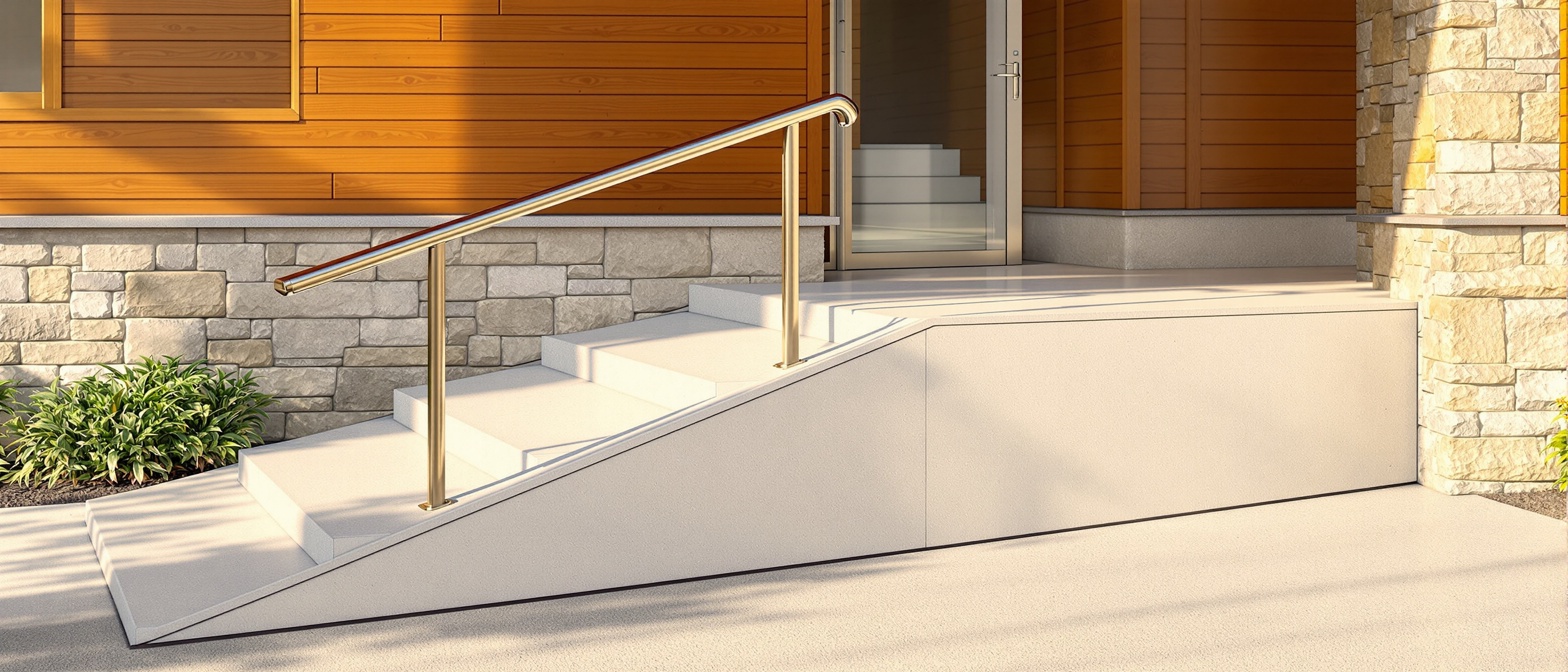
Universal & Accessible Design
Design for the widest range from the start — a ramp round the back is a failure
This is the heart of Studio V. Universal design means designing for the widest range of people from the very start, so no one needs a special adaptation — different from accessible design bolted on late, which a ramp round the back exposes as a failure. Designing for disability helps everyone (the curb-cut effect). The tools are real: the seven principles of universal design (Mace, 1997), the social model of disability (the building disables, not the body), and India’s current Harmonised Guidelines and Accessible India standards.
Learning objectives
By the end of this lesson, you will be able to — mapped to the course outcomes for Interior Design Studio V:
Distinguish universal design (widest range, from the start) from accessible design added as an afterthought.
Apply the seven principles of universal design and understand the curb-cut effect.
Explain the social model of disability and India's accessibility standards (Harmonised Guidelines, Accessible India).
Universal vs accessible
Universal design serves the widest range from the start; accessible design added late — a ramp round the back — is lesser. And designing for disability helps everyone: the curb-cut effect, where a dropped kerb also serves prams, trolleys and tired travellers.[1, 2, 3]
From the start, or bolted on
UNIVERSAL DESIGN means designing for the widest range of people FROM THE START, so that no one needs a special adaptation — everyone uses the same entrance, the same route, the same building. ACCESSIBLE or 'barrier-free' design added as an AFTERTHOUGHT is different and lesser: a ramp round the back, a lift added later, a token accessible toilet. 'Access is a ramp you add at the end' is a MYTH — a separate, secondary way in is a failure of design, not a solution. Universal design removes the need for the special case.[1, 2]
The seven principles
The seven principles (Ronald Mace, NC State, 1997) are the checklist: equitable use, flexibility, simple & intuitive, perceptible information, tolerance for error, low effort, and size & space. There is no ‘average’ user — design for the range.[1]
Mace's universal-design rules
The SEVEN PRINCIPLES OF UNIVERSAL DESIGN, set out by Ronald Mace and colleagues at North Carolina State University in 1997, are the studio's checklist: EQUITABLE USE (useful to all, the same way), FLEXIBILITY IN USE (a choice of ways), SIMPLE AND INTUITIVE USE (easy to understand), PERCEPTIBLE INFORMATION (more than one sense), TOLERANCE FOR ERROR (forgive mistakes), LOW PHYSICAL EFFORT (little force, comfortable) and SIZE AND SPACE FOR APPROACH AND USE (room to reach and manoeuvre). Test a design against all seven and its exclusions show up. Try the inclusive-design decoder below.[1]
Try it — the inclusive-design decoder
The seven principles plus real building features across mobility, seeing and hearing/thinking. Filter by category; each card shows what it does and the honest note, graded VERIFIED, NUANCED or MYTH.
Inclusive-design decoder · the principles & features of designing for all
The 7 universal-design principles plus real features across mobility, seeing and hearing/thinking — graded VERIFIED, NUANCED or MYTH.
1. Equitable use
Useful to all, the same way
Does: The design is useful and appealing to people with diverse abilities — the SAME means of use for all where possible, equivalent when not.
Honestly · The heart of universal design: everyone uses the same main entrance, not a grand stair for most and a ramp round the back for some. A 'separate but equal' access is neither.
2. Flexibility in use
Choice of ways to use
Does: The design accommodates a wide range of preferences and abilities — a choice of methods, adaptable to the left- or right-handed, fast or careful user.
Honestly · Flexibility designs for a RANGE, not an 'average' user who does not exist. A counter at two heights, controls reachable seated or standing.
3. Simple & intuitive
Easy to understand
Does: Use is easy to understand regardless of experience, knowledge, language or concentration — needless complexity removed, information ordered by importance.
Honestly · A space you understand without instruction. If people need a sign or a guard to explain how to move through it, the design, not the user, has failed.
4. Perceptible information
More than one sense
Does: The design communicates needed information effectively regardless of the user's sensory abilities — using more than one mode (visual, tactile, audible).
Honestly · Never rely on a single sense: a lift that only beeps fails a deaf user, one that only lights up fails a blind user. Redundant cues serve everyone, including in a power cut or a loud room.
5. Tolerance for error
Forgive mistakes
Does: The design minimises hazards and the consequences of accidental actions — hazardous elements guarded, warnings given, fail-safe features provided.
Honestly · Assume people will slip, mis-step and err, and design so it is not dangerous — a landing on a long ramp, a kerb at a level change, a guard at a drop. Blaming the user is not a design.
6. Low physical effort
Comfortable, little force
Does: The design can be used efficiently and comfortably with minimum fatigue — reasonable operating forces, neutral postures, few repetitions.
Honestly · A heavy door, a stiff tap or a long unbroken ramp taxes everyone and excludes the frail. Low effort is not laziness; it is the difference between usable and merely possible.
7. Size & space for use
Room to approach
Does: Appropriate size and space for approach, reach, manipulation and use regardless of body size, posture or mobility — clear reach and room for a wheelchair or assistant.
Honestly · Anthropometrics for the RANGE, not the mean: a turning circle for a wheelchair, clear knee space under a counter, reach to controls. Space is what makes the other principles physically possible.
Accessible ramp
Gentle, with landings
Does: A ramp for a level change with a gentle gradient (no steeper than 1:12 in India's guidelines), landings, handrails and a minimum clear width of 1200 mm.
Honestly · A ramp is not automatically accessible: too steep and it is unusable and unsafe. A gentle ramp is LONG — 1:12 turns a 750 mm rise into a 9 m run — so it must be planned into the scheme early, not squeezed in later.
Accessible toilet
Space, grab bars, reach
Does: A WC with clear transfer space beside the pan, grab bars, an accessible basin and reachable controls, sized for a wheelchair user and an assistant.
Honestly · One of the truest tests of a public building's inclusion. It must be part of the main provision, generously sized and genuinely usable — not a token cubicle used as a store.
Lift & doorway widths
Get in, move between floors
Does: A lift serving every level a stair does, and doorways with adequate clear width (about 900 mm) so a wheelchair, pram or trolley passes through.
Honestly · A single upper floor reached only by stairs makes a whole building inaccessible. Clear width is measured through the OPEN door, past the leaf and hardware — the nominal size is not the clear size.
Level thresholds & grab bars
No small steps
Does: Flush, level thresholds at doors and gentle transitions, plus grab bars and handrails where support is needed, so small level changes do not become barriers.
Honestly · A single unexpected step or a raised threshold trips the sighted and stops the wheeled. The smallest level changes, not just the grand stairs, are where accessibility is quietly won or lost.
Tactile paving & guides
Underfoot information
Does: Textured ground surfaces (warning and directional) felt underfoot or by a cane, guiding a blind or low-vision person and warning of hazards such as a stair or platform edge.
Honestly · It carries information through TOUCH where sight cannot be relied on. It must be continuous and correctly laid — a tactile route that stops halfway, or leads into an obstacle, is worse than none.
Contrast & legible signage
Seen by low vision
Does: High tonal CONTRAST between text and background, and between key elements (a door, a step nosing, a handrail) and their surroundings, with large, clear type.
Honestly · Colour alone is not enough — many people cannot distinguish certain colours, so rely on tonal contrast (light vs dark). A beautifully minimal, tone-on-tone interior can be invisible to a low-vision user.
Braille & tactile signs
Read by touch
Does: Raised tactile lettering and Braille on key signs (lifts, room numbers, handrails) so a blind person can read them by touch, mounted at a findable height.
Honestly · Essential, but only useful if a blind person can FIND the sign and knows it is there — so it works with tactile guidance and consistent placement, not in isolation.
Hearing loop & visual alarm
Heard and seen
Does: An induction (hearing) loop at counters and in halls for hearing-aid users, and alarms that both SOUND and FLASH so a deaf person is warned.
Honestly · An emergency alarm that only sounds leaves a deaf person in danger — the perceptible-information principle made life-critical. Loops must be installed and switched ON to work; many exist but sit unused.
Wayfinding & pictograms
Understood without words
Does: Clear wayfinding and internationally understood PICTOGRAMS (toilet, exit, lift) that communicate across language and literacy, supporting people with cognitive differences.
Honestly · Pictograms cross language barriers where words cannot — but only well-known, consistent ones; an invented or ambiguous icon confuses more than it helps. Simple, familiar and consistent beats clever.
Designing for the edges of the range serves the middle too — the reverse is not true. A ramp round the back is a failure, not a solution.
The social model & India's standards
The social model reframes disability as a mismatch with the environment — the stair, not the legs, disables — so inclusion is a design decision. India’s Harmonised Guidelines 2021 and Accessible India set concrete standards (a ramp of 1:12, 1200 mm wide).[2, 3]
The building disables, not the body
The SOCIAL MODEL of disability reframes the whole subject: disability is a MISMATCH between a person and an environment, not a defect in the person. A wheelchair user is not disabled by their legs but by the STAIR with no ramp; a deaf person is not disabled by their ears but by the alarm that only sounds. This matters to a designer because it puts the responsibility where the power is: the building, which you design, is what disables or includes — so inclusion is a design decision, not a favour.[2]
At a glance
| Aspect | The fact | The folklore |
|---|---|---|
| Universal design | For the widest range, FROM THE START — same building for all | A ramp added at the end |
| A separate accessible entrance | A failure of design — 'separate but equal' is neither | A fine solution |
| Designing for disability | Helps EVERYONE — the curb-cut effect | Only helps a few |
| The 'average user' | A myth — design for the RANGE | Who you design for |
| Disability is | A mismatch with the environment — the building disables | A defect in the person |
| India's standard | Harmonised Guidelines 2021 & Accessible India — a ramp of 1:12, 1200 mm wide | No Indian standard exists |
Key terms
Designing for the widest range of people from the start, so no one needs a special adaptation — everyone uses the same entrance, route and building.
Access added late — a ramp round the back, a token accessible toilet; lesser than universal design, because a separate, secondary way in is a design failure.
Designing for disability helps everyone — the dropped kerb for wheelchairs also serves prams, trolleys and tired travellers; access features benefit the whole population.
Mace (NC State, 1997): equitable use, flexibility, simple & intuitive, perceptible information, tolerance for error, low physical effort, size & space for use.
Disability as a mismatch between a person and an environment, not a defect in the person — the stair, not the legs, disables; so inclusion is a design decision.
India's universal-accessibility standards (CPWD, IIT Roorkee, NIUA) and the Sugamya Bharat Abhiyan (2015) — e.g. a ramp no steeper than 1:12, minimum clear width 1200 mm.
Studio task
Take one public entrance and route you know — a shop, a college block, a clinic — and audit it against the seven principles, using the decoder. For each principle, note where the space passes and where it excludes (a single-sense alarm, a heavy door, no turning space, a separate accessible entrance). Then redesign the entrance and route to be universal: everyone using the same way in, the level changes handled by a gentle ramp or level threshold, information given by more than one sense. Check it against India’s standard (a ramp no steeper than 1:12, 1200 mm clear width). Close by naming three people your redesign now includes who were excluded before — and note how each change also helps everyone else.
Self-assessment
1. What is the difference between universal and accessible design?
2. What is the curb-cut effect?
3. What are the seven principles of universal design (Mace, 1997)?
4. What does the social model of disability say?
5. What is India's current accessibility standard?
Recap
References & further reading
- [1]The seven principles of universal design — Ronald Mace and colleagues, Center for Universal Design, North Carolina State University, 1997. https://www.ncsu.edu/
- [2]Universal design, the curb-cut effect and the social model of disability — inclusive design principles (Centre for Excellence in Universal Design; disability-studies references). https://universaldesign.ie/about-universal-design/the-7-principles
- [3]Harmonised Guidelines and Standards for Universal Accessibility in India 2021 (CPWD, IIT Roorkee, NIUA) and the Accessible India Campaign / Sugamya Bharat Abhiyan (2015). https://ccpd.nic.in/harmonized-guidelines-for-standards-of-accessibility/
Further reading
- Center for Universal Design (NC State), The Principles of Universal Design.
- CPWD, Harmonised Guidelines and Standards for Universal Accessibility in India 2021.
- Selwyn Goldsmith, Designing for the Disabled: The New Paradigm.
Sources gathered and fact-checked June 2026. Published values vary by source, sample and method — treat as indicative and confirm against the cited standard before structural use.
The author
Amogh N P
Architect, interior designer, and creative polymath. Studio Matrx began in his notebooks — his vision of design made honest, useful, and open to everyone. Its Academy is written and taught in his memory, and free, forever.
More about Amogh →