
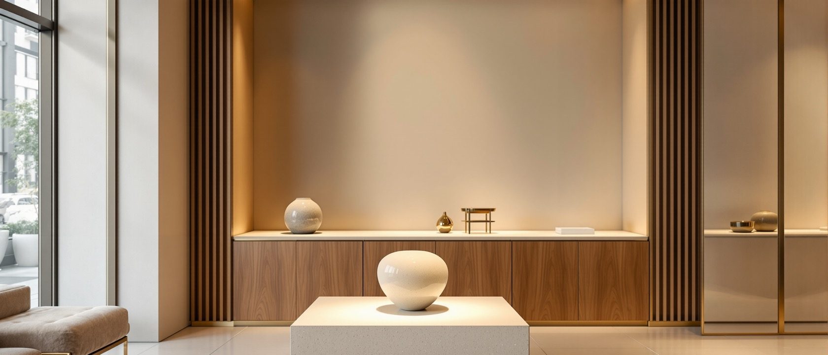
Display & the Art of Selling
The window, the fixture and the finish — and the honest question of what selling theatre is worth
Display is the retailer’s language, and it runs on hierarchy: the window talks to the street, the feature displays hold the heroes, and the wall and bulk carry the range. This unit covers the fixtures that do the selling, the difference between a boutique and a showroom, and the modern flagship and concept store — with an honest question about what selling theatre is really worth. And it tells the most honest story in retail design: the man who invented the shopping mall came to disown it.
Learning objectives
By the end of this lesson, you will be able to — mapped to the course outcomes for Interior Design Studio III:
Explain display hierarchy — from the hero window to the bulk-stock wall — and what each level is for.
Design a display unit or fixture appropriate to a product and a retail type.
Distinguish a boutique from a showroom and design for the difference.
Choose retail finishes — colour, texture, pattern — for wear and replacement, not only for looks.
Judge honestly what 'experiential retail' theatre is worth against its cost.
Display & the art of selling
Rank the displays from the hero window to the bulk wall; design each fixture for its job; and know that a boutique and a showroom are two different rooms.[1, 2, 3]
From the hero window to the bulk wall
A store's displays are a hierarchy, and good merchandising ranks them. At the top is the WINDOW — the store's poster, the one display that talks to the street and earns the footfall; it carries the season's idea and is changed often. Inside, FEATURE displays (a table, a plinth, an end-cap, a mannequin group) hold the hero products and the newness, lit hardest and placed at the power positions. Below them, the WALL and gondola systems carry the working range at browsing density, and at the bottom the BULK stock — the folded, the boxed, the many — is shown efficiently for the shopper who already knows what they want. The design skill is to make this hierarchy legible: a shopper should read, without thinking, what the store most wants them to see, and be able to fall back to the depth of range behind it.[1]
The mall’s cautionary tale
The tools of atmosphere and immersion are real and powerful — and the architect who understood them best, Victor Gruen, publicly disowned what the shopping mall became. That is the ethical spine of commercial design: serve the shopper, don’t disorient.[7]
Finishes for a public floor
Colour, texture and pattern are the retailer’s fastest mood tools — used with restraint so the room stays the quiet frame and the merchandise is the picture — and every finish is specified for a public floor’s brutal wear, not for the opening-day photo.[4, 5]
The retailer's fastest mood tools
Colour, texture and pattern are the cheapest, fastest way to give a retail interior a mood and a brand, and the studio uses them deliberately. Colour sets temperature and identity and does wayfinding; texture signals quality and price (rough, natural, matt reads craft and premium; high-gloss and chrome reads modern and mass); pattern carries energy or calm and can zone a large floor. Used well they turn a plain box into a branded room for the price of paint and finish. The discipline is restraint and hierarchy: the room is the quiet frame, the merchandise is the picture. A retail interior that shouts in colour and pattern competes with its own goods — the best backdrop is the one the shopper never consciously notices because they are looking at what is for sale.[4]
At a glance
| Aspect | The fact | The other side |
|---|---|---|
| Display | A HIERARCHY — window → feature → range → bulk, made legible | MYTH: fill every surface equally with stock |
| Boutique vs showroom | Two rooms: browse-and-carry vs show-in-context-to-order | Treating a furniture showroom like an apparel boutique |
| The interior's job | A quiet frame — the merchandise is the picture | MYTH: the interior should shout in colour and pattern |
| Retail finishes | Specified for WEAR and replacement first, beauty second | MYTH: choose the finish that photographs best on opening day |
| Experience retail | Real brand value — but ask what the theatre costs and returns | MYTH: spectacle always pays; more drama = more sales |
Key terms
The ranked order of displays — window → feature → wall/range → bulk — that tells a shopper what the store most wants seen.
A high-visibility spot (window, entrance feature, end-cap) where the hero product and the newness go, lit hardest.
The display at the end of a gondola run — prime, high-traffic real estate for a feature or a promotion.
A small, curated store merchandised for browse and identity; goods are tried and carried away. Usually a free-flow plan.
A store showing a larger/considered product in context, often to order — furniture, sanitaryware, cars. Staged like small interiors.
The largest, most expensive store, built to broadcast the brand in a prime location; its return is image as much as sales.
Retail folded with café/workshop/gallery to sell an experience. Real brand value — but often expensive theatre with unproven sales return.
Designing retail finishes knowing which are consumable and will be swapped on a cycle — and detailing them for a cheap swap.
Study task
Design one display for a real product you like, and defend it as a system. Say where it sits in the store’s hierarchy (is it the hero window, a feature, or range?), describe the fixture and why its material and detail suit the product and the brand, and name the finishes — with one line on how each will survive a year of public wear and how cheaply it can be swapped. Then answer the Gruen question honestly for a store you admire: does its theatre serve the shopper and the brand, or does it disorient to sell? Ranking the display, detailing the fixture for wear, and being honest about immersion — not just making it pretty — is what this unit is teaching.
Self-assessment
1. What sits at the TOP of a store's display hierarchy, and why?
2. How does designing a SHOWROOM differ from designing a boutique?
3. Why are retail finishes specified for wear and replacement before beauty?
Recap
References & further reading
- [1]Morgan, Tony (2016). Visual Merchandising: Window and In-store Displays for Retail (3rd ed.). Laurence King. Display hierarchy, the window and in-store presentation.
- [2]Mesher, Lynne (2010). Retail Design (Basics Interior Design). AVA Publishing / Bloomsbury. Fixtures, boutique and showroom typologies.
- [3]Din, Rasshied (2000). New Retail. Conran Octopus. Flagship, concept and experiential store design. (On the unproven return of experiential retail, verify against current retail-analytics sources before citing figures.)
- [4]Ching, Francis D. K. & Binggeli, Corky (2018). Interior Design Illustrated (4th ed.). Wiley. Colour, texture and pattern as interior tools.
- [5]Bell, Judith & Ternus, Kate (2017). Silent Selling: Best Practices and Effective Strategies in Visual Merchandising (5th ed.). Fairchild / Bloomsbury. Retail materials, maintenance and store-planning practice.
- [6]Real experiential-retail anchors — Prada Epicenter, New York, OMA / Rem Koolhaas, opened 2001 (the zebrawood 'Wave' ramp; retail as public/cultural space); and the Sunita Shekhawat flagship & Museum of Meenakari Heritage, Jaipur, Studio Lotus, 2024 (a jewellery flagship fused with a craft museum behind a carved-stone jaali; The Plan Award 2024, Retail). https://www.archdaily.com/1025982/museum-of-meenakari-heritage-and-flagship-store-studio-lotus
- [7]Victor Gruen, architect of the first enclosed US shopping mall (Southdale, 1956), repudiating his invention in a 1978 London speech: 'I am often called the father of the shopping mall… I refuse to pay alimony to those bastard developments. They destroyed our cities.' The 'Gruen transfer' is named after him. Source: The West End Museum, 'Victor Gruen'; also Malcolm Gladwell, 'The Terrazzo Jungle', The New Yorker, 15 Mar 2004, and Hardwick, Mall Maker (2004). (Preposition 'to'/'for' varies across secondaries.) https://thewestendmuseum.org/history/era/new-boston/victor-gruen/
Further reading
- Morgan, Tony — Visual Merchandising: Window and In-store Displays for Retail. Laurence King.
- Mesher, Lynne — Retail Design (Basics Interior Design). AVA / Bloomsbury.
- Bell, Judith & Ternus, Kate — Silent Selling: Best Practices in Visual Merchandising. Fairchild.
- Din, Rasshied — New Retail. Conran Octopus. On flagship, concept and experiential store design.
Sources gathered and fact-checked June 2026. Published values vary by source, sample and method — treat as indicative and confirm against the cited standard before structural use.
The author
Amogh N P
Architect, interior designer, and creative polymath. Studio Matrx began in his notebooks — his vision of design made honest, useful, and open to everyone. Its Academy is written and taught in his memory, and free, forever.
More about Amogh →