
 Lesson 8.3
Lesson 8.3 · Furnishings
Lighting Fixtures, Accessories and Plants
The last, movable layer — fittings, vignettes, art and greenery that turn a finished room into your home.
The room is done. Why does it still feel empty?
The painters have gone, the sofa is in, the curtains hang straight — and yet the room feels like a furniture showroom, not a home. The missing piece is the cheapest and most personal layer of all: the things you can carry in your two hands and move whenever you like. A lamp. A bowl. A photograph. A money plant. This is the layer that finally says someone lives here.
A single shelf drawn twice: on the left, crammed edge to edge with identical curios and a big 'X'; on the right, three objects of different heights — a tall vase, a stack of books with a small brass pot, a trailing money plant — looping arrows tracing a triangle between them and a tick mark.
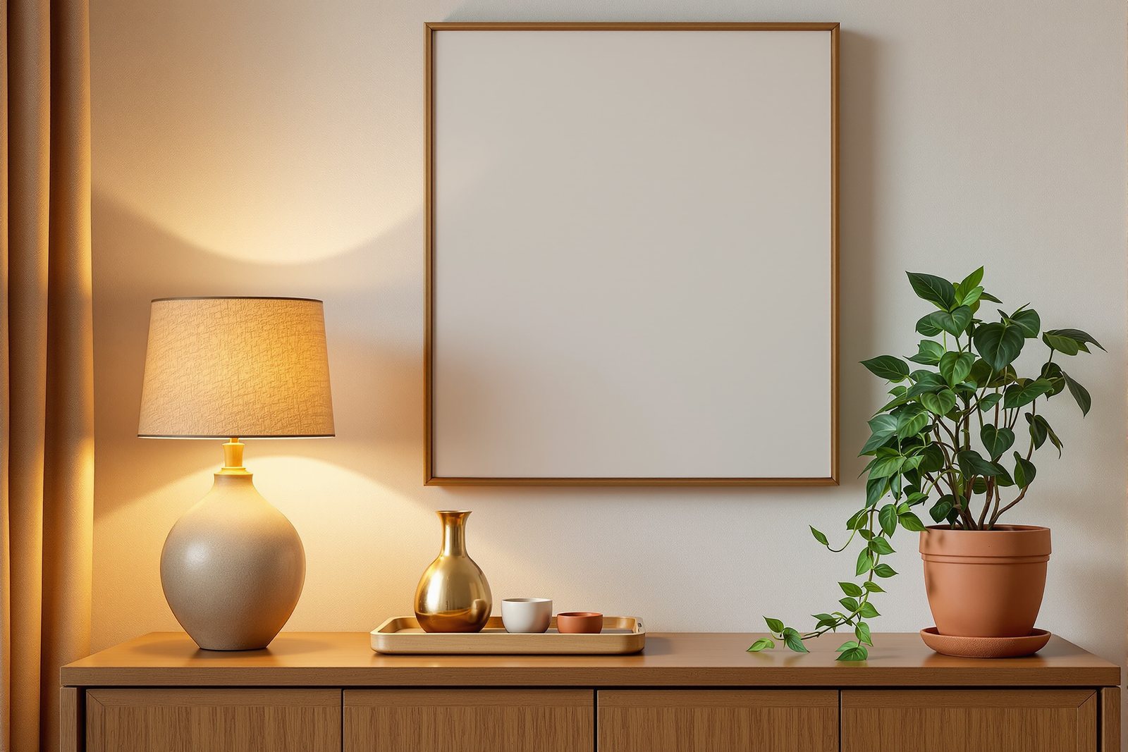
Light fittings are jewellery, not just bulbs
In Module 6 you learned to build light in layers — ambient, task and accent. Now meet the layer's most visible members: the fittings themselves. A decorative fixture earns its place twice, once for the light it throws and once for how it looks switched off.
The pendant over a dining table is the classic test. Hang its bottom edge roughly 750-900 mm above the table top: high enough that nobody across the table is staring through a glaring bulb, low enough to pool warm light onto the food and pull the family into one circle. Too high and it floats meaninglessly near the ceiling; in most Indian flats with 2700 mm ceilings, lower is friendlier.
A chandelier in a double-height foyer or over a large dining table must be scaled to the room — the commonest mistake is buying one two sizes too small, so it hangs like an earring on a giant. As a rough guide, add the room's length and width in feet and aim for a fixture roughly that many inches across.
Then the quiet heroes: floor and table lamps. Ceiling light alone keeps a room lit from above like an office. A lamp brings light down to human level — a 1500 mm floor lamp beside the reading chair, a table lamp on the console — and after dark these create the warm pools that make an Indian living room feel like an evening, not a waiting hall. Buy lamps for the warm corners you actually sit in.
The vignette: how three brass pots beat a row of twenty
Walk past most showcases and wall-units and you see the same thing — every shelf crammed edge to edge, identical curios in straight rows, the eye with nowhere to rest. Accessorising well is the opposite instinct: a few objects, grouped with intent, breathing space around them.
The unit of styling is the vignette — a small composed grouping on a shelf, console or coffee table. Three rules make it work. First, the rule of odds: objects in threes (or fives) read as relaxed and natural; pairs feel stiff and symmetrical. Second, triangulation: arrange the group so your eye travels in a loose triangle — a tall object, a medium one, a low one — never a flat line. Third, varied heights and textures: a stack of books raising a small brass diya, a matte terracotta pot beside a glossy ceramic, a rough handicraft piece against a smooth one.
Mix in a few meaningful pieces — a souvenir from a trip, a grandmother's brass urli, a single framed photo — rather than rows of matching showroom buys. The over-stuffed showcase is the trap; the answer is almost always to take things away, group what remains in odd numbers, and let the shelf exhale.
Art on the wall: hang it where eyes actually are
A beautiful painting hung too high — floating near the cornice, a metre above where anyone looks — is one of the most common and most fixable mistakes in Indian homes. The fix is a number worth memorising: hang art so its centre sits roughly `1500 mm` from the floor, at average standing eye level. Over a sofa or console, drop it a little so the artwork relates to the furniture below — leave about 150-250 mm between the top of the sofa back and the bottom of the frame, so the two read as one composition rather than two unrelated objects.
Scale matters as much as height. A small frame marooned on a large wall looks lost; aim for art (or a group) that fills roughly two-thirds the width of the furniture beneath it.
For more pictures than one wall can hold gracefully, build a gallery wall. Lay the frames out on the floor first and shuffle until the spacing feels even (a consistent 50-75 mm gap between frames reads as deliberate), keep the centre of the whole cluster at that same 1500 mm eye level, and treat the group as a single rectangle. Family photos, a child's painting, a print bought on a holiday — a gallery wall is where an Indian home tells its own story.
Plants: match the green to the light the spot really gets
Nothing finishes a room like something alive. Plants soften hard edges, freshen the air, and add the biophilic calm of the outdoors — and India's love of the money plant trailing across a living-room shelf is well earned. But here is the honest rule that saves most plants from dying: match the plant to the light a spot actually gets, not the light you wish it had.
Walk your room at midday and read each spot truthfully. A bright spot — within a metre of a south- or west-facing window — takes most things, including flowering plants and an areca palm. A medium spot, a couple of metres in or beside a curtained window, suits the forgiving middle: pothos / money plant and peace lily thrive here. A genuinely low-light corner — an inner wall, a north room, a passage — is not hopeless: a snake plant or a ZZ plant will hold green for months on very little. And the windowless flat bathroom that so many Indian homes have? Use a near-zero-light tolerant plant, or simply keep two and rotate them out to a bright spot every couple of weeks.
Not sure what your corner can keep alive? Try the Plant-Light Matcher — pick how much natural light a spot gets and it suggests easy indoor plants that will actually survive there in an Indian home. Finish the styling the same way you styled the shelf: group pots in odd numbers, vary the heights, and let a few terracotta or brass planters carry the texture.
Cheap, reversible, and the layer most people get wrong
Here is what makes this layer special: it costs the least, needs no contractor, and is completely reversible. You can restyle a console on a Sunday morning, swap a lampshade, move the money plant to a brighter ledge — and the room responds at once. That freedom is also the trap.
There are only two ways to get it wrong, and they are opposites. The first is over-cluttering — the maximalist showcase, the wall hung corner to corner, every surface occupied until nothing is special and the eye can find no rest. The second is the cold, unfinished room — walls bare, shelves empty, not one living thing, technically complete but with no warmth and no story. The skill is the middle: edit ruthlessly, then place a few good things with intention.
When you doubt a room is done, ask three quiet questions. Is there light coming down to where I sit? Is there one composed grouping my eye can settle on? Is there something alive in here? If the answer to all three is yes, the room is finished — and it is unmistakably yours.
Hands-on
How much natural light does the spot get?
a few feet in, or by a curtained window
- • Pothos / money plant
- • Peace lily
- • Spider plant
- • Philodendron
- • Areca (slower)
A plant in the wrong light slowly dies, however lovely it looked in the nursery. Read the corner at midday, match the green to it, then group pots in odd numbers with varied heights.
Three altitudes on the same idea
Read the band that fits you — or all three.
You do not need a designer or a budget to finish a room — you need a Sunday. Start by editing: clear a showcase shelf completely, then put back only three or five things you love, in varied heights, with space to breathe. Lower the pendant over your dining table to 750-900 mm above the top if it floats too high. Move one painting down so its centre lands near 1500 mm. Add a table lamp to the corner you read in, and bring home one plant matched to that corner's light. Five small, reversible moves — and the room is suddenly yours.
Treat the styling layer as a deliverable, not an afterthought clients improvise alone. Budget for accessories, art and planters in the proposal, and hand over a styled, photographed room — the difference between a 'completed project' and a portfolio image is this last 5%. Specify pendant and chandelier heights and sizes on the drawings so the electrician does not centre fixtures by guesswork. Build vignettes on site with the client's own meaningful pieces so the room feels theirs, not staged. And spec plants by the real lux each location gets — a dead palm in a low-light corner is a callback you do not want.
This lesson is where the whole course converges: Module 6's lighting layers reappear as physical fittings; Module 7's colour and texture decide which accessories and pots harmonise; this module's furnishings set the stage these objects dress. Train your eye on the numbers — 750-900 mm for a dining pendant, 1500 mm to art centre — but train it harder on editing. The hardest design skill here is subtraction: knowing what to leave off the shelf. Photograph rooms you admire and count the objects in each vignette; you will almost always find threes and fives, varied heights, and breathing space.
“More accessories make a room look richer and more 'designed'.”
Run the method yourself
Pick one finished-but-flat room in your home and run it through the movable layer. Each step is reversible — nothing here needs a contractor or a single hole until you are sure.
- 1Clear one showcase or console shelf completely. Put back only three or five pieces — vary their heights, mix a matte and a glossy texture, raise the smallest on a stack of books, and include one personal piece you love.
- 2Stand at your dining pendant and measure its bottom edge above the table. If it is far above
900 mm, shorten the cord so it hangs750-900 mmup and pools light onto the table. - 3Find your favourite painting and check its centre height against
1500 mm. If it is floating too high, lower it to eye level and, over a sofa, leave about150-250 mmabove the back. - 4Open the Plant-Light Matcher, pick the light level of one corner you want to green, and choose a plant it recommends — pothos for a medium spot, a snake plant or ZZ for a low-light corner.
- 5Add one lamp to a corner you actually sit in, switch off the ceiling light after dark, and notice how a single pool of warm light at human level finishes the room.
The layer that says someone lives here
750-900 mm, well-scaled chandelier, lamps for warm pools at human level), styled vignettes (rule of odds, triangulation, varied heights — never the over-stuffed showcase), art hung with its centre near 1500 mm, and plants honestly matched to each spot's light. Cheap, reversible, and the layer most people over-clutter or skip.That closes Module 8 and, with it, the building blocks of the course — space, light, colour, materials, furniture, soft furnishings and this final styling layer. Next comes the Capstone: you will design one whole room end to end, from empty plan to styled photograph, pulling together every idea you have met. Everything so far has been practice. Now you put it all in one room.