
 Lesson 9.1
Lesson 9.1 · Capstone: A Room, End to End
From Brief to Concept: An Indian Living-Dining
Watch a designer turn a blank room and a real family into a written programme, a zoning diagram and one guiding idea — the front half of designing a whole room.
One room. One family. A blank floor and a deadline.
This is the moment everything in the course has been pointing toward. Not a single surface, not one chair, but a whole room from nothing — a real family, a real floor plan, a real budget. The Raos have handed you their living-dining and asked you to make it work. Before you draw one line, you have to do what every good designer does: listen, measure, and decide what this room is for.
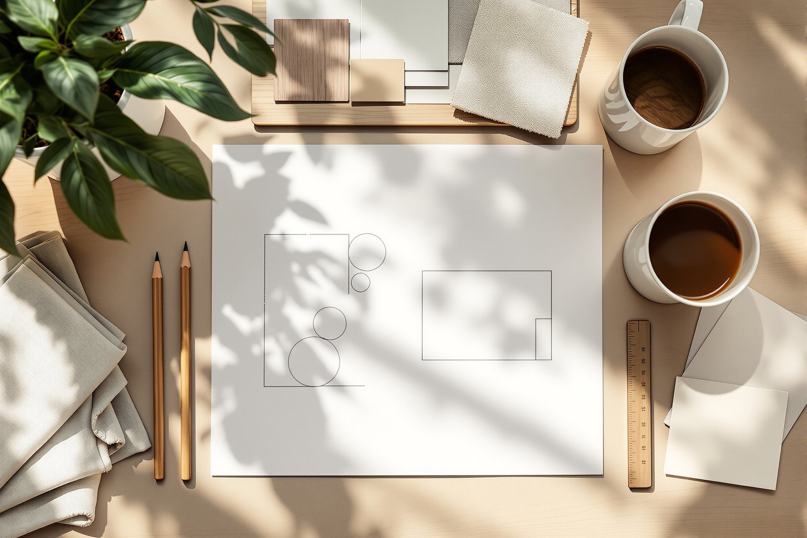
A pencil sketch of three soft bubbles labelled entry, talk and dine, with a dotted desire-line threading past them — and a sticky note beside it reading 'warm, flexible, one calm material'.
Meet the Raos, and write down what they actually need
Anil and Sushma Rao live in a 2 BHK apartment in Pune with their nine-year-old daughter Meera. Anil's parents visit from Nagpur for a month or two each year. The living-dining is one continuous room of roughly 3.6 x 6.9 m that opens off the entry door, sits beside the kitchen, and ends at a west-facing window.
Your first job is not design at all — it is the interview, the opening move of the design process you met in Module 2. You sit with the family and ask who uses this room, and for what. The answers spill out: they want to talk — a proper conversation group where four or five people can sit and face each other, not a row of chairs aimed at a TV. They watch television most evenings. They eat together every night, dining for the three of them but for six or more when Anil's parents or Sushma's sister's family come over. Meera needs somewhere to do homework and spread out her colours and craft. When the grandparents stay, someone has to sleep here. And Sushma wants a small, dignified pooja-and-display corner — not a separate room, just a presence.
Then come the constraints, which you write down just as carefully. The budget is firm at about 4.5 lakh for the whole room. The entry door, the kitchen opening and the window are all fixed — you cannot move services or structure. A 300 mm deep beam crosses the room about two-thirds of the way along, dropping the ceiling there. And that west window throws hard, hot afternoon light straight into the room from 2 pm onward.
Finally — and this is what separates a designer from an order-taker — you rank it all. You cannot give everything top billing in 3.6 x 6.9 m. With the family you agree the order: a real conversation group and comfortable seating for six at dinner come first; a flexible homework-and-guest-bed zone second; the pooja-display corner third; the TV important but not the room's master. That ranked list, written out, is the design brief — the programme that every later decision will answer to.
Read the room before you fill it
Now you do what Module 1 called reading a space — treating the empty room itself as the prime material, the thing you are actually shaping. You go to the flat with a tape and you survey honestly.
You measure the true dimensions, not the builder's brochure ones: 3.6 m wide, 6.9 m long, ceiling at 2.9 m dropping to 2.6 m under that beam. You note orientation and daylight: the long room runs roughly east-to-west, so the entry end is dim in the afternoon while the far end blazes. The west window is your best daylight and your worst heat-and-glare problem at once — a tension you will have to design with, not ignore.
You mark the fixed services: the entry door swinging in at one corner, the kitchen opening on the long wall about a third of the way down, two existing power points, and the TV-and-cable provision on the opposite wall. You note the structure — that beam, and which walls are solid. And you stand in the doorway and trace the circulation desire-lines: the path a person naturally walks from the front door, across to the kitchen, and through to the bedroom passage. People will take the straightest route whether you like it or not, so you draw that line now and promise yourself you will not block it with a sofa. Reading the space this way turns vague worries into a real, measured set of facts you can design against.
Zone it in bubbles before you touch furniture
Here is the discipline that saves beginners from chaos: you place activities before you place objects. You sketch a bubble diagram — loose, soft-edged blobs, one per zone — over a quick outline of the room. No furniture yet. Just: where does the entry breathe, where does the conversation group sit, where does dining go, where does the circulation spine run.
Your ranked brief and your reading of the room push the bubbles into place almost on their own. Dining wants to be near the kitchen, so that bubble lands beside the kitchen opening — short trips with hot serving dishes, the clearances from Module 4 telling you to leave at least 900 mm to pull chairs out and a path behind them. The conversation group wants daylight and quiet, so it drifts toward the window end — but you pull it just shy of that hot west glass, under the calmer ceiling. The circulation spine, that desire-line you traced, becomes a clear lane down one side that none of the seating crosses. The pooja-display bubble tucks into a corner with a solid wall behind it. And the homework-and-guest-bed zone overlaps the conversation group — a single flexible area that changes role by time of day.
You shuffle the bubbles two or three times, testing adjacencies: is dining too far from the kitchen? Does the TV face into glare? Does anyone have to walk through the conversation circle to reach the bedrooms? When the blobs finally sit without fighting each other, you have a plan of the room before you have spent a single rupee or drawn a single sofa.
Distil one idea: the concept and its mood
A working plan is not yet a design. Many rooms could hold these same bubbles and feel completely different — calm or busy, warm or cool, formal or easy. The thing that decides which one the Raos get is the concept: a single guiding idea you commit to, the central decision from Module 2 that every later choice will be measured against.
You write it as one line. For the Raos it becomes: "A calm, warm island for a busy family — one quiet material running through, and the evening light doing the work." That concept statement is small but it is a ruler. It tells you the room should feel warm (so a cool, glassy palette is out), flexible (so heavy fixed furniture is out), built on one calm material that ties the zones together, with lighting tuned for evenings because that is when this family actually lives here.
Now you give the concept a face on a mood board. Reaching back into the design vocabulary of Module 3 — proportion, balance, colour — and the lighting layers and finish materials from later modules, you assemble it: a palette of warm off-white walls, soft terracotta and clay tones, and one anchoring material — let us say honey-toned wood — running from a low media unit through the dining table to a display shelf, so the eye reads the long room as one place, not three. The light and feeling: warm 2700 K lamps for the evenings, a diffusing layer at the west window to turn that harsh afternoon glare into a soft glow rather than fighting it. Restful, low-contrast, easy to host in. Pin a few images, the wood sample, the paint chips, the lamp warmth — and that board becomes the compass for every drawing, finish and fitting still to come.
Build your own brief and concept
Before you go further, do this for a room of your own — yours, a friend's, or an imagined family like the Raos. Open the design-brief-builder interactive. It walks you through exactly the moves you just watched: tick the activities the room must hold (conversation, TV, dining for how many, homework, guest sleeping, pooja-display), tick the constraints (budget band, fixed door and window and kitchen positions, an awkward beam, a hot window), and rank what matters most. As you tick, it assembles a clean written programme for you — and then suggests a starting concept direction and palette mood you can take or argue with.
Use it as a thinking tool, not an answer machine. The point is that by the end you have a real brief and a one-line concept in your own words, ready to turn into drawings. That is the whole front half of designing a room — and you did it before placing a single chair.
Hands-on
What must this living-dining hold?
- • a floated conversation group
- • a dining zone for 6+
A focused room built around a few clear uses — give the lead activity the prime daylight and the focal point, and keep the rest quiet.
A brief is just this: every job the room must do, ranked. Once it is written down, the concept and every later decision have something honest to answer to.
Three altitudes on the same idea
Read the band that fits you — or all three.
If you are doing up your own living-dining, resist the urge to start by picking a sofa or a paint colour. Sit your family down and make the list first: every activity the room must hold, every fixed thing you cannot move, and an honest budget — then rank them. That one-page brief will protect you from the most expensive mistake homeowners make, which is buying furniture that looks lovely in the showroom and fights the room once it gets home.
The interview and the ranked brief are where you earn a client's trust and de-risk the whole job. Get the priorities agreed in writing and signed off before concept, because the conversation-vs-TV, dining-six-vs-flexible-eight tension always surfaces later if you skip it. Present the concept as a single statement plus a mood board, not a finished render — clients buy into a clear idea more readily than a pretty picture they will want to redline.
In a studio crit, the bubble diagram is your best defence. When a tutor asks why the dining sits where it does, you point to the brief (near kitchen), the survey (fixed kitchen opening) and the adjacency test (short serving path, clear circulation). Practise drawing the four-bubble version of any room in under two minutes — entry, conversation, dining, spine — before you ever lay furniture. It trains you to design the experience before the objects.
“Designing a room means choosing nice furniture and a colour scheme — the rest is just arranging things.”
Run the method yourself
Take a real living-dining — yours, a relative's, or the Raos' — and walk it from blank to concept yourself. Five steps, about an hour, no software needed beyond one interactive and a pencil.
- 1Interview the household. Write down every person who uses the room and every activity it must hold, then list the constraints — budget, fixed door, window, kitchen, any beam — and rank the whole lot from most to least important. This ranked list is your brief.
- 2Survey the real room with a tape. Note the true dimensions, the ceiling height (and any drop under a beam), the orientation and which window gives the best and harshest daylight, and the fixed services. Stand in the doorway and pencil the circulation desire-line.
- 3Open the design-brief-builder interactive, tick the same activities and constraints, and let it assemble a written programme and a starting concept direction. Compare its suggestion with your own ranking and note where you disagree — and why.
- 4Sketch a bubble diagram over a rough outline of the room: one soft blob each for entry, conversation, dining and the circulation spine. Shuffle them until dining sits near the kitchen, conversation gets daylight without glare, and nothing crosses the desire-line.
- 5Write a one-line concept statement for the room, then pin a quick mood board — three or four images, one anchoring material, a paint chip and a lamp warmth — that makes the concept visible. That board is now your compass for everything that follows.
What you just did, in order
You now have a brief, a zoning plan and a one-line concept with a mood. In the next lesson, _From Concept to Specification_, you turn all of it into the things a contractor can actually build — a furnished plan with real dimensions, finish and material choices, the lighting layers placed, and a furnishing-and-soft-layer schedule — translating the Raos' guiding idea into drawings and specifications.