
 Lesson 3.2
Lesson 3.2 · A Design Vocabulary
Form and Space: Figure and Ground
How solid form and empty space define each other - and how a designer shapes the void
You don't design the chairs. You design the gaps between them.
Walk into your living room and you'll instinctively count the furniture - the sofa, the table, the shelf. But there is a second thing in that room, just as real, that you were trained to ignore: the shaped emptiness you actually move through. A designer's eye learns to see both at once.
A room is a void with good manners. The walls are just there to introduce it.
One coin, two faces
Pick up a brass diya and look at it. You see a solid form - a curved metal lamp. Now look at the little well in its centre, the hollow that holds the oil. That hollow is not nothing. It is the reason the diya exists; the metal is only there to give the void a shape.
This is the first truth of design: form and space are not two separate things you deal with one after the other. They are two sides of a single coin. Every solid you place - a wall, a wardrobe, a column - simultaneously carves out the empty volume around it. You cannot change one without changing the other. Move the wardrobe and you don't just move an object; you reshape the room you walk through.
Most people design forwards: they buy and arrange the solids and accept whatever leftover space results. The designer thinks both ways at once - aware that the space between things is just as designed, just as deliberate, as the things themselves.
The eye that flips: figure and ground
Perception has a famous trick. You've seen the image that reads as a white vase against a black background - until your eye flips and you suddenly see two black faces in profile, with the vase becoming the empty gap between them. The same picture, two readings. What you call figure (the thing you attend to) and what you call ground (the field behind it) can swap places.
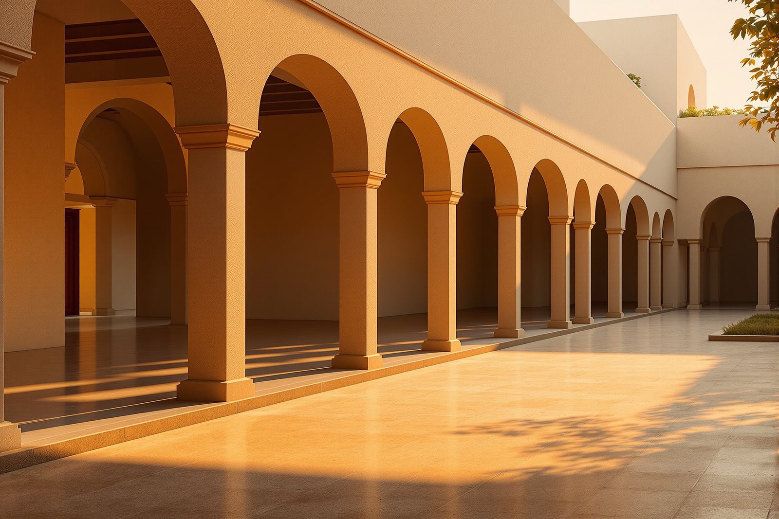
In a room the solid objects are the figure and the void is the ground - that's the default, lazy reading. The whole skill of spatial design is learning to invert it: to look at a verandah and see not the pillars but the cool, shaded volume the pillars hold; to look at a seating group and see the calm pool of floor in its middle as the real thing being designed.
Train this flip and a plan stops being a scatter of furniture symbols. It becomes a pattern of voids - rooms, paths, pauses - that the solids merely fence in.
How planes define a space
So how do you actually make a space without fully walling it in? With planes - vertical and horizontal surfaces that suggest an edge to the void. Each arrangement defines space to a different degree:
- A single horizontal plane - a dhurrie rug on the floor, or a raised stone platform like a temple jagati - barely whispers an edge. It says "the zone is here" without any walls at all.
- A single vertical plane - a carved partition or a tall bookshelf - gives a space a front, a face to gather toward, but leaves the sides open.
- An L-shaped pair of planes - two walls meeting at a corner, or a sofa set against a perpendicular console - anchors and claims a corner. The diagonal is the active edge.
- Parallel planes - two facing walls, or a gully of cupboards down both sides - channel you. They don't enclose so much as direct movement along their length.
- A U-shape - three sides closed, one open - gives strong, protective enclosure while still inviting you in. Think of a pooja niche or a window seat hugged on three sides.
- Four planes give full enclosure: a room. The void is now captured, private, complete.
Notice the progression: each added plane takes the space one step from open suggestion toward closed shelter.
Degrees of enclosure
String those arrangements along a line and you get a gradient - from fully open at one end to fully enclosed at the other. Indian homes, beautifully, live all along this gradient rather than at its extremes.
At the open end sits the rooftop terrace - one horizontal plane underfoot, sky and air on every side. Step in slightly and you reach the verandah: a roof plane overhead carried on columns, but no walls, so the breeze and the garden flow right through. The courtyard (aangan) inverts this - solid walls on all four sides, yet the sky stays open above, so it is enclosed in plan but open to the heavens. The jaali room - screened with a perforated stone or wood lattice - is almost fully closed, yet the holes leak light, air and glimpses, keeping it from feeling sealed. Only the solid room, four walls and a ceiling, reaches the closed end.
This spectrum is not a ranking. Each degree suits a different life: the terrace for festivals and drying chillies, the verandah for afternoon tea and unannounced guests, the courtyard for cross-ventilation and family gathering, the room for sleep and privacy.
Choosing the right degree, on purpose
Here is the designer's real job, the one that hides behind all the talk of style and finishes: for every activity in a home, you choose where it should sit on the enclosure gradient - and then you build only as much plane as that choice needs.
A reading nook wants gentle hug, not a vault, so an L of low shelving and a rug may be enough. A home office on a video call wants four walls and a door. A dining area in a flat often wants the in-between - defined by a ceiling change or a single half-height plane, open enough to feel sociable, edged enough to feel like a place.
When you choose deliberately, you stop over-walling small homes into a warren of dark cells and you stop leaving large spaces so undefined that no one knows where to sit. You shape the void to fit the life - and you spend walls only where the void truly needs them.
Three altitudes on the same idea
Read the band that fits you — or all three.
Train yourself to look past the furniture. The next time a room feels off, don't ask "what object is wrong?" - ask "what is the shape of the empty space I'm standing in?" Often the sofa is fine; it's the leftover void around it that has gone shapeless and awkward. Move things to give the emptiness a clean, intended shape, and the room calms down.
Design space with planes, not just walls. Before you reach for full enclosure, ask whether an L, a pair of parallel planes, or a U would define the zone with less mass and more flow. A single dropped ceiling or a half-height screen often reads as "a place" more elegantly - and far more cheaply - than another partition. Specify the minimum plane that achieves the intended degree of enclosure.
The figure-ground relationship is your analytical lens. In any plan, render the voids as solid black and the solids as white, then read it inverted: are the rooms, paths and pauses well-shaped figures, or accidental leftovers? A plan where the negative space is as intentional as the positive is a designed plan. The void is derived from the solids - but a skilled hand designs them together.
“You design the objects, and the space is just whatever happens to be left over.”
matka, and treats the solids as the means, not the end.Run the method yourself
Five minutes, one room, fresh eyes:
- 1Stand in any room and name the figure (the solid furniture) out loud - then deliberately flip and name the ground (the shaped empty volume you'd walk through). Feel your eye switch.
- 2Trace the outline of the empty floor between your furniture with your finger in the air. Is that void a clean shape, or a ragged accident?
- 3Pick one space in your home and count how many planes enclose it - floor only? floor plus one wall? an L? a U? four sides?
- 4Walk to a verandah, balcony or covered porch and identify it as a partly-defined space: which plane is present (usually the roof) and which are missing.
- 5Place each space you can see - terrace, verandah, courtyard, room - on the enclosure gradient from fully open to fully closed, and decide if its degree actually suits how you use it.
Seeing the void
With the void shaped, we can dress it - and that begins with the single most emotional tool in the kit: colour, read through its three dimensions of hue, value and saturation.