
 Lesson 3.3
Lesson 3.3 · A Design Vocabulary
Colour: Hue, Value and Saturation
The three dimensions of colour - and why value, not hue, usually decides a room
You think you are choosing a colour. You are really choosing three.
Stand in a paint shop in Bengaluru or Jaipur and you will reach for a hue - a warm terracotta, a deep indigo, a sage green. But hue is only one of three dials. The other two, quietly, are the ones that decide whether your room feels luminous and calm or muddy and tired. Most rooms that fail do not fail on hue. They fail on value.
Anyone can pick a hue. Designers pick a value and let the hue tag along.
Colour is three independent things
When you say colour, you usually mean hue - the family a colour belongs to: red, blue, green, yellow. Hue is the name on the paint tin, the word you say out loud. But hue alone tells you almost nothing about how a colour will behave on a wall.
Every colour also has a value - how light or dark it is, from near-white to near-black, completely independent of its hue. A pale sky blue and a pale buttery yellow are different hues but similar values; navy and a deep forest green are different hues but again similar values. Squint at any photograph of a room and the hues fade away, leaving only the pattern of lights and darks. That pattern is value, and it is doing most of the work.
And every colour has a saturation (also called chroma or intensity) - how pure or how greyed it is. A vivid pure red and a dusty greyed rose share the same hue, but one shouts and one whispers. Pull saturation all the way out and every hue collapses to grey.
Three dials. Turn one without touching the others, and the colour transforms. This is the single most useful idea in this lesson, and the colour-explorer interactive lets you feel it directly.
Why value does the heavy lifting
Here is the part most people never hear: in a room, value usually matters more than hue. Value contrast is what creates the sense of light, depth and three-dimensional form. It is what makes a dark sofa read against a pale wall, a white cornice float above a coloured ceiling, a framed print sit forward from the plaster behind it.
Get the values right and a scheme will work in almost any hue - blues, greens, ochres, it hardly matters. Get the values wrong - everything clustered at the same mid-tone - and even the loveliest hue turns flat and muddy, the kind of room you walk into and cannot say why it feels heavy.
This is why the most reliable way to test a palette is to remove hue from the equation. Photograph your swatches and convert the image to greyscale, or simply sort your objects, cushions and tiles by how light or dark they are rather than by colour family. If the lights, mids and darks are clearly spread out in grey, the room will have life. If they all blur together, no hue will save it.
The colour wheel and the schemes it builds
Arrange the hues in a ring - red flowing to orange to yellow to green to blue to violet and back - and you have the colour wheel, the oldest map in design. Its value is not decoration; it tells you which hues are relatives and which are opposites, and from that you can build the classic schemes.
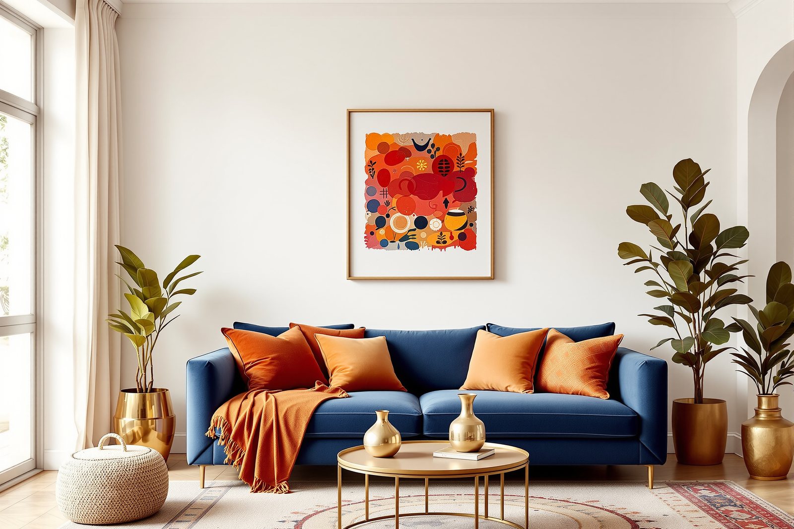
A monochromatic scheme uses one hue and varies only value and saturation - think a room built entirely from terracotta, from the palest sand-washed plaster to a deep burnt clay. Quiet, sophisticated, hard to get wrong. An analogous scheme uses neighbours on the wheel - ochre, mustard and warm green - so the colours hum together like notes in a chord. A complementary scheme uses opposites - blue against orange, the indigo-and-marigold pairing you see across Indian textiles - high energy, vivid, used in small doses. A triadic scheme picks three hues evenly spaced around the wheel, balanced but lively.
Notice that none of these schemes tells you anything about value or saturation - you still set those yourself. The wheel chooses your hue relationships; you must still make the values sing.
Distributing colour: the 60-30-10 idea
Once you have your hues and values, you have to decide how much of each to use - and a room with every colour in equal measure looks restless. A simple, forgiving guide is the 60-30-10 split.
Roughly 60% of the room is your dominant colour - usually the quietest, often the walls and large surfaces, frequently a warm white or a soft neutral. About 30% is your secondary colour - upholstery, curtains, a rug, a feature wall - enough to give the room its character. The last 10% is your accent - cushions, art, a vase, brassware, a single bold chair - the spark that makes you look twice.
The percentages are not sacred; they are a starting reflex. What they encode is a hierarchy: one colour leads, one supports, one punctuates. The fastest way to learn this is to find a room you love - in a magazine, a friend's home, a hotel lobby - and work out its dominant, secondary and accent. You will see the 60-30-10 logic almost every time.
Colour under Indian light - and how rooms feel
Colour is not fixed; it is whatever the light makes of it. And Indian light is ferocious. A midday sun in the plains can hit well over a lakh lux, and it does two cruel things at once: it bleaches pale pastels until they look thin and chalky, and it supercharges saturated hues until they glow. The dusty pink that looked refined in the shop can vanish into white by noon; the deep emerald that seemed risky can come alive.
This is why our oldest colour traditions lean into depth, not pallor - the indigo, madder-red, marigold and turmeric of textiles, the saffron and deep green of festivals, the terracotta and ochre of village walls. Saturated, earthy, jewel-toned colours hold their own against strong sun in a way timid pastels cannot.
It is also why warm whites beat cool whites in most Indian rooms. A blue-tinted cool white can read clinical and grey under our warm-tinted daylight; a warm white with a whisper of yellow or pink stays soft and inviting. Temperature also changes how a room feels: warm hues (reds, ochres, terracottas) advance and make a large room feel cosy and enclosed; cool hues (blues, greens) recede and make a small room feel larger and calmer. Never, ever trust a swatch under the shop's tubelight - tape it to your own wall and look in the morning AND the evening.
Hands-on
#b86846
the colour
124
its value
a 60-30-10 scheme from this hue
Three independent dials
Lock the hue and move only value, then only saturation — watch the same hue go luminous, muddy, then dusty. The grey chip is what your room really reads.
Three altitudes on the same idea
Read the band that fits you — or all three.
When you choose a palette, choose for the light you actually live in, not the light in the showroom. Bring the paint chip home, tape it to the wall, and look at it in morning light and again at dusk - warm Indian daylight and yellow evening bulbs can make the same chip look like two different colours. Lean towards warm whites over cool blue-whites, and trust deeper, slightly muted versions of a colour over bright pastels, which bleach and chalk out under strong sun. A palette that survives daily life is one where dirt, scuffs and bright noon all forgive it.
Build a scheme as a value structure first, hue second. Decide your dominant, secondary and accent before you commit to any specific colour - the 60-30-10 split is a reliable default for distribution. Spread the values: a clear light, a clear mid, a clear dark, so the room has depth rather than a flat mid-tone wash. Then resolve undertones - is that beige leaning pink, green or yellow? - because clashing undertones, not clashing hues, are what quietly make a 'neutral' scheme feel off. Hold saturation in reserve; let one accent carry the high-chroma punch while the dominant stays calm.
Internalise that colour is a three-dimensional space, not a single name. The three independent dimensions are hue (the colour family, the position on the wheel), value (lightness to darkness), and saturation (purity versus greyness, sometimes called chroma). Every named colour is a coordinate on these three axes. The classic schemes - monochromatic, analogous, complementary, triadic - are all defined purely by hue relationships on the wheel, which means value and saturation remain yours to design. Master the three dials separately on the colour-explorer and you will understand colour better than someone who has memorised a hundred palettes.
“Colour means hue - picking a colour is just picking a hue you like, like 'blue' or 'sage' or 'terracotta'.”
Run the method yourself
Five things you can do right now, in your own room, with your own eyes.
- 1Take five objects from one shelf - a book, a cushion, a vase, a frame, a bowl - and physically sort them from lightest to darkest, ignoring their colour entirely. You are now seeing value, the dial most people never notice.
- 2Buy or pick one paint chip and tape it to the wall where it might actually go. Look at it in morning daylight and again after dark under your evening bulbs - note how much the same chip shifts.
- 3Find a room you love in a photo or in real life and name its dominant, secondary and accent colours. Estimate the rough percentages and see how close it lands to 60-30-10.
- 4Photograph a corner of your room and convert the image to greyscale on your phone. If the lights, mids and darks all blur into one grey, your value contrast is too weak - the room needs a clearer dark or light.
- 5Open the
colour-explorer, lock the hue, and move only the value and then only the saturation dial - watch the same hue go from luminous to muddy to dusty, so you can feel how independent the three dimensions really are.
Putting the three dials together
colour-explorer turning one dial at a time, and then go test a real chip in your own ferocious afternoon and soft evening light. Once you can see all three dimensions separately, you stop guessing at colour and start designing it.But a colour never arrives alone - it arrives _on something_, and the same terracotta feels utterly different on rough lime plaster than on glossy tile, which is where our next lesson begins: texture, the feel of a surface.