
 Lesson 6.3
Lesson 6.3 · Lighting and Acoustics
Colour Temperature, CRI and Light Quality
The two numbers on every bulb box that decide how a room feels and whether your walls, food and skin look the way they truly are.
Same room. Same paint. Two completely different homes.
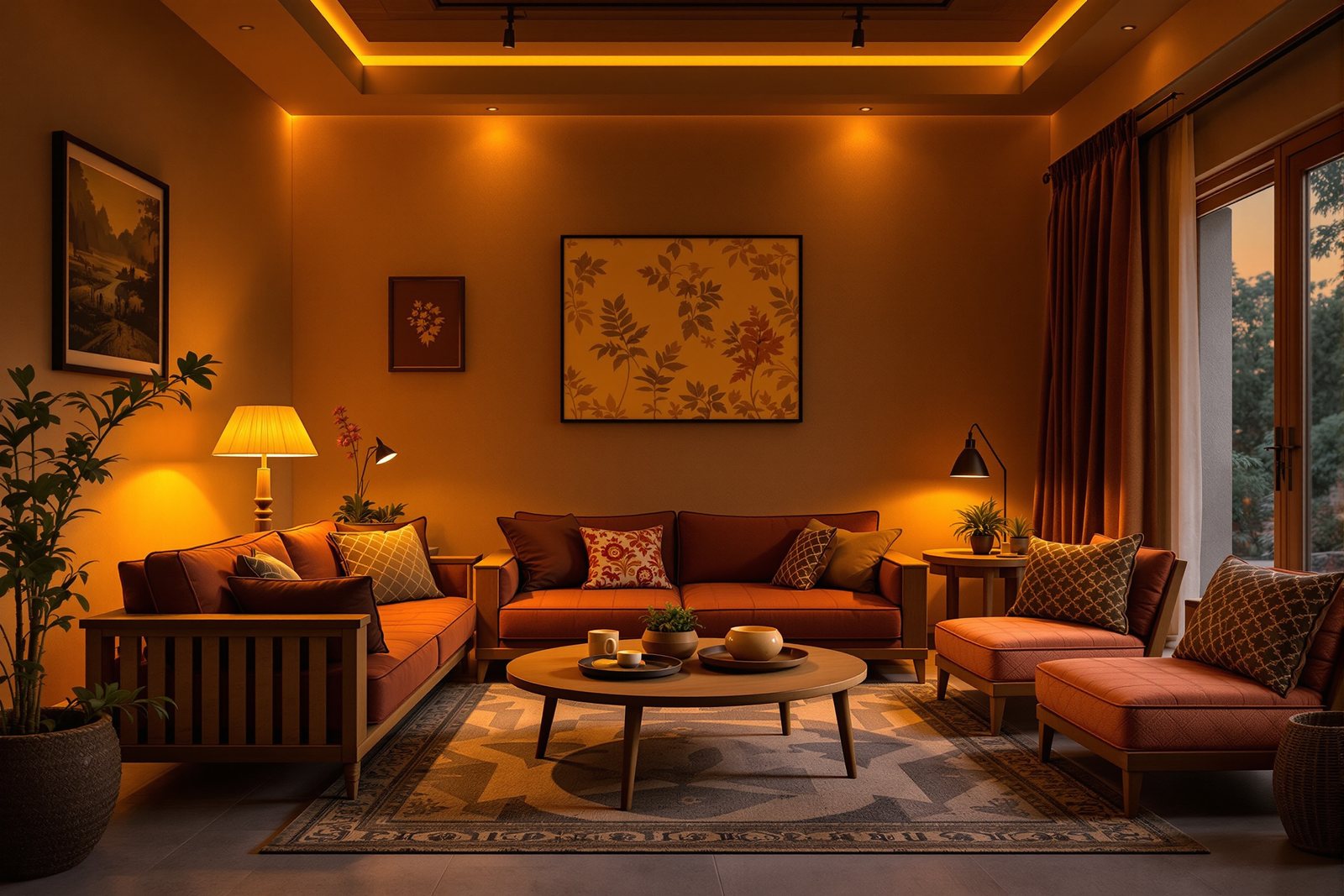
You have felt this without naming it. Step into a living room glowing with soft amber light and your shoulders drop. Step into the same room lit by a harsh blue-white tube and it suddenly feels like a clinic waiting hall. Nothing physical changed — same sofa, same wall colour, same people. Only the quality of the light changed. That quality is not magic or mood; it is two measurable numbers printed on every bulb box, and once you can read them you will never buy the wrong light again.
Sketch a horizontal scale: a glowing amber sun at the left labelled `2700K` warm, a plain white circle in the middle labelled `4000K` neutral, and a cool blue sky at the right labelled `6500K`. Below it, draw a ceiling with one amber bulb and one blue bulb and a big X through it — the do-not-mix rule in one stroke.
Colour temperature: why warm light has a low number
Pick up any LED bulb box in India and you will find a number followed by K — 2700K, 4000K, 6500K. This is the colour temperature, and it describes the hue of the white light, not how bright it is.
Here is the part that trips everyone up: the naming feels backwards. Low Kelvin looks warm; high Kelvin looks cool. A 2700K bulb glows amber and cosy, like a candle flame or the last light of evening. A 6500K bulb is crisp, blue-white, like an overcast noon sky. So the lower the number, the warmer and more golden the light feels.
The physics is simple even if the names are odd: imagine heating a piece of metal. At a lower temperature it glows a deep red-orange; heat it hotter and it shifts through orange to white to bluish-white. Lighting borrows that exact scale. So a 'warm' room light actually corresponds to a lower temperature on the Kelvin scale. Once you accept that low equals warm, every bulb box in the shop suddenly makes sense.
Which temperature belongs in which room
Each band of the Kelvin scale has a job.
Warm — `2700-3000K`. Amber, gentle, relaxing. This is the light for bedrooms, living rooms and dining areas — anywhere you unwind, talk, or eat. It flatters skin, makes wood and fabric glow, and signals to your body that the day is winding down. For most Indian homes, this is the default you want across the living spaces.
Neutral — `3500-4100K`. Clean and alert without going cold. This is the light for kitchens, bathrooms, study tables and workspaces — places where you need to see clearly and stay focused. It keeps whites looking white and helps with detailed tasks like chopping, shaving or reading.
Cool — `5000-6500K`. Crisp, daylight-blue, almost clinical. It is genuinely useful in a garage, utility area, or a task spot where you inspect fine detail — but drop it into a living room and the space feels like a hospital corridor. Save the cool end for work, never for rest.
Notice the logic: warm where you relax, neutral where you work at home, cool only where the job demands raw clarity.
The cardinal rule: never mix warm and cool on one ceiling
This is the single most common lighting mistake in Indian homes, and it is almost always accidental. A bulb fuses, someone runs to the nearest shop, and they grab whatever is on the shelf — a 'cool daylight' LED to sit beside the three 'warm white' ones already on the ceiling. Now one corner of the room glows amber and another glows blue-white. The eye instantly reads the space as broken and unbalanced, even if the person cannot say why.
The rule is unforgiving but easy: keep one colour temperature consistent within a room, and ideally across the whole home. Pick warm for your living spaces and stay with it — every fitting, every replacement, every lamp. Mixing temperatures on a single ceiling is the lighting equivalent of wearing one black shoe and one brown.
The practical defence is to standardise before you ever need a replacement. Decide your home runs on 2700K warm white, write it down, and buy the same spec every single time. The shop will always have both on the shelf; the discipline has to come from you.
CRI: does the light show true colours?
Colour temperature decides the mood. The second number decides the truth. CRI — Colour Rendering Index — runs from 0 to 100 and measures how faithfully a light reveals real colours compared to an ideal reference like daylight.
Under a low-CRI light, something quietly goes wrong. Skin looks sallow and tired. Fresh vegetables and cooked food look grey and unappetising. A rich maroon sari turns muddy, and two fabrics you carefully matched in the shop suddenly clash at home. The colours are all still there — the light just isn't rendering them honestly.
The number to remember is `CRI 90` and above wherever colour matters: the wardrobe and dressing mirror (so your outfit colours are real), the kitchen (so you can judge whether food is cooked), and anywhere you display art or showcase products. For ordinary corridor or storeroom light you can relax, but never compromise on CRI at the mirror or the cooking counter. A cheap bulb that looks fine in the box can quietly make your whole home look a little off — and CRI is the number that tells you in advance.
Light, your body clock, and the traps in cheap LEDs
Colour temperature does more than decorate — it talks to your body. Warm evening light winds you down and helps you ease toward sleep, while cool daytime light keeps you alert and focused. This is why a bright blue-white bulb in the bedroom feels subtly wrong and can leave you wired at night. The most elegant fittings now offer tunable white or dim-to-warm behaviour: cool and bright through the working day, and as you dim them in the evening they drift toward a warm amber glow — light that follows your day instead of fighting it.
To really feel how dramatic this shift is, try the colour temperature slider further down this lesson. Drag it from 2700K to 6500K and watch the same room scene slide from cosy amber to cold clinical blue-white — you will instantly see why the wrong choice can ruin a beautiful space.
Finally, two hidden traps in cheap LEDs. First, they often hide a low CRI even when they look bright, so colours suffer. Second, many cheap drivers flicker — a rapid pulsing you may not consciously see but which causes eye strain and headaches over long evenings. Before you buy, check the box for the CRI figure, and switch the bulb on and wave your hand or your phone camera in front of it: visible banding or strobing means flicker. A good light is judged not by how bright it is, but by how kindly it behaves.
Hands-on
Counter-intuitively, the low number is the warm amber light and the high number is cold blue. Keep one temperature consistent across a space — and remember Kelvin is only mood; CRI 90+ is what makes skin, food and fabric look true.
Three altitudes on the same idea
Read the band that fits you — or all three.
Make one decision and let it rule your whole home: `2700-3000K` warm white for living, dining and bedrooms; reserve neutral 4000K for the kitchen and bathroom. Write the spec on a note in your phone so every future replacement matches. When you buy, insist on `CRI 90`+ for the kitchen and the wardrobe mirror, and switch the bulb on in the shop to check it is steady, not flickering.
Specify colour temperature and CRI explicitly in every lighting schedule — never leave it to the contractor's nearest shelf. Standardise warm white across residential living zones, step to neutral for wet and work areas, and call out CRI 90+ for kitchens, wardrobes, mirrors and any art lighting. For premium projects, propose tunable white or dim-to-warm in master suites and living rooms so the light tracks the client's day, and brief the electrician to verify driver flicker on site before handover.
Train your eye before you trust your instruments. Walk through three rooms tonight and guess each bulb's colour temperature, then check the boxes if you can find them. Notice how a single mismatched cool bulb wrecks an otherwise warm room. Learn to defend a number: when you place a 2700K, CRI 90 fitting in a bedroom, be able to explain it in terms of mood, body clock and colour fidelity — not just preference.
“Higher Kelvin means a better, brighter, higher-quality bulb — so a cool 6500K 'daylight' bulb is the premium choice.”
6500K bulb is simply bluer and cooler, which suits a garage but feels clinical in a living room. Brightness is measured separately in lumens, and true quality lives in CRI and freedom from flicker. A warm 2700K bulb with CRI 95 is a far finer light than a cold 6500K bulb with CRI 75.Run the method yourself
Spend twenty minutes turning your own home into a lighting laboratory. You will start noticing light everywhere afterwards.
- 1Audit your home: walk room to room and read the colour temperature off each bulb box or fitting. Mark every place where a warm and a cool bulb share one ceiling — those are your mismatches to fix.
- 2Open the colour-temperature slider in this lesson and drag slowly from
2700Kto6500K. Stop at each band and decide aloud which room of your home it belongs in. - 3Run a CRI test: hold a colourful fruit or a bright fabric under your kitchen light, then under a window in daylight. If the colours look noticeably duller indoors, your kitchen light has a low CRI.
- 4Check for flicker: switch on a suspect LED and slowly wave your hand or your phone's slow-motion camera in front of it. Banding or strobing lines mean the driver flickers — a sign of a cheap bulb to replace.
- 5Pick your home's standard: choose one warm colour temperature (most homes are happiest at
2700K), note it down, and commit to buying only that spec from now on.
Reading light like a designer
2700-3000K to relax, neutral 3500-4100K to work, cool 5000-6500K only where raw clarity is needed — with the cardinal discipline of never mixing warm and cool on one ceiling. CRI decides truth — 90+ wherever skin, food, fabric or art must look real. Add a watchful eye for hidden low CRI and flicker in cheap LEDs, and you can specify light that doesn't just illuminate a room but takes care of the people in it.90+ where it matters. Beware low CRI and flicker hiding in cheap LEDs.Light shapes how a room looks and feels — but there is a second invisible layer that shapes how it _lives_: sound. In the next lesson we turn from photons to pressure waves and take on **acoustics** — why some rooms echo and exhaust you while others feel calm, and how absorption and isolation let you design for the ear as deliberately as you just learned to design for the eye.