
 Lesson 3.4
Lesson 3.4 · A Design Vocabulary
Texture and the Feel of a Surface
The quality you touch with your eyes - rough and smooth, matt and glossy, and the light that reveals them
Close your eyes and run your hand along the wall
A room you have never touched can still feel rough or smooth, warm or cold, soft or hard. That feeling, read entirely through your eyes, is texture - the surface quality of every material in the space, and the quiet reason one room invites you in while another, identical in colour and layout, leaves you cold.
A flawless gloss finish is just a surface waiting to show you a fingerprint.
The surface quality you read with your eyes
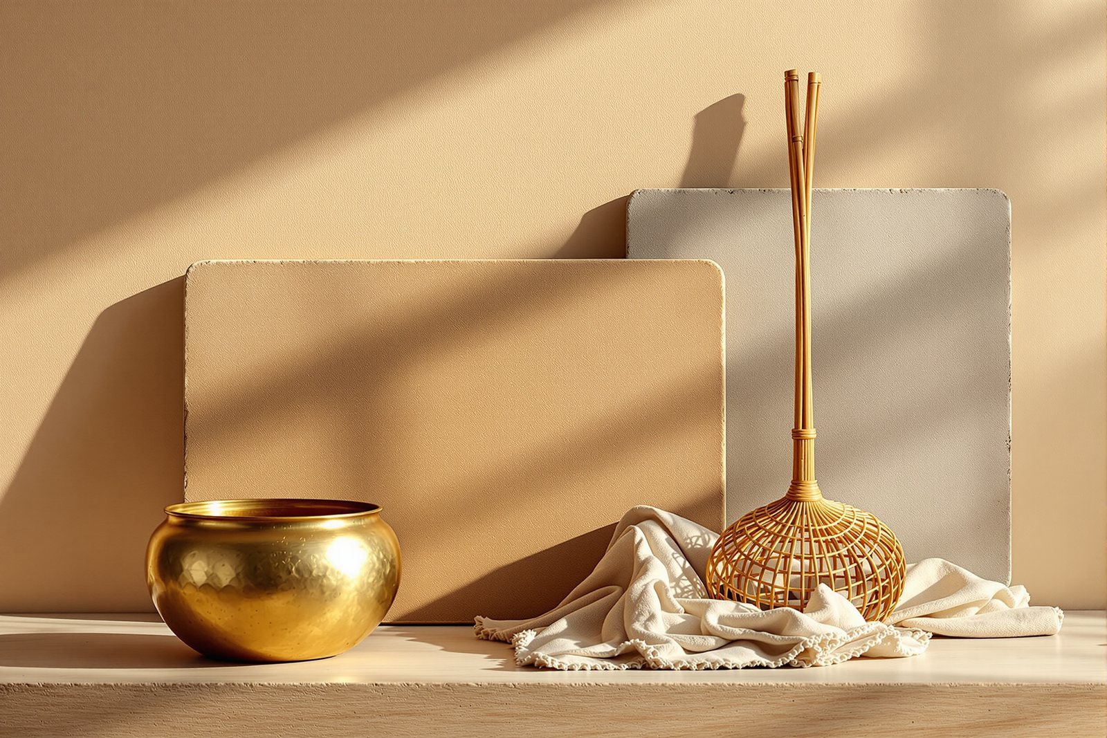
Texture is the character of a surface - how rough or smooth, soft or hard, matt or glossy a material is. It is the difference between a wall of raw Kota stone with its faintly pitted, stony grain and a wall of mirror-polished granite that throws back the room like still water.
You notice texture most when it is missing. A room finished entirely in flat paint, laminate and glass can have perfect proportions and a lovely colour and still feel sterile - flat, cold, a little like an unfinished render. Texture is what gives a space body. It is not a decorative afterthought you sprinkle on at the end; it is one of the core elements of the visual language, sitting alongside colour and line, and it carries an enormous share of how comfortable a room feels.
Tactile texture and visual texture
There are two kinds, and the distinction matters. Tactile texture is real and three-dimensional - if you ran your fingertips across it, you would feel the relief. The hand-pulled weave of a handloom cotton throw, the soft chalky drag of lime plaster, the cool ridges of split cane, the grit of raw Kota: these have genuine depth your skin can read.
Visual texture is the appearance of texture printed onto a smooth surface. A laminate that photographs teak grain, a vitrified tile that mimics weathered stone, a wallpaper that looks like rough plaster - run your hand across them and they are dead flat and slick. They borrow the look without the feel. Both are useful, but they behave very differently under light and under the hand, and a room that is all visual texture and no tactile texture often feels subtly fake, like a photograph of a warm room rather than the room itself.
How light builds and erases texture
Here is the secret most people miss: texture is not really a property of the material at all - it is a property of light. A rough surface looks rough only because thousands of tiny bumps each cast a tiny shadow. Take the shadows away and the roughness vanishes.
This is why a lime plaster wall looks plain and chalky at noon under flat overhead light, then comes alive at six in the evening when low, raking sun skims across it and every ripple throws a long shadow - the whole wall seems to breathe. India's harsh, near-horizontal evening light makes this especially dramatic; a rough wall here can be a different object morning and evening. Finish matters too: glossy surfaces bounce light back hard and read as cool, sleek and formal, while matt surfaces drink the light in and feel warm, soft and quiet. The same granite, polished or leather-finished, can feel like a bank lobby or a farmhouse kitchen.
Composing a texture palette
A room comes alive when textures are made to play against each other. The principle is contrast: set rough beside smooth, matt beside gloss, hard beside soft, and the eye has somewhere to travel. Picture a polished granite counter (smooth, glossy, hard) meeting a rough lime plaster wall (matt, soft-looking) with a stack of handloom cotton cushions nearby (soft, woven, tactile) - three textures arguing pleasantly, and the room reads as rich rather than busy.
India hands you an extraordinary palette for this: woven handloom and silk, fired terracotta, hammered brass, carved jaali, split cane, chalky lime plaster, stony Kota. The discipline is restraint - three or four well-chosen textures in clear contrast, not ten. Too many and the richness tips into clutter; too few and you are back to the cold, flat room you were trying to escape.
Pattern, distance and the maintenance reality
There is a quiet bridge between texture and pattern. A pattern - a repeating motif - dissolves into texture once you step far enough back. The individual flowers on a block-printed curtain are a pattern at arm's length; from across the room they merge into a soft, busy texture. Carved jaali, a brick lattice, a woven rug: all read as pattern up close and texture from afar. Distance is the dial.
And there is a practical truth worth respecting. Rough and matt surfaces are forgiving - they hide dust, scuffs and water marks, which is why lime plaster and leather-finished stone wear so gracefully in Indian homes. High-gloss surfaces are honest to a fault: every fingerprint, every smear, every speck of dust shows on a mirror-polished black granite counter. Choosing texture is partly an aesthetic decision and partly a decision about how much wiping you are signing up for.
Three altitudes on the same idea
Read the band that fits you — or all three.
If your room feels flat, sterile or cold despite nice colours, you almost certainly have a texture problem, not a colour one. The fix is to introduce contrast: against your smooth, glossy surfaces (tiles, glass, polished stone) add something soft and matt - a handloom cotton or jute rug, a woven cane chair, a chunky-knit throw, a rough terracotta pot.
Aim for three or four clearly different textures in a room - one hard and smooth, one soft and woven, one rough and matt. That contrast is what makes a space feel warm and lived-in rather than like a showroom.
Treat texture as a deliberate palette you compose alongside the colour palette, not a styling step at the end. Map each major surface on a few axes - rough/smooth, matt/gloss, hard/soft - and ensure the room has genuine spread across them rather than clustering at one end.
Balance it against maintenance honestly: specify high-gloss where it can be wiped and won't catch raking light cruelly, and use matt and lightly textured finishes in high-touch, high-dust zones where they will age gracefully. Brief the client on the wiping reality of mirror-polished stone before they fall in love with it.
Hold the core distinction precisely: tactile texture is real three-dimensional relief the hand can feel, while visual texture is the printed illusion of texture on a flat surface. The deeper, derived idea is that texture is fundamentally an effect of light - tactile texture exists because micro-relief casts micro-shadows, so it intensifies under raking light and flattens under diffuse light.
Note also that pattern and texture are the same phenomenon at different scales: a pattern resolves into texture as viewing distance increases. Learning to read a surface means reading it together with the light falling on it and the distance you stand from it.
“Texture is a finishing touch - it's really just about fabrics and soft furnishings you add at the end.”
Run the method yourself
Spend fifteen minutes learning to read surfaces with your eyes and your hand.
- 1Stand in one room and catalogue every distinct texture you can find - count the rough, the smooth, the matt, the glossy, the soft. Most flat-feeling rooms have fewer than three.
- 2Pick one tactile texture (a woven cushion, raw stone, lime plaster) and one visual texture (a wood-grain laminate, a stone-look tile) and run your hand over each - feel how the visual one is dead flat while looking textured.
- 3At sunset, watch raking evening light skim across a rough or plastered wall and see how the shadows deepen the texture; then turn on the flat overhead light and watch the same wall go nearly smooth.
- 4Set a rough surface and a smooth surface side by side - a terracotta pot on a polished granite or glass top - and notice how each makes the other look more itself through contrast.
- 5Step back from a patterned curtain, rug or jaali until the individual motifs blur, and catch the exact distance where the pattern turns into texture.
Reading a room through its surfaces
With surface and feel in hand, we turn next to size and relationship - how the proportions of objects and the scale of a space shape the way it makes you feel.