
 Lesson 3.3
Lesson 3.3 · Arrival & Public Spaces
Vertical Circulation & Corridors
Lifts, stairs and the guest corridor are the most-travelled and most-neglected spaces in a hotel - the quiet connective tissue that, done badly, feels institutional and, done well, keeps the welcome alive all the way to the door
The guest corridor is the space a hotel designs last, spends least on, and makes its guests walk down more than any other - which is exactly backwards.
Think about where a hotel guest actually spends their moving time. Not in the lobby they crossed twice, nor the restaurant they visited once, but in the lift they ride several times a day and the corridor they walk every single time they go to or from their room. These are the most-travelled spaces in the entire building - the connective tissue that holds the guest experience together between the grand public rooms and the private sanctuary of the room. And they are, notoriously, the most neglected: the long, flat, dimly lit, endlessly repeating hotel corridor is such a cliche that it has its own horror-film shorthand. That neglect is a design failure hiding in plain sight.
The reason it matters is continuity. The arrival sequence and the lobby can deliver a wonderful welcome, and the room can be a delight, but if the journey between them - the wait for a slow lift, the disorienting lift lobby, the grim march down an institutional corridor past dozens of identical doors - is miserable, the welcome leaks away exactly where the guest is alone, tired and carrying bags. This lesson treats circulation as experience, not leftover space. It covers vertical circulation - lifts and stairs, grouped and sized so waiting feels short and the journey up feels good - and then the guest corridor: why it so often feels institutional, and the moves that make it feel human, legible and like an approach to somewhere you want to be.
The most-walked space gets the least love - fix that. Keep the welcome alive to the door.
Vertical circulation: lifts, stairs and the wait
In any hotel above a few storeys, the lifts are the guest's main vertical journey, and they shape experience in two ways: the wait, and the ride. The wait is largely an engineering problem with an experiential payoff - the number, speed and grouping of lifts, sized by a traffic analysis for the building's height and peak demand, determine whether a guest waits seconds or minutes, and long lift waits at check-out or breakfast are one of the most common and most resented hotel frustrations. The designer's contribution is to group the lifts together in a clearly located lift lobby so the guest does not have to guess which car will arrive, and to make that lift lobby a pleasant, well-lit, well-signed place to wait rather than a dead pocket - the perceived wait shrinks when the space is good and the guest is not anxious about being in the right spot.
The ride and the lift interiors then matter more than their small size suggests, because the guest is trapped in them, close-up, many times a day. A cramped, scruffy, harshly lit lift undoes a good lobby in ten seconds; a well-proportioned, well-lit, nicely finished cab - with a clear floor indicator and intuitive controls - extends the welcome upward. Lift lobbies on each guest floor are also a key wayfinding moment: the instant the doors open, the guest needs to know, without hunting, which way their room number lies. A clear sign or directional cue facing the opening doors is one of the highest-value, lowest-cost wayfinding moves in the whole building.
Stairs play a different role. In most hotels the main guest stair is either a grand architectural gesture in the public volume - a sweeping feature stair that invites people to move between lobby levels and becomes part of the drama - or, for the upper guest floors, primarily a fire escape governed entirely by code. The designer's job is to know which is which: lavish design attention on the feature stair where it earns its keep experientially, and treat the escape stairs as life-safety elements whose dimensions, protection, pressurisation and signage are defer-to-the-code-and-fire-specialist matters, never a place to be clever. Encouraging guests to use attractive stairs for one or two floors is also good for wellness and for lift loading - but only where the architecture makes the stair visible, pleasant and obviously available. Design the vertical journey, in short, so the wait feels short, the ride feels cared-for, and the guest always knows which way to turn when the doors open.
Group the lifts so the wait feels short; make the lift lobby tell you which way to turn.
Why the guest corridor feels institutional
The long guest corridor is the single most neglected space in hospitality design, and it is worth understanding *why* it so reliably feels institutional before trying to fix it. The root cause is structural and economic. The most efficient way to stack guest rooms is the double-loaded corridor - rooms down both sides of a central passage - because it minimises circulation area and maximises the number of rooms, which the whole financial model rewards. But the natural product of that efficiency, left undesigned, is exactly the dispiriting result we all know: a long, straight, flat passage, lit by mean artificial light with no daylight, lined on both sides by dozens of identical doors marching to a vanishing point, with a low ceiling hiding services, a hard acoustic and no sense of where you are or how far you have to go. It is efficient, and it feels like a hospital, a prison or a cruise-ship deck.
Several things compound the gloom. Corridors are usually the place where the building services are crammed - ductwork, pipes, risers - pushing ceilings down and leaving no height to play with. They are internal, so they rarely get daylight or a view. They are long, because long floor plates are efficient, so the perspective is relentless. They are repetitive by nature, because the rooms behind them are repetitive. And they are, frankly, where the budget runs out: after the lobby and the rooms have taken the money and the attention, the corridor gets the cheap carpet, the basic light fitting and none of the design thought. The result is that the guest's most frequent moving experience is also, often, the building's worst.
There is a deeper point here about values. The corridor is the clearest test of whether a designer truly believes that *experience is a journey*, not a set of photogenic rooms. It never appears in the marketing photographs, so it is easy to neglect; but the guest walks it every day, often alone and tired, and it is the last thing they pass through before the sanctuary of their room and the first thing on the way out. A designer who lavishes care on the lobby and abandons the corridor has mistaken the part that photographs for the part that is lived. The good news is that the institutional corridor is not inevitable - it is a default that thoughtful, and often inexpensive, design can decisively break.
Making the corridor feel human
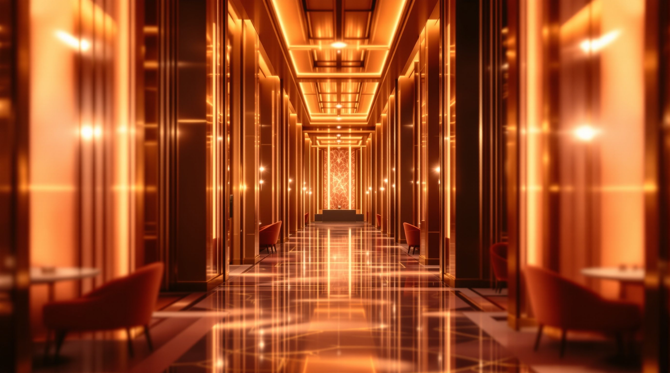
Breaking the institutional corridor is one of the most satisfying craft challenges in hospitality, and most of the moves are about rhythm, light, wayfinding and a sense of approach rather than big budgets. The first move is to break the length: interrupt the relentless straight run with gentle jogs, widenings, a change of direction, an alcove or a seating niche, so the eye never runs uninterrupted to a distant vanishing point. Even subtle variation in the plan turns a tunnel into a series of shorter, comprehensible segments. Where the plan allows, a corridor that bends, steps or opens occasionally to a void, a landing or a window reads as a place rather than a pipe.
The second move is light and the end of the view. Wherever it is possible, get daylight into the corridor - a window at the end, borrowed light, a glazed break - because a sunlit corridor is transformed, and a window at the far end gives the guest a destination for the eye and a sense of orientation. Where daylight is impossible, layered artificial lighting does the work: pools of warm light at the doors and along the run, wall washing rather than a flat institutional blanket, and lighting that varies to create rhythm. The door threshold is the emotional climax of the corridor journey - the approach to one's own sanctuary - so it deserves special attention: a recessed door bay gives a sense of a small private entrance rather than a hole in a wall, and good light, a clear room number and a nice threshold turn arrival at the door into a small pleasure.
The remaining moves are wayfinding, material and acoustics. Clear, well-lit, logically sequenced room numbering, and signage at the lift lobby and at decision points, mean the guest never feels lost - disorientation is a major source of the institutional feeling. Material and pattern - a considered carpet, artwork between doors, a textured or colour-zoned wall, even changing the palette by floor or wing - add interest and aid orientation. And acoustics matter more than designers expect: soft floor and wall finishes keep the corridor quiet, which both makes it feel calmer and protects the rooms from the noise of trolleys, wheeled cases and late-night voices. None of this need be expensive; it needs intent. A corridor designed with rhythm, light, a legible path and a cared-for approach to each door keeps the welcome alive all the way to the room - which is the whole point.
Break the length, bring light, recess the door, guide the way. Intent, not budget.
Circulation as connective tissue and operation
Step back and the real lesson is that circulation is the connective tissue of the entire guest experience - the medium through which the guest moves between every designed moment - and its quality is therefore the quality of the journey itself, not a detail. A hotel is only ever experienced as a *sequence* of spaces joined by circulation, so a broken, disorienting or depressing connection between good rooms is as damaging as a bad room. Continuity of atmosphere is the goal: the brand, the light, the material language and the sense of care should flow unbroken from lobby through lift and corridor to the room door, so the guest never feels they have passed from the hotel's cared-for world into a neglected service zone. The moment the guest feels that drop, the spell breaks.
Circulation is also where front-of-house and back-of-house intertwine most intimately, and managing that is a core planning job. The guest corridor and lifts carry guests; but the same floors must be served by housekeeping and room service, and ideally staff and service move through separate service lifts and back-of-house routes so the guest never meets a laundry trolley, a bin, or a harried staff member in a grand moment. Where service must share guest circulation, it has to be choreographed in time and screened in space. The placement of the cores, the service lifts, the linen and housekeeping stations on each floor, and the seams between guest and service routes are decisions that decide whether the operation runs smoothly and invisibly or constantly intrudes on the guest. This is the two-buildings logic of the whole course, playing out in the plan of every floor.
Finally, circulation carries a heavy safety and accessibility load that the experience design must respect without pretending to resolve. Corridors and stairs are the building's egress routes; they must meet travel-distance, width, fire-protection and signage requirements, and be navigable by every guest including those with disabilities, the elderly and families with luggage. The designer's role is to make circulation that is at once a good experience and fully compliant - and to defer the binding dimensions, fire-protection details, egress widths and accessibility specifics to the current codes (NBC 2016 and the accessibility standards), the fire/life-safety specialist and an access consultant. Design circulation, then, as the connective tissue it is: continuous in atmosphere, clean in its front/back seams, and safe and inclusive by code - so the welcome reaches the room intact.
Egress: corridors & stairs (NBC 2016)
Corridor widths, travel distance, escape-stair design, fire protection, pressurisation, signage
Safety-critical and code-governed; defer all dimensions and protection to the current code and a fire/life-safety specialist. See the Fire & Life-Safety course.
Accessibility in circulation
Clear corridor widths, step-free routes, accessible lifts, reachable controls and signage
Design inclusively; defer clear widths, lift accessibility and dimensions to the current accessibility standards and an access consultant.
Lift traffic analysis
Number, speed and grouping of lifts vs building height and peak demand
Size lifts from a vertical-transportation/traffic study for the specific building; benchmarks are illustrative, not rules - calibrate with a lift consultant.
Service vs guest separation
Separate service lifts and back-of-house routes, floor housekeeping/linen stations, seams
A planning and operational requirement coordinated with the operator's standards; keep service invisible to guests. Revisited in Module 8.
Workshop — rescue an institutional corridor
The fastest way to learn corridor design is to take a bad one and fix it. In this workshop you will diagnose why a typical double-loaded hotel corridor feels institutional, then redesign it with the moves that make it human - on paper, no budget required.
Paper and pen. A rough plan and a sketch of the door approach are enough - this is about the moves and the intent, not a measured drawing.
Goal: a before-and-after of a guest corridor
Inputs: a long double-loaded corridor (real, recalled, or a simple plan you draw) + this lesson + paper
Time: ~45 minutes
- 1Draw or describe the BEFORE: a straight double-loaded corridor with identical doors. List every reason it feels institutional - length, flatness, no daylight, mean light, hard acoustics, poor wayfinding, low ceiling, repetition.
- 2Break the LENGTH: on the plan, add at least two moves that interrupt the straight run - a jog, a widening, a seating niche, a change of direction, or an opening to a void or landing. Show how the tunnel becomes shorter comprehensible segments.
- 3Fix the LIGHT and the END: mark where daylight could enter (a window at the end, borrowed light) or, if impossible, how layered warm light replaces the institutional blanket. Give the eye a destination at the end of the view.
- 4Design the APPROACH TO THE DOOR: sketch a recessed door bay with good light, a clear room number and a nice threshold, so arriving at the room feels like reaching a private entrance.
- 5Add WAYFINDING, material and acoustics: show the sign facing the lift doors, the room-numbering logic, a material or colour move that aids orientation, and the soft finishes that keep it quiet. Write one line on how the AFTER keeps the welcome alive to the door.
You’ll walk away with
A before-and-after corridor study: the diagnosis of the institutional version, and a redesign using rhythm, light, a cared-for door approach, wayfinding and acoustics - proving the fix is mostly intent, not budget.
Three altitudes on the same idea
Read the band that fits you — or all three.
Circulation is fundamentally an architectural and planning problem, and most of what makes it good or bad is set in the base-build. The position, number, grouping and sizing of the lift cores (from a traffic analysis) and the escape stairs; the corridor configuration - whether the efficient double-loaded plan can be relieved with jogs, widenings, daylight at the ends or occasional openings to a void; the floor-to-floor that decides whether the corridor ceiling is mean or generous once services are run; and the separation of guest circulation from service lifts and back-of-house routes on every floor are all yours. Plan daylight into corridors wherever the massing allows - it is the single biggest transformation. Defer egress widths, travel distances, fire protection and stair specifics to the code and your fire/life-safety and access specialists.
The corridor and lift interiors are where your craft keeps the welcome alive through the most-travelled, least-glamorous spaces - and where intent matters more than budget. Breaking the corridor's length with rhythm and niches, layering warm light to replace the institutional blanket, composing the approach to each door with a recessed bay, good numbering and a nice threshold, choosing carpet, art and wall treatment that add interest and aid orientation, and softening the acoustics so trolleys and cases do not wake the rooms are all yours. Carry the brand's material and light language unbroken from lobby through lift and corridor to the room door, so the guest never feels a drop in care. Design the lift cab and lift lobby as carefully as any public room - the guest is trapped there, close up, many times a day.
The corridor is the best place to see whether a hotel really believes experience is a journey. Walk the corridors of a few hotels and notice how they make you feel: Does the lift lobby tell you which way to turn? Is the corridor a flat endless tunnel of identical doors, or is it broken with light, rhythm and a sense of approach to the door? Did you ever glimpse a service trolley or a bin where you should not have? You are learning that the most-used spaces are the most neglected, that breaking the institutional corridor is mostly about intent rather than money, and that circulation is the connective tissue whose quality is the quality of the whole journey. Notice, too, where the escape stairs are and that they are governed by code.
“Corridors and lifts are just circulation - functional connectors to get guests from A to B. As long as they are clean and meet code, they do not need design attention; save the design budget for the rooms and the lobby.”
Do it yourself
No tools needed - reason it through.
- 1Why are lifts and corridors the most-travelled spaces in a hotel, and why does neglecting them leak away the welcome?
- 2What makes a lift wait feel short or long, and what is the single highest-value wayfinding move at a guest-floor lift lobby?
- 3Explain why the double-loaded corridor so reliably feels institutional - the structural, economic and budgetary reasons.
- 4Name four moves that make a corridor feel human, and why most of them cost intent rather than money.
- 5What does it mean to call circulation the connective tissue of the experience, and how do guest and service routes need to be handled on each floor?
The one line to carry out
Peer-reviewed journals & authoritative standards
- 01Circulation in architecture and the experience of moving through space — Wikipedia — Circulation (architecture), 2026.
- 02The elevator as vertical transportation — Wikipedia — Elevator, 2026.
- 03Wayfinding and orientation along corridors — Wikipedia — Wayfinding, 2026.
- 04Fire safety and means of egress — Wikipedia — Fire safety, 2026.
One more public space completes the set - and it is the one designers most love to neglect and guests most surprisingly remember. Next we design public restrooms and cloakrooms: getting the unglamorous right as a genuine brand signal.
The author
Amogh N P
Architect, interior designer, and creative polymath. Studio Matrx began in his notebooks — his vision of design made honest, useful, and open to everyone. Its Academy is written and taught in his memory, and free, forever.
More about Amogh →