
 Lesson 5.1
Lesson 5.1 · Food & Beverage
Restaurants & Dining Rooms
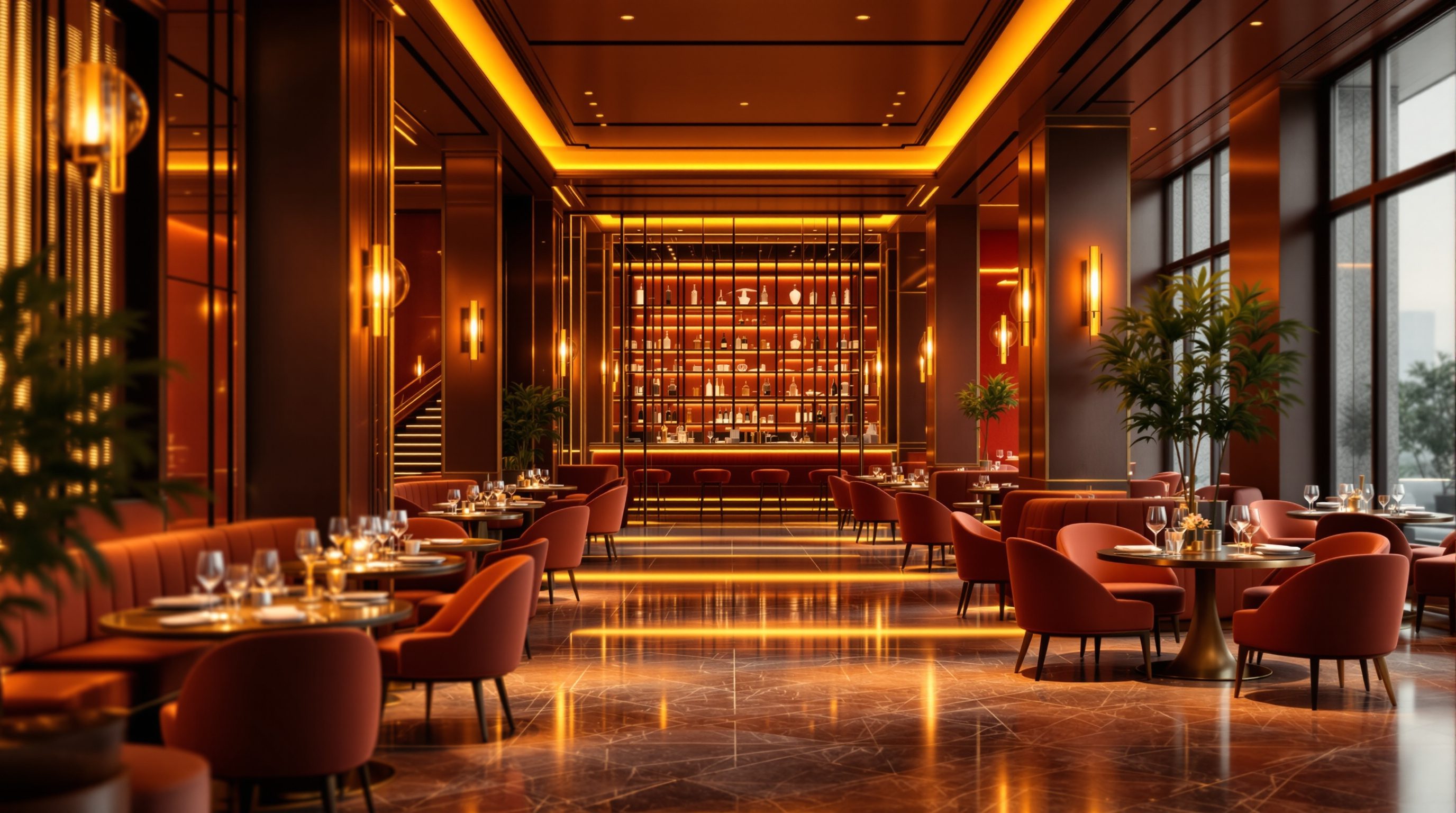
The dining room is a stage tuned between energy and intimacy, where a deliberate mix of seats at chosen densities decides how a meal feels and how the room earns its living
No one remembers how many tables a restaurant had. They remember whether it felt alive or dead, and whether their own table felt like the best seat in the house.
Stand at the door of a restaurant you love and feel what hits you first. Before the food, before a single dish, you read the room: is it humming or hushed, packed or empty, glamorous or cosy? And then, the second your host walks you in, a quieter question forms - where will I sit, and is it a good table? The dining room answers both questions at once, and it answers them through a few deceptively simple decisions that the designer made long before the first guest arrived: how many seats, of what kinds, how close together, facing what.
This is the craft of the dining room, and it is more exacting than it looks. A restaurant floor is not a neutral container you fill with tables; it is a finely tuned instrument that has to feel generous to the guest and perform hard for the operator on the same square metres. Pack the seats and the room buzzes and earns - but crowds, rushes and disappoints. Space them and every guest feels looked after - but the room can read as empty and the maths stops working. Between those poles lies the designer's real work: a deliberate mix of seat types at chosen densities, arranged so that almost every guest gets what feels like a good table, and the room can flex from a quiet Tuesday to a full Saturday without ever looking wrong.
Sit in the worst seat in the room and fix it. If every table feels chosen-for, you have designed the floor well.
A seating MIX, not a grid of identical tables
The single biggest mistake in dining-room design is to treat the floor as a grid - rows of identical tables, evenly spaced, filling the room like a classroom. Real restaurants almost never work that way, because real guests do not arrive in identical groups with identical needs. Across a service you will seat couples, pairs of friends, a family of five, a lone diner with a book, a business four, a birthday of ten. A grid of four-tops serves none of them well: the couple feels lost at a table for four, the group of six has to be awkwardly bolted together, and the single guest is marooned. So the first principle is that a dining room is a deliberate mix of seat types, each earning its place.
The workhorse is the two-top, or deuce - a small table for two that pairs of guests fill and that, crucially, can be pushed together to make fours and sixes as the night demands. Ranged along a banquette - a continuous upholstered bench against the wall - deuces become the densest, most flexible and most sociable seating you can offer: the bench reads as comfort, the tables slide to fit any party, and diners sit shoulder-to-the-room watching the life of the place. Freestanding fours and rounds anchor the centre and the generous zones, giving larger parties room and the floor a change of rhythm. A counter or chef's bar absorbs singles, walk-ins and waiting guests who would otherwise be turned away, and turns a solo meal into a front-row seat. A private or semi-private corner - a booth, a screened nook, a table behind a half-wall - offers the intimacy that couples and celebrations pay for.
The art is the proportion of the mix. A romantic destination leans on deuces, banquettes and intimate corners; a buzzy all-day spot leans on counters, communal tables and flexible fours; a banquet-heavy Indian restaurant plans for the large family group as the default, not the exception. Get the mix right and the host can seat almost any party at a table that fits, the floor fills evenly and attractively, and the room flexes through the week. Get it wrong - a floor of identical fours - and you will watch half the tables sit half-used while parties wait at the door, the worst of both worlds for guest and operator alike.
Deuces on a banquette are the secret weapon: densest, most flexible, most sociable seat in the room.
Energy and intimacy: the density dial
Every dining room sits somewhere on a dial between energy and intimacy, and where it sits is set mostly by one decision: how tightly the seats are packed. Density is the designer's master control, and it works on the guest's feelings in opposite directions at once. Pack tables close and the room fills easily, voices and clatter build into a warm hum, strangers are near, and the place feels alive, popular, exciting - the electric buzz of a full trattoria or a hot new opening. Space tables out and each party gets air, quiet and privacy; conversation stays at the table; the room feels calm, refined, expensive - the hush of fine dining. Neither is right or wrong; each suits a different concept and a different night.
The trap is that the two things guests want - a room that feels alive AND a table that feels private - pull against each other, and you cannot maximise both. A too-tight room crosses from buzzy into stressful: elbows touch, you overhear the next table's argument, waiters squeeze past your chair, and intimacy is impossible. A too-loose room crosses from refined into dead: a half-full restaurant spread thin feels like a failure, guests feel exposed and self-conscious, and the energy drains out. The skilled move is to choose a target density deliberately for the concept, and then to design the room so it reads as comfortably full across a range of real occupancies - which is why an empty-looking dining room is often a planning failure, not a business one.
Designers have a whole kit for tuning energy and intimacy beyond raw spacing. Level changes, screens, banquette backs, planting and half-walls break a big floor into smaller, more intimate bays while keeping an overall sense of life. Lighting does enormous work - a pool of warm light on each table reads as intimacy even in a busy room. Ceiling height and acoustics set the baseline: a hard, high room amplifies buzz (sometimes too much), a soft, lower one wraps guests in calm. And the best tables - the corner banquette, the window, the booth with a view of the room - are deliberately composed so that being seated there feels like a small privilege. Energy and intimacy are not opposites you must choose between; they are a balance you compose, table by table.
Layout, sightlines and the good and bad table
Once the mix and the density are set, the layout has to resolve a hard truth every restaurateur knows: not all tables are equal, and the designer decides how unequal they are. Guests instantly rank tables. The good ones have a back to a wall and a view over the room, a window, a sense of the kitchen or bar as theatre, or simply air and light around them. The bad ones are by the toilet door, in the path to the kitchen, under a harsh downlight, squeezed against a service station, or stranded in a dead centre with nothing to look at and everyone looking at them. A dining room that has a handful of coveted tables and a clutch of tables no one will sit at willingly is a room that fights its host every single night.
So the designer's job is to raise the floor - to make the worst table acceptable and to spread the good qualities around - while accepting that some hierarchy is inevitable and even useful. Perimeter seating is prized, which is why banquettes line the walls and why skilled layouts push seating to the edges and keep the centre lighter. Backs want protection: people relax facing the room with something solid behind them, so booths, banquette backs and screens create that security in the open floor. Sightlines are composed deliberately - what does a seated guest see? A beautiful bar, an open kitchen, a garden, other well-dressed diners (people are the best decoration) - and what should they NOT see: the bus station, the toilet corridor, the kitchen's dirty side, a fire exit.
Service also shapes the plan. Aisles must be wide enough for staff to pass with trays and for guests to reach their seats with dignity - a pinch point where waiters turn sideways past diners' heads is a daily indignity. Service stations (for water, cutlery, crumbing down, order points) need to be near the tables they serve but screened from view. The path from kitchen to table should be short, direct and hidden, so hot food arrives hot and the labour of service stays invisible. A good dining-room layout, then, is a quiet piece of stagecraft: it gives almost every guest a table that feels chosen-for, composes what they see and hide what they should not, and lets the service move like a silent, efficient tide around them.
Flexibility, and the covers-drive-revenue logic
Underneath the atmosphere runs a commercial engine the designer must respect, because it pays for everything: covers drive revenue. A dining room's income in a service is, roughly, the number of seats multiplied by the number of turns (how many times each seat is filled in a night) multiplied by the average spend per guest. Every one of those levers is partly a design decision. Seats are set by your density and mix. Turns are helped or hurt by how quickly a table can be cleared, reset and reseated, and by whether the layout lets a host manage the floor smoothly. Average spend is nudged by the comfort and occasion of the room - a guest who feels looked after and relaxed orders the extra course and the bottle rather than the glass. A restaurant that ignores this logic - too few seats, a floor that cannot turn, a room that rushes guests out before dessert - starves, however lovely it looks.
This is exactly why density is never a neutral choice: every extra chair you fit is revenue, and a little less comfort, and the designer tunes that trade-off for the concept. A high-volume, low-spend cafe needs tight, fast, flexible seating that turns several times a day. A fine-dining room accepts far fewer covers and slower turns because the spend per cover and the experience justify it. Neither is squeezing guests cynically or spacing them wastefully; each is the right answer to a different business model, and a good designer can read the brief and calibrate. Treat the benchmark numbers you will hear - seats per square metre, covers per service, turns per night - as illustrative figures to calibrate, as of 2026, to the brand, the market and the operator, never as universal rules to copy.
Flexibility is the other half of the engine, because a dining room must earn its living across wildly different nights. The same floor has to feel right for a quiet weekday lunch and a packed Saturday dinner, and to absorb a sudden party of twelve. So the best layouts are built to flex: deuces that combine into any party size, movable tables and light chairs, a private area that opens to the main room or closes off for a function, a section that can be "closed" on slow nights so the remaining floor still reads as full. In a country where the large family group and the celebratory booking are central to dining out, this flexibility - and a clear plan for the big table - is not a nicety but the heart of a restaurant that works every day of the week.
Revenue = seats x turns x spend. Every extra chair is money and a little less comfort. Tune it to the brief.
Occupant load & egress (NBC 2016)
Seat count limits, exits, aisle widths, travel distance for the dining room
The seat count and layout here are design logic; the binding occupant load, aisle and exit dimensions come from the current code + a fire/life-safety specialist. See the Fire & Life-Safety course.
Accessibility (barrier-free design)
Accessible tables, routes, turning space and reach in the dining room
Provide accessible seating and clear routes; defer the binding dimensions and proportion of accessible seats to the current accessibility guidelines + the access consultant.
Seating benchmarks (seats/m2, covers, turns)
Density, covers per service, turns per night, average spend targets
Illustrative figures, as of 2026, to calibrate to the concept, market and operator - never copy a density or cover number as a rule.
Workshop — tune a dining room between energy and intimacy
A dining room only teaches you its logic when you plan one. In this workshop you will lay out a small restaurant floor as a deliberate seating mix, choose and defend a density, and test it against the covers logic and a range of real nights.
Paper and pen are enough; CAD or a sketch app helps. No real measuring required - this is about composition, density and judgement, not construction dimensions (defer those to the code and consultants).
Goal: a tuned dining-room layout with a defended density and seating mix
Inputs: a concept (pick one: buzzy all-day cafe-bistro, or an intimate fine-dining room) + a rough floor (say 10 m x 8 m) + this lesson + paper or a CAD/sketch tool
Time: ~60 minutes
- 1Write the concept and target guest in one line, then decide where on the energy-intimacy dial this room should sit and name a target density (tight/medium/generous) - and say why, in terms of the concept and the covers maths.
- 2Lay out a seating MIX, not a grid: place a banquette run with deuces along a wall, freestanding fours/rounds in the centre, a counter or communal table for singles and walk-ins, and one private or semi-private corner. Label the party size each zone serves.
- 3Audit sightlines and the good/bad tables: mark the best two tables and the worst two, say what each sees (and what it should not - toilet, kitchen door, service station), then redesign so the worst table becomes acceptable.
- 4Draw the service paths and aisles: show the hidden route from kitchen/pass to the tables, place screened service stations, and check every aisle is wide enough for staff with trays and guests to pass with dignity.
- 5Stress-test for flexibility and covers: show how the deuces combine for a party of six, how a slow night still reads as full, and estimate seats x turns x spend for your concept - then note one change that would improve the guest's feeling without wrecking the maths.
You’ll walk away with
A labelled dining-room plan showing the seating mix, a defended target density, composed sightlines with the worst table fixed, hidden service paths, and a short note on flexibility and the covers logic for your concept. Keep it beside the later F&B lessons.
Three altitudes on the same idea
Read the band that fits you — or all three.
You set the room the dining experience lives in, and its proportions decide what densities and moods are even possible. The footprint and shape of the dining floor, the ceiling height (which sets the acoustic baseline between buzz and hush), the structural grid and where columns land (a column in the middle of the best banquette run is a lifelong problem), the daylight and the view, and the position of the kitchen and its pass relative to the floor - these shell moves make or break the later layout. Give the dining room a clear, column-disciplined floor, a short protected route to the kitchen, generous floor-to-floor for ventilation, and a relationship to light and view that the interior can compose. Defer occupant-load, egress and kitchen-separation specifics to the code and the fire and kitchen consultants; give the interior designer and operator a forgiving, well-proportioned volume to tune.
The dining room is where your craft is felt most directly - it is the seat the guest actually sits in and the mood they actually breathe. You compose the seating mix (deuces, banquettes, rounds, counter, private corners) and the density; you tune energy against intimacy with lighting, acoustics, screens, level changes and banquette backs; you raise the worst table and compose the sightlines from the best ones; and you detail the banquettes, chairs, tables and service stations for comfort, durability and years of hard nightly use. Work table by table as a guest would, not as a plan from above: sit in the worst seat and fix it. Keep aisles generous for service and dignity, design the floor to read as full across real occupancies, and calibrate density to the concept and the covers logic rather than copying a benchmark.
This lesson teaches you to see a dining room the way a designer does - as a tuned instrument, not a tiled floor. Next time you eat out, count the seat types (how many deuces, fours, banquette runs, counter stools), feel the density and ask whether the room is pitched for energy or intimacy, and judge your own table: is it a good one, and why? Notice where the bad tables are and why no one wants them, how wide the aisles are, what you can and cannot see from your seat, and how the staff move. Then think about the covers-drive-revenue maths quietly running underneath - seats times turns times spend - and how the room's comfort and flexibility serve it. You are learning to hold the guest's feeling and the operator's maths in the same glance, which is the whole discipline in miniature.
“Designing a restaurant dining room is basically fitting in as many tables as you can, nicely spaced, and making it look good - the seating is just arithmetic, and more seats is always better because more seats means more money.”
Do it yourself
No tools needed - reason it through.
- 1Why is a dining room designed as a mix of seat types rather than a grid of identical tables? Name four seat types and what each is for.
- 2Explain the energy-versus-intimacy dial and how density controls it. What goes wrong at each extreme?
- 3What makes a table 'good' or 'bad', and what can a designer do to raise the worst table without destroying the hierarchy entirely?
- 4State the covers-drive-revenue logic and explain how seats, turns and average spend are each partly design decisions.
- 5Why is flexibility central to a dining room, especially in the Indian market, and name three ways a layout can be built to flex?
The one line to carry out
Peer-reviewed journals & authoritative standards
- 01Restaurant — Wikipedia — Restaurant, 2026.
- 02Dining room — Wikipedia — Dining room, 2026.
- 03Types of restaurant — Wikipedia — Types of restaurant, 2026.
- 04Foodservice — Wikipedia — Foodservice, 2026.
The dining room is one F&B room; a hospitality building usually runs several very different ones. Next we turn to the bar, the cafe and the lounge - spaces that sell atmosphere and occasion as much as food, and shift their whole character across the day.
The author
Amogh N P
Architect, interior designer, and creative polymath. Studio Matrx began in his notebooks — his vision of design made honest, useful, and open to everyone. Its Academy is written and taught in his memory, and free, forever.
More about Amogh →