
 Lesson 6.3
Lesson 6.3 · The Human Experience
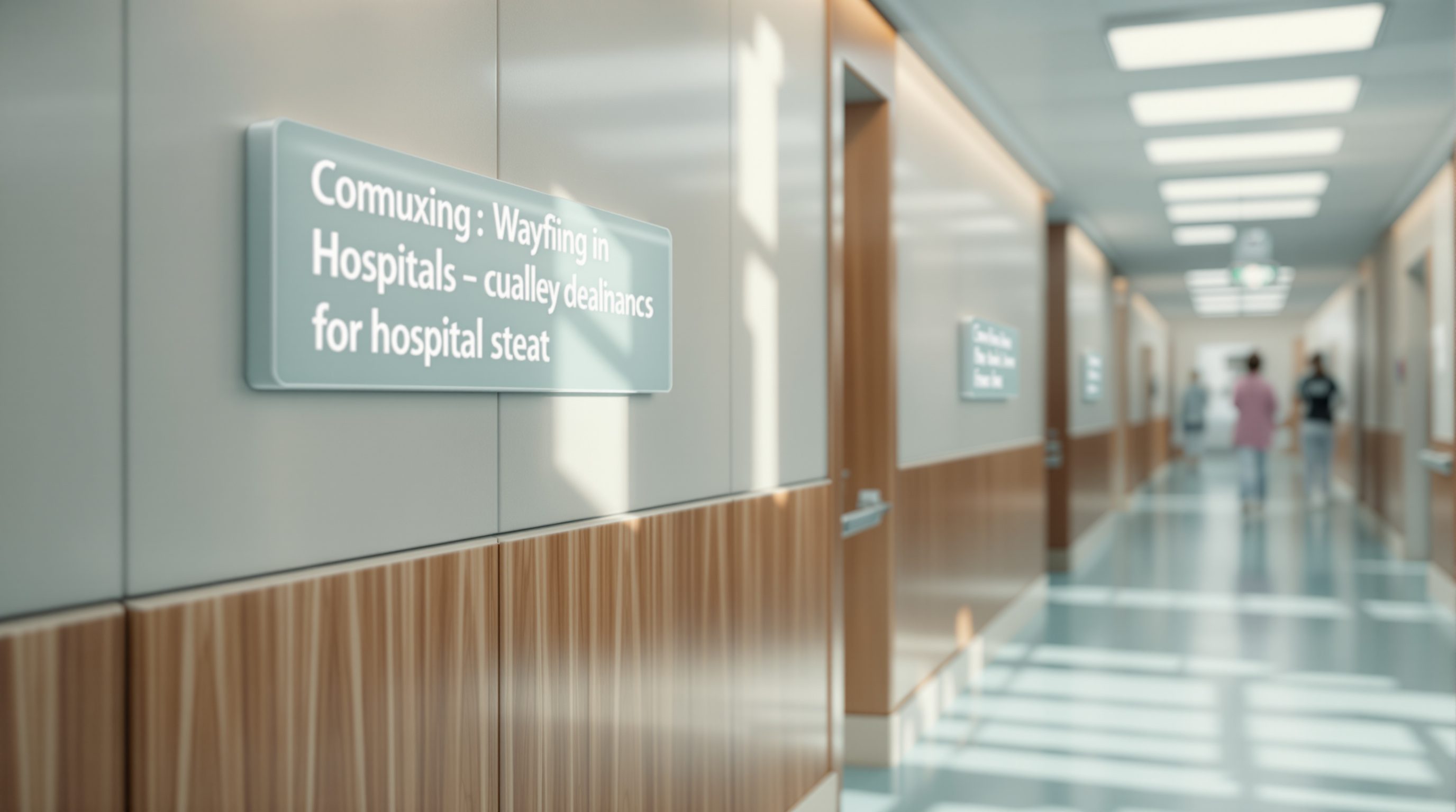
Wayfinding in Hospitals
A vast, repetitive, frightening building full of unfamiliar words - and you cannot sign your way out of confusion; legible wayfinding is designed first into the architecture, then supported by zoning, colour and signs
You cannot sign your way out of a confusing building - legibility is designed into the plan, then supported by signs, never the other way round.
A large hospital is one of the most disorienting buildings a person ever enters, and they usually enter it frightened, in pain, running late, or caring for someone who is. They face a vast, repetitive, multi-level building full of unfamiliar words - nephrology, phlebotomy, ambulatory care - and branching corridors that all look alike, with a target they cannot afford to miss. Getting lost here is not a minor irritation. It raises stress in people who are already overloaded, it makes patients late for or miss appointments, and it quietly consumes enormous amounts of staff and volunteer time spent redirecting people.
Wayfinding is the whole system by which people orient themselves and navigate - and, crucially, it is far more than signage. It is the legibility of the building itself, the clarity of its entrances and circulation, its landmarks and views, its zoning, its colour and its signs, its maps and digital tools, and the people who help, all working together. The single most important principle in this lesson is that you cannot sign your way out of a confusing building. A plan that is fundamentally illegible cannot be rescued by adding more signs - which only multiply the confusion. Wayfinding, like dignity, begins in the plan.
Wayfinding = building first, then zoning + colour, then signs. Colour never alone. Test on the lost, not the designers.
Getting lost is a clinical and humane failure
Picture the person arriving: elderly, perhaps, or unwell, or a relative carrying a bag and a worry, stepping into a building the size of a small town. The words on the doors mean nothing to them - nephrology, phlebotomy, ambulatory care - the corridors branch and repeat, the levels shift, and somewhere in this maze is an appointment they cannot miss. For this person, getting lost is not a small inconvenience. It raises stress and anxiety in someone already overloaded; it makes patients late for or miss appointments and procedures, which has real clinical cost; and it silently consumes staff and volunteer time, as studies of large hospitals have put the annual cost of employees stopping to redirect lost people at strikingly large figures. Poor wayfinding is a clinical, operational and humane failure at once.
It helps to be precise about what wayfinding is. It is not signage - or rather, signage is only its most visible layer. Wayfinding is the entire system by which people build a mental map and make navigation decisions: the legibility of the building form, the clarity and hierarchy of circulation, the entrances, the landmarks and views out, the zoning and colour, the signs, the printed and digital maps, and the human help at information desks. These layers either reinforce one another or fight one another.
> You cannot sign your way out of a confusing building. Legibility is designed into the plan, then supported by signage - never the other way round.
That principle is the spine of the lesson. A hospital whose plan is a uniform maze of identical corridors, with hidden or competing entrances and circulation that changes level and direction without logic, cannot be fixed by adding signs; each new sign simply adds to the visual noise, and you end up with the familiar litter of arrows, taped-up paper notices and contradictory old and new boards that signals a building which has lost control of its own legibility. So this lesson works from the architecture outward: first the legible building, then zoning and colour, then signage and language, then the different people who must find their way. Two other Studio Matrx courses go deeper on pieces of this - Universal & Accessible Design on inclusive wayfinding, and Colour Theory & Application on how colour coding really works - and this lesson cross-links to both.
Frightened, late, unfamiliar words, identical corridors. Getting lost = stress + missed appointments + wasted staff time.
Design the building to be legible first
A legible hospital lets people build a mental map and make decisions without reading a single sign. Several architectural moves create that legibility, and they matter far more than any signage system laid on top.
A clear, hierarchical circulation system. People should be able to tell a main 'street' or spine from a minor corridor, and a public route from a staff one. Many large hospitals use exactly this idea - a clearly legible main concourse or hospital street off which the departments hang - so a first-time visitor only has to find the street and then their branch. A clear hierarchy (main spine, then department entrance, then room) is far easier to read than a uniform maze in which every corridor looks like every other.
One obvious entrance and a strong arrival point. Multiple competing entrances are a classic wayfinding disaster; a single, generous, obvious main entrance with a clear reception and information point gives everyone a confident starting node and a place to ask. From there, decision points - the junctions where a choice must be made - should be clear, well lit, and carry their information exactly where the decision happens, not ten metres before or after it.
Landmarks, daylight and views out. Memorable landmarks (an atrium, a distinctive artwork, a courtyard, a cafe) and views to the outside let people orient themselves and remember a route - 'turn right after the garden'. Daylight and external views also tell you which way is out, which windowless interiors destroy. Consistent, logical spatial structure - floors and wings that repeat a predictable pattern, with lifts and stairs in consistent, findable positions - means that learning one floor helps you read the next.
Think of wayfinding as a hierarchy of tools, strongest at the foundation: a legible building form and circulation; then clear zoning and landmarks; then colour and naming; then signage; then maps, digital aids and people. The lower tools do the heavy lifting and the higher ones fill the gaps. A hospital that inverts this - relying on signage to explain an illegible plan - is exactly the one in which everyone is perpetually lost.
Then zoning, colour, signage and language
Once the building is as legible as it can be, a consistent signage and identification system supports it. Good hospital signage is consistent in design and position; uses plain language and recognised symbols rather than clinical jargon where possible; names destinations the way the public thinks of them; and appears reliably at every decision point, with confirmation signs along the way so people know they are still on the right path. Too many signs are as bad as too few - clutter is noise. Numbering and naming should be logical and memorable, a clear floor-and-zone system rather than an accreted muddle of historic names.
Zoning and colour-coding can reinforce this. Dividing a large hospital into named, colour-identified zones or wings - 'the Green Zone', a coloured wing - gives people a coarse, memorable structure to hang the detail on. But colour coding has real limits and must be designed with care (the Colour Theory & Application course explains why): roughly one in twelve men has some colour-vision deficiency, so colour must never be the only code. Always pair it with a name, a number, a symbol and words, so the colour helps those who can use it and never excludes those who cannot.
Language and literacy are decisive in India, where a single hospital serves people who read different languages, or do not read fluently at all. Signage should use the appropriate local languages alongside widely-understood symbols and pictograms, and should never assume literacy or English. Accessibility runs through all of it (the Universal & Accessible Design course goes deeper): signage legible to people with low vision - size, contrast, mounting height, non-glare surfaces - tactile and Braille information where required, step-free routes that are actually the signed routes rather than an afterthought, and information that works for people who cannot hear an announcement or read a screen. Design the wayfinding for the most excluded user - who cannot read the dominant language, or see well, or hear - and it becomes clearer and kinder for everyone else.
Wayfinding for everyone - patients, visitors, staff, emergencies
Different people ask the building different questions, and one system must answer them all.
Patients and visitors - usually first-timers, stressed, often elderly or unwell - need the gentlest and most redundant guidance: a confident entrance, an information desk, simple routes to the high-volume public destinations (outpatients, wards, diagnostics, the pharmacy, the cafe, the toilets), and reassurance along the way. Pre-visit information - clear directions and a map sent with the appointment, and increasingly a map on a phone - starts the wayfinding before arrival, which is especially valuable for a daunting large hospital where the first five minutes set the tone of the whole visit.
Staff navigate the building daily and learn it, but they depend on fast, often back-of-house routes between the departments they shuttle between; their need is efficient, direct circulation - which also serves the next lesson's fight against wasted walking - more than public signage. Emergencies need the opposite of leisurely wayfinding: an unmistakable, direct, heavily-signed route for ambulances and for walk-ins to the emergency department, findable instantly by a panicking stranger in the dark, with no ambiguity at any junction.
> Design the wayfinding for the most stressed, least familiar, least able user - and everyone else is served automatically.
Finally, wayfinding must survive the hospital's constant change. Departments move and expand (Module 1.4), and a system that cannot be updated cleanly decays into that litter of contradictory old and new signs and taped-up notices which itself announces a building that has lost its grip. Design the system, like the building, to be maintained and adapted over time. And test it against reality: the true measure of wayfinding is not how elegant the sign manual looks, but whether a frightened first-time visitor can actually find their way - so watch real people try, see where they hesitate and get lost, and fix those exact points. Wayfinding is judged by the lost, not by the designers.
Patients: gentle + redundant. Staff: fast direct routes. Emergency: unmistakable. Test on the lost, not the designers.
Wayfinding hierarchy
Legible building form first, signage last
Architecture (circulation, entrances, landmarks) does the heavy lifting; zoning, colour and signage support it. A legible plan cannot be replaced by signs.
Colour-coding + redundancy
Zone colour must never be the only code
Roughly 1 in 12 men has colour-vision deficiency, so pair colour with name, number, symbol and words. See the Colour Theory course; verify accessibility requirements.
Accessible / inclusive signage
Legible, multilingual, tactile, step-free wayfinding
Contrast, size, height, local languages, pictograms, Braille and step-free signed routes. Design for the most excluded user; verify against accessibility standards.
Workshop — get lost on purpose
The only honest test of wayfinding is whether a stranger can navigate. This exercise turns you into that stranger in a large, complex building, then asks you to diagnose each failure at the right layer - building, zoning or signage.
None required - a large complex building and a notebook. A companion to observe where you hesitate is useful. Respect access rules and patient privacy.
Goal: diagnose real wayfinding failures at the correct layer
Inputs: a large hospital, station, airport or mall you can visit + a notebook
Time: ~40 minutes
- 1Pick a destination inside a large, complex building and navigate to it from the entrance as if for the first time. Note EVERY point where you hesitate, double back, or want to ask for help.
- 2At each failure point, diagnose the LAYER: was it the BUILDING (illegible circulation, no landmark, hidden entrance), the ZONING/COLOUR (no clear zones, colour-only coding), or the SIGNAGE (missing, cluttered, jargon, wrong place)?
- 3Test inclusivity: would this route work for someone who cannot read the dominant language, has low vision, or uses a wheelchair? Is the step-free route the same as the signed route?
- 4Find the building's strongest wayfinding asset (a legible street, a landmark, daylight) and its weakest link, and note how the layers helped or fought each other.
- 5Write a short diagnosis ranking the failures by layer, and propose the single change - ideally architectural, not just a new sign - that would most improve legibility.
You’ll walk away with
A layered wayfinding diagnosis of one complex building - failures sorted into building, zoning and signage, tested for inclusivity - ending in the single highest-value fix. Proof that you can tell a legibility problem from a signage problem.
Three altitudes on the same idea
Read the band that fits you — or all three.
Wayfinding is your problem before it is the signage consultant's. Legibility is set by the massing and plan: a clear circulation hierarchy with a readable main street, one obvious entrance rather than several competing ones, decision points that are clear and well lit, memorable landmarks and daylight, and a structure that repeats predictably so learning one floor helps you read the next. Get these right and signage merely confirms what the building already says; get them wrong and no signs will save you.
You make legibility visible and inclusive. Signage design and placement, colour-coded zones, materials and lighting that mark thresholds and landmarks, and the calm reduction of clutter all fall to you - and each must be accessible: legible contrast and size for low vision, tactile and Braille where needed, local languages plus pictograms for varied literacy, and colour never used as the only code (roughly one in twelve men cannot rely on it). Coordinate colour with the healing palette of the previous lesson so wayfinding and calm reinforce rather than fight each other.
Wayfinding is where empathy becomes measurable. The test of a hospital's legibility is simple: could a frightened, first-time, non-expert visitor find their way without help? Practise by arriving somewhere new - a hospital, a station, an airport - and noticing exactly where you hesitate, double back or have to ask, then diagnosing whether the failure was the building, the zoning or the signs. You will learn that the strongest wayfinding tool is a legible plan, and that signage is a support, not a cure - a lesson that applies far beyond hospitals.
“If people get lost in a hospital, the fix is better signage - add clearer, bigger, more frequent signs.”
Do it yourself
No tools needed - reason from the lost visitor's point of view.
- 1Explain the principle 'you cannot sign your way out of a confusing building'.
- 2Name three architectural moves that make a hospital legible before any signage is added.
- 3Why must zone colour never be the only wayfinding code, and what should accompany it?
- 4How do the wayfinding needs of staff and emergencies differ from those of first-time visitors?
- 5What is the real test of whether a hospital's wayfinding works?
The one line to carry out
Peer-reviewed journals & authoritative standards
- 01Wayfinding — Wikipedia, 2026.
- 02Accessibility — Wikipedia, 2026.
- 03Universal design — Wikipedia, 2026.
Wayfinding for staff is really about the fast, efficient routes they live on - which leads straight into the final lesson: designing for the people who work in the hospital, their efficiency, respite and safety.
The author
Amogh N P
Architect, interior designer, and creative polymath. Studio Matrx began in his notebooks — his vision of design made honest, useful, and open to everyone. Its Academy is written and taught in his memory, and free, forever.
More about Amogh →