By the end of this lesson, students will be able to:
Curate which drawings a project needs and at what scales — building visual sets of information rather than piles of views.
Lay out multi-drawing sheets using grids, alignment, white space, and reading order.
Combine drawing types (plan + section perspective + diagram) so they reinforce one narrative.
Establish text hierarchy: titles, labels, scales, and north points that inform without shouting.
DiagramEye-path arrows and alignment grids on a sheet layout.
DiagramThe same drawing set scattered vs. composed on a grid.
DiagramThe same content at 100% density vs. 65% density.
DiagramA title-block and label-hierarchy specimen.
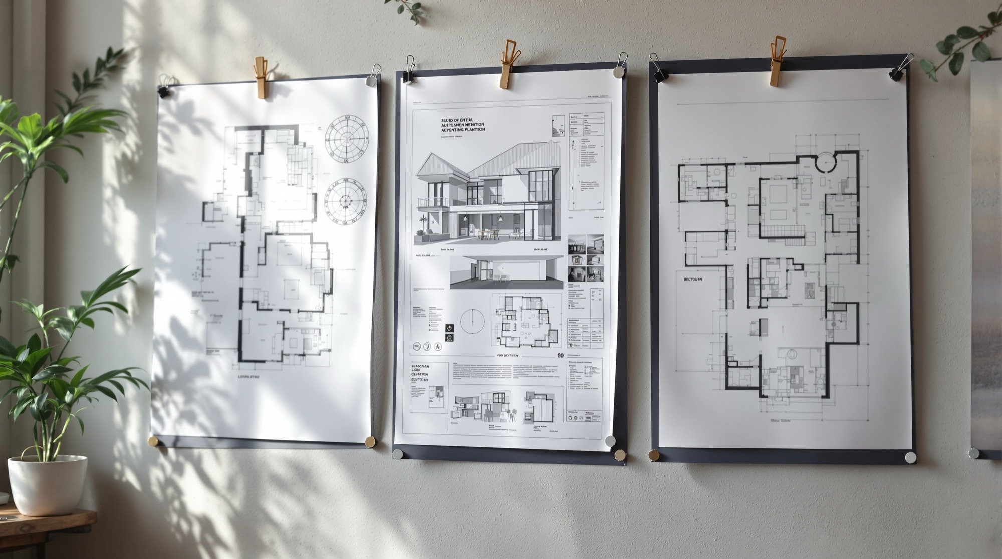
ReferencePresentation boards on a studio wall.
Key concepts
A sheet is itself a designed object: the eye must know where to enter, where to travel, and where to rest.
Alignment and shared scale create relationships between drawings; misalignment creates noise.
White space is structural, not leftover.
Consistency across a set: orientation, lineweights, and labels repeat so the viewer learns the language once.
In-class activities & exercises
Layout forensics (30 min)Students annotate three sheet layouts — one good, two flawed — identifying entry point, flow, and faults.
Thumbnail layouts (40 min)Six rapid A4 thumbnails arranging the pavilion's drawing set on an A1 sheet.
Mock-up build (70 min)Printing/sketching drawings at scale, physically cutting and arranging them on a trace A1 until the composition works, then fixing positions.
Title-block clinic (30 min)Designing a minimal title and label system for the set.
Worked example sketches
How the technique looks in practice — loose, hand-drawn examples. Scroll to watch each one draw in; click to zoom.
DiagramA pavilion's drawing set composed on an A1 sheet grid.
DiagramEye-path and alignment grid traced over a sheet layout.
DiagramA minimal title block and label-hierarchy specimen.
DiagramA scattered drawing set vs. the same set aligned on a grid.
Homework / studio assignment
Finalize the A1 layout plan as a measured mock-up with every drawing's position, scale, and caption decided.
Assessment
Rubric on reading order clarity, alignment discipline, and economy of annotation.
A
The author
Amogh N P
Architect, interior designer, and creative polymath. Studio Matrx began in his notebooks — his vision of design made honest, useful, and open to everyone. Its Academy is written and taught in his memory, and free, forever.