
Colour in the Studio
Colour made by hand — and discovered to be relative.
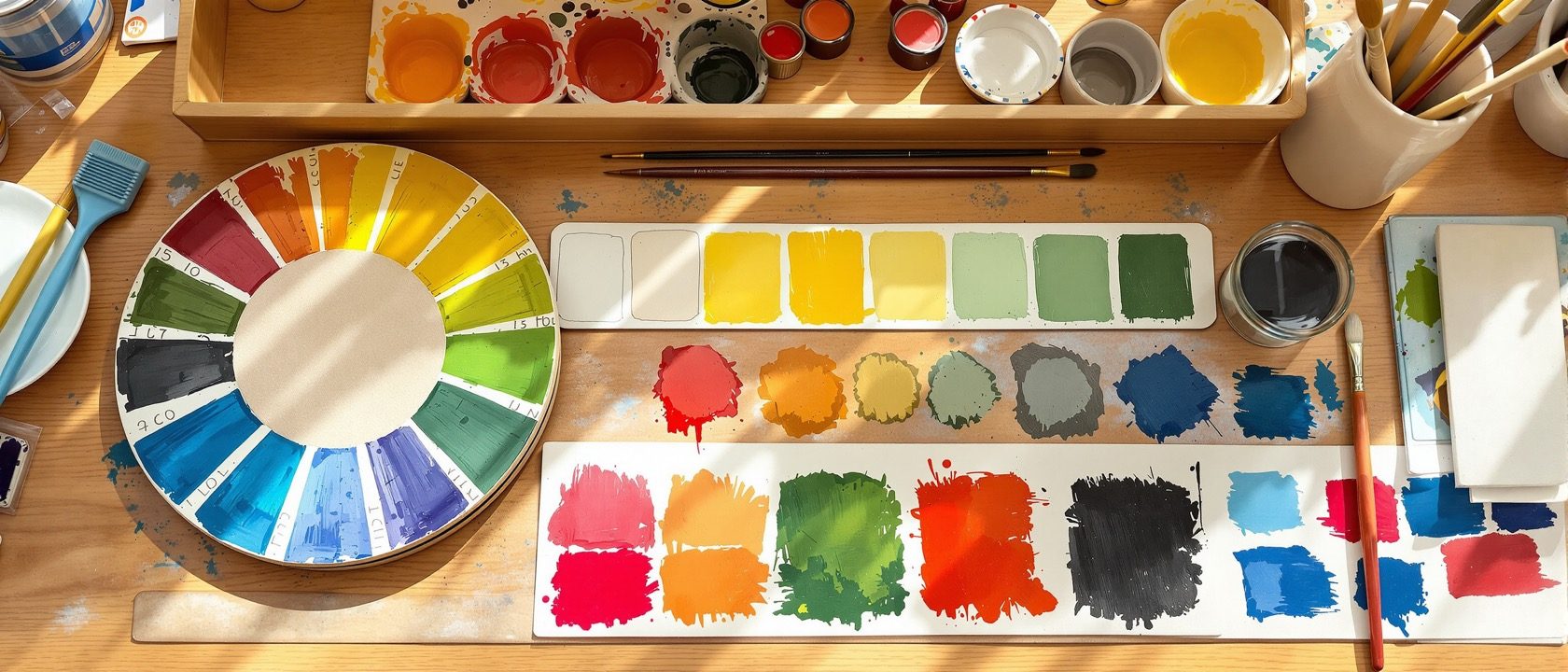
The studio way with colour is to mix and paint it yourself, never just name it — then to discover that colour is relational and unstable. Build a wheel by hand; then learn the perceptual truths that matter for interiors, all from Albers: the same colour changes with its neighbours, the light, the surface and the area. The swatch is a starting point, not the truth.
Learning objectives
By the end of this lesson, you will be able to — mapped to the course outcomes for Basic Design Studio:
Mix and paint a 12-hue wheel and value/saturation scales from three primaries.
Compose the colour schemes as sheets and translate one into a model.
Demonstrate simultaneous contrast — make one colour appear as two (Albers).
Predict how colour shifts with light, surface texture, area and distance.
Colour made by hand
Mix a 12-hue wheel from three primaries, build value and saturation scales, and compose the schemes — and keep paint-mixing apart from light-mixing.[2, 3]
Mix it, don't name it
Build a 12-hue wheel BY HAND from the three primaries — mix the secondaries (orange, green, violet) and the tertiaries yourself. Producing it manually teaches subtractive pigment mixing and the geography of hue. The wheel is made, not memorised.[2]
Colour is relative
The perceptual truths every interior designer must feel — simultaneous contrast, and how colour shifts with light, surface texture, area and distance.[1, 4]
Albers's central lesson
Josef Albers's Interaction of Color (Yale, 1963): 'in visual perception a colour is almost never seen as it really is.' Colour is RELATIONAL — the same colour looks different against different grounds. The definitive studio proof is the simultaneous-contrast study: place identical swatches on two grounds and make ONE colour appear as TWO (or two different colours look the same).[1]
At a glance
| Aspect | One side | The other |
|---|---|---|
| Colour truth | Myth: fixed on the swatch | Reality: relative to ground, light, surface, area (Albers) |
| Mixing | Paint: subtractive (RYB/CMY), darkens | Light: additive (RGB), lightens |
| Complements | Myth: they clash, avoid them | Reality: controlled contrast energises |
| Area | Small chip: reads darker/duller | Large area: reads lighter/more intense |
| Neutrals | Myth: grey is one colour | Reality: mixed, temperature-biased, relative |
Key terms
Mixing pigments (RYB / CMY) — darkens toward black. Studio colour.
Lightness/darkness of a hue / its purity, greyed with a complement.
A colour induces its complement in a neighbour — one colour can look like two (Albers/Chevreul).
Adjacent colours blending in the eye at a distance.
Itten's area/proportion contrast — the ratio of two colours changes dominance.
The warm/cool character of a light source that shifts a colour's appearance.
Studio exercise
Paint a 12-hue wheel and a nine-step value scale of one hue from three primaries only. Then do the Albers study: place two identical small swatches on two different grounds and make the one colour appear as two. Finally, photograph one painted swatch under three light sources (daylight, warm bulb, cool LED) and record how it shifts.
Self-assessment
1. Albers's central lesson in Interaction of Color is that colour is —
2. Mixing paint (pigment) is —
3. The same hue painted over a large wall, versus a small chip, tends to look —
Recap
References & further reading
- [1]Josef Albers, Interaction of Color, Yale University Press, 1963 (colour is relative; simultaneous contrast).
- [2]Johannes Itten, The Art of Color (Kunst der Farbe), 1961 (the twelve-hue wheel; the seven colour contrasts).
- [3]Maitland Graves, The Art of Color and Design; and colour-mixing systems (subtractive RYB/CMY vs additive RGB).
- [4]Linda Holtzschue, Understanding Color (colour in light, surface, perception — interior-relevant).
- [5]M. E. Chevreul, The Law of Simultaneous Contrast of Colours, 1839 (the scientific origin Albers builds on).
Further reading
- Josef Albers — Interaction of Color.
- Johannes Itten — The Art of Color.
- Linda Holtzschue — Understanding Color.
Sources gathered and fact-checked June 2026. Published values vary by source, sample and method — treat as indicative and confirm against the cited standard before structural use.
The author
Amogh N P
Architect, interior designer, and creative polymath. Studio Matrx began in his notebooks — his vision of design made honest, useful, and open to everyone. Its Academy is written and taught in his memory, and free, forever.
More about Amogh →