
Rendering Tone, Light & Context
Where line drawing ends, tone begins: this is how a flat sheet of paper learns to hold light, weight and life.
An outline drawing states the facts; tone makes them feel real. By grading light and dark across a surface we round a flat shape into a solid, tell the eye where the light is coming from, and — with the geometry of shade and shadow — reveal exactly how far one thing stands in front of another. Add the people, furniture and trees that set the scale, and a diagram becomes a place. This unit is where drawings stop being lines and start being spaces.
Learning objectives
By the end of this lesson, you will be able to — mapped to the course outcomes for Architectural Graphics II:
By the end you can build a controlled range of tonal values with hatching, crosshatching, stippling and graded tone, and lay them down to a ten-step value scale.
By the end you can read the direction of illumination in a drawing and use graded tone to model a form so that its surfaces round and turn convincingly.
By the end you can distinguish shade from shadow and cast the shadows of points, lines and planes using the conventional 45 degree light in plan, elevation and paraline views.
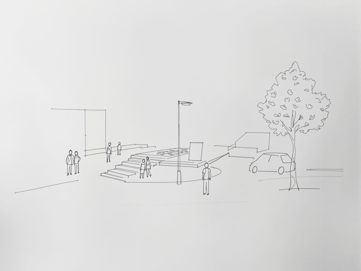
By the end you can populate a drawing with context, people, furniture, vehicles, landscaping and reflections, at the right scale and level of abstraction so it reads as a believable place.
The big ideas
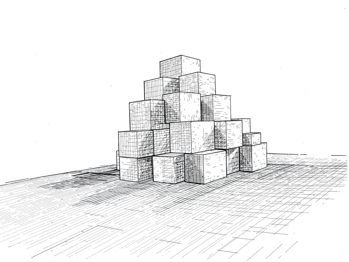
Value is the relative lightness or darkness of a mark. Learn to build it — by hatching, crosshatching, scribbling and stippling — to grade it into rounded form, to read the single direction of light, and to cast the shade and shadows that explain depth.[1, 2]
Value is the drawing's second language
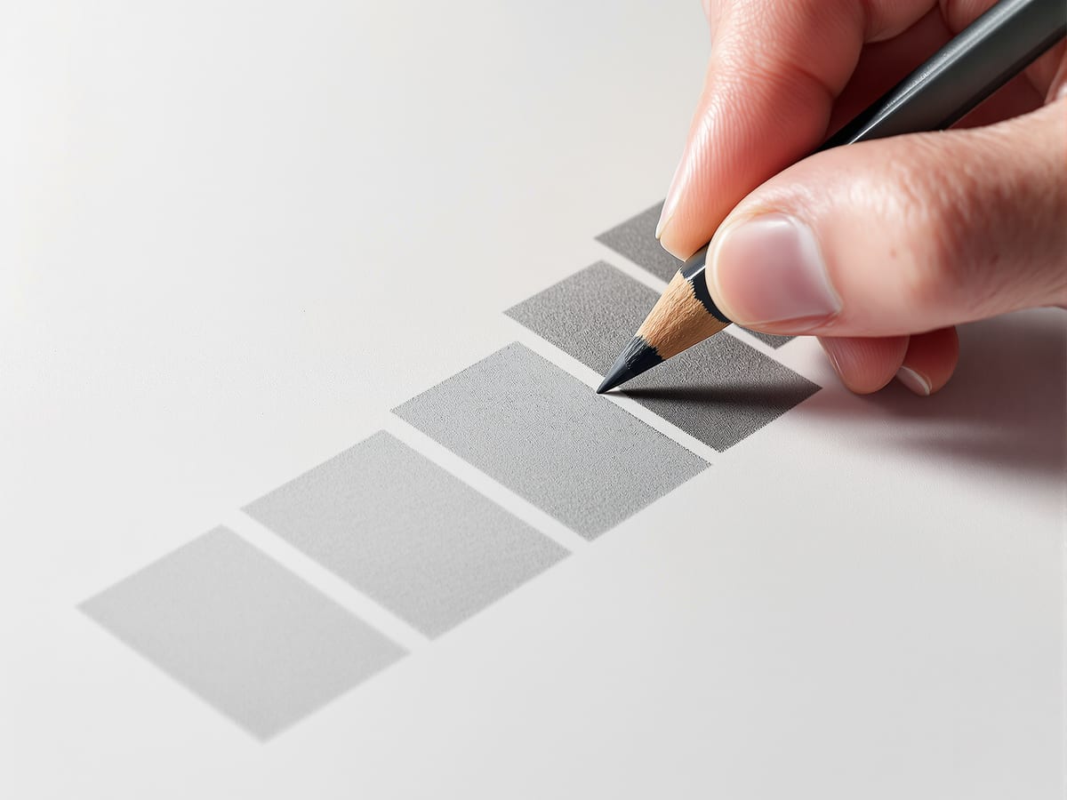
We do not really see light; we see its effects, the patterns of light and dark that a surface returns to the eye. Tonal value is simply how light or dark an area reads, and it is the key to depicting light, form, texture and space. With pencil and pen on paper we build value by controlling the spacing and density of marks, not by pressing harder or swapping to a softer grade. Keep the law of simultaneous contrast in mind: the same grey looks lighter against a dark neighbour and darker against a light one. Even in your darkest passages, hold on to a little of the white paper, or the drawing goes flat and lifeless.[1, 2]
In practice
The worked methods: ruling a clean value scale, casting a 45-degree shadow by projecting between plan and elevation, using shade and shadow to give a paraline real depth, and drawing figures in correct proportion so they read the scale of a space rather than clutter it.[1, 3]
Four ways to make a tone
Practise the core shading techniques until each gives you a controllable range. Hatching lays roughly parallel lines close enough that they merge into a value; overlay further sets at slightly different angles to deepen the tone while keeping a unified diagonal grain. Crosshatching crosses two or more sets of parallels for richer, darker fields. Scribbling loops random multidirectional lines, flexible and quick, best with one dominant direction so a grain still holds it together. Stippling builds value from fine dots, slow and patient work best done with a fine ink pen on smooth paper. In every case control spacing and density, and resist deepening a tone by fattening the line or enlarging the dot, that only coarsens the texture.[1, 2]
Shade vs shadow
| Aspect | One | The other |
|---|---|---|
| What it is | Shade | Shadow |
| Where it sits | On the object's own unlit surfaces | On a separate surface the object blocks light from |
| Marks vs source | Modelling (value suggests volume) | Lighting (value tied to a real light direction) |
| Building tone | Hatching (parallel line sets) | Stippling (fine dots) |
| Value vs texture | Value: relative lightness or darkness | Texture: the visual grain the marks also create |
Key terms
How light or dark an area of a drawing reads, from the white of the paper to the darkest black.
Shading made of roughly parallel lines spaced close enough to merge into a continuous tone.
Two or more overlaid sets of parallel lines used to build up darker, richer values.
A tone built entirely from fine dots, controlled by their size and spacing.
A graded strip running from white through greys to black, usually in ten even steps, for calibrating the eye.
Rendering the illusion of volume and depth on a flat surface by shading with graded tone.
The darkness on the parts of an object turned away from the light source.
The dark shape an object casts onto another surface by blocking the light.
Studio task
Draw a simple massing model — a cube with a smaller block on top — as an elevation. Pick a light direction and hold it consistently. Grade a tone across each face so the lit, shaded and reflected-light zones read; then cast the shadows at a true 45 degrees. Finally, place a single well-proportioned human figure beside it. Watch the drawing gain both depth and scale in one move.
Self-assessment
1. In pencil hatching, what should you vary to make an area darker?
2. What is the difference between shade and shadow?
3. When drafting architectural shadows with the conventional light, what angle do the rays take?
Recap
References & further reading
- [1]Francis D.K. Ching, Architectural Graphics (6th ed.). Hoboken: John Wiley & Sons, 2015.
- [2]Francis D.K. Ching, Design Drawing (3rd ed.). Hoboken: John Wiley & Sons, 2018.
- [3]Francis D.K. Ching, Architecture: Form, Space, and Order (4th ed.). Hoboken: John Wiley & Sons, 2015.
- [4]Robert W. Gill, Rendering with Pen and Ink (rev. ed.). London: Thames & Hudson, 1984.
- [5]Rendow Yee, Architectural Drawing: A Visual Compendium of Types and Methods (4th ed.). Hoboken: John Wiley & Sons, 2012.
Further reading
- Robert W. Gill, Basic Rendering: Effective Drawing for Designers, Artists and Illustrators. London: Thames & Hudson, 1991.
Sources gathered and fact-checked June 2026. Published values vary by source, sample and method — treat as indicative and confirm against the cited standard before structural use.
Where this course goes next
You can now make a single drawing that reads as space. The final unit is about the whole sheet — composing a presentation that carries an argument — and about the freehand sketching and diagramming that begins every design long before any of these systems is drawn.
The author
Amogh N P
Architect, interior designer, and creative polymath. Studio Matrx began in his notebooks — his vision of design made honest, useful, and open to everyone. Its Academy is written and taught in his memory, and free, forever.
More about Amogh →