

Presentation & Freehand Drawing
Compose a sheet that persuades, then learn to draw the world with a free hand and reduce a design to its parti.
A brilliant design badly presented is a design no one understands. The final unit closes the loop two ways. First, presentation: how to arrange plans, sections and perspectives on a sheet so the eye reads them as one clear argument — through spacing, alignment, graphic symbols and lettering. Second, freehand drawing and diagramming: the fast, thinking-by-hand sketching that comes before every measured drawing, and the parti — the single organising idea a whole scheme grows from.
Learning objectives
By the end of this lesson, you will be able to — mapped to the course outcomes for Architectural Graphics II:
By the end you can compose a set of drawings into a unified presentation, using spacing, alignment and the field of the sheet to form clear visual sets.
By the end you can add graphic symbols, a graphic scale and legible titling that read correctly from the intended viewing distance.
By the end you can draw freehand from observation using contour and analytical methods, building an image in stages from structure to detail.
By the end you can reduce a design to a diagram and distil its parti, the central organising idea, into a concise concept sketch.
The big ideas
A presentation is not a pile of drawings; it is a designed thing in its own right. Whether the eye reads a group as one set or as scattered figures depends on spacing, alignment and similarity — plus the graphic symbols, scale, north point and lettering that let a stranger navigate it.[1, 5]
What a presentation drawing is for
A presentation is not a single beautiful sheet; it is a coordinated set of drawings made to persuade an audience, a client, a jury or a browsing reader, of a design's value. However handsome each drawing is, it stays a tool for communicating an idea, never an end in itself. Good presentations share a few collective qualities. They have a clear point of view, so the central concept comes through. They are economical, using only what is needed. They are legible and accurate, simulating a plausible reality so decisions rest on sound information. Above all they have unity and continuity: every part supports the whole and links to what comes before and after. We normally read a sheet left to right and top to bottom, moving from the general and contextual towards the specific and detailed.[1, 2]
In practice
Then the drawing that starts it all: sketching from observation to notice, understand and remember; composing and building a drawing in stages; analytical drawing that finds the geometry inside a subject; and the diagram and parti that carry a design idea in a few strokes.[2, 4]
Drawing to notice, understand, remember
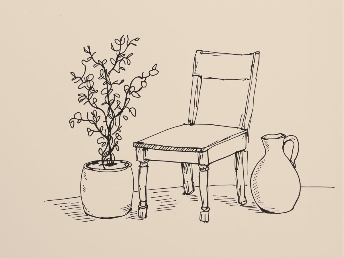
Freehand drawing remains the most intuitive way to record what we see, think and imagine, its tactile, moving nature sharpening awareness in the present. We draw from observation for three reasons. To notice: sketching on location makes us aware of places we usually pass without a glance. To understand: careful seeing reveals not just the detail that catches the eye but how it fits a larger structure of patterns and shapes, and the act stirs visual thinking. To remember: a drawing is a graphic record we can revisit to recall a place. The kit is simple, a pen or pencil and a sketchbook. A fine nib pulls you towards minute detail; a broad pencil or marker nudges you toward the whole and forces you to leave things out. Throughout, the line is the essential element: light or heavy, taut or limp, it can suggest hard and soft materials and even imply depth.[2, 5]
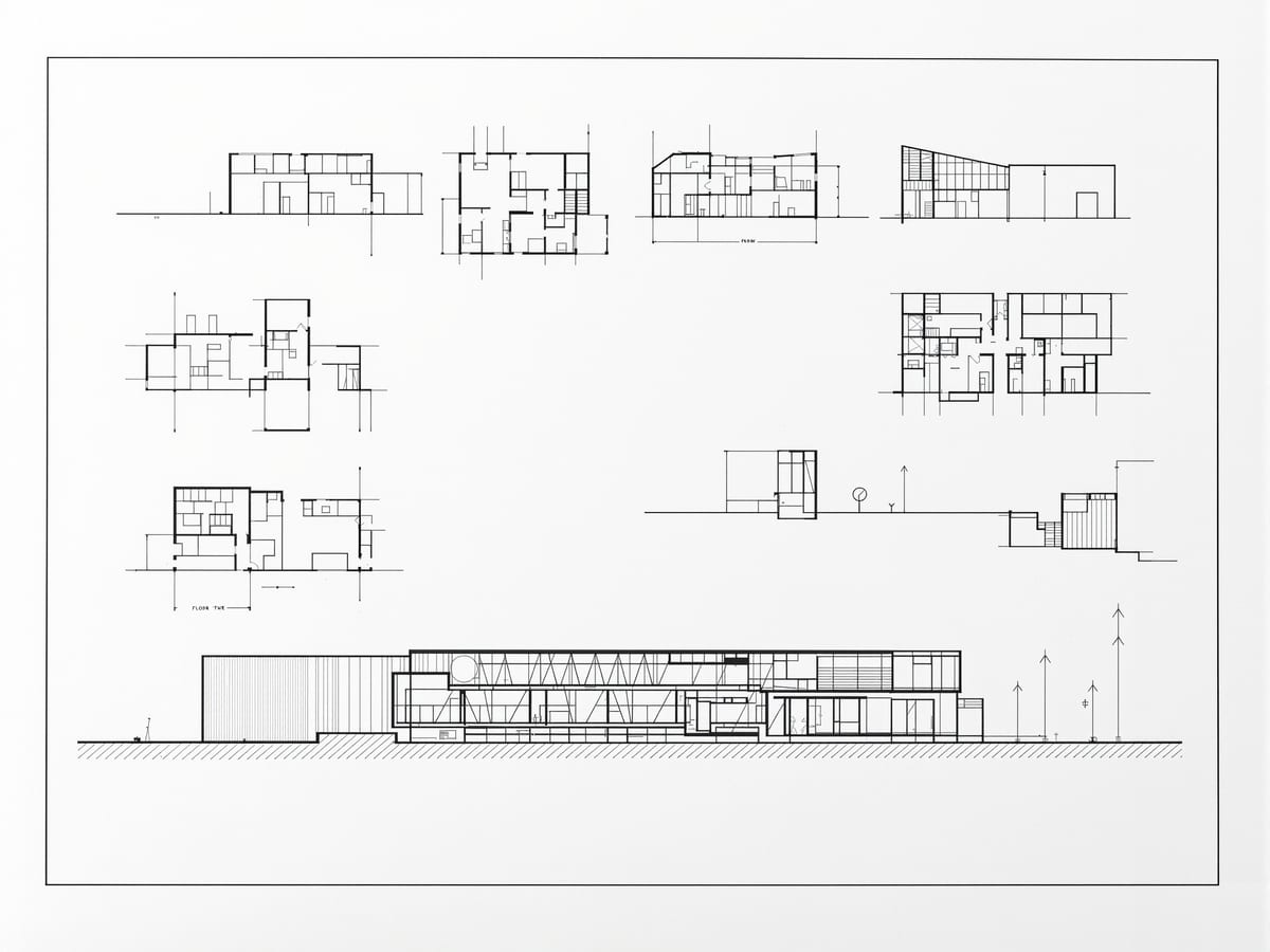
Scattered figures vs a visual set
| Aspect | One | The other |
|---|---|---|
| Purpose | Presentation drawing: simulate a plausible reality and persuade | Diagram: strip a notion to its essential elements and relationships |
| Direction of work | Contour drawing: part to part, following each edge | Analytical drawing: whole to parts to details |
| Defining a field | Spacing and alignment: the preferred, quiet means | Lines and boxes: use sparingly, risk ambiguous figure-ground |
| Conventions on the sheet | Presentation: no borders, title blocks or spare dimensions | Working drawing: borders, title blocks and full dimensions expected |
| Shadow edges | Freehand tone: define the edge by contrast of value | Line drawing: a drawn outline, avoided for shadows |
Key terms
A drawing made to describe and persuade an audience of a design's value, always a tool for communication rather than an end in itself.
A group of drawings read together as related information because of shared spacing, alignment and similarity of treatment.
A bounded region of a sheet, defined by spacing, a line, a box or a tone, within which a drawing or set of drawings sits.
A graduated bar representing proportionate size that stays accurate even when a drawing is enlarged or reduced.
Slow drawing of edges in which the hand follows the eye, treating negative spaces as seriously as positive shapes.
Light exploratory strokes that locate centres, alignments and proportions and are left visible as the drawing is built up.
The relationship between a positive shape and the space around it; ambiguous figure-ground confuses which is the subject.
The central organising idea or concept of a design, expressed concisely as a concept diagram.
Studio task
Lay out a one-sheet presentation for a small project — a pavilion, a bus stop, a room. Include a plan, a section, one perspective and a short title, and place them on an invisible grid so spacing and alignment do the work of holding them together. Add a graphic scale and a north arrow. Then, on a separate scrap, draw the whole idea as a single parti diagram in under a minute. If the parti is clear, the sheet will be too.
Self-assessment
1. What most reliably makes several drawings read as one visual set?
2. Why is a graphic scale bar preferred over a written ratio on a presentation sheet?
3. How does analytical drawing differ from contour drawing?
Recap
References & further reading
- [1]Francis D.K. Ching, Architectural Graphics (6th ed.). Hoboken: John Wiley & Sons, 2015.
- [2]Francis D.K. Ching, Design Drawing (3rd ed.). Hoboken: John Wiley & Sons, 2018.
- [3]Francis D.K. Ching, Architecture: Form, Space, and Order (4th ed.). Hoboken: John Wiley & Sons, 2015.
- [4]Edward T. White, Concept Sourcebook: A Vocabulary of Architectural Forms. Tucson: Architectural Media, 1975.
- [5]Rendow Yee, Architectural Drawing: A Visual Compendium of Types and Methods (4th ed.). Hoboken: John Wiley & Sons, 2012.
- [6]Robert W. Gill, Rendering with Pen and Ink. London: Thames & Hudson, 2006.
Further reading
- Michael E. Doyle, Color Drawing: Design Drawing Skills and Techniques for Architects, Landscape Architects, and Interior Designers. Hoboken: John Wiley & Sons, 2007.
Sources gathered and fact-checked June 2026. Published values vary by source, sample and method — treat as indicative and confirm against the cited standard before structural use.
Where to take this next
You now hold the whole graphic language — from the first projection line to the finished, argued sheet. Keep a sketchbook always to hand; draw the buildings you pass; and pair this with Architectural Graphics I for the instrument-and-geometry half of the craft. Drawing is a habit before it is a skill — so draw every day.
The author
Amogh N P
Architect, interior designer, and creative polymath. Studio Matrx began in his notebooks — his vision of design made honest, useful, and open to everyone. Its Academy is written and taught in his memory, and free, forever.
More about Amogh →