
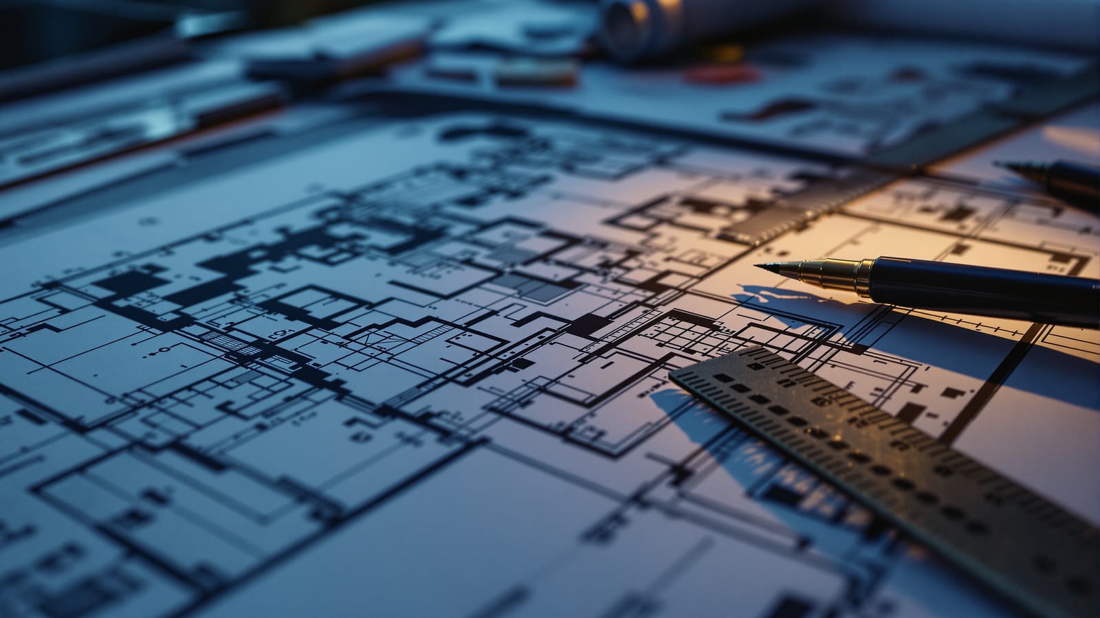
Multiview Drawings — Plans, Sections & Elevations
Slice a building open, look straight at its faces, and let line weight carry the depth the flat page cannot.
The plan, the section and the elevation are the three drawings that carry almost every building ever made. They look austere — flat, measured, unglamorous — but a good one holds a whole design in perfect clarity, and a bad one hides it. The secret is not the linework alone but the conventions of the cut and a disciplined hierarchy of line weights: knowing what has been sliced through, what is seen beyond, and how to make the difference visible at a glance.
Learning objectives
By the end of this lesson, you will be able to — mapped to the course outcomes for Architectural Graphics II:
By the end you can set the plan cut at the right height and draw a floor plan that reads clearly, with cut walls and columns given their proper poché.
By the end you can cut a building section through the most telling spaces and render it with a line-weight hierarchy that separates the cut from what is seen beyond.
By the end you can explain why plans, sections and elevations are abstract, know-based views rather than optical ones, and how the three coordinate as one set.
By the end you can read a drawing and tell, from line weight and tone alone, where mass meets space and which surfaces recede into depth.
The big ideas
A plan is a horizontal cut looking down; a section a vertical cut looking sideways; an elevation a straight look at a face. Each is an orthographic projection, true to measure but flat — so the real craft is bringing depth back with poché and line weight.[1, 3]
The horizontal cut
A floor plan is not a picture of a room; it is a horizontal slice. Imagine passing a level plane through the building about 1.2 to 1.4 metres (roughly 4 feet) above the floor, lifting off everything above, and looking straight down at what remains. The plane shears through walls, columns and most door and window openings, and below it we see the floor, counters and tabletops. Because a plan shows width and length but never height, it is the natural field for studying how spaces are arranged, connected and proportioned in the horizontal dimension. Everything parallel to the picture plane stays true to size and shape.[1, 2]
In practice
Work through the real methods: setting out a floor plan in the right sequence; using poché and weight to make the cut legible; reading a site through contours; the reflected ceiling plan; and the depth cues that keep an elevation from going flat.[1, 5]
From regulating lines outward
Work from the most continuous, ordering elements toward the things they contain. Begin with the regulating lines — a grid of centrelines that fixes the structural or modular system. Give the major walls, posts and columns their true thickness next. Then place the openings: windows, doorways, stairways. Finish with the fine grain — door leaves and their swing arcs, stair treads and railings, built-in furniture. Working in this order keeps the drawing coherent, because each layer hangs off the framework already established rather than being patched in afterwards. It is the same discipline whether you draft by hand or build the model digitally.[1, 2]
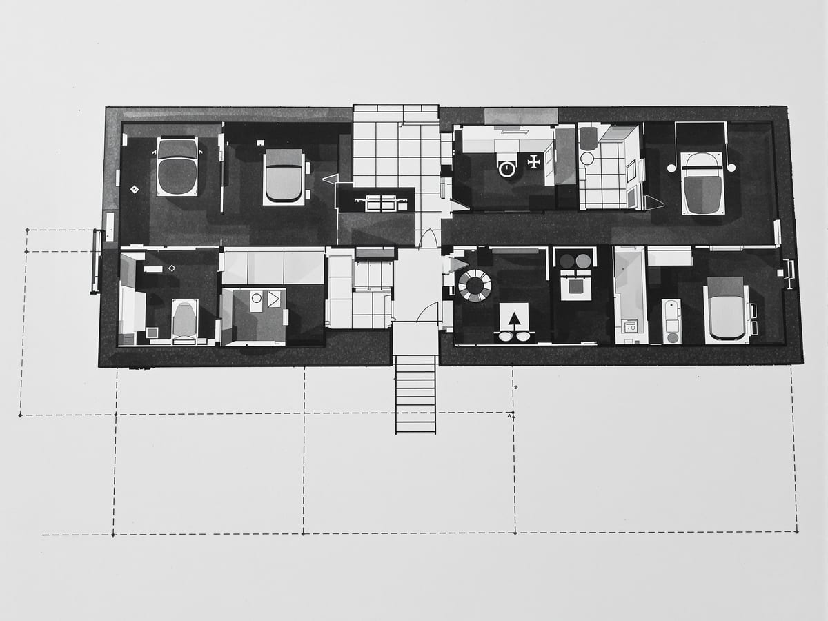
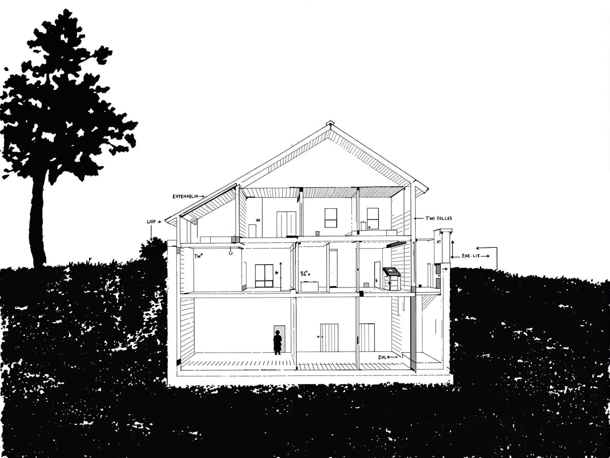
What is cut vs what is seen beyond
| Aspect | One | The other |
|---|---|---|
| What it is | Solid matter sliced open by the cutting plane | Surfaces and objects seen through the space beyond the cut |
| Line weight | Heaviest line — profiles the cut edge | Lighter, thinner lines that recede with distance |
| Tone | Poché — blackened or middle grey | Left white or given a light, receding value |
| In a floor plan | Walls, columns, door and window jambs | Floor, counters and tabletops below the plane |
| In a building section | Cut floor, wall, roof and the continuing soil mass | Interior elevations of walls standing beyond the cut |
Key terms
A view drawn with parallel projectors striking the picture plane at right angles, so faces parallel to that plane keep their true size and shape.
A horizontal section of a building, cut about 1.2 metres above the floor with the upper part removed, seen looking straight down.
The horizontal cutting plane of a floor plan; it shears through walls, columns and most openings and is what we emphasise most heavily.
The darkening of cut solids — walls, columns, floor and roof — with black or grey tone to set solid mass against spatial void.
The read in which solid matter reads as figure and open space as ground (or the reverse), the basic legibility a plan or section depends on.
A plan of the ceiling projected downward onto a mirror on the floor, keeping the same orientation as the floor plan.
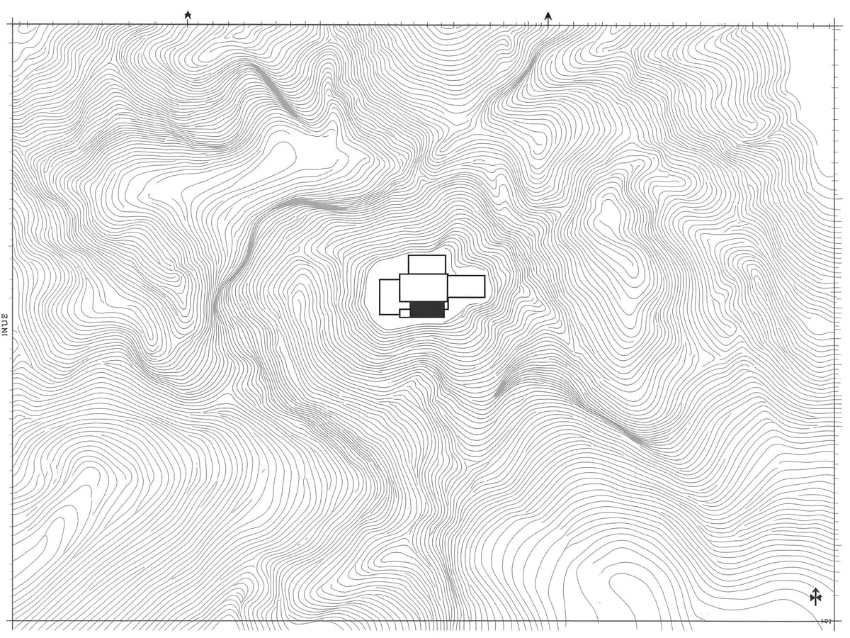
A continuous line joining points of equal height on a site plan; its spacing shows the slope of the ground.
A vertical slice through the building revealing the heights, structure and vertical connections of its interior spaces.
Studio task
Choose one room you know well. Draw its floor plan to scale, then a section cut through its most interesting wall — a window, a door, a change of level. Poché the cut walls solid, draw everything seen beyond in a lighter weight, and add a reflected ceiling plan if the ceiling does anything at all. Check one height in the section against the same height in an elevation; they must agree.
Self-assessment
1. At roughly what height is the horizontal cutting plane of a typical floor plan taken?
2. Why do we apply poché and a hierarchy of line weights to a plan or section?
3. On a site plan, what does tight spacing between contour lines indicate?
Recap
References & further reading
- [1]Francis D.K. Ching, Architectural Graphics (6th ed.). Hoboken: John Wiley & Sons, 2015.
- [2]Francis D.K. Ching, Design Drawing (2nd ed.). Hoboken: John Wiley & Sons, 2010.
- [3]Rendow Yee, Architectural Drawing: A Visual Compendium of Types and Methods (4th ed.). Hoboken: John Wiley & Sons, 2012.
- [4]Robert W. Gill, Basic Perspective. London: Thames & Hudson, 1974.
- [5]Francis D.K. Ching, Architecture: Form, Space, and Order (4th ed.). Hoboken: John Wiley & Sons, 2014.
- [6]Bureau of Indian Standards, IS 962: Code of Practice for Architectural and Building Drawings. New Delhi: BIS.
Further reading
- Thomas C. Wang, Plan and Section Drawing (2nd ed.). New York: John Wiley & Sons, 1996.
Sources gathered and fact-checked June 2026. Published values vary by source, sample and method — treat as indicative and confirm against the cited standard before structural use.
Where this course goes next
Multiview drawings measure truly but never show a form in the round. The next unit adds the third dimension back into a single picture — first the parallel world of paraline drawings, then the converging world of perspective.
The author
Amogh N P
Architect, interior designer, and creative polymath. Studio Matrx began in his notebooks — his vision of design made honest, useful, and open to everyone. Its Academy is written and taught in his memory, and free, forever.
More about Amogh →