
Mood boards & style exploration
The fortnight of pinning references is now an afternoon. Here's how to use AI to find, fuse and pressure-test a style before you commit a single drawing.
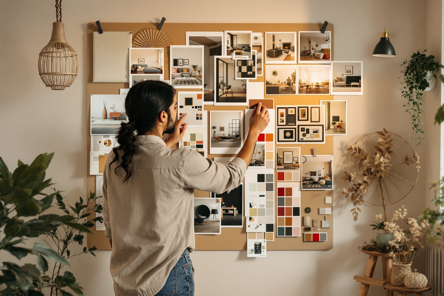
Three style directions for a 3BHK, drawn before the client's coffee arrives.
The old mood-board ritual: a week on Pinterest, a board of other people's rooms, a meeting where the client says 'I like it but...' and you start again. AI collapses that loop. You can now generate a coherent, original board for 'warm Scandinavian-meets-Chettinad with brass and lime plaster' in minutes, fuse two styles that have never met, and put three distinct directions in front of a client in the first meeting. The point isn't pretty pictures. It's _alignment_ - getting the client to point at the direction they love before you've sunk forty hours into the wrong one. That's where a mood board earns its keep, and AI makes it almost free.
Mood boards as alignment tools, and style fusion as a superpower
It exists to align taste before you design, not to decorate a deck
A mood board is not art direction for its own sake - it's a de-risking tool. Its job is to surface the gap between what you imagine and what the client imagines, while changing course is still free.
AI changes the economics of that. Because a coherent board now costs minutes, not days, you can afford to show three directions instead of defending one. Generate a clean, calm direction, a warm-textured direction and a bold-contrast direction for the same brief, and let the client react. Their reaction - what they're drawn to, what they recoil from - is worth more than any single board you could have laboured over. You're using AI exactly the way the whole course prescribes: to diverge widely and cheaply, then converge on the client's real taste.
Keep the honesty rule from Module 0 visible: these boards show direction - mood, palette, material feel - not a buyable room. The brass pendant in the image isn't a product yet. Say so, and the board does its job without setting a false expectation.
Scandinavian-meets-Chettinad, and other marriages that used to take a designer's whole eye
The single most useful trick AI brings to style work is fusion - blending two design languages into a coherent third. Type 'Scandinavian minimalism meets Chettinad vernacular - pale oak and lime plaster with athangudi tile, brass accents, warm and uncluttered' and the model finds a plausible middle ground in seconds. This used to be a senior designer's party trick; now it's a prompt.
Use it to escape clichés. Instead of 'modern' (which the model reads as generic and faintly American), name a fusion that's specifically yours: 'Goan-Portuguese meets Japandi', 'art-deco Bombay meets warm minimalism', 'Kerala tropical meets industrial loft'. Each gives the client a board that feels considered and original rather than off-the-shelf.
The judgement you bring: not every fusion works, and the model can't tell you which. It will confidently blend two styles into mush. You decide whether the marriage has integrity - whether the brass actually belongs with the oak, whether the proportions hold. AI proposes the fusion; your trained eye accepts or rejects it.
A fusion prompt that names the materials of both parents ('pale oak AND athangudi tile') fuses far better than two abstract style words alone.
Converge: pick, refine, and lock the direction before design starts
Divergence is the easy half. The skill is converging.
Once the client points at the direction they love, you tighten: pull the three or four images that are truly on-brief, name the palette and the key materials in words (so it survives outside the AI), and write a one-line design statement the whole project will be measured against. That statement - 'warm, tactile, uncluttered; lime plaster, pale oak, brass, athangudi' - is the real deliverable. The pictures were scaffolding to reach it.
This is exactly what Studio Matrx's Moodboards / Style Explorer is built to do for Indian interiors - apartments and villas, six rooms, ten styles - and it's a live example of the whole loop: explore directions fast, then carry a clear, named direction into the actual design. Whether you use that or raw Midjourney, the discipline is identical: diverge to find the taste, converge to a written direction, then design for real.
Mood boards aren't only an interiors tool - use AI style boards at concept to align a client on architectural _character_ before you commit to a parti: 'is this a heavy, grounded, masonry building or a light, layered, framed one?'. Generate two or three character directions, let the client react, and you've de-risked the whole scheme's language in one meeting. Then converge to a written character brief that governs material, massing and detail. The board persuades; the brief disciplines the design.
This is the lesson you'll use most. Build a repeatable kit: for each new client, generate three directions (calm / warm / bold) for the hero room, fuse a style that fits their story, and run the meeting off the boards. InteriorAI's 40+ styles and virtual staging make quick exploration easy; Midjourney gives the most seductive boards; Firefly keeps it commercially safe for a paid deck. Then convert the chosen direction into a named palette and a real FF&E starting list. Taste aligned in week one is the single biggest cause of a smooth fit-out.
Style fusion is how a solo studio develops a recognisable signature fast. Spend a weekend generating fusions until you find two or three that feel like _you_, and reuse them as your house directions across pitches. It reads as a point of view, which wins work. Lean on Studio Matrx Moodboards / Style Explorer for India-specific styles and rooms so you're not reinventing the wheel, and always convert a winning board into a written, named direction so the look survives once you leave the AI.
Midjourney v7
Most seductive boards + style fusion
Best at coherent, atmospheric boards and at blending two styles into a believable third. Honest limit: it shows direction, not buyable products, and licensing needs checking for paid decks.
InteriorAI
Interior styles + virtual staging
40+ styles, virtual staging, quick style exploration and 3D/VR walkthroughs - fast for trying many interior directions on a room. A restyle tool, not a sourcing or costing tool.
Adobe Firefly
Commercially-safe boarding
Trained on commercially-safe data, inside Photoshop; good for patterns, colorways and mood boards you can put in a paid client deck with lower legal risk.
Studio Matrx Moodboards / Style Explorer
India-specific style exploration
Apartments and villas, six rooms, ten styles - a live worked example of explore-fast-then-converge, framed for Indian interiors. Use it to carry a named direction into real design.
“An AI mood board is the deliverable - if the client loves the board, the design is basically done.”
The board is scaffolding, not the building. A loved board only means taste is aligned; the actual room still needs real, measured, sourced, costed materials and furniture, real clearances and services, and your design judgement. The brass pendant and the marble in the image aren't products you can buy. The deliverable is a written, named direction the client signed off - the pictures just got you there.
Workshop — three directions for a real 3BHK, then one named direction
Run the full diverge-then-converge loop on a real (or imagined) 3BHK living room: generate three style directions, fuse one, and walk away with a written design direction. Thirty minutes.
Free: Firefly free tier or Studio Matrx Moodboards. Better: Midjourney or InteriorAI for richer boards.
THREE DIRECTION PROMPTS for the SAME 3BHK living room:

A) CALM:  "3BHK living room, warm minimal, lime-plaster walls,
   pale oak, off-white linen, soft north light, uncluttered,
   editorial mood, photorealistic --ar 16:9"

B) WARM:  "...same room, Scandinavian-meets-Chettinad, pale oak
   AND athangudi tile, brass accents, jute, warm evening light"

C) BOLD:  "...same room, art-deco Bombay meets warm minimalism,
   deep green, fluted teak, brass, dramatic side light"

FUSION TO PUSH (pick your favourite and deepen it):
  name BOTH parents' materials explicitly in the prompt.
- 1Generate all three direction boards (A, B, C) for the same room, keeping the aspect ratio fixed at 16:9 so they read as a set.
- 2Lay them out side by side as one decision sheet - this is the sheet you'd put in front of a client.
- 3Pick the direction with the most life in it and deepen the fusion: name both parent styles' materials explicitly and regenerate two or three variations.
- 4Cull to the four images that are genuinely on-brief; delete the rest. Resist keeping a pretty image that's off-direction.
- 5Name it in words the AI can't keep for you: write the palette and the three or four key materials as plain text ('lime plaster, pale oak, brass, athangudi tile').
- 6Write the one-line design statement the whole project will be measured against, and note one honest caveat (which materials are still placeholders to source for real).
You’ll walk away with
A three-direction client decision sheet plus a single written, named design direction with palette, key materials and a one-line statement - the actual deliverable a mood board exists to produce.
Two quick experiments.
- 01Generate the same room in five named styles back to back (Japandi, Chettinad, art-deco, brutalist, coastal). Seeing them adjacent trains your own eye on what each style really means.
- 02Try a fusion the model will struggle with ('minimalist meets maximalist') and watch it produce mush - proof that your judgement, not the model's, decides if a marriage works.
A mood board's job is to align taste before you design, and AI makes that almost free - so show three directions, not one, and fuse styles to escape clichés. But the board is scaffolding: the real deliverable is a written, named direction the client signed off. Diverge with the images, converge to words.
Mood boards de-risk a project by aligning taste early. AI lets you diverge cheaply (three directions, original style fusions like Scandinavian-meets-Chettinad) then converge to a written, named direction with a real palette. The pictures are scaffolding; the signed-off direction is the deliverable. Your eye, not the model, decides if a fusion works.
How do I use AI to make a mood board for interior design?
Generate three style directions for the same hero room - say calm, warm and bold - using Midjourney, InteriorAI, Firefly or Studio Matrx Moodboards, keeping the aspect ratio fixed so they read as a set. Use them to align the client's taste in the first meeting, then converge: cull to the on-brief images, write the palette and key materials in plain words, and lock a one-line design direction. The written direction, not the images, is the deliverable.
Can AI blend two interior styles, like Scandinavian and Chettinad?
Yes, and style fusion is one of AI's best tricks. Name both parents and, crucially, both parents' materials - 'pale oak AND athangudi tile, brass accents, lime plaster' - and the model finds a plausible third style in seconds. But it can't tell you whether the marriage has integrity; it will happily blend two styles into mush. Your trained eye decides whether the fusion actually holds.
Will AI mood boards replace working with a designer?
No - they replace the slow first-draft of taste, not the designer. A board aligns direction; it can't source real, costed, available products, handle clearances and services, or carry design judgement and accountability. AI makes the exploring phase almost free, which lets a designer spend their time where it matters: turning the agreed direction into a buildable, liveable room.
_You've aligned the overall look. Now zoom into the surfaces themselves - exploring materials, palettes and finishes with AI, and the critical step from a generated finish to a real, sourced, costed material._