
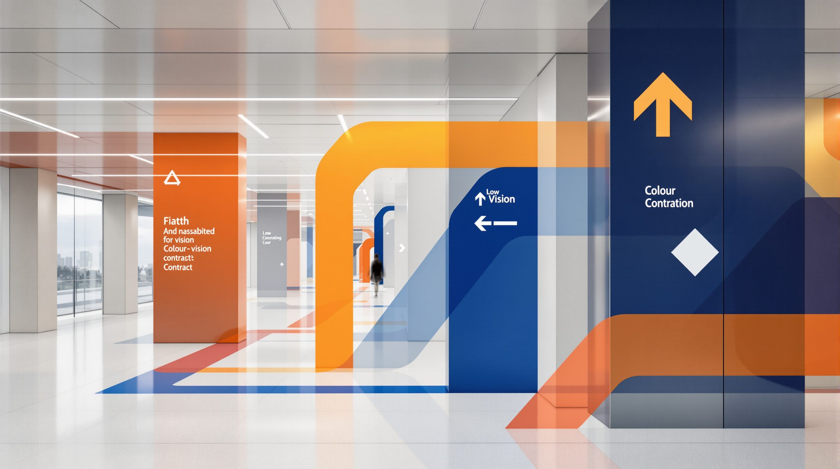
 Lesson 7.3
Lesson 7.3 · Accessible & Inclusive Wayfinding
Colour Vision, Contrast & Low Vision
Far more people see poorly than see nothing at all - through low vision, ageing eyes, colour blindness or simple glare - and designing for them comes down to a handful of powerful moves: strong luminance contrast, large clear type, controlled light, and never, ever letting colour be the only thing that carries the message
Most people with impaired sight are not blind - they see, but not clearly - and they are helped or defeated by three ordinary things: contrast, type size and light.
When people hear "visual accessibility" they tend to picture a blind visitor with a cane. But blindness is the small end of a very large group. Vastly more people have low vision - sight that is impaired but usable - through ageing eyes, cataracts, glaucoma, diabetic changes and a dozen other causes, and their number grows with every year the population ages. Add the colour-blind (a striking share of men) and, honestly, everyone reading a sign in glare, in dusk, without their glasses, or through the tears of a stressful day, and you are designing for most of the people who will ever use the place. These are not rare users at the margin; they are the mainstream, and they are helped or defeated by a handful of ordinary design decisions.
The good news is that the moves that serve low vision and colour blindness are simple, cheap and make signage better for absolutely everyone. They come down to four. Luminance contrast - a big difference in lightness between the message and its background - is the single most powerful thing you can do, because a low-vision eye that cannot resolve fine detail or distinguish hues can still read a strong light-dark difference. Large, clear type gives the impaired eye something it can actually resolve. Controlled light - avoiding glare, veiling reflections and gloom - decides whether even a well-made sign can be read at all. And the redundancy rule, sharpened here to a hard line: never let colour be the only thing that carries a message, because to the colour-blind, and in poor light to everyone, colour alone can simply disappear. This lesson takes each in turn - and, as ever, defers the binding contrast minimums to the standard.
Low vision = the mainstream, not a niche. Contrast (greyscale test) + big clear type + good glare-free light + never colour alone. All of it just = signage done well.
Luminance contrast is the workhorse - not colour
If you take one thing from this lesson, take this: the eye reads contrast, and for accessibility the contrast that matters is luminance contrast - the difference in lightness - not the difference in colour. A low-vision eye may not resolve fine detail, may not separate hues, may see the world as a low-resolution, washed-out image - but a strong light-against-dark difference punches through almost all of that. This is why dark text on a light ground, or light text on a dark ground, is the backbone of readable signage, while a mid-tone message on a mid-tone background is a struggle even for good eyes and invisible to poor ones.
The classic mistake is to trust colour to do contrast's job. Two colours can look vividly different to a normal-sighted designer - red text on a green panel, say - and yet be almost identical in lightness. To a colour-blind viewer who cannot separate red from green, and to anyone in dim light where colour perception fades, that pair collapses into one flat field and the message vanishes. The designer's self-test is quick and merciless: imagine the sign in greyscale (or actually desaturate it). If the message survives as a clear light-dark difference in black and white, it has real luminance contrast; if it disappears into grey mush, it was relying on colour, and it will fail low-vision and colour-blind users. Squinting at the sign, or stepping far back, does the same job - both strip away the detail and the hue and leave only the lightness difference the impaired eye actually uses.
There is a real number behind this - luminance contrast is measurable, and the accessibility standards set minimum contrast values for signage and for text against its background. Those minimums are exactly the kind of binding specific this course defers: they vary by standard, by element and over time, so treat any ratio you meet as an illustrative benchmark as of 2026 and verify the required value against the current standard for the project. What is not deferred, because it is timeless design judgement, is the principle: build every sign on a strong lightness difference, prove it in greyscale, and never assume that because two colours look different to you they will read as different to everyone.
The eye reads LIGHTNESS, not hue. Squint or go greyscale: if the message survives, it has real contrast; if it vanishes, it was leaning on colour. Contrast minimums: from the standard.
Never colour alone: redundant, stacked cues
The luminance point has a twin that deserves its own hard rule: colour may reinforce a message, but it must never be the only thing carrying it. Colour is genuinely useful in wayfinding - colour-coding a zone, a line, a department is memorable and powerful - and nothing here says avoid colour. What it says is that any information encoded *only* in colour is lost to the colour-blind (a large group, especially among men, for whom red and green are the classic confusion) and, in poor light, to everyone. A map whose only way of telling the blue route from the green route is the colour; a status system where red means closed and green means open with nothing else to tell them apart; a "follow the red line" system read by someone who cannot see red as different - each fails a real, common user.
The cure is redundancy, stacked cues: pair colour with at least one other independent signal so the message survives the loss of any single one. Colour plus a label (the blue route is also marked "Route B" or named); colour plus a shape or pattern (the lines differ in dash pattern or icon as well as hue); colour plus a pictogram; colour plus position. The green exit sign works not because it is green but because it also has the word, the running figure and the arrow - remove the colour entirely and it still reads. That is the test: cover or greyscale the colour and check the message is still fully there. Colour-coding is then a bonus that helps the many people who *can* use it, layered on top of a system that does not *depend* on it.
This is simply the redundancy principle from the module opener, aimed at one channel. It costs almost nothing - a label already there, a symbol you were going to use, a pattern instead of a plain fill - and it converts a fragile colour-only system into a robust one. It also disciplines the colour-coding itself: because colour is a bonus not a crutch, you are freed to choose colours that are distinguishable to colour-blind viewers where you can (avoiding the worst red-green traps, using differences in lightness as well as hue), knowing that even if someone misses the colour entirely, the label, shape or symbol still carries them. Design as if the colour might not be seen - because for a great many people, in a great many conditions, it will not be.
Large, clear type - and controlling light
Contrast decides whether a message can be separated from its background; type size and clarity decide whether the impaired eye can resolve the message at all, and this is the second great lever for low vision. Bigger is the obvious move - larger characters are readable at lower acuity and from further away - but size interacts with everything the course has already taught about legibility: a clean, open sans-serif with generous letter spacing and open counters reads far better at low acuity than a decorative or condensed face; sentence case is easier than all-capitals for a long message; short, plain wording is easier than dense text for an eye that tires quickly. The letter-height-per-viewing-distance benchmarks from the typography lesson are the starting point, and for low vision you design generously toward the larger end of them - remembering they are figures to verify, not rules. Crucially, large clear type is not a special low-vision variant bolted on; it is the default sign done well, which is why designing for low vision quietly upgrades every sign for every tired, glancing, distant reader.
The third lever is one designers forget because it is not on the drawing: light. A sign with perfect contrast and generous type can still be unreadable if the light is wrong. Glare is the chief enemy - a glossy sign face or a glazed directory catching a window or a downlight throws a veiling reflection across the message and washes it out, and it does so worst for older and low-vision eyes that scatter light internally. Uneven pools of bright and dark, deep gloom, and strong backlighting that throws a sign into silhouette all defeat readability too. So the design moves are as much about the sign's finish and setting as its graphics: prefer matte, non-reflective faces; position and light signs so no lamp or window glares off them into the reading eye; keep lighting on signs and along routes even and adequate, without hot-spots or dark patches; and remember that older eyes need more light and take longer to adjust between bright and dark zones, so sharp lighting transitions disorient them. Contrast, size and light work as a trio: get all three right and a low-vision visitor reads the sign; fail any one and the other two may not save it. The binding light levels, like the contrast minimums, belong to the standard and the lighting specialist - the principle, that a sign must be legible in its real light, belongs to you.
Contrast + size + light = a trio. Matte faces (no glare), even bright light (no gloom or hot-spots), generous type. Older eyes need more light and adjust slowly - avoid sharp light-to-dark jumps.
Designing for the low-vision mainstream
Step back and the theme of this lesson is that low vision is not a niche - it is the mainstream of visual accessibility, and designing for it is mostly just designing signage well. The four moves - strong luminance contrast, never colour alone, large clear type, controlled glare-free light - are not exotic accommodations; they are what separates a good sign from a poor one for everybody. This is the curb-cut effect again: the sign engineered so a low-vision visitor in bad light can read it is exactly the sign the rushed, distant, tired, glancing majority read fastest. There is essentially no tension between designing for low vision and designing well - which is why these moves should be the default of the whole sign family, not a special accessible line.
That reframing changes how you work. Instead of designing a handsome sign and then "checking accessibility" at the end, you set the accessibility moves as the baseline the sign family is built on: pick a high-contrast palette and prove it in greyscale from the first sketch; choose an open, legible face at generous sizes as the standard; specify matte finishes and coordinate sign lighting with the lighting design from the start; and encode nothing in colour that is not also carried by label, shape or symbol. Do that and accessibility is not a constraint you fight but the grain you work with. It also pays to test the way low-vision users experience signs - view your design small and blurred, in greyscale, in raking light and glare, from a distance and at speed - because these cheap simulations reveal failures a crisp on-screen mock-up hides.
And hold the two boundaries the course keeps. First, the binding numbers - the minimum luminance contrast for signage and text, the light levels along accessible routes - are set by the accessibility and lighting standards, vary and are revised, and must be verified against the current version for the specific project, with the accessibility consultant and lighting designer where it matters; treat every figure here as illustrative as of 2026. Second, low vision sits inside the whole inclusive system: it overlaps the tactile and audible provision of the last lesson (a low-vision visitor may use large high-contrast signs and tactile paving and audible cues) and the multilingual provision of the next, and it is served best when all of it is one integrated, tested system designed for the person having the hardest time. Next we turn to that final dimension - language, script and culture - where India's many-scripted reality makes redundancy and pictograms matter more than anywhere.
Luminance contrast (NBC 2016 / Harmonised Guidelines / WCAG-family)
Minimum contrast for signage, text-to-background, and key surfaces
The principle - build on lightness contrast, prove it in greyscale - is here; the binding minimum ratios vary by standard and element and defer to the current accessibility standard and consultant.
Colour vision & 'never colour alone'
Colour-coding paired with an independent cue; colour-blind-safe choices
A design principle rather than a single code: never encode essential information in colour alone; pair with label, shape, pattern or symbol. Verify colour-coding survives greyscale and colour-blind simulation.
Lighting for legibility & low vision
Even adequate light on signs and routes, glare and reflection control, transition zones
Binding light levels and glare limits defer to the lighting and accessibility standards and the lighting designer. Older and low-vision eyes need more light and adjust slowly - avoid sharp bright-to-dark transitions.
Workshop — the greyscale, squint and glare test on real signs
Low-vision failures are invisible to a good eye looking at a crisp sign up close - and glaringly obvious the moment you simulate impaired sight. In this workshop you will stress-test real signs (or your own designs) with three cheap simulations that reveal contrast, colour and light failures.
A phone camera with a basic photo editor (for greyscale and blur), some real signs or your own designs, and a notebook. No specialist equipment needed.
Goal: find low-vision and colour failures in real signage
Inputs: a set of real signs (a building, station or your own designs) + a phone camera + this lesson + a notebook
Time: ~50 minutes
- 1Collect 6-8 signs (photograph them, or use your own designs). For each, note what it is trying to communicate and how it uses colour, type and light.
- 2GREYSCALE TEST: convert each image to black and white (phone photo edit or a filter). Mark every sign whose message weakens or disappears - those were relying on colour or on too little luminance contrast.
- 3SQUINT / DISTANCE / BLUR TEST: squint hard at each sign, or step far back, or blur the photo. Mark where the type is too small, too tight, too decorative or too low-contrast to resolve - this is roughly what low vision sees.
- 4COLOUR-ONLY AUDIT: find every place where information is carried ONLY by colour (a colour-coded map or route, a red/green status). Check whether a label, shape, pattern or symbol also carries it; flag the ones that fail.
- 5LIGHT AUDIT (on site if possible): look for glare and veiling reflections on sign faces, gloom, and harsh bright-to-dark transitions. For every failure found across the four tests, write the fix (more luminance contrast, larger clearer type, an added non-colour cue, a matte face or better light) and flag which need the standard's numbers and a specialist.
You’ll walk away with
A one-page low-vision stress-test of real signs: the greyscale, squint and colour-only results, the light failures, and a specific fix for each - with the items needing binding contrast minimums or light levels flagged for the accessibility consultant and lighting designer.
Three altitudes on the same idea
Read the band that fits you — or all three.
Two of the four low-vision levers are architectural and lighting decisions you own - light and the conditions signs live in. A route lit evenly and adequately, without glare pools, deep gloom or harsh bright-to-dark transitions that punish ageing eyes, does as much for low-vision wayfinding as the signs themselves - and it is set by the lighting design and the architecture, early. Position sign locations so daylight and luminaires do not glare off them, coordinate sign lighting with the scheme rather than leaving signs in shadow, and keep contrast and legibility in mind when choosing wall and floor finishes (a step-edge or door that contrasts with its surround is wayfinding too). Defer the binding contrast minimums and light levels to the accessibility and lighting standards and the specialists.
The low-vision moves are your sign-design defaults, and they cost nothing to adopt from the first sketch. Build the whole sign family on strong luminance contrast, proven in greyscale, not on colour that only looks different to good eyes; specify large, clear, open type at generous sizes; choose matte, non-reflective faces; and encode nothing in colour alone - always pair it with label, shape or symbol. Set these as the baseline the family is built on, not an accessible variant checked at the end, and test your designs small, blurred, greyscaled and in glare. Coordinate the binding contrast minimums, finishes and sign lighting with the accessibility consultant, lighting designer and fabricator against the current standard.
Learn the four moves - luminance contrast, never colour alone, large clear type, controlled light - and the greyscale test, and you will spot low-vision failures everywhere. Train the reflex: whenever you see a sign, imagine it in black and white and ask whether the message survives, and ask what happens to it in glare or gloom. Understand that most visually impaired people are not blind but low-vision, that a large share of men are colour-blind, and that these moves help everyone (the curb-cut effect), so there is no trade-off between accessible and good. You are not expected to know the exact contrast ratio the standard demands - that is for the standard and the consultant - but you should be able to design a sign that passes the greyscale test every time.
“As long as you use bright, bold, different colours, your signage will be clear and colour-blind people are a rare edge case not worth worrying about.”
Do it yourself
No tools needed - reason it through.
- 1Why is luminance contrast, not colour difference, the thing a low-vision eye actually reads - and what is the quick self-test for it?
- 2State the 'never colour alone' rule and give three independent cues you can pair with colour so a message survives the loss of colour.
- 3How do type size and clarity, and the control of glare and light, each decide whether a low-vision visitor can read a sign?
- 4Why is designing for low vision described as 'the mainstream' and as having 'no tension' with designing well?
- 5Which decisions here are timeless principles, and which (contrast minimums, light levels) must defer to the standard and specialist?
The one line to carry out
Peer-reviewed journals & authoritative standards
- 01Contrast (vision) — Wikipedia — Contrast (vision), 2026.
- 02Color blindness — Wikipedia — Color blindness, 2026.
- 03Low vision — Wikipedia — Low vision, 2026.
- 04Web Content Accessibility Guidelines — Wikipedia — Web Content Accessibility Guidelines, 2026.
Impaired sight is one barrier between a person and a sign; language is another. Next we turn to multilingual and cross-cultural wayfinding, and India's many-scripted, low-literacy reality where pictograms and redundancy matter most of all.
The author
Amogh N P
Architect, interior designer, and creative polymath. Studio Matrx began in his notebooks — his vision of design made honest, useful, and open to everyone. Its Academy is written and taught in his memory, and free, forever.
More about Amogh →