
 Lesson 3.6
Lesson 3.6 · A Design Vocabulary
Balance, Harmony, Rhythm and Emphasis
The grammar that turns a pile of elements into a composition
Why does one room feel settled and another feel like a furniture showroom exploded?
Two living rooms can own the exact same sofa, the same lamp, the same brass figurine, the same teak table. One feels composed; the other feels like a storeroom with ambitions. The elements are identical. What differs is the grammar holding them together.
Matching everything isn't harmony - it's a uniform. Give the room one rebel.
Elements are words; ordering principles are sentences
Everything you have learned so far - form, colour, texture, proportion - hands you a vocabulary. A teak chair, a saffron cushion, a rough jute rug, a tall plant: these are your words. But a pile of words is not a sentence, and a roomful of beautiful objects is not a composition.
The ordering principles are the grammar. They are the rules of arrangement that decide whether your elements sit together as a settled whole or jostle like strangers in a queue. There are four worth knowing by name: balance, rhythm, emphasis and harmony. Learn to see them and you stop guessing why a room "works" - you start knowing.
Think of the difference between a tidy desk and a composed desk. Both are clean. Only one has been arranged.
Balance: distributing visual weight so nothing tips
Balance is the distribution of visual weight so a composition feels settled rather than about to topple. It comes in three kinds.
Symmetrical balance is mirror balance - the same arrangement on both sides of a centre line. It reads as formal, calm and ceremonial: a pooja niche flanked by two identical brass lamps, the facade of a colonial bungalow with matched windows and a central door, a bed with a lamp and table on each side. It is restful and dignified, but lean on it too hard and a room turns stiff.
Asymmetrical balance balances different elements by their visual weight rather than by mirroring. A large low sofa on one wall can be balanced by a cluster of two smaller chairs and a tall potted palm on the other - unequal objects, equal pull. This is the language of the relaxed modern Indian home: dynamic, informal, alive.
Radial balance arranges elements around a central point - a round dining table with chairs fanned out, a chandelier spilling light in a circle, a rangoli. The crucial idea underneath all three is visual weight: a thing pulls harder when it is larger, darker or more saturated in colour, more textured, or isolated in empty space. A single dark carved cabinet alone on a pale wall weighs as much as a whole pale sofa set.
Rhythm: leading the eye with repeated elements
Rhythm is visual movement - the way your eye is led across a space by elements that repeat. Just as a beat carries music forward, repeated forms carry the gaze.
The simplest is repetition: a row of identical columns down a verandah, a screen of repeating jaali blocks, a line of matched pendant lights over a kitchen island. The eye reads the pattern and travels along it.
Alternation sets up an ABAB pulse - a colonnade of column, arch, column, arch; tiles that switch between two motifs; cushions that alternate plain and patterned. The variation keeps the rhythm from going flat.
Gradation is a graduated change - a stepwise shift in size, tone or spacing, like a wall of frames that grow from small to large, or a paint wash that deepens from floor to ceiling. Gradation gives rhythm a direction, pulling the eye toward where the change is heading. A jaali screen is rhythm you can stand inside.
Emphasis and harmony: the anchor and the whole
Emphasis is the focal point - the one element that dominates and anchors the eye the moment you enter. It might be a single carved teak door, a deep-toned feature wall, a striking artwork, or a statement chandelier. Emphasis answers the question where do I look first? A room with no focal point feels aimless - your eye wanders and finds nowhere to rest. A room with five competing focal points feels chaotic, because everything shouting is the same as nothing being heard. You usually want one clear hero, with everything else playing support.
Harmony is the pleasing sense of a whole, and it lives in the tension between two forces. Unity is the feeling that things belong together - a shared palette, repeated forms, a consistent material story. Variety is enough difference to keep the eye interested. All-matching is dead - a room where every wood is the same teak and every cushion the same beige feels embalmed. All-different is chaos. Good design lives in the space between: unity holds the room together, variety keeps it breathing. An ornate carved piece earns its drama precisely because the rest of the room is quiet enough to let it speak.
Seeing all four at once
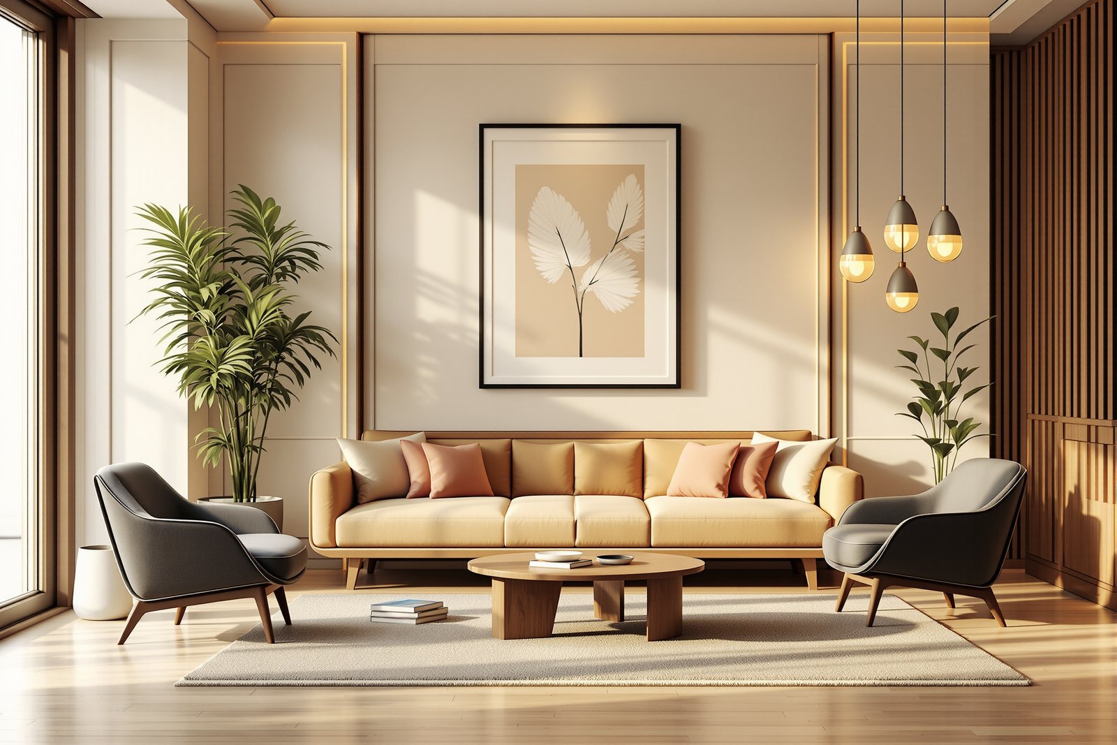
In a real room the four principles work together, not in turn. Picture a calm modern living room in a Bengaluru flat: a long sofa balanced asymmetrically by two chairs and a tall plant (balance), a row of three pendant lights threading the gaze across the space (rhythm), a single jewel-toned artwork that catches you at the door (emphasis), all sitting inside a warm wood-and-cream palette with just enough contrast to stay awake (harmony).
Pull one principle out and you feel the loss. Remove emphasis and the room drifts. Remove rhythm and it goes static. Break balance and it feels uneasy without your knowing why. Lose harmony and it splinters. This is why composition feels mysterious until you have the words - and then suddenly obvious. The balance-composer interactive lets you place visual weights on a layout and watch in real time whether the composition settles or tips, so you can feel these forces rather than just read about them.
Hands-on
Balance the heavy element
The big dark block on the left has fixed visual weight. Balance it on the right — a smaller element, placed further out, can hold its own.
Three altitudes on the same idea
Read the band that fits you — or all three.
To make a room feel composed instead of cluttered, stop adding and start arranging. Give the room one clear hero - a carved door, a painting, a feature wall - and let everything else support it instead of competing. Aim for balance you can feel: if one side is heavy with a big dark cabinet, answer it on the other side with a lamp, a plant and some art rather than leaving it bare. And resist the urge to match everything; a room where every piece coordinates perfectly often feels lifeless rather than calm.
Deploy the four principles deliberately, as decisions rather than instincts. Choose your balance strategy per space - symmetry for ceremonial and formal rooms, asymmetry for relaxed living areas - and use visual weight (size, saturation, texture, isolation) as the lever that lets you balance unlike elements. Build rhythm through repetition, alternation or gradation in joinery, lighting runs and openings to lead circulation and the eye. Protect a single dominant emphasis and ruthlessly demote the rest. And tune harmony by setting a unifying palette or material spine, then introducing controlled variety so the scheme reads composed, not monotonous.
Treat the ordering principles as the grammar that turns a vocabulary of form, colour, texture and proportion into a composition. Where the elements are your nouns, balance, rhythm, emphasis and harmony are the syntax that makes them say something. Notice that each principle is derived from how the eye and body read space - balance from our sense of physical stability, rhythm from the way attention moves over repeated stimuli, emphasis from selective attention, harmony from the cognitive pleasure of pattern with surprise. Learn to name them in spaces you admire, and analysis becomes a tool you can later wield as design.
“A balanced room must be symmetrical, and matching everything is what creates harmony.”
Run the method yourself
Stand in any room you can reach right now and run these five quick reads.
- 1Test for balance: mentally draw a vertical line through the centre of one wall. Does each side carry roughly equal visual weight, or does one side feel heavy and the other empty? Name whether the room is symmetrical, asymmetrical or unbalanced.
- 2Find the focal point: walk to the doorway and notice where your eye lands first. Is there one clear hero, several competing, or nothing at all? An aimless feeling usually means missing emphasis.
- 3Spot a rhythm: look for any repeated element - a row of windows, jaali blocks, pendant lights, picture frames. Trace how your eye travels along it, and decide if it is repetition, alternation (ABAB) or gradation.
- 4Check unity versus variety: count how many wood tones, metals and major colours are in play. Too few and it feels dead; too many and it feels chaotic. Is the room belonging-together (unity) or breaking apart (variety)?
- 5Open the balance-composer interactive and place visual weights onto a sample layout - make a heavy object on one side, then balance it with smaller elements on the other and watch the composition settle or tip.
The grammar beneath the feeling
With the grammar of composition in hand, the next module turns to the parts you actually detail - floors, walls, ceilings, doors, windows and stairs - the interior building elements where these principles meet real materials.