
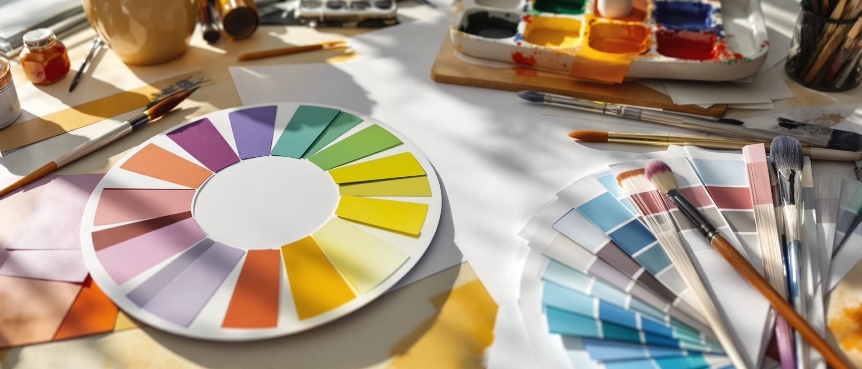
Colour Theory & Colour Psychology
The wheel, the three dimensions, the systems — and colour read honestly.
Colour is the element students most want to master and most often muddle. The discipline is to hold three things apart — hue, value and intensity — and to read colour psychology critically: the spatial effects are real, but the emotional “meanings” are context-dependent and culturally learned (Elliot & Maier, 2014), not universal.
Learning objectives
By the end of this lesson, you will be able to — mapped to the course outcomes for Design Fundamentals:
Describe the colour wheel and the three independent dimensions of colour.
Build monochromatic, analogous, complementary, split-complementary and triadic schemes.
Distinguish the RYB, Munsell, additive-RGB and subtractive-CMY colour systems.
Read colour psychology critically — as context-dependent tendencies, not universal law.
The wheel and its three dimensions
Twelve hues; three independent dimensions; tints, shades and tones; and schemes built from relationships on the wheel.[1, 2]
Hue, value, intensity
The artists' wheel has three PRIMARIES (red, yellow, blue), three SECONDARIES mixed from two primaries (orange, green, violet) and six TERTIARIES (a primary + adjacent secondary) — twelve hues. Every colour has three INDEPENDENT dimensions: HUE (its identity/position on the wheel), VALUE (how light or dark it is) and INTENSITY / chroma (how vivid or dull). You can change one without the others — a light vs dark blue (value), a vivid vs muted red (intensity). Confusing the three is the commonest colour error.[1, 2]
Colour systems and psychology — honestly
Distinguish the artists’ RYB wheel, Munsell’s hue/value/chroma, additive RGB (light to white) and subtractive CMY (ink to black) — then read colour psychology as tendencies, not law.[4, 5, 6]
Itten & Goethe
The red-yellow-blue wheel is the artists' teaching model. Goethe's Zur Farbenlehre (Theory of Colours, 1810) gave a psychological/perceptual account opposing Newton's optics — the colour circle and complementary afterimages. Itten's The Art of Color (1961) formalised the 12-hue wheel and the seven colour CONTRASTS (hue; light–dark; cold–warm; complementary; simultaneous; saturation; extension). RYB is a teaching/artist's model — intuitive, but NOT colorimetrically accurate.[4]
Build a colour scheme
Every scheme is a piece of geometry on the wheel. Pick a base hue and a scheme, and watch the palette generate on the wheel’s logic — monochromatic varies value; the others step the hue.
Colour-harmony explorer
210°
30°
Opposites on the wheel — the highest contrast and energy; each makes the other look more intense.
Hue drives the scheme; monochromatic varies value instead. Mixing two complements would neutralise — placing them side by side (as here) makes each look more intense.
At a glance
| Aspect | A common belief | The reality |
|---|---|---|
| Additive vs subtractive | RGB (light): mix all → white | CMY (ink): mix all → black |
| Three primaries | Artists' RYB (approximate pigment model) | Print CMY (accurate subtractive); screen RGB (additive) |
| Complements mixed | Myth: they brighten | Reality: they neutralise toward grey/brown |
| Warm/cool | Myth: literally change temperature | Reality: perceptual/associative + spatial effects |
| Colour psychology | Myth: universal settled science | Reality: context-dependent, culturally learned (Elliot & Maier) |
Key terms
A colour's identity and position on the wheel (red, blue…).
How light or dark a colour is — independent of hue.
How vivid or dull (pure or greyed) a colour is.
Hue + white / hue + black / hue + grey (or complement).
Dulling a hue toward grey by mixing in its complement.
Elliot & Maier's view that a colour's psychological effect depends on context and learning.
Studio task
Choose one room and produce three palettes for it — a monochromatic, an analogous and a complementary scheme — each named by hue, value and intensity. For the complementary one, show the neutral you would get by mixing the two complements, and note one culture-specific colour meaning you would be careful with for this client.
Self-assessment
1. The three independent dimensions of colour are —
2. Mixing two complementary colours together produces —
3. The most defensible statement about colour psychology is —
Recap
References & further reading
- [1]Johannes Itten, The Art of Color (Kunst der Farbe), Reinhold/Wiley, 1961 (12-hue wheel, seven contrasts).
- [2]Linda Holtzschue, Understanding Color: An Introduction for Designers, Wiley (hue/value/chroma, systems, perception).
- [3]Jonathan Poore, Interior Color by Design (schemes applied to interiors).
- [4]J. W. von Goethe, Zur Farbenlehre (Theory of Colours), 1810; and Harold Linton, Color in Architecture.
- [5]Andrew J. Elliot & Markus A. Maier, 'Color Psychology…', Annual Review of Psychology 65: 95–120, 2014.
- [6]Gary Gordon, Interior Lighting for Designers, Wiley (perceived colour depends on the light source).
Further reading
- Johannes Itten — The Art of Color.
- Linda Holtzschue — Understanding Color.
- Jonathan Poore — Interior Color by Design.
Sources gathered and fact-checked June 2026. Published values vary by source, sample and method — treat as indicative and confirm against the cited standard before structural use.
The author
Amogh N P
Architect, interior designer, and creative polymath. Studio Matrx began in his notebooks — his vision of design made honest, useful, and open to everyone. Its Academy is written and taught in his memory, and free, forever.
More about Amogh →