
 Lesson 3.4
Lesson 3.4 · BIPV Technologies
Transparency, Colour & Aesthetics
Solar no longer has to be a black rectangle - it can be tinted see-through glass, a deep coloured facade, a printed pattern, a textured surface - but every step that makes solar more beautiful tends to make it generate less, and designing that trade honestly is the real craft
For decades solar meant one look: a shiny blue-black rectangle. The design frontier of BIPV is the escape from that rectangle - into colour, transparency and pattern - and the honest price that escape charges.
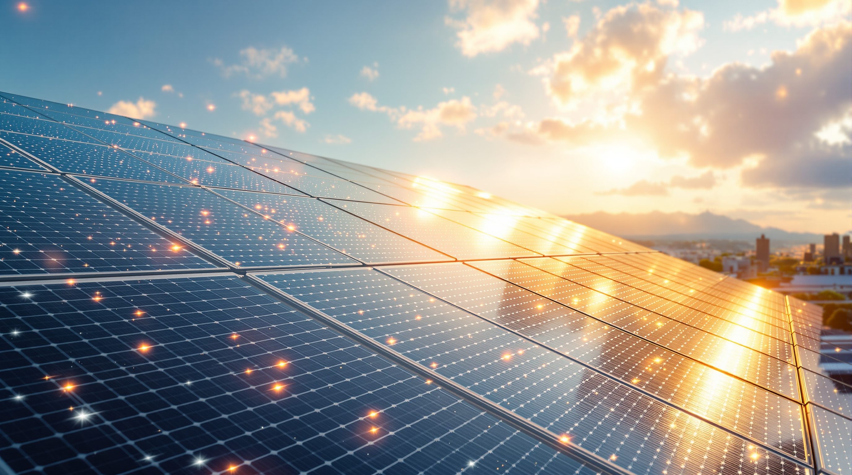
Ask most people to picture a solar panel and they see the same thing: a dark, glossy, blue-black grid, framed in aluminium, unmistakably technical and rarely beautiful. For a long time that single appearance was a real barrier to solar as architecture - a material that looked like equipment, tolerable on a back roof but hard to make part of a considered facade. The most exciting frontier in BIPV is the dissolving of that constraint: solar that can be a warm terracotta to match a streetscape, a pane of tinted glass you see the city through, a surface printed with a pattern or given a stone-like texture, a facade that reads as architecture first and generator second.
This is where BIPV becomes genuinely expressive - a material in the designer's palette rather than a device to hide. But it comes with a discipline that separates the honest designer from the salesperson, and it is the through-line of this entire lesson: almost every step that makes solar more beautiful tends to make it generate less. Colour reflects away light that would have become power; transparency lets light pass through instead of converting it; pattern and texture cost some active area. None of this is a flaw to be embarrassed about - it is a trade to be designed, deliberately and openly. This lesson shows how transparency, colour, pattern and texture are actually achieved, and how to make the aesthetics-versus-yield decision with judgement and honesty.
Solar escapes the black rectangle: transparent (dots or veil), coloured (reflect the hue away), patterned/printed, textured (cheap). But beauty costs yield - it is physics. Spend yield where cheap+unseen, buy beauty where it counts. No free performance.
Semi-transparent PV - solar you can see through
The most architecturally powerful move is making PV see-through, because it lets solar become glass - windows, skylights, curtain-wall vision panels, canopies - generating while admitting daylight and view. There are two main ways to do it, and they look and behave differently.
The first is spacing opaque cells apart. Take conventional (usually crystalline) cells, lay them out with deliberate gaps, and laminate them between panes of glass: you see through the gaps, while the cells generate. The degree of transparency is simply how much gap you leave - more gap, more light and view, but fewer cells and so less power. The characteristic look is a regular pattern of dots or squares with clear space between, and the honest catch for interiors is that it casts a patterned, dappled shadow and a somewhat dotted view, which can be lovely (a considered screen) or distracting depending on the space and the spacing.
The second is semi-transparent thin-film, where the PV layer itself is thin or partially removed (sometimes finely laser-scribed) so that some light passes through the whole surface. This gives a more even, veil-like transparency - a uniform tint rather than dots - and a more continuous view, at generally lower efficiency. A distinct and much-hyped third path is the transparent cell that harvests mainly invisible light (infrared and ultraviolet) while passing visible light, aiming for genuinely clear glass that generates; it is real and advancing but still low-yield and largely emerging.
Underneath all of them sits a physical fact no technology repeals: light let through for view is light not converted to power. The more transparent the glass, the less it generates, full stop - so highly transparent, high-yield solar glass is not on offer, and any product promising it deserves scepticism. That makes transparency a designed compromise: you choose a transparency that balances the daylight, view and glare the interior needs against the generation the surface should contribute, knowing the two pull against each other. It is one of the clearest places where BIPV is an interiors decision as much as an energy one, and where binding daylight, glare and glazing-performance judgements should be shared with the manufacturers and engineers rather than assumed from a headline transparency figure.
See-through solar 2 ways: space opaque cells (see the GAPS, dotted view + dappled shadow) or semi-transparent film (even tinted veil). Physics: light through = light not converted. Clear + high-yield does not exist.
Colour, pattern and texture - escaping the black rectangle
The other half of the aesthetic frontier is making opaque solar look like something other than a black rectangle - coloured, patterned, textured - so it can belong to a facade rather than fight it.
Colour is achieved mostly by controlling which wavelengths of light reach the eye versus the cell. A coloured coating, a tinted or interference filter on the cover glass, or a specially treated front surface reflects the chosen colour back to the viewer while letting the rest through to the cell - so a module can be made terracotta, green, grey, gold, deep blue, even close to a specific brick or stone. The unavoidable cost is that the reflected colour is light the cell never converts, so coloured modules generate less than a plain black one, and the more saturated and light the colour (a pale or bright hue reflects more), the greater the loss; deep, dark colours cost least, pale bright colours cost most. Some approaches (structural colour, careful interference coatings) minimise the penalty, but a penalty remains.
Pattern and print push further: modern techniques can print images, graphics, textures or a uniform ceramic-frit-like appearance onto the module's surface, so a facade can carry a designed pattern, a masonry look, or an artwork while generating. Again the printed or masked areas reflect or block light, trading output for appearance, and the design skill is placing pattern where it earns its keep.
Texture and finish address the other giveaway of standard PV - the glossy, mirror-like surface. Matte, anti-reflective, satin, embossed or textured glass can make a module read as a considered material (like honed stone or fritted glass) rather than shiny equipment, softening reflections and glare - valuable both aesthetically and for reducing nuisance glare to neighbours. These finishes have smaller and sometimes negligible yield effects compared with strong colour or high transparency, which makes texture often the cheapest aesthetic lever in yield terms.
The common thread is liberating: solar can now genuinely match, complement or express a building's material language. The common discipline is honest: colour and pattern cost output, texture usually costs little, and the designer should know roughly which lever costs what, and choose deliberately.
The trade-off, designed honestly - aesthetics versus yield
Put the effects together and you get the single most important idea in this lesson, worth stating as a principle: aesthetics and yield trade off, almost always in the same direction. A plain, black, opaque, optimally-angled module generates the most; every move toward transparency, colour, pattern or a poor angle for the sake of the architecture tends to reduce output. This is not a defect of the technology; it is physics, and pretending otherwise is a form of solar-washing.
The mature response is not to avoid the aesthetic choices - that would waste BIPV's whole promise - but to design the trade deliberately, surface by surface. Two habits make this honest. First, spend yield where it is cheap and buy beauty where it counts. Put your plainest, most efficient, best-angled modules where they are not seen and yield matters most (a high roof, a service facade), and spend the yield penalty of colour or transparency only where the architecture genuinely needs it (the street facade, the daylit atrium glass). Do not pay a colour penalty on a surface no one sees. Second, know roughly what each lever costs and decide with eyes open: texture is usually near-free, deep colour costs a little, pale bright colour and semi-transparency cost more, high transparency costs most - so a saturated pale-coloured, highly transparent flagship facade may generate a small fraction of what a plain black roof of the same area would, and that can still be the right decision *if you knew the trade and chose it for good reasons* (identity, daylight, a surface bolt-on could never use).
The test of an honest BIPV design is that the aesthetic choices were made knowing their yield cost and judged worth it - not made blindly and then dressed up as free performance. A beautiful coloured facade that generates modestly but genuinely, is expected to, and earns its place on architecture and displaced material, is good BIPV. A 'solar' feature chosen purely for green image that generates almost nothing is solar-washing (Module 9.1). And the actual numbers - how much a given colour, transparency or pattern costs in yield on a given product - are illustrative here and belong to the manufacturers' verified data and the engineers' modelling, never to assumption.
Aesthetics vs yield trade off, same direction. Plain black = most power; colour/transparency/pattern = less. Design it: spend yield where it is cheap (unseen), buy beauty where it counts (seen). Know the cost, choose with eyes open.
Solar as an expressive material - the designer's new palette
Step back and the deeper shift becomes clear: BIPV turns solar from a piece of equipment into an architectural material - something with colour, transparency, texture, pattern and character that a designer composes with, exactly as they would with stone, glass, timber or metal. That is a genuine expansion of the palette, and it changes the designer's role from hiding solar to expressing it.
This reframing carries real creative freedom. A generating facade can be tuned to a streetscape's colour, a canopy can dapple light like a leaf ceiling while powering the space below, a glazed atrium can glow with a tint and generate at once, a pattern can carry a building's identity across a wall that also feeds its meters. Solar can be quiet and near-invisible (matte modules that read as ordinary cladding) or loud and expressed (a boldly coloured, patterned generating skin that announces what the building does). Both are legitimate; the choice is architectural intent, not a technical default. Handled well, the fact that the surface generates can become part of the building's meaning - a visible, honest statement that the envelope is doing real work.
But the palette comes with responsibilities that keep it honest. Aesthetic choices carry yield costs, so expressive solar must still be expected to perform to the level its design implies and not sold as more than it is. The surface must still be a good building element - weathertight, durable, fire-appropriate, safe in breakage and glare-managed for neighbours - so beauty never overrides the building-element spec. And in a hot, cost-sensitive, high-sun context like much of India, the expressive premium of colour and transparency must be weighed especially honestly against cheaper, plainer, higher-yield options, and against heat effects on the modules. The designer's job is to wield this new material with both imagination and discipline: compose with solar as a real, expressive part of the architecture, know and own the trade-offs each aesthetic choice makes, and defer the binding electrical, structural, fire, glazing-performance and yield judgements to the qualified engineers, the manufacturers' verified data and the governing codes. That combination - imagination about what solar can be, and honesty about what it costs - is the whole craft this module has been building toward.
Transparency vs yield
See-through PV by spaced cells or semi-transparent film
Light let through for view is not converted, so more transparency means less power - a physical limit, not a temporary gap. Spaced cells give a dotted view; film an even veil. Daylight and glare judgements shared with engineers. Module 4.3.
Colour and pattern cost
Coloured, printed, patterned modules
Reflecting or masking light for looks reduces output; pale bright colours cost most, deep dark least. Choose colour knowing the penalty; verify the actual loss with the manufacturer. Module 9.1.
Texture and anti-glare finish
Matte, satin, embossed, anti-reflective surfaces
Usually a small yield cost - the cheap aesthetic lever - and can reduce nuisance glare to neighbours. A building-element and neighbour-impact consideration too. Module 5.2.
Honest performance (anti solar-washing)
Aesthetic choices sold as free performance
Expressive solar must still be expected to perform to what its design implies; a decorative 'solar' feature that generates almost nothing is solar-washing. Yield figures defer to verified data and engineers. Module 9.1.
Workshop - design an honest aesthetics-versus-yield strategy
The craft is spending yield deliberately. In this workshop you will take a building's generating surfaces and decide, honestly, where to keep solar plain and efficient and where to spend yield on colour or transparency - and roughly what it costs.
A building with several generating surfaces (real or imagined), this lesson, and a notebook. No calculation - this is about designing the trade with judgement; the exact yield penalties come from manufacturers and engineers.
Goal: a surface-by-surface aesthetics-versus-yield strategy
Inputs: a building (real or imagined) with several generating surfaces (roof, seen facade, glazed area) + this lesson + a notebook
Time: ~45 minutes
- 1List the generating surfaces and rank them by how visible they are and how much yield each could give (a plain high roof versus a prominent street facade versus daylit glazing).
- 2Assign an aesthetic level to each: plain/black/efficient where unseen and yield matters; colour, pattern or transparency only where the architecture genuinely needs it.
- 3For each aesthetic choice, note the rough yield lever it pulls (texture near-free, deep colour a little, pale/bright colour and semi-transparency more, high transparency most) and whether it is worth it.
- 4For any glazing, state the daylight/view/glare intent and how the chosen transparency serves the interior, flagging that the real numbers come from the maker.
- 5Write a one-paragraph honest defence: where you spent yield on beauty and why it earns its place, where you kept solar plain, and how you would avoid solar-washing.
You’ll walk away with
A one-page aesthetics-versus-yield strategy: each generating surface with its assigned aesthetic level, the rough yield cost, and an honest justification - spending beauty where it counts and keeping performance real - pending the manufacturers' verified numbers and an engineer's modelling.
Three altitudes on the same idea
Read the band that fits you — or all three.
BIPV hands you solar as an expressive material - colour, transparency, pattern, texture - so you can compose with it like stone, glass or metal rather than hide it, and that is a real expansion of your palette. But the discipline is non-negotiable: almost every step toward beauty costs output. Transparency lets light pass instead of converting it; colour and pattern reflect or block light the cell would have used; texture usually costs little. So design the trade deliberately - spend your plainest, best-angled, most efficient modules where yield matters and no one looks, and buy the yield penalty of colour or transparency only on the surfaces where the architecture genuinely needs it. Know roughly what each lever costs (texture near-free, deep colour a little, pale/bright colour and transparency more), and make the aesthetic choice with eyes open, expecting the performance the design implies. Keep beauty subordinate to the building-element spec (weathertight, fire, safety, glare), and defer the binding electrical, structural, fire, glazing and yield judgements to the engineers, the manufacturers' data and the codes.
Transparency, colour and texture in BIPV are largely interiors decisions, because they govern the light that reaches the room. Semi-transparent PV glazing sets how much daylight enters, its colour and evenness, the view out, and the shadows cast - spaced cells give a dotted view and dappled shadow, semi-transparent film an even tinted veil, and each transmits a different amount and quality of light. Coloured and patterned glazing tints the interior light accordingly. Hold the hard rule at the centre of every conversation: the more light a solar glass lets through, the less power it makes, so choosing transparency is a negotiation between the daylight, view, glare and comfort the space needs and the generation the surface should give. Texture and anti-reflective finishes can cut glare with little yield cost - a useful, cheap lever. Coordinate the binding daylight, glare and glazing-performance judgements with the engineers and manufacturers; your domain is how the light that comes through actually serves the people inside.
Master the design frontier and its one iron rule: solar can now be semi-transparent, coloured, patterned and textured - an expressive material - but almost every step toward beauty costs yield. Learn the mechanisms: transparency by spacing opaque cells (see the gaps, dotted view) or by semi-transparent film (even veil); colour by coatings and filters that reflect the chosen hue away (so coloured modules generate less, pale bright colours cost most, deep dark least); pattern and print by masking areas; texture and matte finishes that cut glare cheaply. Understand why it is physics, not a fixable flaw: light sent through for view or bounced back for colour is light the cell never converts. Then learn to design the trade honestly - spend yield where it is cheap and unseen, buy beauty where it counts, know each lever's rough cost, and never sell aesthetic choices as free performance (that is solar-washing). You are expected to wield solar as a material with imagination and honesty, deferring the binding numbers and safety to engineers, manufacturers and the codes.
“Modern coloured and transparent solar has basically solved the old ugliness problem, so you can now have a beautiful coloured or see-through solar facade that generates just as much as ordinary black panels - the aesthetics-versus-yield trade-off is outdated marketing.”
Do it yourself
No tools needed - reason it through.
- 1Describe the two main ways to make PV see-through, and how each looks and behaves for the interior.
- 2Why does a coloured solar module generate less than a plain black one, and which colours cost the most yield?
- 3Explain why 'highly transparent and high-yield solar glass' is not physically available.
- 4State the 'spend yield where it is cheap, buy beauty where it counts' strategy in your own words.
- 5What distinguishes honest expressive BIPV from solar-washing?
The one line to carry out
Peer-reviewed journals & authoritative standards
- 01Building-integrated photovoltaics — Wikipedia - Building-integrated photovoltaics, 2026.
- 02Daylighting — Wikipedia - Daylighting, 2026.
- 03Solar cell efficiency — Wikipedia - Solar cell efficiency, 2026.
- 04Greenwashing — Wikipedia - Greenwashing, 2026.
That completes the technologies of BIPV - what it is, the cells it is built from, the products it comes as, and how far it can be made beautiful. With the material understood, the course turns to where it goes: integrating BIPV into the real surfaces of the envelope - roofs, facades, glazing, shading and canopies - which is the whole of the next module.
The author
Amogh N P
Architect, interior designer, and creative polymath. Studio Matrx began in his notebooks — his vision of design made honest, useful, and open to everyone. Its Academy is written and taught in his memory, and free, forever.
More about Amogh →