
Principles in the Studio
Arranging the elements — on the sheet, then in relief.
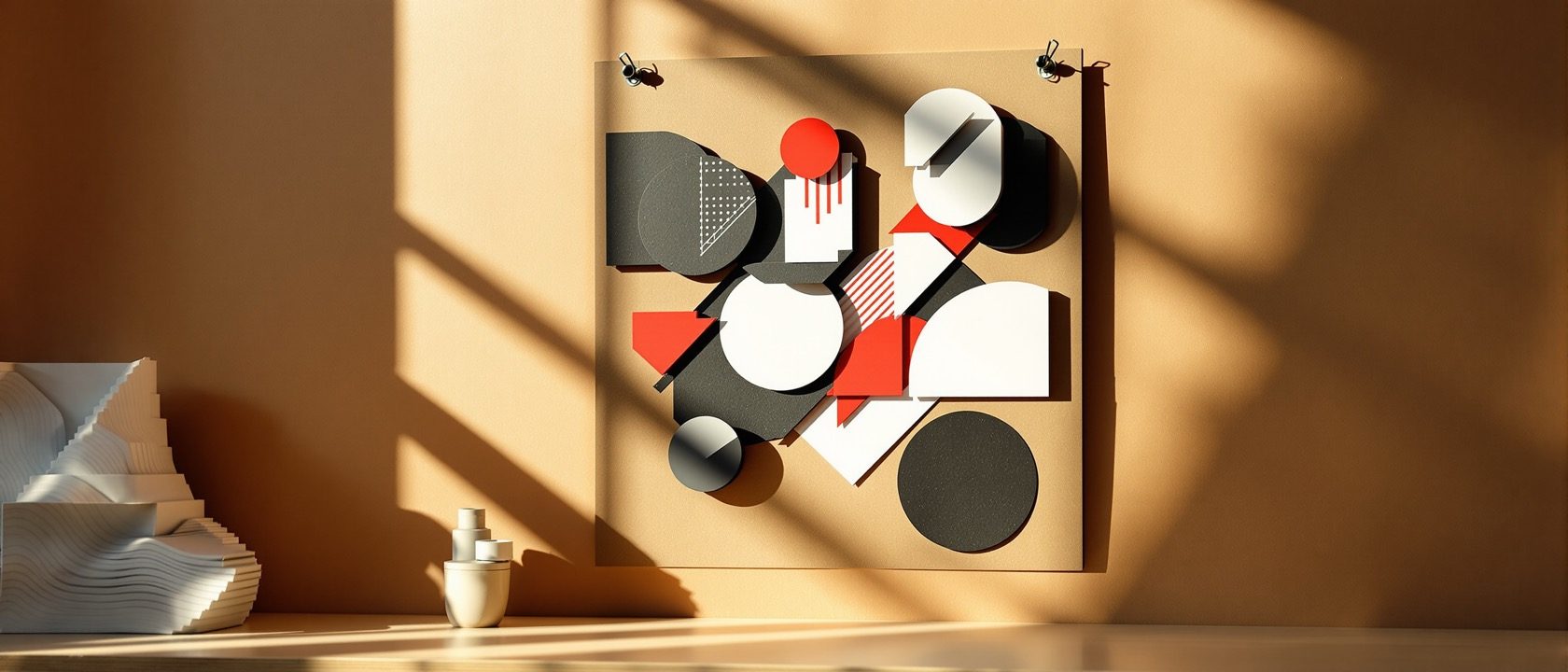
The principles are the decisions that organise elements — and in the studio they are operations you perform, first on a sheet and then translated into a low-relief model, so you learn each principle is real in three dimensions. Cut the same paper two ways and discover that asymmetry balances by visual weight, not by mirroring.
Learning objectives
By the end of this lesson, you will be able to — mapped to the course outcomes for Basic Design Studio:
Compose symmetrical and asymmetrical balance from an identical set of shapes.
Build the four rhythms and engineer a clear centre of interest.
Translate a figure-ground composition from a sheet into a low relief.
Hold unity and variety in tension — do much with little.
Arranging the elements
Balance in three kinds, rhythm spaced into movement, emphasis engineered, and unity held in tension with variety.[2]
Symmetry is the easy kind
Balance is visual equilibrium: SYMMETRICAL (mirror/formal), ASYMMETRICAL (unequal elements balanced by visual weight — size, value, position, isolation — the harder, more sophisticated skill), and RADIAL (around a centre). The signature exercise cuts the SAME black shapes into a symmetrical and an asymmetrical composition, so you feel that asymmetry balances by weight, not by mirroring.[2]
From sheet to relief
Negative space as material, the figure-ground relief that proves the principles in space, proportion toward the grid, and the discipline of subtraction.[2, 3]
The void is material
Positive space is the occupied figure; NEGATIVE space is the shaped void around and between — and it is an ACTIVE, designed element, not leftover. For interior design this matters most: the void (circulation, breathing room) is often the primary design material. 'Nothing' is doing work.[2]
At a glance
| Aspect | One side | The other |
|---|---|---|
| Balance | Myth: balance = symmetry | Reality: asymmetry balances by visual weight |
| Negative space | Myth: empty leftover | Reality: an active, designed element |
| Composition value | Myth: more = better | Reality: do much with little (unity + control) |
| Dimension | Sheet: principles as 2D moves | Relief: proved real in 3D |
| Emphasis | Myth: it just happens | Reality: engineered one change at a time |
Key terms
Equilibrium of unequal elements by visual weight — the higher balance skill.
Elements arranged around a central point.
A motif spaced to create a beat — regular, alternating, progressive, flowing.
The engineered focal point the eye meets first.
The shaped, active void around and between figures — not leftover.
A low three-dimensional composition raised from a base — the 2D→3D bridge.
Studio exercise
Cut a set of black paper shapes. Make TWO compositions from the same set — one symmetrical, one asymmetrical — on identical formats. Then take your asymmetric composition and rebuild it as a layered-card low relief so the figure literally stands off the ground. Note where visual weight, not mirroring, did the balancing.
Self-assessment
1. Asymmetrical balance is achieved by —
2. The 2D→3D relief exercise mainly proves that —
3. In foundation design, 'doing much with little' signals —
Recap
References & further reading
- [1]Christian Leborg, Visual Grammar, Princeton Architectural Press, 2006.
- [2]Timothy Samara, Design Elements, Rockport, 2020 (principles, composition).
- [3]Gail Greet Hannah, Elements of Design: Rowena Reed Kostellow and the Structure of Visual Relationships, Princeton Architectural Press, 2002 (3D structure, asymmetric balance).
- [4]Maitland Graves, The Art of Color and Design (classic principles-of-design source).
Further reading
- Gail Greet Hannah — Elements of Design (Rowena Reed Kostellow).
- Timothy Samara — Design Elements.
- Maitland Graves — The Art of Color and Design.
Sources gathered and fact-checked June 2026. Published values vary by source, sample and method — treat as indicative and confirm against the cited standard before structural use.
The author
Amogh N P
Architect, interior designer, and creative polymath. Studio Matrx began in his notebooks — his vision of design made honest, useful, and open to everyone. Its Academy is written and taught in his memory, and free, forever.
More about Amogh →