
Architectural Drawing & Representation Fundamentals
Module 1 of the Student Foundations Track — Orthographic Projection, Axonometric, Isometric, Perspective, BIS Line-Weight Standards, Material Hatching Conventions, the Sketchbook Discipline, and the Hand-to-Software Translation for Indian B.Arch and B.Des Students
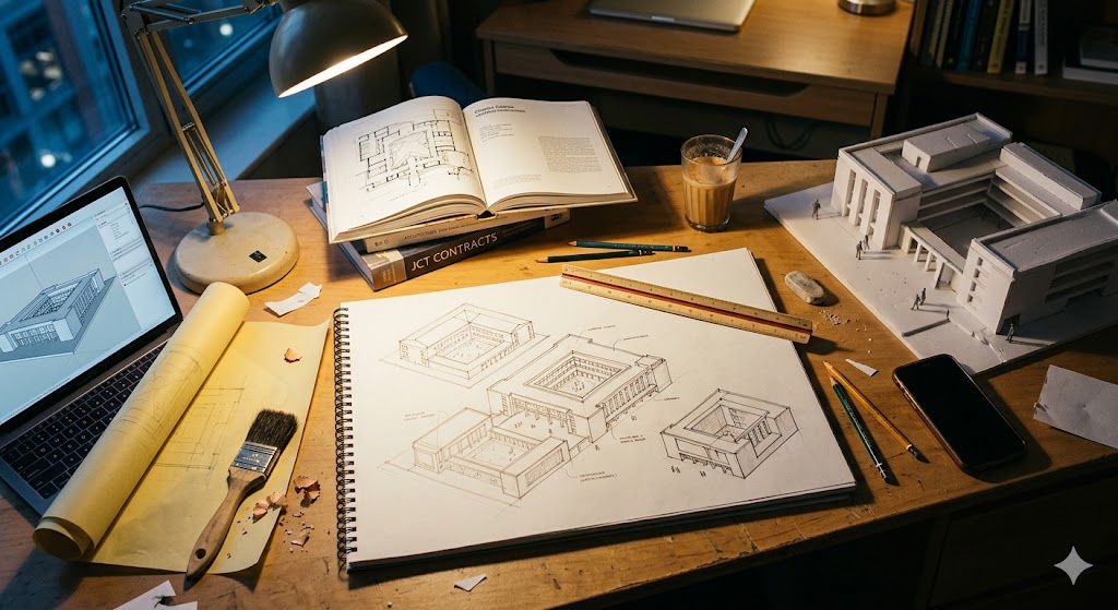
Architecture begins with drawing. This is true in the literal sense — the architect's first artifact is always a drawing — and in the deeper sense — the architect thinks through drawing in a way no other discipline does. The B.Arch graduate who has practised drawing for five years has acquired a particular cognitive instrument: the ability to imagine a three-dimensional spatial proposition and translate it into the two-dimensional conventions that allow it to be communicated, refined, and built. That instrument cannot be acquired by any amount of software practice alone. The student who skips hand drawing, in 2026, is the student whose architectural thinking remains a layer thinner than the thinking of the student who maintains the daily discipline.
This module is the foundational reference for that discipline. It is Module 1 of the eight-module Student Foundations track — the architect-side counterpart to the practitioner-track Site Supervision Checklist and Scope Boundaries guides published earlier in the Studio Matrx library. The orientation throughout is towards the Indian B.Arch / B.Des student in 2026, learning architectural representation in a five-year curriculum, with reference to the BIS (Bureau of Indian Standards) drafting framework that governs Indian architectural and engineering drawings.
The treatment is structured around the six drawing conventions every student must master — plan, section, elevation, axonometric, isometric, and perspective — followed by the production discipline (line weights, hatching, scale, sheet layout), the daily practice (sketchbook), and the hand-to-software translation. The references at the end include the canonical drawing pedagogy texts (Ching, Pallasmaa, Hewitt) alongside the Indian-specific BIS standards and Indian-architect drawings (Doshi, Correa, Mehrotra) that students should study in parallel.
"Drawing is the artist's most direct and spontaneous expression — a species of writing: it reveals, better than does painting, his true personality." — Edgar Degas, paraphrased in architectural pedagogy
"The act of drawing is an act of thinking. The pencil is an instrument of philosophical inquiry. — Juhani Pallasmaa, paraphrased
1. Why Drawing Matters in 2026
The argument for hand drawing in 2026 has shifted. Twenty years ago, the question was practical — drawing was the only available means of architectural representation. Today, with ubiquitous CAD, BIM, and increasingly capable generative-AI rendering, drawing has become a cognitive discipline rather than a strictly productive one. The argument for hand drawing now rests on five claims, each empirically supported:
- Drawing is a form of thinking. Architectural research from the 1990s onward (Goldschmidt, Linkography, 2014; Schön, The Reflective Practitioner, 1983; Pallasmaa, The Thinking Hand, 2009) has consistently demonstrated that the act of sketching produces new spatial ideas, not merely records existing ones. The student who only drafts in CAD has access to fewer ideas than the student who sketches first.
- Software accelerates production but slows ideation. CAD and BIM tools privilege precision and reversibility — both desirable in the production phase. In the ideation phase, the same tools impose a "commitment cost" on each decision (the model becomes harder to change as it grows) that hand drawing does not. Students who attempt to ideate in Revit early in their education spend most of their effort on the software, not the design.
- Hand drawing builds the eye, not just the hand. The trained ability to see proportion, alignment, and scale — to recognise when something is "off" by a millimetre or a degree — develops through repeated drawing practice. Students who skip the hand-drawing phase often produce technically valid CAD drawings whose proportions are aesthetically incoherent.
- Hand drawing is the most efficient mode for fast-turn iteration. A trained architect can sketch through ten plan options in the time it takes to model one in Revit. In studio reviews, in client meetings, on site — the hand sketch remains the fastest design tool.
- Drawing is what distinguishes architecture from rendering. A render is an output; a drawing is a thinking artifact. Studios at the highest level (Studio Mumbai, Atelier Bow-Wow, RMA, Anupama Kundoo) place enormous weight on hand-drawing-led process. The student aiming at this trajectory cannot bypass drawing.
This module assumes you are a B.Arch / B.Des student in India — typically Year 1 to Year 3 — building the foundational drawing repertoire. The discipline below is sufficient for the full five years and, frankly, for the full architectural career.
2. The Six Drawing Conventions Every Student Must Master
Every architectural project is communicated through some combination of the six conventions below. A student who is fluent in all six can describe any spatial proposition; a student who is fluent in only some has gaps that will surface in studio reviews and, later, in practice.
| Convention | What it shows | Primary use | Common mistakes |
|---|---|---|---|
| Plan | Horizontal slice through building, viewed from above | Spatial organisation, room layout, circulation | Slice height inconsistent (typically 1.2 m above floor); ceiling features missed |
| Section | Vertical slice through building | Vertical relationships, floor heights, structural logic | Cut line not shown on plan; section not at "telling" location |
| Elevation | View of a building face, no perspective | Façade composition, openings, materiality | Drawn with perspective foreshortening (it should be parallel projection) |
| Axonometric | 3D parallel projection at 30°/30° from plan | Volumetric reading, design narrative | Confused with isometric; line weights flat |
| Isometric | 3D parallel projection at 30°/30° equal-axis | Quick 3D study, technical illustration | Used where axonometric is more honest; over-stylised |
| Perspective | 3D with vanishing points (1-pt, 2-pt, or 3-pt) | Visual experience, atmospheric communication | Vanishing points placed incorrectly; eye level inconsistent |
The first three (plan, section, elevation) are the orthographic conventions — parallel projections that preserve true dimensions. They are the foundation of constructible drawings. The next two (axonometric, isometric) are paraline conventions — 3D parallel projections that preserve true dimensions on at least two axes. They are the foundation of design communication. The sixth (perspective) is the projective convention — 3D with foreshortening that mimics how the eye sees. It is the foundation of experiential communication.
The student's drawing repertoire must include all six. The studio jury reads them all; the practitioner deploys them in different contexts. The chapters below treat each.
3. Orthographic Projection — Plan, Section, Elevation
The orthographic trio is the foundation of all architectural drawing. Every B.Arch project, from Year 1 to thesis, requires a coherent set of plans, sections, and elevations. The conventions are tightly defined; the student's discipline is to know them and apply them consistently.
3.1 First-Angle vs Third-Angle Projection
Two international conventions exist: first-angle projection (used in India, UK, Europe — codified in BIS standards including IS 696 and IS 10711) and third-angle projection (used in USA and Canada). The two differ in which way the views are unfolded around the object.
For an Indian B.Arch student, first-angle projection is the BIS standard. The convention is that an elevation labelled "front elevation" is drawn as seen from the front — placed below the plan in the standard sheet layout. This is opposite the third-angle American convention, where the front elevation appears above the plan.
| Layout | First-angle (BIS · India) | Third-angle (USA) |
|---|---|---|
| Plan | Top-left or centre | Top-left or centre |
| Front elevation | Below the plan | Above the plan |
| Side elevation | Right or left of plan, swung outward | Right or left of plan, swung outward (different sense) |
| Section | Adjacent to plan; cut line on plan with arrow | Adjacent to plan |
Most B.Arch institutions in India teach first-angle projection. The student should confirm with their faculty before any major submission — but in absence of explicit guidance, default to first-angle.
3.2 Scale Standards in Indian Practice
| Drawing | Standard scale (Indian residential) |
|---|---|
| Site plan | 1:500 or 1:200 |
| Floor plan (residence) | 1:50 or 1:100 |
| Floor plan (large project) | 1:100 or 1:200 |
| Section | Same scale as plan typically |
| Elevation | Same scale as plan typically |
| Detail drawing | 1:20 or 1:10 or 1:5 |
| Construction detail | 1:5 or 1:2 or 1:1 (full size) |
| Site plan (urban project) | 1:1000 or 1:2000 |
The student's discipline is to match scale to information density. A 1:50 floor plan can show furniture and fittings; a 1:200 plan shows only walls and openings. Students often draw too small (cluttered illegible plan) or too large (sparse-feeling plan). Match the scale to what you are trying to say.
3.3 The Plan — What It Is and What It Isn't
A plan is a horizontal slice through the building, conventionally at 1.2 m above the finished floor, with everything below the slice drawn in outline and everything above the slice (overhead beams, lighting, ceiling features) drawn in dashed line (indicating "above the slice plane").
| Plan element | Convention |
|---|---|
| Cut walls (intersected by slice) | Heavy poché — solid fill or hatched per material |
| Walls below the slice (low parapets, kerbs) | Medium-weight outline |
| Doors | Cut at slice; arc shows swing; door panel shown perpendicular to wall |
| Windows | Cut at slice; sill below shown if relevant; glazing line indicated |
| Furniture, fixtures | Plan view at light line weight |
| Overhead features | Dashed line — beams, mezzanines, projections |
| Slice plane indicator | Cut line with arrows pointing in the direction of view |
| Levels | Spot levels (e.g., +0.150) at thresholds, ramps, raised platforms |
The most common student mistake is forgetting that a plan is a slice. Students draw what they "see" from above — including roofs, ceilings, and overhead features — instead of what is cut by the 1.2 m slice plane. The discipline: always visualise the slice; everything below at solid line, everything above at dashed line.
3.4 The Section — The Most Diagnostic Drawing
A section reveals what no other drawing reveals — the vertical organisation of the building. Floor heights, ceiling heights, structural depths, mezzanines, double-height volumes, the plinth-to-roof relationship — all become visible only in section.
The student's section discipline is to cut at the most telling location. A section through a corridor reveals nothing; a section through a stair, a courtyard, or a double-height space reveals the project's spatial logic. Every B.Arch project benefits from at least two sections — one longitudinal (along the long axis), one transverse (across the short axis) — chosen to reveal the project's most important spatial moves.
| Section element | Convention |
|---|---|
| Cut earth | Hatched diagonally (typical Indian convention: 45° at 1 mm spacing) |
| Cut concrete (RCC) | Hatched at 45°, finer line, denser |
| Cut brick masonry | Diagonal hatching, broader line |
| Cut steel | Solid black or cross-hatched |
| Cut timber | Wavy parallel lines following grain |
| Cut glass | Two parallel lines with central hatch |
| Visible elevation behind cut | Lighter line weight |
| Floor plate cut | Heavy line — defines the structural floor |
| Ceiling line (below slab) | Medium line |
A common failure mode: students draw the section as a cartoon of the building — every wall the same weight, no hatching, no clear distinction between cut and visible. The section becomes illegible. The discipline: heavy line for the cut, light line for the elevation behind, distinct material hatching for cut elements.
3.5 The Elevation — Façade as Composition
An elevation is a parallel projection of one face of the building. It should be drawn with no foreshortening — vertical lines remain vertical, horizontal lines remain horizontal. The elevation is the compositional drawing — the one in which proportion, rhythm, hierarchy, and material expression become visible.
| Elevation element | Convention |
|---|---|
| Building outline | Heavy continuous line |
| Openings (windows, doors) | Medium line; mullions and glazing pattern shown |
| Projections (chajjas, balconies, fins) | Distinct line — typically a slightly heavier line |
| Recesses (niches, jharokhas) | Shown with shadow line indicating depth |
| Ground line | Heavy continuous line; finished ground level (FGL) referenced |
| Surrounding context | Lighter weight; trees, neighbouring buildings outlined |
| Material rendering | Hatching or shading indicating wall finish, tile, masonry |
| Shadow lines | Cast shadows added at ~45° to indicate depth (optional but encouraged in studio reviews) |
The most common student mistake on elevations is failing to render the materiality. Walls drawn with no hatching read as undifferentiated planes; the same elevation rendered with brick coursing on one wall, plaster on another, and timber panel on a third reveals the architectural intent. Spend the extra hour on material rendering.
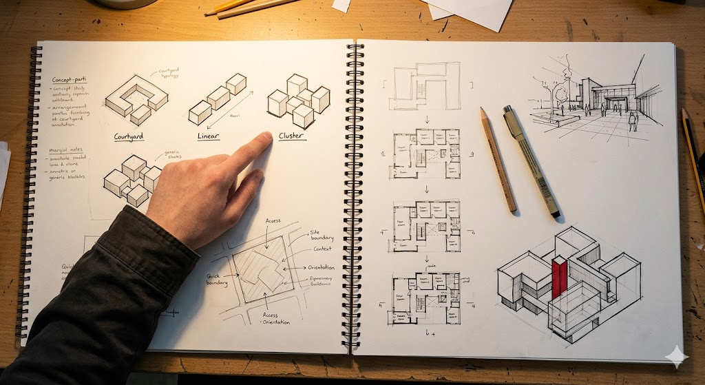
4. Axonometric, Isometric, and Oblique — Reading 3D from 2D
The paraline drawings — axonometric, isometric, and oblique — are the architect's quickest 3D communication tools. Each is a parallel projection that preserves true dimensions on at least two axes; together, they cover the design-narrative spectrum.

4.1 The Three Paraline Conventions
| Convention | Construction | When to use |
|---|---|---|
| Plan oblique | Plan drawn at 45°/45° (or 30°/60°) with verticals projected vertically | Quick volumetric study from a plan; preserves plan as a true projection |
| Axonometric | Plan rotated to 30°/30° with verticals projected vertically | Standard design-narrative drawing in architecture; preserves plan on the picture plane |
| Isometric | All three axes at 30° apart (120° between each); equal foreshortening on all three | Technical illustration; component drawings; furniture |
For most B.Arch design-studio work, the axonometric (30°/30°) is the convention. It preserves the plan as drawn, reads naturally as a 3D projection of a 2D plan, and is what most published architectural drawings use. The isometric is more common in technical illustration and furniture detail drawings; the plan oblique is occasionally used for very quick volumetric studies.
4.2 When to Use a Paraline Drawing
The paraline drawing's strength is communicating volume and assembly. It shows the building as an object in space, with three faces visible simultaneously, and dimensions readable on (most) edges. Use paraline drawings for:
- Concept communication in studio reviews — "here is the volumetric idea"
- Process diagrams — showing how elements come together (exploded axonometric)
- Site relationships — showing the building in its context
- Construction details — assembly diagrams (exploded isometric is common)
The paraline drawing's weakness is atmospheric communication. It cannot convey what it feels like to be in the space — that requires perspective. Use paraline for thinking the building; use perspective for communicating the experience.
4.3 Construction Method — Axonometric
The simplest approach to constructing an axonometric:
1. Draw the plan at the desired scale (e.g., 1:100).
2. Rotate the plan 30° clockwise (or anti-clockwise — convention varies; 30° gives the standard "axonometric look").
3. From every corner of the rotated plan, project verticals upward at the appropriate scale (e.g., 3 m for typical floor-to-ceiling).
4. Connect the tops of the verticals to form the upper plan.
5. Add architectural detail — openings, projections, shadows.
The first three steps can be done by hand in 5-10 minutes once the plan is drawn. Full axonometric with detail and shadow may take 1-3 hours; this is high-value drawing time.
5. Perspective Drawing — The Visual Communication Tool
Perspective is the convention closest to how the eye sees. It introduces foreshortening and vanishing points — receding parallel lines converging at a point on the horizon. There are three standard types.

| Perspective type | Vanishing points | Use |
|---|---|---|
| One-point | One vanishing point on the horizon | Long corridor or street view; symmetric interior; classical façade |
| Two-point | Two vanishing points on the horizon | Standard architectural exterior view; corner of a building; most studio renders |
| Three-point | Two on the horizon + one above or below | Looking up at a tall building; aerial view of low building; dramatic angles |
5.1 Setting Up a Perspective
A perspective drawing requires four discipline points:
- Eye level (horizon line) — a horizontal line representing the viewer's eye height. Typically 1.5-1.7 m above the ground (standard adult eye level). Lowering the eye level looks "kid-like" or "grand"; raising it looks "aerial."
- Station point — the viewer's location in plan. Determines the angle from which the building is seen.
- Picture plane — an imaginary vertical plane between the viewer and the object, perpendicular to the line of sight.
- Vanishing point(s) — on the horizon line for one- and two-point; receding lines converge to these.
The student's discipline: establish all four before drawing. Sketching perspectives without setting up the eye level and vanishing points produces drawings that "feel wrong" — the eye knows when the construction is inconsistent, even if the viewer cannot articulate why.
5.2 Perspective vs Render — When to Use Which
In 2026, generative software (V-Ray, Lumion, Twinmotion) produces photorealistic perspectives in minutes. Why hand-draw perspectives at all?
- Hand perspective is faster for ideation. A 5-minute perspective sketch tests an idea; a 5-hour render commits to it.
- Hand perspective shows the architect's eye. It reveals what the architect chose to emphasise — light, scale, framing — that an automated render does not.
- Hand perspective is the studio-jury convention for design-development. Faculty trust hand perspectives for design quality more than rendered ones (which can mask design weaknesses with photographic polish).
- Hand perspective trains your eye for the rendered output. Students who hand-draw perspective produce better-composed rendered perspectives; the inverse is not true.
The discipline: always hand-draw the perspective before rendering it. Use the rendering software for production, not for design.
6. Hand Drawing Tools and Techniques
The B.Arch student needs a working drawing kit. The cost is modest (₹3,000-8,000 for a complete starter set in 2026); the lifespan is years. The list below is canonical for Indian B.Arch students.
| Tool | Indian price (2026) | Purpose |
|---|---|---|
| Pencils — Staedtler, Faber-Castell HB / 2H / 4H | ₹40-100/pc | Layouts (4H), construction lines (2H), darkening (HB) |
| Pencils — B / 2B / 4B | ₹40-100/pc | Tone, shadows, freehand sketching |
| Pencil sharpener (mechanical) | ₹150-300 | Consistent point |
| Eraser — Staedtler Mars Plastic | ₹25-50 | Clean erasing without smudging |
| Kneaded eraser | ₹100 | Tonal cleanup, lifting graphite |
| Drafting tape / masking tape | ₹50-100 | Securing sheet to drafting board |
| T-square or parallel ruler | ₹400-1,500 | Horizontal lines |
| Set squares — 30°/60° and 45° | ₹150-400 | Vertical and angled lines |
| Drafting compass | ₹300-800 | Arcs, circles |
| Scale ruler — engineer's (1:20, 1:25, 1:50, 1:75, 1:100, 1:125) | ₹200-500 | Measuring at scale |
| Scale ruler — architect's (1:50, 1:100, 1:200, 1:500) | ₹200-500 | Architectural scales |
| Drafting pens — Staedtler Pigment Liner / Sakura Pigma Micron | ₹100-200/pen | Inking — sizes 0.05, 0.1, 0.3, 0.5, 0.8 |
| Tracing paper roll — A2 size | ₹200-400 | Iterative sketching, overlays |
| A2 sketchbook | ₹400-800 | Daily sketching |
| Watercolour pan set (12 colours) | ₹500-1,500 | Studio render washes |
| Markers — Copic / Faber-Castell | ₹150-300/pc | Colour studies, quick renders |
| French curve / flexible curve | ₹200-500 | Smooth curved lines |
6.1 The Pencil-Grade Hierarchy
| Grade | Hardness | Use |
|---|---|---|
| 4H | Very hard | Construction lines, light layouts; barely visible after drafting |
| 2H | Hard | Background construction, scale references |
| HB | Medium | General drafting, finished line weights for working drawings |
| B | Soft | Tone, shadow studies, darker lines |
| 2B | Softer | Sketching, freehand work, shadow gradients |
| 4B | Very soft | Heavy tone, deep shadows, freehand expression |
Most B.Arch students over-use HB pencils and under-use the harder grades. Start with 4H for layouts; you will erase and redraw less.
6.2 The Pen-and-Ink Discipline
Once the pencil drawing is finalised, students often "ink" the drawing — tracing over the pencil work in pen for a final, durable, photographable presentation. The ink line weights follow BIS standards (§7) and use a specific set of pen sizes:
| Pen size | Use |
|---|---|
| 0.05 mm | Hatching, fine detail |
| 0.1 mm | Light line weights, secondary elements |
| 0.3 mm | Standard interior lines |
| 0.5 mm | Standard structural and primary lines |
| 0.8 mm | Heavy outlines, cut lines, building outline |
The discipline: progress from light to heavy. Start with 0.05 mm hatching, then 0.1 mm secondary lines, then 0.3 mm interior lines, then 0.5 mm structural lines, then 0.8 mm building outline. Reverse order is forgiving (you can darken later); start with heavy and you cannot go back.
7. Line Weights, Hatching, and Material Conventions — The BIS Standard
Indian architectural drawings follow the BIS (Bureau of Indian Standards) framework for representation. The relevant standards are:
- IS 696 — Code of practice for general engineering drawing
- IS 962 — Code of practice for architectural and building drawings
- IS 10711 — Sizes for technical drawings
- IS 10712 — Folding of drawings (relevant for submission)
- IS 10719 — Lettering and numerals in technical drawing
The student's discipline is to know these — every B.Arch faculty examines drawings against the BIS framework. Below is the working summary.

7.1 BIS Line-Weight Standard
| Weight | Use |
|---|---|
| 0.13 mm | Hatching, very light dimensioning |
| 0.18 mm | Light secondary lines, leader lines |
| 0.25 mm | Standard interior lines, dimensions |
| 0.35 mm | Standard cut lines (in elevation, not in section) |
| 0.50 mm | Primary building outline, key elements |
| 0.70 mm | Heavy outline, cut lines in section |
| 1.00 mm | Border lines, exceptional emphasis |
Students often draw all lines at the same weight, which produces a "flat" drawing where nothing reads as more or less important. The discipline: use at least three line weights on every drawing. Cut elements heaviest, key edges medium, hatching lightest.
7.2 Material Hatch Conventions
| Material | Convention |
|---|---|
| Cut concrete (RCC) | Diagonal hatching at 45°, ~1 mm spacing |
| Cut brick masonry | Diagonal hatching at 45° with longer dashes, ~2 mm spacing |
| Cut steel | Solid black or close cross-hatching |
| Cut timber | Wavy parallel lines following the grain direction |
| Cut stone (rubble) | Random irregular polygons |
| Cut stone (cut stone) | Parallel lines at 30° |
| Cut earth | Diagonal hatching at 45°, no fill |
| Cut insulation (gypsum, glass wool) | Curved or wavy lines, parallel |
| Glass | Two parallel lines with light internal hatching |
| Aluminium | Solid fill or close diagonal hatching |
| Tile / marble | Rectangles indicating tile pattern |
| Carpet / soft floor | Loose curved lines |
The hatch is what tells the viewer what the wall is made of. A cut wall with no hatch is illegible; a cut wall with hatch is a story. Spend the time.
7.3 Lettering and Annotation
| Convention | Standard |
|---|---|
| Text height (titles) | 5-7 mm |
| Text height (sub-titles) | 3-5 mm |
| Text height (notes) | 2.5-3 mm |
| Text height (dimensions) | 2.5 mm |
| Text style | Block lettering, single-stroke; consistent height across the sheet |
| Capitalisation | All capitals for titles and most labels |
Hand-lettering is a learned skill that takes 3-6 months of daily practice to consistent; students who skip lettering practice produce sheets where the drawings are excellent but the labels look unprofessional. The discipline: practice lettering for 10 minutes a day, separately from drawing practice, until your block lettering is consistent.
8. Sketchbook Discipline — The Daily Practice
The sketchbook is the architect's primary thinking instrument. It is not a portfolio (it is private), it is not a notebook (it is visual), and it is not a final drawing (it is iterative). Students who maintain a daily sketchbook practice through B.Arch produce visibly better designs by Year 3 than students who do not.
The discipline:
- One sketch per day, minimum. Could be a building you saw, a room you imagined, a detail you sketched. 30 minutes is enough.
- Date every sketch. The sketchbook becomes a chronological record of your seeing and thinking.
- Sketch from observation, not photograph. The eye trains by drawing what is in front of you, not by tracing a photo.
- Travel with your sketchbook. Site visits, family trips, commute time — every public space is studio material.
- Sketch of plans, sections, axonometrics, perspectives — vary the convention. The sketchbook is the laboratory for fluency.
- Don't tear out sketches. The "bad" sketches are part of the practice; tearing them out breaks the discipline.
Famous architects' sketchbooks are studied as cultural artifacts:
| Architect | Sketchbook style |
|---|---|
| Le Corbusier | Voyage d'Orient sketchbooks (Athens, Istanbul) — quick spatial parties, wash tonality, written notes interspersed |
| BV Doshi | Sketchbook entries as both site observations and design experiments — Sangath developed iteratively in his sketchbooks |
| Charles Correa | Concept sketches typically in marker on tracing paper — quick, decisive, large-scale |
| Frank Lloyd Wright | Plan-oblique sketches with strong directional emphasis; figure-on-ground intuitive |
| Renzo Piano | Section-led sketches; structural systems drawn as collaborative process notes |
| Studio Mumbai (Bijoy Jain) | Site-led sketches; material studies; craft-anchored |
The student's reward is the same: by Year 3, your sketchbook becomes the most useful thing in your studio toolkit.
9. The Hand-to-Software Translation
Most B.Arch students transition from hand drawing to CAD in Semester 2 (some institutions earlier, some later). The transition is critical — done well, it integrates hand and software seamlessly; done poorly, it creates a permanent gap where the student loses the hand-drawing discipline before the software discipline is established.
The recommended workflow:
| Phase | Tool | What it produces |
|---|---|---|
| Concept & ideation | Hand sketch (sketchbook + tracing paper) | Parti diagrams, plan options, massing studies |
| Schematic design | Hand drawing on A3/A2 sheets | First plans, sections, elevations, axonometric study |
| Design development | Hand drawing → CAD transition | Refined drawings; some hand, some digital |
| Working drawings | CAD (AutoCAD / Revit) | Construction-ready drawings with dimensions |
| Presentation | Hybrid — hand sketches + CAD plans + rendered perspectives | Studio-jury submission |
| Studio jury | Printed sheets + physical model + hand-drawn perspectives | Final review presentation |
The principle: hand for thinking, software for production. Students who attempt to ideate in CAD are slower and less inventive; students who attempt to produce final drawings by hand are imprecise and inefficient. The discipline is to know which phase you are in.
The Studio Matrx Software Stack lays out the recommended software learning path. AutoCAD is the foundation; SketchUp is the early modelling tool; Revit / Rhino come later. Photoshop and InDesign are mandatory for portfolio production from Semester 3.
10. Drawing for Studio Reviews vs Drawing for Construction
These are different drawings, made for different purposes. Conflating them is the most common student error.
| Aspect | Studio review drawing | Working / construction drawing |
|---|---|---|
| Purpose | Communicate design intent + spatial idea | Convey buildable information to contractor |
| Scale | 1:100 typical (residence); 1:200 (larger) | 1:50 typical for plans; 1:5 for details |
| Line weights | Hierarchical — heavy for cut, medium for visible, light for context | Strict BIS hierarchy; cut > primary > secondary > hatching |
| Annotation | Conceptual labels — "courtyard", "datum line", "main entry" | Dimensions, materials, IS code references, level callouts |
| Material rendering | Hatching for narrative material expression | Hatching for material identification (BIS standard) |
| Context | Surrounding buildings, trees, urban fabric | Plot boundary, FAR, setback dimensions |
| People / scale figures | Yes, for narrative scale | No |
| Shadow | Sometimes, for compositional emphasis | No |
| Drawing list | Plan, section, elevation, axonometric, perspective, model photo | All sheets per BIS layout (architectural, structural, MEP, BoQ) |
| Time to produce | Hours to days per project | Weeks for full set |
| Audience | Faculty, jury, peers | Contractor, structural engineer, MEP consultant, BBMP / MCGM |
The student's discipline is to know which mode you are in. Studio reviews reward clarity and design ambition; construction drawings reward precision and BIS compliance. The two skills overlap but are not identical.
11. Twelve-Test Drawing Self-Diagnostic
Before submitting any major drawing set, run the following twelve tests. Failing more than three suggests a systematic discipline gap that needs work.
| Test | Question | Pass criterion |
|---|---|---|
| 1 | Does the plan read as a slice (cut walls heavy, overhead dashed)? | Yes — distinct line weights for cut vs above |
| 2 | Are sections cut at telling locations (revealing the project's spatial idea)? | Yes — at least two; one longitudinal, one transverse |
| 3 | Are line weights hierarchical (3+ distinct weights visible)? | Yes — cut, primary, secondary, hatching all distinct |
| 4 | Are materials hatched per BIS conventions in cut elements? | Yes — concrete, brick, steel, timber, glass each correctly hatched |
| 5 | Are elevations parallel (no perspective foreshortening)? | Yes — vertical lines vertical, horizontal horizontal |
| 6 | Are dimensions and levels annotated where required? | Yes — overall dimensions, room dimensions, threshold levels, cut-line callouts |
| 7 | Is the lettering consistent across the sheet (height, style)? | Yes — single-stroke block, consistent heights |
| 8 | Is the title block complete (project, drawing, scale, date, drawn-by, north arrow)? | Yes — all fields filled |
| 9 | Is the sheet layout balanced (no over-crowded or empty zones)? | Yes — drawings, annotations, and white space proportioned |
| 10 | Does the drawing communicate the design intent without verbal explanation? | Yes — a stranger could read the project's main move from the sheet |
| 11 | Are all drawings drawn to scale (no eyeballed proportions)? | Yes — scale ruler used; dimensions verified |
| 12 | Has the sheet been proofed for typographical and spelling errors? | Yes — final read-through done |
Students who pass 10+ tests on every submission see consistent grade improvements over their B.Arch.
12. Common Student Drawing Mistakes — and How to Fix Them
| Mistake | Consequence | Fix |
|---|---|---|
| All lines drawn at same weight | "Flat" drawing; nothing reads as more important | Use 3+ line weights; cut heaviest, hatching lightest |
| Plan drawn as a top-view with roof and overhead beams visible as solid | Plan is actually a slice; everything above 1.2 m should be dashed | Re-draw with the slice convention; dashed lines for overhead |
| Section cut through a corridor (or other non-telling location) | Section reveals nothing; jury feedback "where is the spatial logic?" | Re-cut through stair, courtyard, or double-height space |
| Elevation drawn with perspective foreshortening | Façade composition is distorted; not a true elevation | Re-draw with parallel projection; no foreshortening |
| No material hatching in cut elements | Walls read as undifferentiated planes | Add BIS hatching for concrete, brick, etc. |
| Inconsistent lettering height across sheet | Sheet looks unprofessional | Standardise — 5-7 mm titles, 3 mm labels, 2.5 mm dimensions |
| Cut line not shown on plan | Reader cannot locate the section | Add cut line with arrows pointing in view direction |
| Axonometric line weights flat (all equal) | Volume reads as undifferentiated | Heavy edge lines, medium internal, light hatching |
| Perspective drawn without setting up vanishing points | Distorted perspective; "feels off" | Set up horizon line, station point, vanishing points before drawing |
| Studio drawing has working-drawing precision (over-dimensioned) | Reads as a contractor's drawing, not a design narrative | Strip dimensions; add narrative labels |
| Working drawing has studio-drawing freedom (no dimensions) | Contractor cannot build from it | Add dimensions, levels, BIS material specifications |
| Sheet over-crowded (drawings touching, no white space) | Reader cannot navigate the sheet | Use 25% white space rule; group drawings, leave breathing room |
The fix in every case is the same drawing, with the discipline applied. A B.Arch student who internalises the twelve mistakes above produces sheets that consistently rank in the top 25% of any studio jury.
13. Companion Resources at Studio Matrx
- Architecture Academy — Student Resources Hub — software stack, downloadable templates, reading list, career pathways
- Studio Matrx Architecture Academy — five practitioner tracks (Bylaws, Contracts, Site Management, Practice Building, Sustainability)
- Working Drawings Documentation in India — practitioner-side counterpart on construction-ready drawings
- Site Supervision Checklist for Indian Architects — what to look for when reading drawings on site
- The Architect's Scope of Services in India — how drawing fits into the COA Stage 1-9 framework
Companion Studio Matrx Tools
- Design Brief Generator — structure your studio briefs at the start of every project
- Colour Palette Generator — moodboard colour palettes for studio renders
- Site Inspection — site-visit checklist for studio site analysis assignments
14. References
Primary Indian Standards
- IS 696 — Code of practice for general engineering drawing.
- IS 962 — Code of practice for architectural and building drawings.
- IS 10711 — Sizes for technical drawings.
- IS 10712 — Folding of drawings.
- IS 10713 — Scales for use on technical drawings.
- IS 10714 — General principles of presentation in engineering drawing.
- IS 10715 — Marking of dimensions in engineering drawing.
- IS 10719 — Lettering and numerals in technical drawing.
Foundational Pedagogy Texts (Internationally Used in B.Arch)
- Ching, F. D. K. (2014). Architecture: Form, Space, and Order (4th ed.). Wiley. — The single most-prescribed B.Arch textbook globally.
- Ching, F. D. K. (2010). Architectural Graphics (5th ed.). Wiley. — The drawing-conventions handbook.
- Hewitt, M. (1985). The Architect's Hand: A Cultural History of the Architect's Sketchbook. Routledge. — Why drawing matters historically.
- Pallasmaa, J. (2009). The Thinking Hand: Existential and Embodied Wisdom in Architecture. Wiley. — The cognitive case for hand drawing.
Peer-Reviewed Academic References — Drawing as Cognition
- Goldschmidt, G. (2014). Linkography: Unfolding the Design Process. MIT Press. — Empirical analysis of how sketching produces design ideas.
- Schön, D. A. (1983). The Reflective Practitioner: How Professionals Think in Action. Basic Books. — Foundational on reflection-in-action and the sketch as thinking instrument.
- Goldschmidt, G. (1991). The dialectics of sketching. Creativity Research Journal, 4(2), 123–143.
- Suwa, M., & Tversky, B. (1997). What do architects and students perceive in their design sketches? A protocol analysis. Design Studies, 18(4), 385–403.
- Goldschmidt, G., & Smolkov, M. (2006). Variances in the impact of visual stimuli on design problem solving performance. Design Studies, 27(5), 549–569.
- Tversky, B. (2002). What do sketches say about thinking? AAAI Spring Symposium, Reasoning with Mental and External Diagrams.
Peer-Reviewed Academic References — Architectural Representation
- Allen, S. (2009). Practice: Architecture, Technique and Representation (Expanded 2nd ed.). Routledge.
- Pérez-Gómez, A., & Pelletier, L. (1997). Architectural Representation and the Perspective Hinge. MIT Press.
- Frampton, K. (1995). Studies in Tectonic Culture: The Poetics of Construction in Nineteenth and Twentieth Century Architecture. MIT Press.
- Eisenman, P. (1999). Diagram Diaries. Universe Publishing.
- Robbins, E. (1994). Why Architects Draw. MIT Press. — Empirical study of how practising architects use drawing.
Indian Drawing Pedagogy
- Architecture Council of Architecture (CoA). Standards of Architectural Education — drawing competencies in the National Architectural Education Standards.
- Doshi, B. V. (Vastushilpa Foundation). Various sketchbook publications — accessible at the Vastushilpa Foundation Ahmedabad.
- Mehrotra, R. (RMA Architects). Published process drawings and sketchbook excerpts in Architecture in India since 1990 (Pictor Publishing, 2011).
Companion Studio Matrx Guides
See §13 above for the full cross-reference list.
Author's Note: Architectural drawing is the discipline that most clearly distinguishes the trained architect from every other professional. Engineers calculate, contractors build, clients articulate — but only the architect draws in the cognitive sense this guide has tried to describe. The student who maintains the daily drawing discipline through five years of B.Arch acquires a particular instrument that no software, no AI, no Pinterest scroll can replace. The student who skips it has, by graduation, a thinner architectural vocabulary than peers who maintained the practice. The map in this module is the discipline; its application — every day, in your sketchbook, on your A2 sheets, and in your studio submissions — is what builds the eye and the hand together. The other seven modules of the Student Foundations track build on this one. They presume you have started drawing daily, by hand, with the BIS conventions, and are continuing the practice across all five years of your B.Arch.
Disclaimer: This module is for educational reference. Indian Standards (IS) referenced are subject to amendment by the Bureau of Indian Standards; students should verify current text against the BIS website (bis.gov.in) at the time of any specific drawing submission. Faculty conventions may vary by institution; in case of conflict between this guide and faculty instruction, follow faculty instruction. Studio Matrx, its authors, and contributors accept no liability for outcomes based on this guide.
Export this guide
Related Guides — Deep-dive reading
Case-Study Analysis — How to Read an Architectural Project
Module 7 of the Student Foundations Track — Selecting Case Studies that Match Your Design Problem, Five-Layer Analysis Framework (Site, Programme, Form, Material, Detail), Data Collection Methods, How to Apply Findings to Your Own Studio Project, the Citation Discipline, and a Twelve-Test Pre-Submission Diagnostic for Indian B.Arch Students
Student FoundationsHow Architects Read Drawings Differently Than Homeowners
The same sheet, two different readings — what a trained eye notices first, the questions professionals ask of a drawing, and how to start seeing a plan the way your architect does.
Construction DrawingsScope Boundaries — Architect, Interior Designer & Contractor
The Architects Act 1972, the IIID Code, BOCW 1996 & RERA 2016 — Stage-by-Stage Role Map, Hot Boundary Zones, Liability Matrix, and the Tri-Party Contracting Discipline for Indian Residential Practice
ConstructionRelated Tools — Try Free
Brise-Soleil Visualizer
Interactive horizontal-louvre cut-off angle calculator — sun altitude, louvre depth, and spacing inputs with a live shadow preview. Computes θ = arctan(spacing/depth) for façade shading, ECBC envelope compliance, hospital daylight design, and tropical sun-control detailing.
Sun Shading ToolCross-Ventilation Analyzer
Estimate airflow and air changes per hour (ACH) from room size, window areas, layout, and local wind — with NBC 2016 Part 8 compliance check.
Ventilation CalculatorConcept Generator
Get 3 AI-generated design concepts for any room with style, materials, and cost estimate.
DesignAI