
 Lesson 4.1
Lesson 4.1 · Portfolio Formats
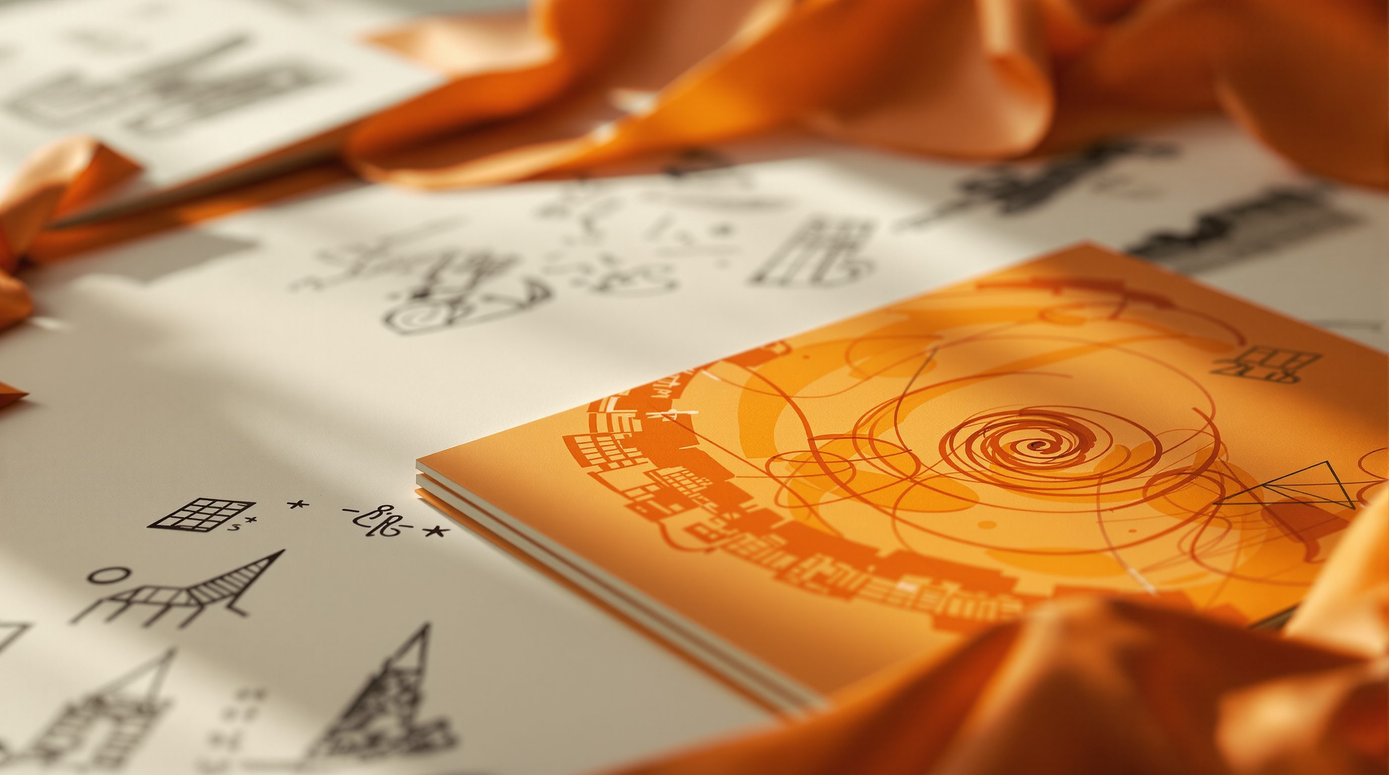
The Print Portfolio
The physical book or boards you carry into a room - paper, size, binding and the object in the hand - and the small leave-behind that keeps arguing your case after you have gone
A screen can be scrolled past in a blink. A well-made book has to be picked up, opened and set down - and that small ceremony is working for you before you say a word.
In a world of emailed PDFs and portfolio websites, it is tempting to think print is finished. It is not - it has simply become specialised. You will rarely post a printed book to apply for a job now, but you will still bring one into the room for an interview, a client pitch, a portfolio review or a school crit, and in that room the physical object does something no screen can. It sets the pace. When you hand someone a book, they open it at your opening, turn pages at your rhythm, and cannot skim ahead in a swipe. The weight of good paper, the crispness of the trim, the quiet confidence of a page that is not crammed - all of it reads as care and competence before a single project is understood.
This is also where print can betray you fastest. A brilliant screen portfolio can be undone by a cheap, warped, badly-trimmed printout with the images too dark and the type set in a font that turned to mush at that size. The physical version exposes every decision you got away with on a glowing display. So print is not simply your PDF sent to a printer - it is a distinct format with its own craft: size and orientation, paper and weight, binding and finish, and the small, cheap, ruthless companion piece - the leave-behind - that keeps making your case on someone's desk long after you have shaken hands and gone.
Print for the room, not the inbox. One great book + one cheap leave-behind with a QR.
Why print still earns its place
Print survives for one honest reason: presence. In an interview, a crit or a client meeting, the portfolio you can hold is a shared object on the table between you - you both look at the same page, you can point, they can turn back, and you control the sequence in a way a laptop being angled awkwardly across a desk never allows. A screen invites skimming and stray notifications; a book invites attention. That physical focus is a real advantage in exactly the moment your future is being decided, and it is why many studios and almost every architecture school still expect to see work in the flesh.
There is a quieter argument too. A printed portfolio is a demonstration of finishing. Anyone can keep tweaking a digital file forever; committing to ink means you decided, you resolved, you shipped. The object says this person can bring something to completion at a professional standard - which is precisely the doubt a reader is trying to resolve. And print rewards craft in ways a screen hides: the register of a full-bleed image, the feel of the stock, the way a spread opens flat so a panorama is not swallowed by the gutter. Get these right and the book flatters your work; get them wrong and it undermines even strong projects.
But be clear-eyed about when print is worth the cost and effort. You almost never print to apply any more - the first pass is digital (the next lesson). You print for the moment you will be in the room: the interview, the pitch, the review, the degree show. That means you can make a small number of beautiful copies rather than a cheap batch, and it means the book can assume you will be beside it to talk - so it can be more image-led and less explanatory than a PDF that has to stand alone. Decide the occasion first; it settles almost every other choice, from how many copies you need to how much text each page must carry.
> Print for the room you will walk into, not for the inbox. It is the version you talk to, and the version that proves you can finish.
Print = presence + proof-of-finishing. You print for the room, not the inbox.
Size, orientation and paper
Start with size and orientation, because they shape every spread you will lay out. The safe, sensible default is A4 (210 x 297 mm) or A3 (297 x 420 mm). A4 is portable, cheap to print anywhere, easy to post if you ever must, and comfortable to hold in an interview; A3 gives images real presence and suits drawing-heavy architecture work, but it is heavier, pricier and can feel unwieldy across a small table. Landscape orientation is popular because most architectural images, spreads and panoramas are wider than they are tall, and a landscape book opens into a generous double-page; portrait suits text-led or single-image-per-page layouts. Square formats (say 210 x 210 mm) look modern and image-led and photograph well for social, but waste paper on wide drawings. There is no single right answer - but pick one format and one orientation and hold it for the whole book. Mixing them reads as indecision.
Then paper, where cheap choices show instantly. Paper weight is measured in gsm (grams per square metre); ordinary office paper is around 80 gsm and looks flimsy and see-through in a portfolio. For inner pages aim for roughly 120-170 gsm - substantial enough that images do not ghost through from the reverse and pages turn with a satisfying weight. A slightly heavier cover (200-300 gsm, or a proper card cover) protects the book and signals quality the moment it is picked up. Choose a finish deliberately: matte or satin paper controls glare, keeps dark architectural images from turning to mirrors under interview-room lighting, and generally looks more considered; high-gloss can make photography pop but fingerprints badly and can read as cheap.
Two technical points save heartbreak at the print shop. First, colour and brightness: screens are backlit and lie to you, so images that look rich on your laptop often print noticeably darker and flatter. Always order a single test print before you commit to a full run, and if you can, calibrate or at least soft-proof, and lighten and add contrast to images knowing print eats both. Second, bleed and trim: if an image or colour runs to the very edge of the page (full bleed), your file must extend about 3 mm beyond the trim line on every bled edge, and you must keep text and anything important inside a safe margin, because trimming is never pixel-perfect. Set these up before you lay out, not after.
Binding, and the object in the hand
Binding is where a portfolio stops being pages and becomes an object - and it is judged the instant someone picks it up. The main choices, from cheapest to finest:
- Spiral or wire (wiro) binding - cheap, fast, and it lies completely flat, which is genuinely useful for spreads and panoramas. The downside is it looks like a college print job: the coil is visible, it can catch and bend, and it quietly says draft. Fine for a working review copy; rarely right for a serious interview book. - Saddle-stitch (stapled fold) - two staples through a folded stack. Neat and inexpensive for thin books (up to roughly 40-48 pages), lies reasonably flat, and looks clean. Good for a short, sharp portfolio or a sampler. - Perfect binding - pages glued into a wrapped spine, like a paperback book or a magazine. This is the most professional-looking option for most portfolios: it has a proper spine you can print a name on, feels like a real publication, and reads as finished and confident. The trade-off is that it does not lie perfectly flat, so keep important content out of the gutter and avoid splitting a single key image across the centre. - Layflat / photobook binding - a premium method where each spread is printed on one sheet so the book opens dead flat with no gutter loss, ideal for full-bleed panoramas and photography-led interiors books. It is the most expensive route, usually via an online photobook service, and for a small number of interview copies it can be worth every rupee.
Loose boards are a different animal, common in architecture school crits and some design reviews: large mounted or printed panels (A2/A1) you can spread out, reorder and point at, rather than a bound book. They give impact and flexibility and suit a wall pin-up, but they are awkward to carry, easy to damage and impossible to leave behind, so treat them as a review/exhibition format, not your portable portfolio.
Whatever you choose, the details betray the amateur: a wonky trim, a cover that curls, fingerprints on gloss, a spine title that is upside-down relative to convention. Handle the finished book yourself before the interview as your reader will - pick it up cold, open it, turn every page - and fix anything that snags. The object should feel resolved in the hand.
Perfect binding = the grown-up look (has a spine). Spiral = draft. Layflat = premium for panoramas.
The leave-behind that keeps arguing for you
Here is the piece most people forget, and it is one of the highest-return things in the whole format. After an interview or pitch, your beautiful bound book goes home with you. What stays on the reader's desk to remind them you exist while they decide between five candidates? That is the job of the leave-behind: a small, cheap, self-contained piece you can hand over and let them keep.
At its simplest a leave-behind is a single well-designed A4 or A5 sheet (or a short folded card) carrying your name and contact details, one or two of your strongest images, a one-line description of who you are and what you do, and - crucially - a link and QR code to your full digital portfolio or website. It is not a shrunken copy of your whole book; it is a teaser and a business card fused together. Its job is to survive the pile on the desk, jog the reader's memory a week later (ah yes, the person who did that housing project), and give them a one-tap route back to the full work when they are ready to shortlist. Some designers hand over a printed mini-portfolio of a few pages for the same reason; a proper business card with your website is the absolute minimum.
A worked example of a leave-behind line, printed under your hero image:
Asha Menon - Part 1 Architectural Assistant, Bengaluru
Housing, adaptive reuse and low-carbon detailing.
Full portfolio: ashamenon.in  (scan the code)
That is specific, it is legible, and it points somewhere. Compare the useless version many people leave: a generic card with only a phone number, or nothing at all because they assumed the interviewer would remember. They will not. Assume every reader is busy, is seeing several people, and will decide days later with your book no longer in front of them - and design the small thing that will still be on the desk when they do. It costs almost nothing to print and it is often what tips a maybe into a callback.
GSM (paper weight)
Grams per square metre - how heavy and substantial the paper feels
80 gsm is flimsy office paper. Aim ~120-170 gsm for inner pages, heavier for the cover.
Binding (spiral / saddle-stitch / perfect / layflat)
How the pages are held together, from draft-cheap to premium
Perfect binding looks professional and has a printable spine; layflat is best for panoramas.
Bleed and trim
Extending full-bleed art ~3 mm past the trim line, keeping text in the safe margin
Trimming is never pixel-perfect - set bleed up before you lay out, not after.
The leave-behind
A small, cheap piece you hand over and the reader keeps
One page or a card with a hero image, one line about you, and a QR/link to your full work.
Workshop — design and cost your interview book and leave-behind
You will make two format decisions and a real one-page artefact, so that when an interview is booked you can print, not panic. Work from the curated project list you already have.
Your curated work, a print shop or online photobook service (for the test print), and a free QR-code generator for the leave-behind link.
Goal: settle format, binding and a leave-behind for one real occasion
Inputs: your curated projects + a ruler + access to a print shop or online photobook
Time: ~45 minutes
- 1Name the occasion you are printing for (a specific interview, crit or pitch) and write one line on what it needs - image-led or explanatory, how many copies, how much text per page.
- 2Choose size and orientation and justify it in a sentence (e.g. 'A3 landscape - my drawings and panoramas need width'). Commit to one for the whole book.
- 3Pick a binding for that occasion and note its cost and its one weakness (e.g. 'perfect binding - looks professional; keep key images out of the gutter'). Get a real price from one print shop or online service.
- 4Order or mock up ONE test print of a single spread. Look at it in ordinary room light: are the images too dark? Is the smallest caption still legible? Note two fixes.
- 5Design a single-sheet leave-behind: your name and role, one hero image, one line on what you do, and a link plus a QR code to your digital portfolio. Keep it to one side of one page.
- 6Hand the test spread and the leave-behind to a friend cold and watch: what do they pick up first, and can they tell within seconds who you are and what you do?
You’ll walk away with
A decided format and binding with a real quoted cost, one test-printed spread with two noted fixes, and a finished one-page leave-behind with a working QR code - ready to print the moment an interview lands.
Three altitudes on the same idea
Read the band that fits you — or all three.
For architecture, print is still the language of the interview and the crit, so treat it as a serious deliverable. Favour A3 or a generous A4 landscape so plans, sections and long images breathe, use matte 150 gsm-plus stock so dark renders do not glare, and keep your best drawing across a spread that opens near-flat. Bring one immaculate perfect-bound copy to talk to, and leave a one-page teaser with a QR code to your full PDF or site. Boards are for reviews and degree shows, not for carrying to a job interview.
An interiors book lives on photography, so print quality is not optional - it is the whole point. Choose a photo-led format (square or landscape), consider layflat or premium photobook binding so full-bleed room shots are not swallowed by the gutter, and print on matte or satin so materials and finishes read true rather than glaring. Show a few resolved projects large, with tight material and FF&E close-ups, and a before/after where you have it. Leave behind a beautiful single card or folded piece with your strongest interior and a link - clients remember images.
You will need a printed portfolio for crits, degree shows and many interviews, so do not leave it to the night before - print eats time you will not have. Order one test print early to catch dark images and font problems, pick A4 or A3 and one orientation, and use 120-170 gsm paper so it does not feel like a stapled essay. You do not need the priciest binding; a clean perfect-bound or saddle-stitched book beats an expensive one printed in a panic. Make a cheap one-page leave-behind with a QR to your work - almost no student does, and it makes you memorable.
“Print is dead - everyone uses PDFs and websites now, so there is no point making a physical portfolio any more.”
Do it yourself
Reason these through before you spend money at the print shop.
- 1When is print worth making, and when should you rely on the digital version instead?
- 2Why does paper weight (gsm) and finish matter so much to how a portfolio is judged?
- 3What is 'bleed', and why must you set it up before laying out full-bleed pages?
- 4What is a leave-behind, and what single job does it do that your bound book cannot?
- 5Why should you always order a test print before committing to a full run?
The one line to carry out
Peer-reviewed journals & authoritative standards
- 01Career portfolio — Wikipedia, 2026.
- 02Page layout — Wikipedia, 2026.
- 03Architectural drawing — Wikipedia, 2026.
- 04Graphic design — Wikipedia, 2026.
The book is the version you hand across a table in person. Next we build the version that arrives before you do and decides whether you are even in the room - the emailed PDF that gets you shortlisted.
The author
Amogh N P
Architect, interior designer, and creative polymath. Studio Matrx began in his notebooks — his vision of design made honest, useful, and open to everyone. Its Academy is written and taught in his memory, and free, forever.
More about Amogh →