
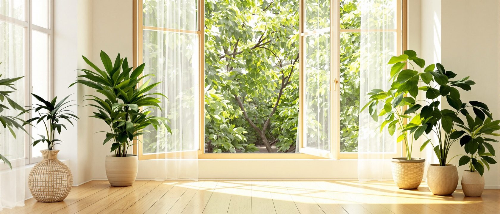
Colour, Light & Mood
Separating the science of colour and light from the folklore.
Colour psychology is the single most over-hyped area in interior lore — so this unit uses a scalpel. Separate the perceptual facts from the modest, real effects (saturation drives arousal, hue drives pleasantness) from the folklore (fixed hue-emotion charts, Baker-Miller pink, red-and-appetite). Then the genuinely strong science: daylight, the body clock, and the field’s best-evidenced area — nature and restoration.
Learning objectives
By the end of this lesson, you will be able to — mapped to the course outcomes for Psychology of Interiors:
Judge colour claims against evidence — separating saturation/valence effects from hue-emotion folklore.
Explain that colour meaning is cultural, with the Indian context.
Explain daylight's benefits, the circadian system and CCT — with the evidence caveats.
Apply biophilia and restoration (SRT, ART) — the field's best-evidenced area.
Colour: science vs folklore
The reliable structure of colour affect, the myths to correct, and the cultural meaning of colour — including the Indian context.[3, 4]
Saturation drives arousal, hue drives valence
The reliable structure of colour affect runs along SATURATION and BRIGHTNESS → arousal, and HUE → pleasantness — not along specific hue→emotion links (Valdez & Mehrabian, 1994). Bright, saturated colours are generally more stimulating; desaturated, darker ones less so. WARM (red/orange) vs COOL (blue/green) is a real, cross-culturally common association (advancing/stimulating vs receding/calming) — but modest and partly learned.[3]
Try it — the colour-claim checker
Pick a popular colour claim and see the honest verdict — solid science, a nuance, or a pop-psychology myth.
Colour-claim checker · science or folklore?
“Bright, saturated colours feel more energetic than muted ones.”
Well-supported
The reliable structure of colour affect: saturation and brightness drive AROUSAL, and hue drives pleasantness — far better than any specific hue→emotion link (Valdez & Mehrabian, 1994).
Keep colour PERCEPTION (solid science) apart from colour “psychology” (mostly weak) — the reliable rule is saturation→arousal, hue→valence.
Light, the body clock & restoration
Daylight’s benefits, the circadian system and colour temperature with its honest caveats, and biophilia and restoration — the best-evidenced area of the whole course.[1, 2]
Light is not only for seeing
DAYLIGHT is strongly beneficial — for mood, satisfaction, alertness and health; daylight and views consistently rank among the most valued interior attributes and correlate with wellbeing, and in hospitals with recovery. A third class of retinal cells — ipRGCs containing MELANOPSIN, peak sensitivity ~480 nm (blue) — mediates non-visual responses: melatonin suppression, alertness and circadian entrainment. This is real physiology.[1, 2]
At a glance
| Aspect | One side | The other |
|---|---|---|
| Colour effect | Myth: fixed hue-emotion chart | Reality: saturation→arousal, hue→valence |
| Baker-Miller pink | Myth: pacifies aggression | Reality: did not replicate |
| Colour meaning | Myth: white = purity everywhere | Reality: cultural — white = mourning in much of India |
| Cool white light | Myth: always best for work | Reality: modest, low-quality evidence; harms evening sleep |
| Nature / plants | Myth: soft feel-good trend | Reality: the field's best-evidenced benefit |
Key terms
The reliable colour effect: vividness drives arousal; hue drives pleasantness (not fixed hue-emotions).
A famous 'calming' colour claim that did not replicate — the flagship colour-psychology myth.
Retinal cells (peak ~480 nm) driving the non-visual, circadian effects of light.
Warmth of white light in kelvin — 2700 K warm, 6500 K cool/daylight.
Ulrich's theory: nature triggers rapid physiological and affective stress reduction.
The Kaplans' theory: natural settings restore fatigued directed attention.
Studio task
Find three interior-design blog posts or product pages that make colour-psychology claims. For each, classify the claim as solid, nuanced or folklore using the evidence from this unit, and rewrite it into an honest statement a designer could stand behind. Then propose a lighting scheme for a study and a bedroom that respects the circadian caveat (warm and dim in the evening) and specifies where daylight and greenery do the real work.
Self-assessment
1. The most reliable structure of colour's emotional effect is —
2. Baker-Miller ('drunk-tank') pink is taught as —
3. The best-evidenced wellbeing finding in the unit is —
Recap
References & further reading
- [1]Roger S. Ulrich (1984), 'View through a window may influence recovery from surgery,' Science 224(4647), 420–421; E.O. Wilson, Biophilia (1984).
- [2]Rachel & Stephen Kaplan, The Experience of Nature: A Psychological Perspective (1989), Cambridge University Press (Attention Restoration Theory).
- [3]Valdez, P. & Mehrabian, A. (1994), 'Effects of color on emotions,' Journal of Experimental Psychology: General 123(4), 394–409.
- [4]Elliot, A.J. & Maier, M.A. (2014), 'Color psychology,' Annual Review of Psychology 65, 95–120; Mehta & Zhu (2009), Science 323, 1226–1229.
Further reading
- Rachel & Stephen Kaplan — The Experience of Nature.
- Sally Augustin — Place Advantage: Applied Psychology for Interior Architecture.
- Robert Gifford — Environmental Psychology: Principles and Practice.
Sources gathered and fact-checked June 2026. Published values vary by source, sample and method — treat as indicative and confirm against the cited standard before structural use.
The author
Amogh N P
Architect, interior designer, and creative polymath. Studio Matrx began in his notebooks — his vision of design made honest, useful, and open to everyone. Its Academy is written and taught in his memory, and free, forever.
More about Amogh →