
 Lesson 0.1
Lesson 0.1 · What Interior Design Is
Space, the Prime Material
Why the interior designer's real material is the void, not the wall
You think you are choosing a sofa. You are actually shaping a volume of air.
Walk into a room you love and ask what, exactly, you are responding to. Not the bricks — they are hidden. Not even the furniture, at first. You are responding to a *volume of space*: its height, its light, the way it holds you or releases you.
That volume is the interior designer's prime material. Everything else — walls, colour, a teak chair — exists to give that emptiness a shape you can live inside.
A potter shapes clay; an interior designer shapes the emptiness the clay surrounds.
The discipline, in one sentence
Here is a working definition worth keeping: *interior design is the deliberate planning and shaping of the spaces inside a building* — so that they shelter us, hold the daily life that happens in them, steer how we move and act, and, at their best, say something about who we are.
Read it again and notice which word does the real work: spaces. Not surfaces, not objects. The designer does arrange objects and surfaces, yes — but always in service of the space they define. Lao Tzu put it twenty-five centuries ago: we knead clay into a pot, *but it is the emptiness inside that makes it useful.* The walls are the clay. The room is the pot.
Positive and negative: the two halves of every room
Designers borrow a pair of words from drawing. The positive elements are the solid things — a wall, a column, a sofa, a bookshelf. The negative space is the void between and around them: the air you move through, the gap over the dining table, the breathing room beside a bed.
The beginner's error is to design only the positive — to choose beautiful objects and push them to the edges. The result is a room that is full and dead. The trained eye composes the *negative* space just as deliberately: it leaves a generous emptiness here, pinches a passage there, lets a double-height void pull the eye up. In a good room, the empty space has a shape you could almost draw.
India already knew this
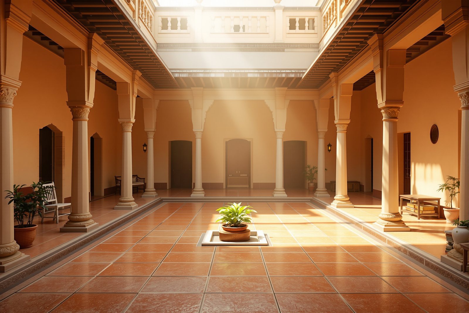
You do not have to import this idea — Indian building has always designed the void first. The courtyard (*aangan*, *nadumuttam*, *chowk*) is literally a room made of nothing but enclosed sky: the most important space in the house has no roof and no furniture. The verandah is negative space deliberately held between inside and out — neither room nor garden, and the most-used spot in the home. A temple's power is its sequence of contracting and expanding voids, ending in the small dark *garbhagriha*.
Western interiors learned to compose space; Indian architecture never forgot it. This course simply makes the instinct conscious.
Three dimensions, not two
A plan on paper tempts you to think in two dimensions — push the furniture around a rectangle. But space is volume: it has height, and height is where amateurs lose the room. A 3.0 m ceiling and a 2.6 m ceiling over the same floor plan are two different rooms; one breathes and one presses down.
So from the very first sketch, think in section as well as plan. Where does the eye travel upward? Where is the ceiling low and intimate, where high and generous? The most memorable Indian interiors — a *haveli* courtyard, a Kerala *tharavadu*, a modern double-height living room — are memorable in *section*.
Hands-on
Toggle between the two readings of the same room. The amateur designs only the objects; the skilled designer composes the void — the circulation and breathing room between them — as deliberately as the furniture. Add pieces and watch that void disappear.
Three altitudes on the same idea
Read the band that fits you — or all three.
Before you buy anything, stand in the empty room and notice the *space*, not the walls. Is the air around the sofa cramped or generous? Can two people pass behind the dining chairs when someone is seated? A common mistake is filling every corner — leaving deliberate emptiness is design, not waste. Ask your designer to show you the circulation (the paths you walk) before the furniture.
Draw the negative space as a positive shape. On your plan, hatch the *circulation and clearance* voids and check they read as a coherent figure, not leftover scraps between furniture islands. Keep a primary clearance of 900 mm for main paths and 600 mm for secondary ones; design the void to those, then place the positive elements. Section studies at 1:50 catch the height problems a plan hides.
Internalise the *figure–ground* relationship (Module 3 formalises it). In any composition, foreground figure and background ground are mutually defining — change one and you change the other. An interior is the three-dimensional case: solids (figure) and the space they enclose (ground) define each other. Train yourself to *invert* the reading — see the void as the figure. The Nolli plan of Rome did this for a city; do it for a room.
“Interior design is decoration — choosing nice colours, furniture and finishes for a room.”
Run the method yourself
Take a room you know well — your own living room will do. You are going to learn to *see the space* instead of the stuff in it.
- 1Stand in the doorway and, for thirty seconds, ignore every object. Try to sense only the volume of air — its width, depth and especially its height. Does it feel generous or tight?
- 2Now identify the negative space: the empty paths and gaps you move through. Trace the main walking route with your eyes. Is it a clear, deliberate shape, or leftover scraps between furniture?
- 3Find the room's tallest and lowest felt ceiling moment (a beam, a loft, a fan zone). Notice how height alone changes the feeling.
- 4Name one Indian void you grew up with — a courtyard, verandah, *otla*, staircase landing. What made that *empty* space the best-used place in the house?
- 5Sketch the room in plan and mark the circulation in one colour. If the coloured void looks like a sensible shape, the space is well planned. If it looks like a leftover, that's your first design problem.
The one idea this whole course stands on
If space is the material, what exactly are we shaping it *for*, and by what standard is a room 'good'? Next: the two jobs every interior must do at once — work, and move us.