
Colour Theory for Architects & Interior Designers
A Complete Guide to Colour in Indian Interior Spaces
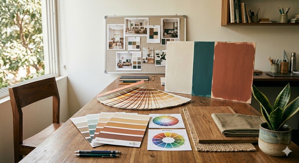
Colour is the most powerful tool in an interior designer's arsenal. It can make a room feel larger or intimate, energise or calm, modern or traditional — all without moving a single piece of furniture. Yet colour selection remains one of the most anxiety-inducing decisions for Indian homeowners.
This guide gives architects, interior designers, and homeowners a systematic framework for colour decisions — backed by colour science, psychology, and decades of Indian interior design practice.
The Colour Wheel — Foundation of All Colour Decisions

The colour wheel organises 12 hues into a logical circle. Every colour decision in interior design starts here.
Primary Colours (3)
Red, Yellow, Blue — cannot be created by mixing other colours.
Secondary Colours (3)
Orange (Red + Yellow), Green (Yellow + Blue), Violet (Blue + Red) — each is a mix of two primaries.
Tertiary Colours (6)
Yellow-Orange, Red-Orange, Red-Violet, Blue-Violet, Blue-Green, Yellow-Green — each is a mix of a primary and an adjacent secondary.
Understanding Colour Properties
| Property | Definition | Interior Design Impact |
|---|---|---|
| Hue | The colour itself (red, blue, green) | Sets the mood and character |
| Saturation | Intensity of the colour | High = bold statement; Low = subtle elegance |
| Value | Lightness or darkness | Light = spacious feel; Dark = intimate/cosy |
- Tint = Colour + White (e.g., Pink is a tint of Red)
- Shade = Colour + Black (e.g., Maroon is a shade of Red)
- Tone = Colour + Grey (e.g., Dusty Rose is a tone of Red)
Pro tip for Indian homes: Most successful Indian interiors use tones (colour + grey) rather than pure hues. Tones feel sophisticated and work well under both natural daylight and warm artificial lighting.
Warm vs Cool Colours
Warm Colours (Red, Orange, Yellow side)
- Feel: Energetic, cosy, intimate, advancing (room feels smaller)
- Best for: Living rooms, dining rooms, north-facing rooms
- Indian context: Traditional Indian interiors lean warm — terracotta, saffron, gold
Cool Colours (Blue, Green, Violet side)
- Feel: Calm, spacious, refreshing, receding (room feels larger)
- Best for: Bedrooms, bathrooms, south/west-facing rooms
- Indian context: Modern urban homes favour cool palettes — sage, teal, powder blue
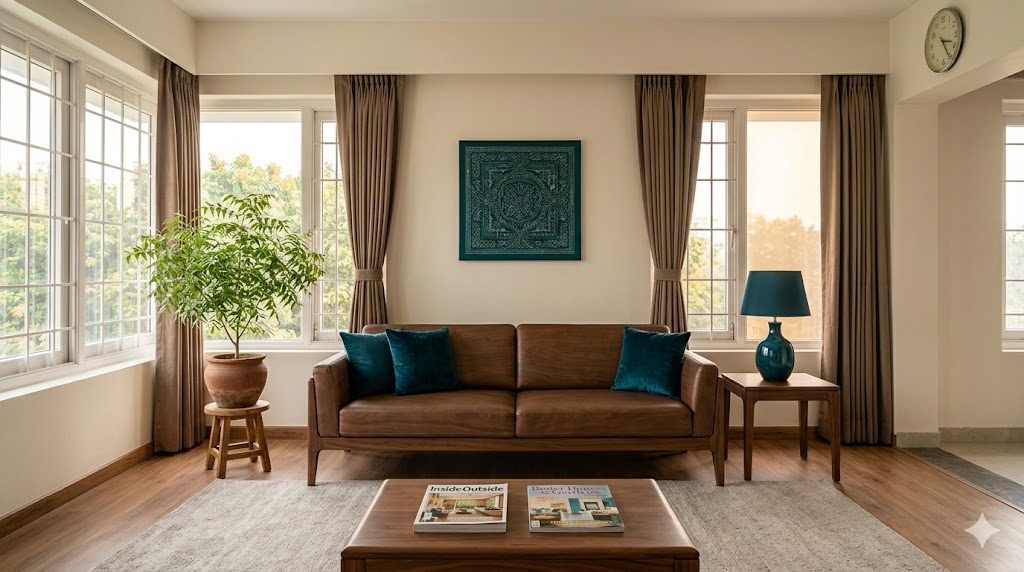
Neutral Colours (White, Grey, Beige, Brown, Black)
- Feel: Timeless, flexible, grounding
- Indian context: Neutral + accent is the most popular approach across all budget levels
6 Colour Schemes Every Designer Must Know

1. Monochromatic
One hue, varied in tint, shade, and tone. Light blue walls, medium blue upholstery, dark blue cushions.
Best for: Bedrooms, spa-like bathrooms
2. Complementary
Two colours directly opposite on the wheel. Blue + Orange, Red + Green. High contrast, high energy.
Best for: Living rooms, accent walls
3. Analogous
Three adjacent colours on the wheel. Harmonious and easy on the eyes.
Best for: Bedrooms, any space needing calm flow
4. Triadic
Three equally spaced colours. Vibrant and balanced.
Best for: Kids rooms, creative spaces
5. Split-Complementary
One base + two colours adjacent to its complement. Dynamic but manageable.
Best for: Dining rooms, living rooms
6. Neutral + Accent (The Indian Favourite)
Neutral palette with one strong accent colour. The most popular scheme in urban Indian homes. Safe, timeless, refreshable.
Best for: Every room — the safest starting point
The 60-30-10 Rule

The single most important rule for colour proportion:
- 60% — Dominant (walls, large rugs, major furniture)
- 30% — Secondary (upholstery, curtains, smaller furniture)
- 10% — Accent (cushions, artwork, vases, statement lighting)
| Proportion | Element | Example |
|---|---|---|
| 60% | Walls + ceiling + floor | Warm white |
| 30% | Sofa + curtains + TV unit | Walnut brown + beige |
| 10% | Cushions + artwork + lamp | Mustard yellow / Teal |
The 10% is where personality lives. Change the accent colour seasonally — it costs almost nothing compared to repainting.
Colour Psychology — Room-by-Room Guide

| Room | Recommended | Avoid | Effect |
|---|---|---|---|
| Living Room | Warm neutrals, beige, earthy tones | Very dark walls | Social, welcoming |
| Master Bedroom | Soft blue, lavender, sage green | Bright red, orange | Restful, sleep-promoting |
| Kitchen | White, cream, light green, yellow | Very dark colours | Clean, energising |
| Bathroom | White, light blue, aqua | Dark brown, dark red | Fresh, spa-like |
| Kids Room | Soft primaries, pastels | All-white, all-dark | Playful, creative |
| Study | Green, blue-grey, warm white | Red, orange | Focused, productive |
| Pooja Room | White, saffron, gold | Black, dark grey | Sacred, serene |
| Dining | Warm tones — terracotta, wine | Cold blue, stark white | Appetising, intimate |
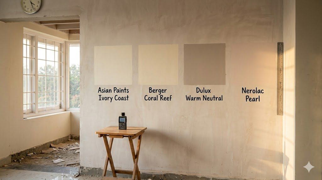
Indian Paint Brands — Quick Reference
| Brand | Popular Shades | Colour Tool |
|---|---|---|
| Asian Paints | Autumn Leaf, Tranquil Blue, Ivory Coast | Colour Spectra app |
| Berger | Coral Reef, Silver Sage, Golden Sand | iColor Visualizer |
| Nerolac | Pearl White, Aqua Marine, Sunset Glow | Paint My Space |
| Dulux | Warm Neutral, Dusty Miller, Antique White | Visualizer app |
| Nippon | Lily White, Serene Green, Mist Blue | Colour Creation |
Colour and Lighting
The same colour looks dramatically different under different lighting:
| Lighting | Effect on Colour | Common In |
|---|---|---|
| Natural north light | Cooler, truest rendition | North-facing rooms |
| Natural south/west | Warmer, yellow cast | South/west rooms |
| Warm LED (2700-3000K) | Enhances warm, dulls cool | Living rooms |
| Cool LED (4000-5000K) | Enhances cool, washes warm | Kitchens, offices |
The Swatch Test Rule
Always test on the actual wall. Paint a 2ft x 2ft patch and observe at 4 times:
1. Morning (east light)
2. Afternoon (peak daylight)
3. Evening (artificial warm light)
4. Night (only artificial light)
Indian Colour Trends 2025-2026
The trending palette for Indian urban interiors:
- Greige — grey + beige, the perfect neutral
- Sage Green — nature-inspired calm
- Terracotta — earthy warmth, Indian heritage
- Navy Blue — sophisticated depth
- Warm White — not stark, slightly creamy
- Walnut — rich wood tone for furniture
- Forest Green — bold but grounding
- Caramel — soft warmth
- Taupe — understated elegance
- Charcoal — modern dark accent
- Olive — earthy green with depth
- Blush — subtle feminine warmth
Vastu Shastra and Colour

| Direction | Recommended Colours | Avoid |
|---|---|---|
| North | Blue, green, white | Red, orange |
| South | Red, orange, pink | Blue, black |
| East | Green, light blue, white | Dark shades |
| West | White, grey, blue | Green, red |
| Northeast | Light blue, white, cream | Dark colours |
| Southeast | Red, orange, pink | Blue, green |
| Southwest | Brown, beige, yellow | Blue, white |
| Northwest | White, grey, silver | Red, orange |
Common Colour Mistakes
1. Too many colours — limit to 3-4 using 60-30-10
2. Choosing from tiny swatches — colours intensify on large surfaces
3. Ignoring undertones — white has dozens of undertones
4. Same white everywhere — use warm white in living, cool white in bathrooms
5. Forgetting the ceiling — a tinted ceiling adds depth
6. Following trends blindly — use trends only in the 10% accent layer
7. Ignoring fixed elements — floor, granite, tiles are permanent; paint must complement
Colour for Small Apartments
- Light colours on walls expand visual space
- Consistent palette across rooms creates flow
- One accent wall maximum — smallest wall, not largest
- Glossy/satin finish reflects more light
- Mirror + light walls doubles perceived space
Key Takeaways
- Master the 60-30-10 rule — the most reliable formula for any room
- Start with neutrals, add colour through accents — safest and most refreshable
- Always test paint on the actual wall — observe under 4 lighting conditions
- Warm colours advance, cool colours recede — control perceived room size
- Indian homes cycle between natural and artificial light — choose colours that work under both
- The ceiling is the fifth wall — a tinted ceiling adds sophistication
References:
- Itten, Johannes — The Art of Color (1961)
- Munsell Colour System — munsell.com
- Asian Paints Colour Spectra 2025
- Berger Paints Colour Trends India 2025
- Vastu Shastra — Traditional Indian Architectural Science
- NBC 2016, Part 8 — Building Services (Lighting standards)
Export this guide
Related Guides — Deep-dive reading
Vastu Colors for Home — A 2026 Working Reference for Indian Homes
Five elements · Room-by-room palette · Direction-aligned colors
VastuCurtain Colour Selection Guide: How to Choose the Right Shade (India 2026)
Blend with the wall or contrast for a statement, pull from the rug, light vs dark, warm vs cool — a practical method for choosing curtain colour in Indian homes.
Window TreatmentsTransitional Interiors — A 2026 Style Guide for Indian Homes
The balanced middle path · Classic silhouettes, clean lines · Neutral base, one warm accent
Design StylesRelated Tools — Try Free
Circadian Light Meter
Patient-centric circadian lighting visualizer for Indian healthcare design — time-of-day × intensity → CCT, melanopic lux (EML / mEDI), melatonin suppression, and an alertness curve. Calibrated against WELL v2 L03 Circadian Lighting Design, CIE S 026:2018, Brainard 2001, and Lucas et al. 2014.
Circadian ToolCross-Ventilation Analyzer
Estimate airflow and air changes per hour (ACH) from room size, window areas, layout, and local wind — with NBC 2016 Part 8 compliance check.
Ventilation CalculatorApartment Furniture Size Chart
Standard furniture dimensions for Indian apartments — sofas, beds, tables, dining, storage.
Reference Chart