
21 · Mid-Century — Modernism Comes of AgeNo. 01 in era
Seagram Building
A tower of bronze and amber glass, pulled back from Park Avenue behind an empty granite plaza. The Seagram Building took Mies van der Rohe's dictum that "less is more" and scaled it to thirty-eight storeys — perfecting the modern skyscraper and, for better and worse, setting the template every corporate high-rise would chase for a generation.
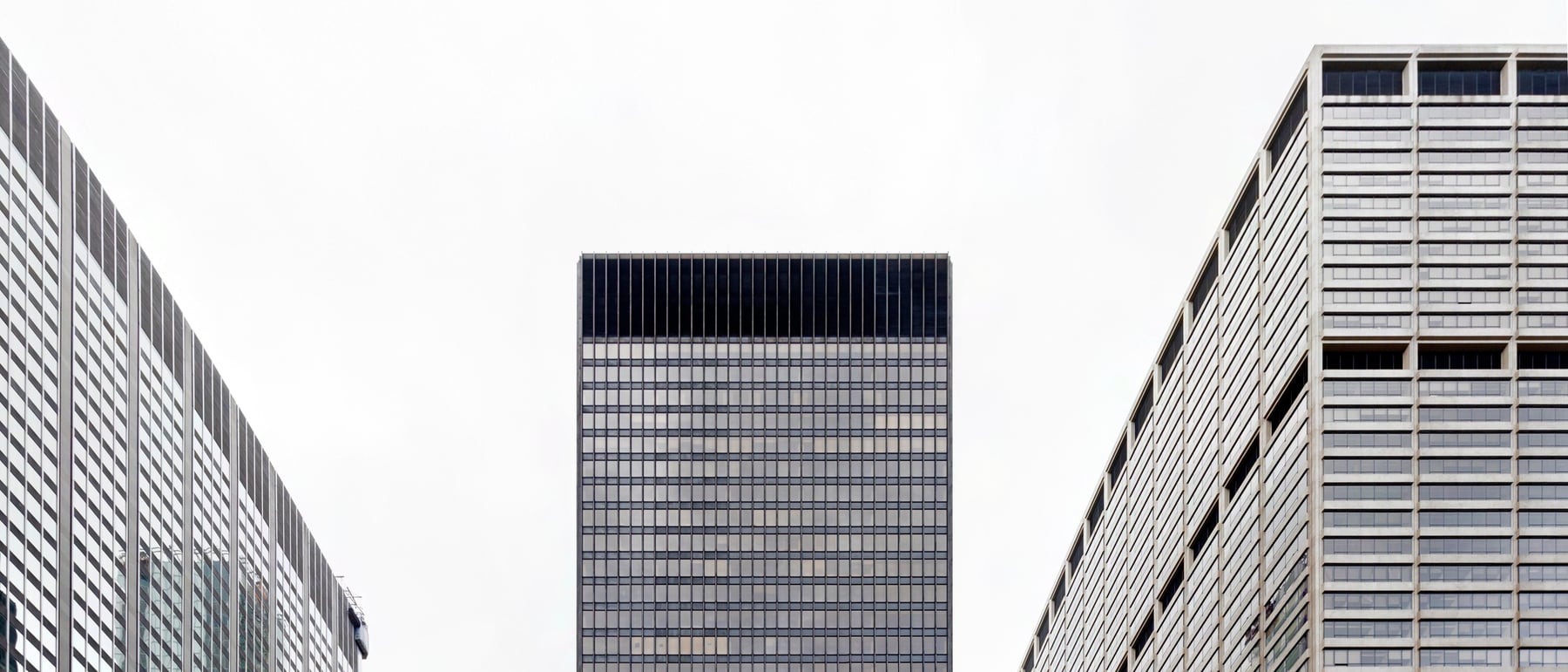
1. The plaza — giving away the street
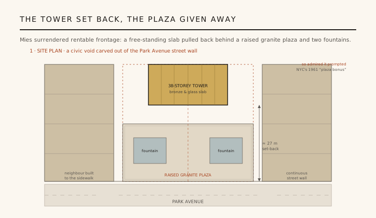
Manhattan's zoning rewarded developers who filled their lots to the sidewalk, and Park Avenue was a canyon of buildings doing exactly that. Mies did the opposite. He set his tower back roughly ninety feet and laid a raised granite plaza across the frontage, flanked by two rectangular fountain pools on a central entry axis. Rentable ground-floor frontage — the most valuable real estate on the block — was simply given away to make civic open space.
It was a radical, almost extravagant move, and it worked so well that planners tried to bottle it. New York's landmark 1961 zoning resolution introduced the "plaza bonus," granting extra floor area to any tower that provided a public plaza. The result was hundreds of lesser imitations — windswept, underused forecourts that captured the setback but none of Seagram's proportion or generosity. Few grasped that the plaza only reads as a gift because the tower behind it is so disciplined.
2. Phyllis Lambert and the choice of Mies
The building might have been mediocre. Samuel Bronfman, head of the distiller Joseph E. Seagram & Sons, had approved an undistinguished design for the company's new headquarters. His daughter, Phyllis Lambert — then twenty-seven and trained as an architect — wrote her father a blistering letter rejecting it and won the right to lead the search for someone better.
After consulting Philip Johnson, then at the Museum of Modern Art, Lambert chose Ludwig Mies van der Rohe, the émigré director of the Bauhaus who had built almost nothing at scale in America. It was an act of extraordinary patronage: a client willing to spend lavishly on restraint. Lambert served as director of planning, and the tower stands as much to her judgment as to Mies's genius.
3. The honest lie of the bronze mullion
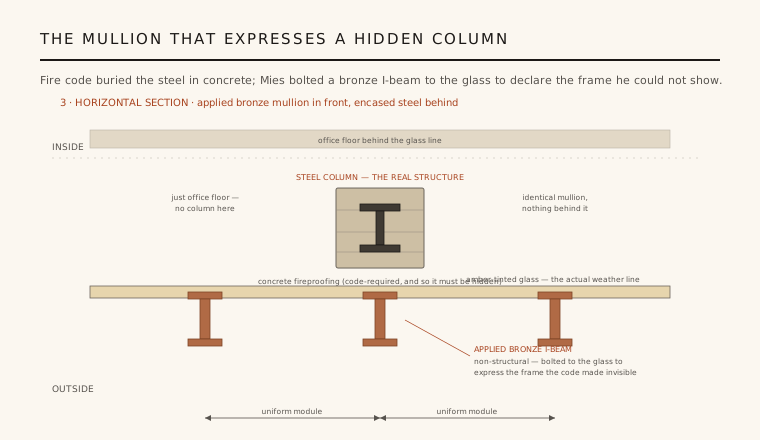
Mies believed a building should express its structure. But American fire codes forbade it: the steel skeleton of a tall building had to be encased in concrete fireproofing, hidden from view. Mies's response was one of modernism's most eloquent contradictions. He clad the tower in a curtain wall of amber glass and custom-extruded bronze, and onto its face he bolted continuous vertical I-beam mullions — real bronze structural profiles that carry no load at all.
These applied mullions run in a strict uniform rhythm across the whole facade, whether or not a real column stands behind the glass at that point. They are, in effect, a portrait of the frame the code made invisible — a decorative member pretending to be structure in order to tell the truth about structure. Critics have argued about it ever since. It is not honest construction, but it is honest expression, and the tension between the two is the intellectual heart of the building.
4. Materials, module and the discipline of luxury
Up close, the austerity is anything but cheap. The tower is a study in costly materials handled with obsessive care: bronze that would weather to a dark patina, pink-grey travertine, marble, and glass tinted a warm topaz so the whole slab glows in low sun. Mies detailed everything to a single governing module, from the paving grid of the plaza to the mullion spacing and the ceiling coffers, so the building reads as one continuous field of proportion.
That control extended to things a lesser architect would ignore. The story that Seagram supplied its own window blinds — allowed to sit only fully up, halfway, or fully down — is often told to capture the point: the facade was to remain visually pure. Whether apocryphal or not, it names a real ambition. "Less is more" here did not mean less effort or less money; it meant subtracting everything that was not essential and perfecting what remained.
5. The Four Seasons and the legacy
At the base, Philip Johnson designed the interiors of the Four Seasons restaurant — a landmark of modern design in its own right, with its rippling metal-chain curtains, Richard Lippold sculpture and seasonal changes of decor. It made the tower's ground floor a stage for mid-century New York and demonstrated that Miesian rigour could host warmth and theatre.
The Seagram Building's influence was immense and double-edged. It became the definitive image of the corporate headquarters, endlessly copied in glass boxes that borrowed the silhouette but not the substance — the lavish materials, the plaza, the fanatical detailing. New York recognised the original in 1989, granting landmark status to the exterior, lobby and plaza. It endures as the point where the modern skyscraper reached a kind of perfection, and as a warning about how badly perfection travels.
Every glass-and-metal corporate tower with a plaza at its feet — and every debate about whether such plazas serve the public or merely buy floor area — descends directly from what Mies did at 375 Park Avenue.
References & further reading
- 01Lambert, Phyllis (2013). Building Seagram. Yale University Press, New Haven.
- 02Schulze, Franz & Windhorst, Edward (2012). Mies van der Rohe: A Critical Biography (New and Revised Edition). University of Chicago Press, Chicago.
- 03New York City Landmarks Preservation Commission (1989). Seagram Building, Including the Plaza — Designation Report (LP-1664). City of New York.
- 04Mertins, Detlef (2014). Mies. Phaidon Press, London.
- 05Blake, Peter (1996). The Master Builders: Le Corbusier, Mies van der Rohe, Frank Lloyd Wright. W. W. Norton, New York.
Last verified 2026-07-09. Ancient and vernacular works often have no single architect or firm date; dates are given as widely accepted approximations and the builder-culture is named where no individual designer is known.