
12 · The RenaissanceNo. 07 in era
San Giorgio Maggiore
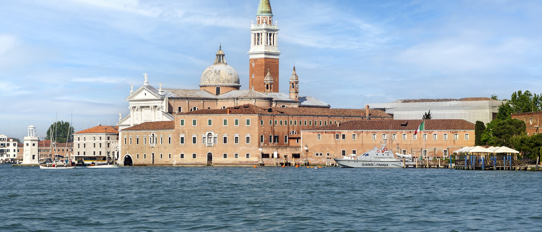
Seen from the Piazzetta, across the shining water of the Bacino, it reads as a single white classical temple floating on its own island. But look harder at that facade and there are two temples, not one — a tall narrow front for the nave laid over a low wide one for the aisles. This is Palladio's most elegant answer to the oldest problem in church design: how do you put a Roman temple portico on the humpbacked cross-section of a Christian basilica?
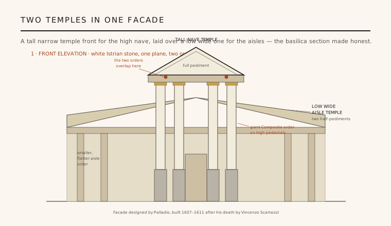
1. The problem of the basilica front
Every Renaissance architect who admired ancient Rome wanted to give a church the noble face of a classical temple — a portico of columns carrying a single triangular pediment. But the Christian basilica has an awkward shape to dress. In section it is not one clean rectangle but a stepped silhouette: a tall central nave flanked by lower side aisles. A single temple front sized to the nave leaves the aisles as blank stumps; one sized to the whole width produces a squat, over-wide pediment that crushes the nave it is meant to crown. The cross-section and the temple simply do not fit.
This mismatch had defeated a century of architects, who mostly hid it behind scrolls, screen walls and false storeys. Palladio refused the disguise. He held that a facade should tell the truth about the building behind it, and the truth here was two different heights. So instead of forcing the section into one temple, he decided to express it honestly — with two temple fronts of different sizes, interlocked in a single plane of white stone.
2. Two interlocking temple fronts
Palladio's solution is to superimpose two temples in one wall. A tall, narrow temple front stands for the nave: four giant Composite columns raised on high pedestals, rising the full height of the central vessel and carrying a complete triangular pediment. Behind and around it runs a second, lower and wider temple front for the aisles: a smaller, flatter order of pilasters carrying an entablature and two half-pediments whose rakes slope down and outward, disappearing behind the giant columns. The two orders overlap in the same plane, each complete in its own logic yet fused into one composition.
The device is brilliant because it is legible. Read the tall columns and you see the height of the nave; read the low half-pediments running out to the sides and you see the fall to the aisle roofs. The facade becomes a diagram of its own section, drawn entirely in correct classical grammar — no scrolls, no fudging, no false wall. Palladio had rehearsed the idea on smaller Venetian churches, but at San Giorgio Maggiore, and again at the Redentore across the Giudecca, he perfected it into the model that Baroque architects across Europe would borrow for two centuries.
3. White stone across the water
The facade is faced in gleaming white Istrian stone, a dense limestone that weathers to a luminous, marble-like brightness. That choice is urban strategy as much as material. San Giorgio Maggiore sits alone on its own small island directly across the Bacino di San Marco from the Piazzetta and the Doge's Palace, and Palladio composed the church to be read from there — not from a narrow street but across a broad sheet of open water. The white front catches the Venetian light and reads as a bright, crisp marker answering the pink-and-white mass of San Marco opposite.
This is architecture as urban scenography. The facade is oriented and scaled for a long view over the lagoon; the giant order and clean pediment stay legible at a distance where fine ornament would dissolve. Rising behind it, the tall brick campanile completes the silhouette — though the tower we see today is a later rebuild of 1791, its predecessor having collapsed. Church, tower and monastery together form one of the most deliberately staged views in all of Venice.
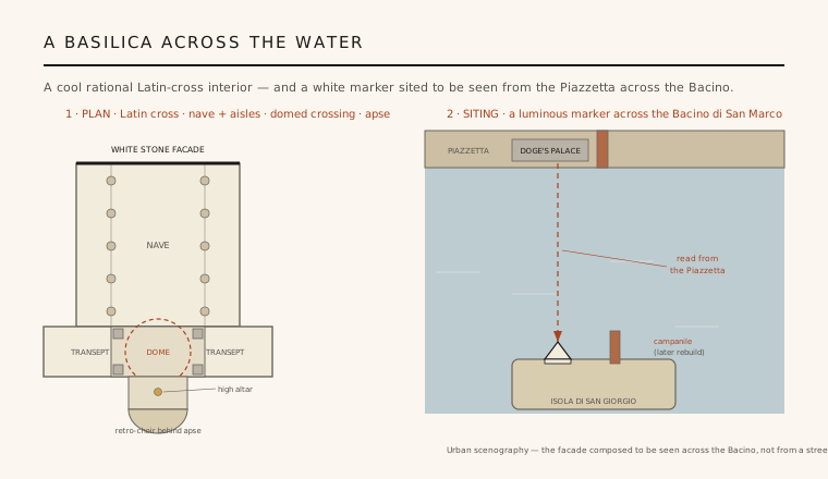
4. A cool, rational interior
Inside, the mood is bright, harmonic and calm. The plan is a Latin cross — a long nave with side aisles, short transepts, a domed crossing and an apsidal sanctuary. Palladio articulates the walls with tall engaged columns and pilasters of grey pietra set against white plaster, a restrained two-tone palette of cool grey and clean white that reads as pure structure rather than decoration. Big thermal (semicircular) windows high in the walls flood the whitewashed vaults with even, silvery light.
The proportions are governed throughout by simple harmonic ratios, so the space feels measured and intelligible — the antithesis of the gold-drenched mystery of San Marco across the water. Behind the high altar Palladio opened a retro-choir for the Benedictine monks, screened by columns so that light spills through from beyond the sanctuary. Everything is legible, ordered and serene: a Christian basilica rebuilt as a work of clear Roman reason.
5. Built after his death — and its long shadow
It is important to be honest about the chronology. Palladio designed the church for the wealthy Benedictine monastery and construction of the body began in 1566, but he died in 1580 with the great facade still unbuilt. The stone front we admire was raised only in 1607–1611, executed by Vincenzo Scamozzi, working to Palladio's design though not without his own adjustments — which is why scholars debate exactly how faithfully the built facade matches the master's final intention. The interior, too, was completed and furnished over decades after his death.
None of this diminishes its authority. San Giorgio Maggiore, together with the Redentore, fixed the interlocking temple-front church facade as a permanent part of the classical language, copied from Rome to London to colonial America. Through Palladio's own treatise, the Quattro Libri, and the Palladian revival it seeded, this quiet white church on a Venetian island became one of the most influential building fronts ever composed — proof that the honest expression of an awkward structure can be more beautiful than any disguise.
Any building whose front is composed as a piece of civic scenography to be read across open water or plaza — from Utzon's white Sydney Opera House sails answering the harbour to a museum designed for the long approach view — is still working Palladio's insight at San Giorgio: honesty about the section, resolved into a single luminous face for the city.
References & further reading
- 01Ackerman, J. S. (1991). Palladio. Penguin Books, Harmondsworth (2nd ed.).
- 02Wittkower, R. (1971). Architectural Principles in the Age of Humanism. W. W. Norton, New York.
- 03Boucher, B. (1998). Andrea Palladio: The Architect in His Time. Abbeville Press, New York.
- 04Palladio, A. (trans. Tavernor, R. & Schofield, R.) (1997). The Four Books on Architecture. MIT Press, Cambridge, MA.
- 05Cooper, T. E. (2005). Palladio's Venice: Architecture and Society in a Renaissance Republic. Yale University Press, New Haven.
Last verified 2026-07-06. Ancient and vernacular works often have no single architect or firm date; dates are given as widely accepted approximations and the builder-culture is named where no individual designer is known.