
25 · Late Modern, Postmodern & the Road to NowNo. 06 in era
Portland Building
In 1982 a fifteen-storey office block in Oregon did the unthinkable: it painted itself. Cream, terracotta and teal, hung with giant keystones and looping swags, Michael Graves's Portland Building dragged colour and ornament back onto the civic tower — and detonated the argument about what a modern building was allowed to look like.
1. The box that broke ranks
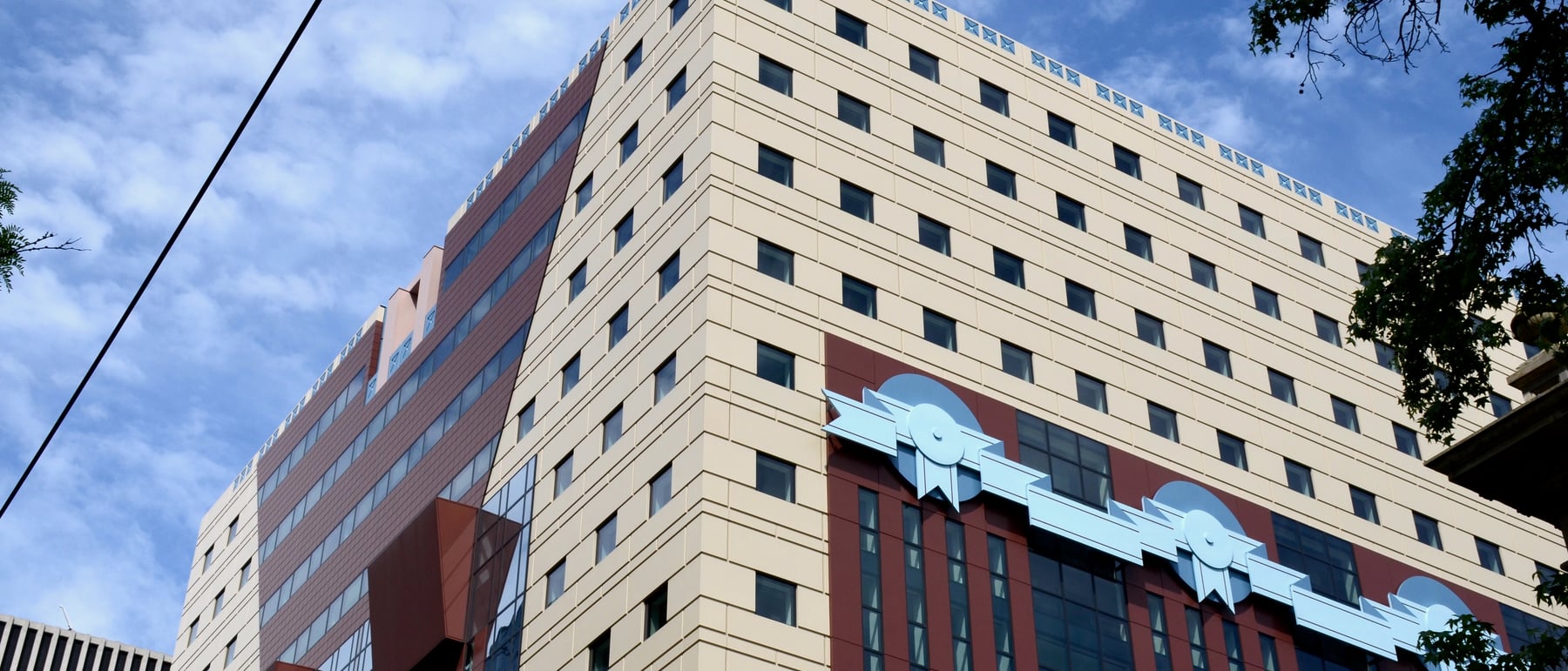
By 1980 the American office tower had a settled orthodoxy: a taut curtain wall of glass and steel — neutral, repetitive, ornament-free. Graves won the limited competition for Portland's Municipal Services Building with a proposal that rejected all of it: a squat, near-cubic concrete block whose two principal facades are not window walls but pictures of a building, laid onto the box in cream, terracotta-maroon and teal blue. It was one of the first major Postmodern public buildings, and it made Graves internationally famous almost overnight.
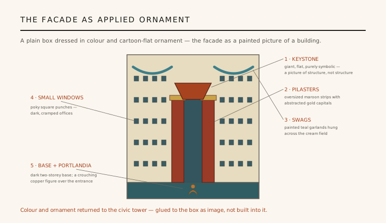
The devices are frankly theatrical — an enormous stylised keystone spanning the central bays, oversized pilasters clad in maroon rising past a mirror-glass panel, abstracted capitals, and painted swags or garlands looped across the upper field. None of it is structural. The keystone carries no arch; the pilasters support nothing. Graves treats the elevation as a surface to be composed: a flat, almost cartoon-like rendering of the classical language, applied to a cheap concrete frame the way a poster is pasted to a wall.
2. A civic tower dressed as a classical column
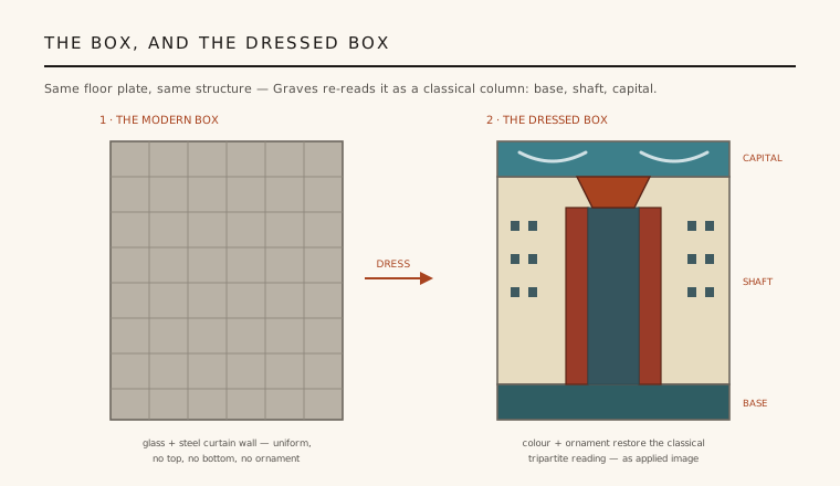
The building's deep move is to re-read the modern box through the oldest device in Western architecture: the tripartite division of the column into base, shaft and capital. A dark two-storey base grounds the block; the cream shaft carries the giant order of pilasters and keystone; a distinct upper zone reads as a crowning capital or entablature. Where the Miesian tower deliberately erased top and bottom — a uniform grid that could be any height — Graves gives the tower a beginning, a middle and an end.
This is architecture arguing about meaning rather than construction. Graves and his defenders held that the abstract, ornament-free box had severed architecture from the public's ability to read a building — that people understand base/middle/top, doors that look like doors, a front that faces the street. The Portland Building tries to restore that legibility. Its critics answered that the scheme is skin-deep: a composition drawn on the elevation, not expressed in the plan or the structure behind it.
3. Ornament as image, not structure
Set the bare box beside the dressed box and the method is plain. Strip Graves's surface and you are left with an ordinary reinforced-concrete office slab; the entire architectural content lives in the applied layer of colour and figure. This was a deliberate provocation. After a half-century in which "honesty" meant a facade that expressed its structure, Graves insisted a building could instead wear a costume — that representation, symbolism and colour were legitimate architectural material.
The colour does real work. The cream ground, the terracotta-maroon of the pilasters and keystone, and the teal accents were chosen to give the mass warmth and readability at civic scale — a polychrome tradition Graves traced back past Modernism to classical and vernacular building. In an American downtown of grey and bronze glass, the Portland Building was, and was meant to be, loud. Whether that loudness read as wit or as kitsch became the central quarrel of 1980s architecture.
4. The workplace behind the picture
The price of the picture was paid inside. To keep the facade legible as a composition, the windows were reduced to small, square, punched openings, evenly and sparsely distributed — flattering to the elevation, poor for the rooms behind them, which staff long complained were dark, cramped and short of daylight and view. The symbolic front, in short, was privileged over the workplace it enclosed. It is the building's most persistent and most fairly aimed criticism.
Cheap, fast, low-budget construction brought further trouble. The building leaked, its concrete and cladding weathered badly in Portland's wet climate, and its mechanical systems aged poorly. Even sympathetic critics conceded that the Portland Building worked better as an image and a manifesto than as a place to spend a working day — a tension between symbol and function that has shadowed its reputation ever since.
5. Jukebox or monument — and the re-clad
Reception split violently. To admirers it was the built breakthrough of Postmodernism — the moment the movement's theory (Venturi's complexity and contradiction, Jencks's coding) hardened into a real public building — and it was listed on the National Register of Historic Places in 2011, unusually young for such recognition. To detractors it was a "decorated box," even a "jukebox": ornament without conviction. Crouching over the entrance is Portlandia (1985), a hammered-copper figure that is the second-largest such statue in the United States after the Statue of Liberty.
Its fabric, however, kept failing, and in 2017–2020 the building was gutted and re-clad in a major renovation, the original painted-concrete-and-tile skin largely replaced by a new rainscreen that reproduced the colours and motifs. Purists argued the reconstruction compromised a listed original; pragmatists countered it was the only way to keep the building standing. Either way, the Portland Building endures as the canonical monument of architectural Postmodernism — the box that proved a civic tower could again be coloured, ornamented and meant to be read.
Every contemporary facade that treats its skin as an independent, communicative layer — the patterned rainscreens and unapologetic colour of a Sauerbruch Hutton block or a civic building by David Adjaye — descends from Graves's wager that a building's surface can carry meaning in its own right.
References & further reading
- 01Wheeler, K. V., Arnell, P., Bickford, T. (eds.) (1982). Michael Graves: Buildings and Projects 1966–1981. Rizzoli, New York.
- 02Jencks, C. (1991). The Language of Post-Modern Architecture (6th ed.). Academy Editions / Rizzoli, London & New York.
- 03Curtis, W. J. R. (1996). Modern Architecture Since 1900 (3rd ed.). Phaidon Press, London, pp. 589–617.
- 04Frampton, K. (2007). Modern Architecture: A Critical History (4th ed.). Thames & Hudson, London (World of Art).
- 05National Park Service (2011). Portland Public Service Building, National Register of Historic Places Registration Form. U.S. Department of the Interior (institutional record).
Last verified 2026-07-11. Ancient and vernacular works often have no single architect or firm date; dates are given as widely accepted approximations and the builder-culture is named where no individual designer is known.