
12 · The RenaissanceNo. 09 in era
Laurentian Library
In one small, tall room in Florence, Michelangelo took every rule the Renaissance had recovered from antiquity — the column, the console, the pediment — and used them to say the opposite of what they mean. The vestibule of the Laurentian Library is where architecture first learned to break its own grammar on purpose: the birthplace of Mannerism.
1. The ricetto: a wall at war with itself
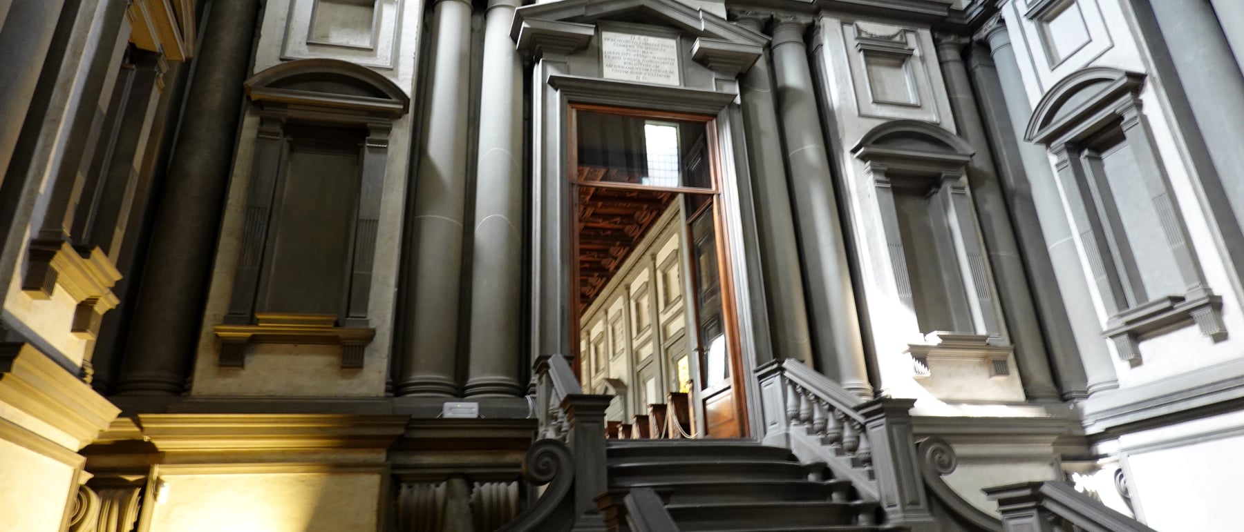
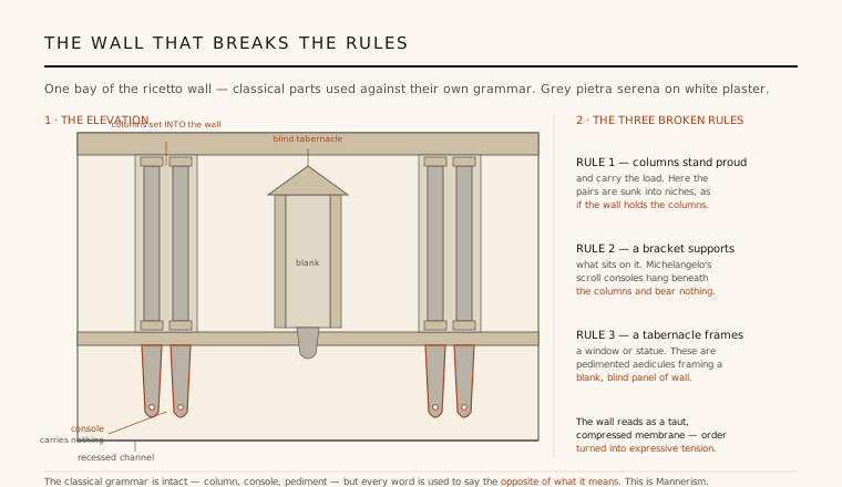
You enter the library through the ricetto — a vestibule that is nearly square in plan (roughly 10.5 m a side) but rises far taller than it is wide, so the space grips you like the bottom of a well: dark, compressed, vertical. What holds the eye is the wall. Michelangelo dresses it in the grey pietra serena and white plaster of Florentine tradition, but he arranges those parts in ways that would have appalled his predecessors. Paired columns are set back into recessed channels in the wall, so that the white plaster projects forward of them. In every classical building the column stands proud and carries the wall; here the columns are sunk into niches, appearing to be held by the wall rather than to support it.
Two further provocations complete the argument. Beneath each pair of columns hangs a scroll console — a bracket whose whole job, since antiquity, is to carry what sits on top of it — yet these consoles taper away to nothing and bear no load at all, mere decorative pendants under columns that reach the floor by other means. And in the wall fields between the columns sit tabernacles: little aediculae with proper pediments that, in any normal building, would frame a window or a statue. Michelangelo's frame nothing — they enclose blank, blind panels of wall. The grammar is intact; every word is misused on purpose.
2. Grey on white: Michelangelo against Brunelleschi
The materials are a direct quotation of Filippo Brunelleschi, a century earlier and a few hundred metres away: the same grey pietra serena for the architectural members, the same white intonaco for the fields between. But Brunelleschi's system was rational. His grey elements — pilasters, arches, entablatures — read as a structural skeleton, a load-bearing frame drawn on the white infill so that you could see the logic of how the building stood. Michelangelo keeps the palette and inverts the meaning. His grey members no longer describe structure; they describe stress.
The result is a wall treated less as a post-and-beam order than as a taut, sculptural membrane — a surface under compression, its columns pressed into it, its brackets straining, its blind windows pushing outward against a skin that will not open. This is the intellectual heart of what the twentieth century named Mannerism (Rudolf Wittkower's 1934 study of the library remains the classic account): the deliberate use of the classical vocabulary against its own rules, for emotional and sculptural effect rather than structural clarity. Michelangelo, a sculptor first, made a room you read the way you read a straining body.
3. A staircase like a lava flow
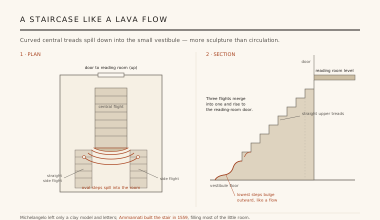
Almost the entire floor of the tiny ricetto is filled by its staircase, and it is one of the strangest objects in Renaissance architecture. A broad central flight runs up the middle, but its treads are convex: they bulge outward, and the lowest three swell into wide ovals with scrolled ends, so the whole flight seems to pour down into the room and pool on the floor — a cascade, or a flow of solidified lava, rather than a set of steps. Two narrower straight side flights, without outer railings, flank the lower run; higher up the three merge into a single flight that rises to the reading-room door.
As circulation this is absurdly extravagant — the central curved steps are awkward to climb and the side flights barely used. That is the point: the stair is more sculpture than machine, a piece of carved furniture scaled up to fill a room and to charge the compressed vestibule with movement. It is the moment the space finally releases the vertical tension the walls have been building, gathering you up out of the dark well and delivering you to the calm hall above.
4. The reading room: the deliberate opposite
Pass through the door at the top of the stair and everything reverses. The reading room (sala di lettura) is long, low and serene — roughly 46 m of calm horizontal space, evenly lit by a rhythmic row of windows down each side, its walls quietly ordered by a regular beat of pilasters that divide the length into bays. After the dark, upward-straining well of the ricetto, the release into this bright, rational, near-classical hall is one of the most controlled spatial contrasts in all architecture. The tension of one room exists to make the calm of the next feel earned.
Michelangelo designed the room as a total interior. The reader sits at rows of continuous wooden desks, the plutei or banchi, whose sloped tops and end-boards he detailed himself, each aligned with a window bay. Overhead a carved and coffered wooden ceiling is answered, panel for panel, by a matching pattern in the red-and-white terracotta floor — ceiling and floor mirror each other exactly, binding the long room into a single measured order. Where the vestibule breaks the rules, the reading room keeps them, deliberately, to prove the vestibule meant to.
5. Absent architect, newborn style
It is essential to be honest about how the building came to be. Pope Clement VII commissioned it in 1523 to house the Medici collection of Greek and Latin manuscripts, and Michelangelo worked on the design from 1524. But in 1534 he left Florence for Rome and never returned. Construction stalled for a generation, and by the time it resumed he could no longer clearly recall his own intentions — in a much-quoted 1555 letter he confessed to Vasari that he remembered the staircase only vaguely, 'as if in a dream.' The stair we climb was built in 1559 by Bartolomeo Ammannati, working from a small clay model Michelangelo sent from Rome together with written instructions. The library finally opened to readers in 1571.
That secondhand execution takes nothing from its importance. The Laurentian Library is the monument in which Michelangelo demonstrated that the classical orders could be treated as an expressive language rather than a fixed grammar — that a column could be made to look burdened, a bracket useless, a window blind, all in the service of feeling. It licensed everything that followed: the studied 'errors' of Giulio Romano, the liberties of the late Renaissance, and ultimately the Baroque's confident bending of the orders. Architecture had discovered that it could quote a rule in order to break it.
Every architect who quotes a classical element only to subvert it — from Robert Venturi's 'both-and' Postmodernism to the deliberately 'wrong' proportions and knowing dissonances of contemporary practice — is still working in the license Michelangelo opened in this one small, straining room.
References & further reading
- 01Ackerman, J. S. (1986). The Architecture of Michelangelo (rev. ed.). University of Chicago Press, Chicago.
- 02Wittkower, R. (1934). Michelangelo's Biblioteca Laurenziana. The Art Bulletin 16(2), pp. 123–218.
- 03Argan, G. C. & Contardi, B. (1993). Michelangelo Architect. Thames & Hudson / Abrams, New York.
- 04Wallace, W. E. (1994). Michelangelo at San Lorenzo: The Genius as Entrepreneur. Cambridge University Press, Cambridge.
- 05Summerson, J. (1963). The Classical Language of Architecture. Methuen / MIT Press, London.
Last verified 2026-07-06. Ancient and vernacular works often have no single architect or firm date; dates are given as widely accepted approximations and the builder-culture is named where no individual designer is known.