
25 · Late Modern, Postmodern & the Road to NowNo. 10 in era
Church of the Light
In a quiet Osaka suburb, Tadao Ando gave a tiny Protestant congregation almost nothing — a plain concrete box, no ornament, no spire, barely any light. Then he sliced the altar wall clean through with a cruciform slot, and a glowing cross of pure daylight turned austerity into one of the great spaces of modern architecture. Minimalism as spiritual intensity, not mere reduction.
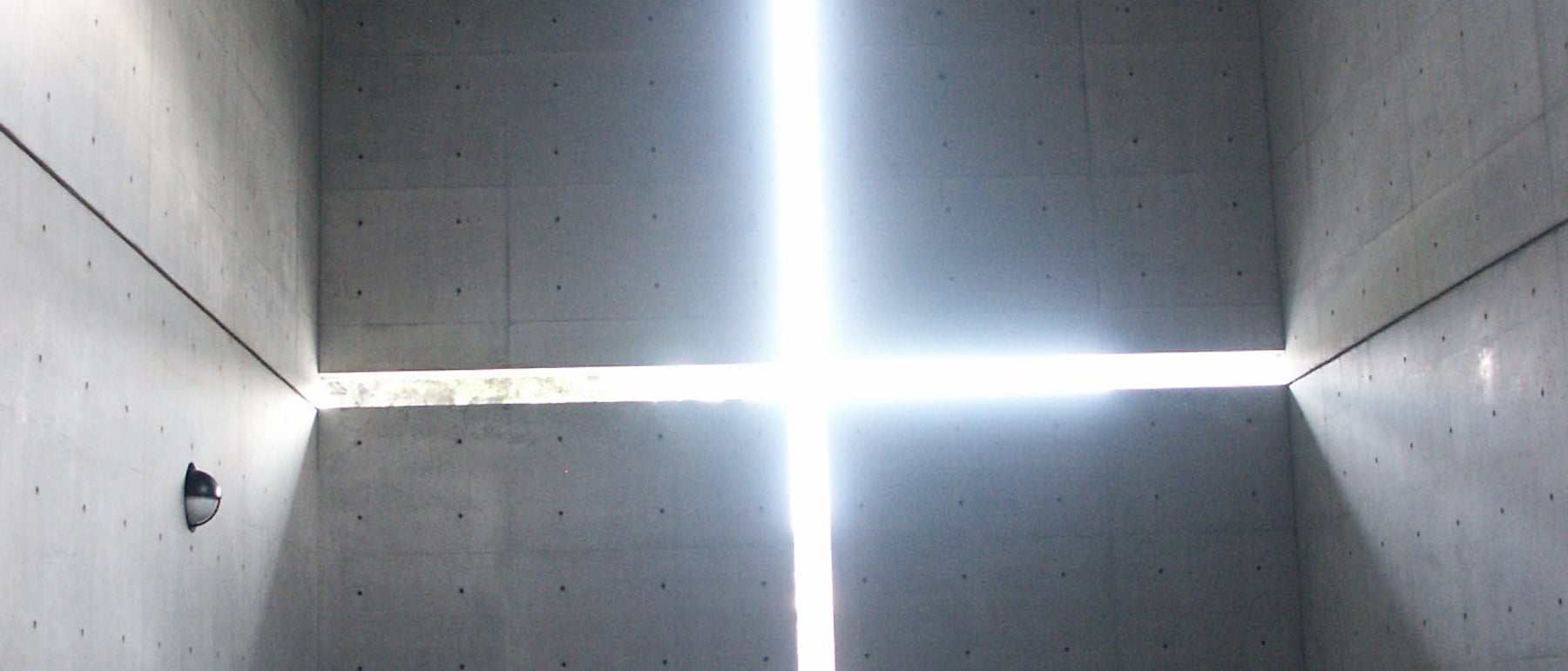
1. A cross cut out of the wall
The whole building turns on a single gesture. The end wall behind the altar — the darkest surface in a deliberately dark room — is sliced by a cruciform slot cut clean through the concrete, full height and full width. There is no applied crucifix, no figure, no symbol hung on the wall; the cross is an absence, a void where the concrete has simply been left out.
Daylight pours through that void, so a luminous cross of pure light hangs glowing in the darkness. Ando originally left the opening unglazed, open to the air and the cold, wanting nothing — not even a pane of glass — between the worshipper and the light. The effect is to make the most important element of a Christian church out of the one thing that costs nothing: emptiness filled with day.
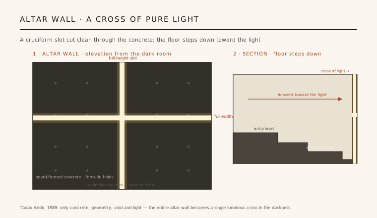
2. Concrete as a finished, silken surface
The container is nothing but a plain rectangular box of in-situ concrete — no cladding, no plaster, no decoration inside or out. What redeems such bareness is the quality of the material itself: Ando's concrete is famous for being silky and precise, poured into meticulously made timber formwork and left as the final surface, so the smooth grey face carries the faint grain of the boards and the regular grid of form-tie holes that held the shuttering together.
Those small, evenly spaced holes are not a flaw but the ordering system of the whole wall — a quiet module that measures the surface the way coursing measures masonry. The concrete is at once industrial and refined, mass-produced and hand-controlled. In Ando's hands a cheap, ordinary material becomes a disciplined, almost tactile surface worthy of a sacred room.
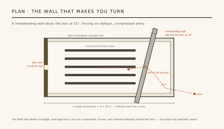
3. A wall set at fifteen degrees
The plan looks, at first, like nothing at all: a single small room. Its one move is a freestanding wall that pierces the box at 15°, cutting diagonally across one end. You cannot walk straight in along an axis toward the altar; the tilted wall blocks the direct path and leaves only a narrow gap to slip through.
So entry becomes oblique and compressed. You approach, are turned by the angled wall, squeeze past it, and are released sideways into the dark room, where the cross of light finally confronts you. With a single skewed plane Ando choreographs a whole procession — approach, compression, turn, arrival — the kind of spatial control a Baroque church would have needed a whole sequence of rooms to achieve.
4. Darkness, and the descent to the light
The interior is kept deliberately dark and austere. Floor and pews are made of rough, dark scaffold-plank timber — the same cheap boards used on building sites — left low and heavy so the room feels closer to a workshop than a nave. Against this gloom, the cross reads all the more fiercely; light works only because Ando has been ruthless about withholding it.
Crucially, the floor steps down toward the altar. As the congregation moves forward they descend, so that the minister stands lower than the worshippers and everyone is drawn down and in toward the light. The descent inverts the usual raised altar and turns the act of approaching into a small, bodily submission — a movement toward the cross rather than up to it.
5. Emptiness as intensity
Church of the Light is often filed under Western minimalism, but its deeper roots are Japanese. It is built on ma — the idea of charged, active emptiness — and on the aesthetics of shadow, in which darkness is not a lack but a medium that makes a single point of light overwhelming. The building proves that reduction can be an intensifier: strip away everything, and what remains is enormous.
That lesson is why a chapel with almost no budget and almost no square metres became a canonical modern space. With only concrete, geometry, void and light, Ando demonstrated that minimalism need not be cool or empty of feeling — it can be a discipline for producing awe. The church remains in ordinary weekly use, which is perhaps the truest measure of its success: monumental architecture that still works as a small parish room.
Its equation of bare concrete, controlled darkness and a single cut of daylight still governs contemplative spaces from Peter Zumthor's Bruder Klaus field chapel to Steven Holl's light-carved chapels — proof that in an age of spectacle, emptiness can be the most powerful material.
References & further reading
- 01Ando, T. & Frampton, K. (1995). Tadao Ando: Buildings, Projects, Writings. Rizzoli, New York.
- 02Dal Co, F. (1995). Tadao Ando: Complete Works. Phaidon Press, London.
- 03Jodidio, P. (2007). Ando: Complete Works 1975–2012. Taschen, Cologne.
- 04Furuyama, M. (2006). Tadao Ando: The Geometry of Human Space. Taschen, Cologne.
- 05Tanizaki, J. (1977). In Praise of Shadows. Leete's Island Books, New Haven (orig. 1933).
Last verified 2026-07-11. Ancient and vernacular works often have no single architect or firm date; dates are given as widely accepted approximations and the builder-culture is named where no individual designer is known.