
25 · Late Modern, Postmodern & the Road to NowNo. 07 in era
AT&T (Sony) Building
In 1978 the man who had helped import the glass box to America turned around and crowned a Manhattan skyscraper with a giant broken pediment lifted from a Chippendale cabinet. Philip Johnson's AT&T Building clad its tower in warm pink-grey granite instead of glass, quoted the ancient column — base, shaft, capital — and put Postmodernism, and Johnson himself, on the cover of Time. It remains the moment historical ornament walked back into the corporate mainstream.
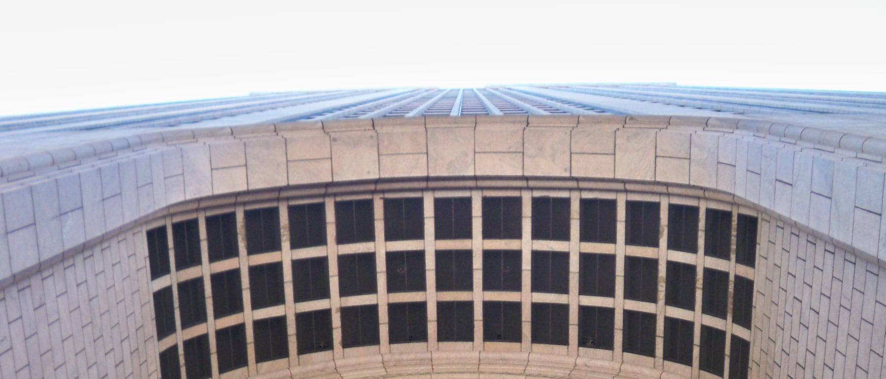
1. The column made 197 metres tall
Johnson organised the whole tower as a single classical column: a base, a shaft and a capital, stacked to the height of a skyscraper. The base is a monumental seven-storey (about 33 m) round-arched entrance loggia of rusticated granite, deliberately recalling a Renaissance palazzo or a Roman triumphal gate rather than a modern lobby. Above it a tall, almost unadorned shaft rises the full height of the building, and the whole thing is capped by the notorious broken pediment.
The tripartite reading was not decoration bolted onto a modern box; it governed the silhouette. Where the previous generation — including the young Johnson at the Seagram Building — had insisted a tower express nothing but its structural frame and its skin, here the skyscraper was asked to behave like an order, with a beginning, a middle and an emphatic end. That single decision is what makes 550 Madison legible from a mile away and unmistakable in the skyline.
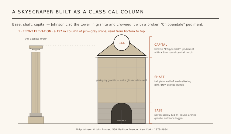
2. Granite, not glass — a deliberate rejection of the curtain wall
The most radical move is easy to miss because it is so quiet: the building is faced in stone. Some thirteen thousand tonnes of pink-grey Stony Creek granite were hung as thick panels over a conventional steel frame, giving the tower a warm, weighty, masonry presence utterly unlike the taut reflective skins around it. Windows are punched openings in a wall, not a continuous sheet of glazing, so the facade reads as solid and load-bearing even though the granite is technically a veneer.
This was a pointed argument. The glass curtain wall had become the default language of corporate America, and Johnson — who had helped write that language — now abandoned it for the oldest cladding in architecture. The choice of stone signalled permanence, history and institutional gravity, exactly the image a telephone monopoly wanted, and it gave Postmodernism a material as well as a formal identity.
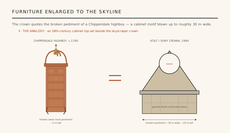
3. The Chippendale crown
At the summit sits the element that made the building famous and infamous: a broken triangular pediment, roughly 30 m wide, with a large circular notch cut out of its apex. To most eyes it looked exactly like the swan-neck bonnet of an eighteenth-century Chippendale highboy — or the hood of a grandfather clock — enlarged to the scale of the skyline. A piece of furniture ornament had been blown up several hundred times and set 190 m in the air.
The crown was a piece of pure architectural rhetoric. It served no structural or mechanical purpose beyond screening rooftop plant, yet it did the essential cultural work: it quoted history openly, unashamedly, at a scale nobody could ignore. It is the single gesture that let critics declare Postmodernism had arrived in the corporate boardroom — and the one that split them instantly into camps of witty and liberating versus kitsch.
4. Johnson's about-face and the cover of Time
The design carried extraordinary weight because of who made it. Philip Johnson had co-authored the 1932 exhibition and book that named the International Style and had spent decades as the chief American evangelist for Mies van der Rohe's glass minimalism. For that figure to crown a skyscraper with a Chippendale top was a public renunciation, and it read as the establishment itself changing its mind.
The gesture was rewarded with celebrity. In January 1979 Time put Johnson on its cover cradling a model of the tower, the pediment held up like a trophy — one of the very few times a work of architecture became mainstream news before it was even built. The image fixed the AT&T Building as the emblem of a movement and turned an eighty-year-old architect into the face of architectural revolt.
5. Liberation or kitsch — and a second life
Reaction divided sharply and has never fully settled. Defenders saw a witty, generous liberation from the dogma of the box: a return of history, ornament, colour and civic scale that modernism had banished. Detractors — including many modernists — dismissed the pediment as kitsch, an expensive one-liner, ornament without conviction. That very argument is part of the building's importance; it forced the discipline to debate meaning, memory and symbolism after decades of banishing them.
The building has since had a quieter afterlife. Sony took it over in 1992, enclosing the once-open arcaded base — a change later reversed — and it is now known simply as 550 Madison, a designated New York City landmark. Time has been kind to it: what once looked like a provocation now reads as a dignified, well-built stone tower, and its crown endures as the single most recognisable image of Postmodern architecture.
Every skyline silhouette engineered to be instantly recognisable — from ornamental crowns to the branded 'top' of a contemporary supertall — descends from the moment 550 Madison proved a corporate tower could speak in quotation marks and put itself on the cover of a magazine.
References & further reading
- 01Stern, Robert A. M., Mellins, Thomas & Fishman, David (2006). New York 1960: Architecture and Urbanism Between the Second World War and the Bicentennial. Monacelli Press, New York.
- 02Jencks, Charles (1991). The Language of Post-Modern Architecture (6th ed.). Rizzoli, New York.
- 03Schulze, Franz (1994). Philip Johnson: Life and Work. University of Chicago Press, Chicago.
- 04New York City Landmarks Preservation Commission (2018). 550 Madison Avenue (formerly AT&T Building) — Designation Report (LP-2612). City of New York.
- 05Goldberger, Paul (1984). The AT&T Headquarters: Post-Modernism's First Monument. The New York Times, Architecture.
Last verified 2026-07-11. Ancient and vernacular works often have no single architect or firm date; dates are given as widely accepted approximations and the builder-culture is named where no individual designer is known.